
The Power of Reporting and Analysis in YouTrack 6

In YouTrack 6, we introduced additional functionality for providing stakeholders with succinct, easy-to-digest information about the state of the project. This is subdivided into two areas: reports and the live dashboard.
Reports
In issue tracking systems, reports are used to provide interested parties with snapshots of the project’s state. A report may be as simple as a timeline graph that indicates a race to completion, or it might be a breakdown of time spent by user or by task, or something a bit more complicated.
Typical report users might include:
- A developer who wishes to get accurate information about their progress in dealing with bugs and feature requests.
- A project manager wishing to see the progress of a project or, e.g., its adherence to an SLA agreement.
- A division lead, program manager or CEO wishing to get up-to-date information about the state of several/all projects currently being worked on.
YouTrack 6 introduces 17 different report types grouped into the following four categories:
Issue Distribution Reports
These show the distribution of issues by different criteria, starting from the most specific and going towards the most generic. One can see number of issues distributed by assignee or project or a field of your choosing; alternatively you can have a two-field distribution or a matrix report.
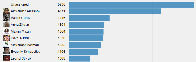
Here’s an example of an Issues per assignee report:
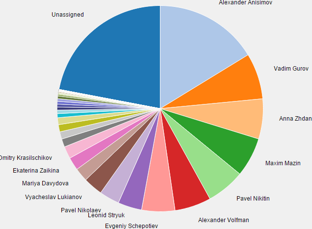
Incidentally, it is also possible to produce a pie chart instead of a bar graph:
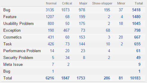
And, if you just want the numeric data, you can simply produce a matrix report:
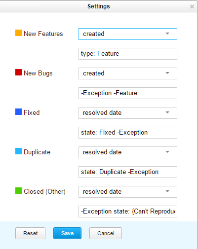
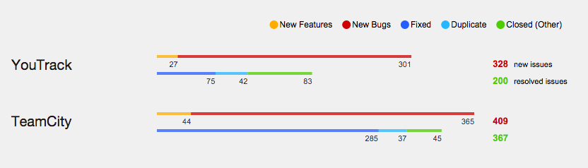
Finally, we have something called an ‘Advanced issues per project’ report. This report lets you fine-tune the selections and coloring of issue distributions displayed for a Project Portfolio. For example, suppose I want to display two bars, one showing the distribution of new issues by type (bugs vs. features) and another bar to indicate the distribution of resolved issues (fixed/duplicate/other). For a set of projects to do this, I can configure the query settings like so:
Now, I can define the color for each of the indicators, and, after I’m done, I get the following generated bars:
Timeline Reports
These types of reports show the dynamics of changes of your project in time. This includes the familiar Burndown and Cumulative flow diagrams (albeit unconstrained by the scope of a particular agile board) as well as indicators of how you are coping with SLA/quality of service requirements.
Here’s a look at the report generated for purposes of managing an SLA:
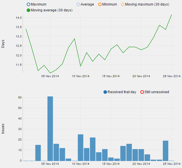
In the image above, the top diagram shows the moving average of the number of days an issue remains in an unresolved state. It’s also possible to add additional indicators (e.g., minimum or maximum) by clicking the circles above the chart. The bottom chart shows the number of issues that have been resolved on a particular day.
Time Management Reports
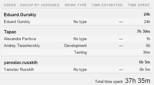
The time report (there is only one type of report in this category) shows how time is spent by different project members. It is possible to group the time spent either per user or per issue, and it’s also possible to take into account the work item types, if they were specified when work was logged:
State Transition Reports
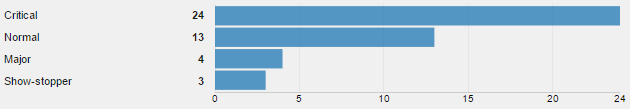
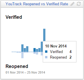
These reports show how your projects’ issues transition from one state to another. This can be useful, for example, for determining how well your QA processes work: after all, if too many issues transition from Verified to Reopened state, it could be an indicator that they are not being addressed properly.
Here’s precisely this type of report, showing the distribution of reopened issues aggregated by priority:
It’s important to note that reports can be made either shared or private, and you can specify which group of users gets to see them. And as far as report updates go, the following rules hold:
- Reports that incorporate a timeline have a setting for how often they are recalculated.
- Issue distribution reports get recalculated once every 10 minutes.
Please note that just because a report has been recalculated doesn’t mean you’ll get an automatic visual update if you leave a page open. To see the updated values of your report, you need to either open it or reload it if you’ve got it open already. Only then, provided that the recalculation time has elapsed, will you see the updated values. You can always get the most recent data by recalculating the report manually, clicking on the recalculate icon.
Dashboard
Put simply, the dashboard provides at-a-glance visibility of what’s going on in your project or, indeed, several projects at once. The dashboard consists of widgets — rectangular blocks that you can drag around and drop into place as you wish. A dashboard is a per user construct, meaning it is individually configured by each team member.
At the moment, the dashboard can contain three types of elements:
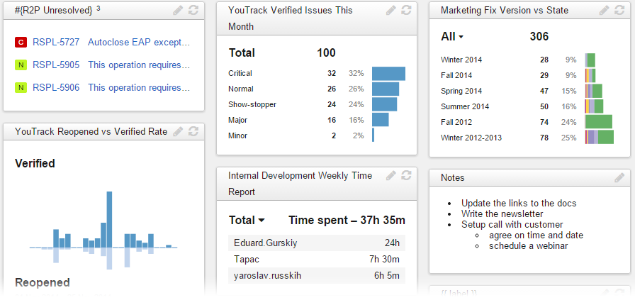
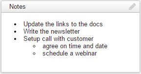
- Notes — this is a way for the user to add a set of notes to their dashboard. Markdown syntax is supported.
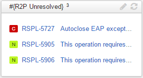
- Issues — this lets the user show the results of an issue search. The list contains the issue’s ID, summary (both hyperlinks that open the full issue screen) as well as a visual indicator of the issue’s priority:
- Report – perhaps the most exciting part of all, this type of widget contains the image generated from a preexisting report. Just like the report itself, the images support user interaction: for example, hovering the mouse over a bar chart will show the actual values:
The rules for recalculating the data on the dashboard are similar to those for reports. Reports and issue lists are refreshed once every 10 minutes (apart from timeline reports, which have a setting). Reloading the page refreshes the display (provided the underlying data has been recalculated), but if you want the widget to recalculate right now, simply press its Recalculate button.
Conclusion
With reporting and dashboard functionality, YouTrack has moved one step closer to enabling project oversight to happen in a fluid, transparent manner. If you haven’t started using YouTrack already, check out the YouTrack product page — we have both hosted and on-premise solution, and provide a free license for small teams. Enjoy!
Subscribe to YouTrack Blog updates


