
Adding Volume to the Kotlin Identity

Kotlin isn’t just a programming language, and it’s not just a language for Android development. It’s a whole ecosystem for creating various projects, from mobile apps and websites to data science. It’s an active, friendly community, with hundreds of online and offline events happening all around the world.
Despite its fairly long history, Kotlin has never had a consistent visual style. Designs were created for specific events or to solve a particular problem, with only the Kotlin flag remaining constant. When creating new assets, we’ve had to reconsider what we already have, which has made the design process more complicated than it should be.
We wanted to create a brand identity that would be robust, iconic, and recognizable, and at the same time multifaceted and easily used.

The colors felt outdated and the whole impression we got from the logo was at odds with a modern, growing programming language. Although the stripe in the logo did help it to stand out and make it recognizable, it wasn’t a very unique look, and so we decided to remove it. We took our flag, removed the stripe, and mixed its colors to make them brighter and more vibrant. That’s basically the story of how we came up with our awesome new logo – the gradient filled flag.
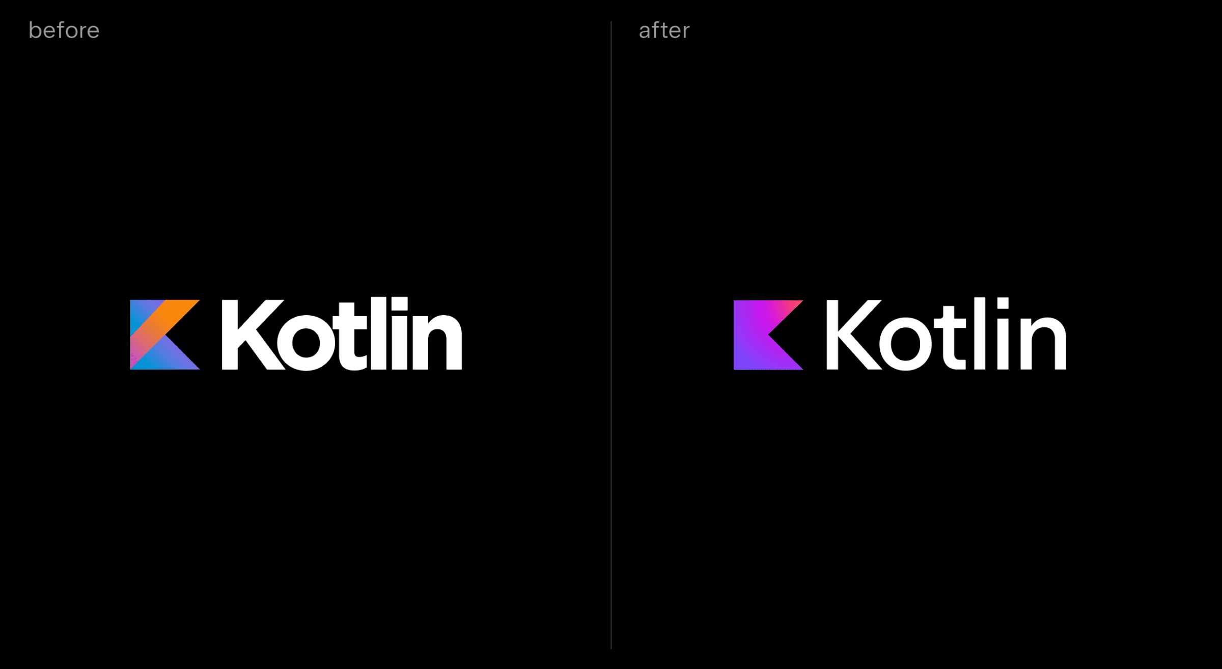
As a font, we’ve picked JetBrains Sans. As one of JetBrains’ products, we wanted to emphasize our relationship and our commitment to the same values. As a fun detail, there is an alternative “i” in the font, specifically for the word Kotlin.
Brand identity is a versatile tool that can be used across a broad spectrum of situations. We’ve picked 3D shapes for the basis of Kotlin’s visual language, as they can be used in many ways. These shapes can be used as shapes, masks for photos, icons, and so much more.


We’ve now managed to successfully implement the visual style into our product pages and social media, made two online events, and are in the process of planning the next one! We already see that our communications are becoming more consistent, leading to a more robust brand. And what’s more, the design team can now deliver everything that much faster.
Art director:
Vladimir Grigoriev
Designers:
Alexey Salmin
Denis Voronov
Subscribe to Kotlin Blog updates


