DataGrip 2018.2 EAP 2
Hello! Now is a good time to take a look at the new EAP build for 2018.2 which will be released later this month. It comes with one notable feature and several bug-fixes.
Context info
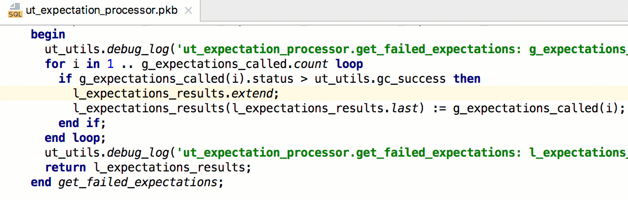
When editing a huge procedure in a package, it is sometimes useful to refresh your memory on the context of it: what particular procedure or package is now being edited. To do this use Alt+Q (Shift+Ctrl+Q for OSX) to see the context information:
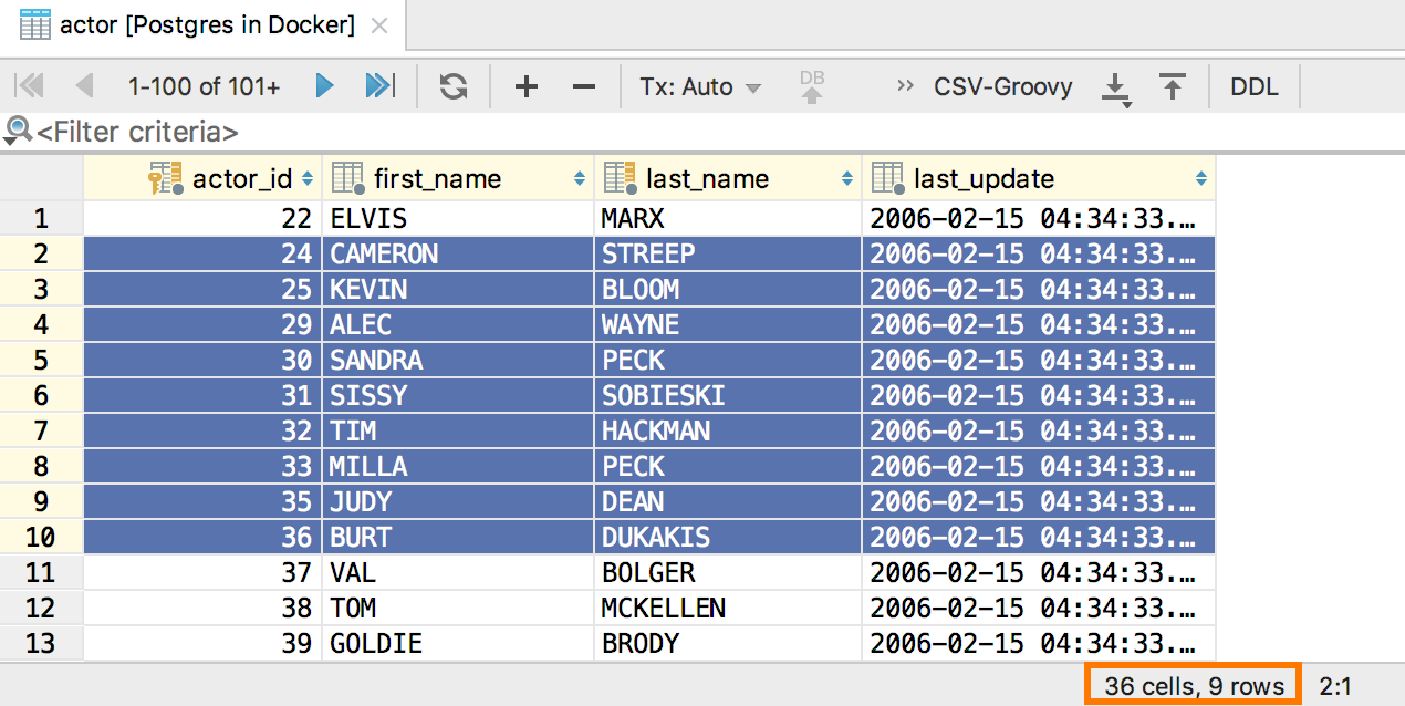
Number of selected rows
Now DataGrip will show the number of rows selected in the data editor in the status bar.
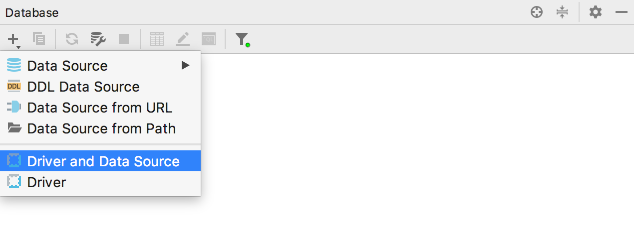
Custom data source
We added the ability to add jdbc-driver based data source to the drop-down invoked by the + button on the toolbar.
By the way, how do you like our new grayscale toolbar icons? 🙂
Bug fixes
DBE-6681: MySQL comments are being formatted properly
DBE-5204: DDL for a table opens in a right place
DBE-1858: Deleting the criteria from the Filter field shows all rows in the data editor
That’s it! Don’t forget about Twitter, our forum, and the issue tracker.
Your DataGrip Team
_
JetBrains
The Drive to Develop
Oleksii Vynnychenko says:
July 5, 2018> how do you like our new grayscale toolbar icons? 🙂
While I think UI/UX in DataGrip (and in all JB products in general) is one of the best in industry and I like 99% of what you do, I have to say these monochrome icons are a step backwards in UX and the plugin (ToolWindow Colorful Icons) you’ve released doesn’t solve the issue.
Maksim Sobolevskiy says:
July 5, 2018And what is the issue? The velocity of finding an icon?
Oleksii Vynnychenko says:
July 5, 2018Yes.
I feel like I over-complained already since I’m writing it in every occasion 🙂 .
We’re finding buttons by shape of the icon and by color. Making everything grey is taking away one of those two for nothing in return. Color doesn’t distract me at all (as JB team said in blog post on this matter), it only helps.
I’ve seen responses from people that don’t have good eye sight and it hits them too (whether we think you shouldn’t sit in front of PC without glasses or not). It’s blurry grey on light gray background for them.
Same goes for tool window – reading label takes longer than looking at icon and again color helps there because different icons have different color or at least different amount of same color.
It just makes my UX and productivity worse for nothing.
Edoardo Luppi says:
July 5, 2018Idea should offer a way to switch icon set. There are people with eyesight problems that needs colors. But I think a grayscale IDE is much better if you don’t have such problems. Too much colors are frustrating.
Jason Streisburg says:
July 6, 2018Why in the world would you grayscale all of the icons? That should be optional and disabled by default.
Instead of focusing on grayscaling the icons, how about adding colors to columns for different column types? HeidiSQL has this. null and integers have different colors than strings. Really helps organize things mentally at a glance.
Grayscale icons is a big step backwards.
Maksim Sobolevskiy says:
July 10, 2018We have this ticket already https://youtrack.jetbrains.com/issue/DBE-1274
BUT!
Can you elaborate why do you need this? Now numbers are aligned to the right so you can distinguish them from strings.
BlenderKou says:
July 25, 2018when it supoor SAP HANA DateBase
Maksim Sobolevskiy says:
July 26, 2018We don’t know yet https://youtrack.jetbrains.com/issue/DBE-630