Fleet
More Than a Code Editor
Introducing Fleet’s New Islands UI
We envisioned Fleet as a coding tool with a clear minimalist design that doesn’t overwhelm and helps keep you focused. Today we’re introducing a new, bolder look for Fleet. We believe that this new direction in Fleet’s UI will help make your developer experience more cohesive, intuitive, and, of course, productive.
New islands layout
The most notable change introduced in this update is the islands layout. The new design visually separates the editor and tool panels, creating a cleaner and more focused workspace. This update not only gives Fleet a sleek, organic look but also helps you focus on the task at hand by minimizing distractions and guiding your attention to the content within each panel.
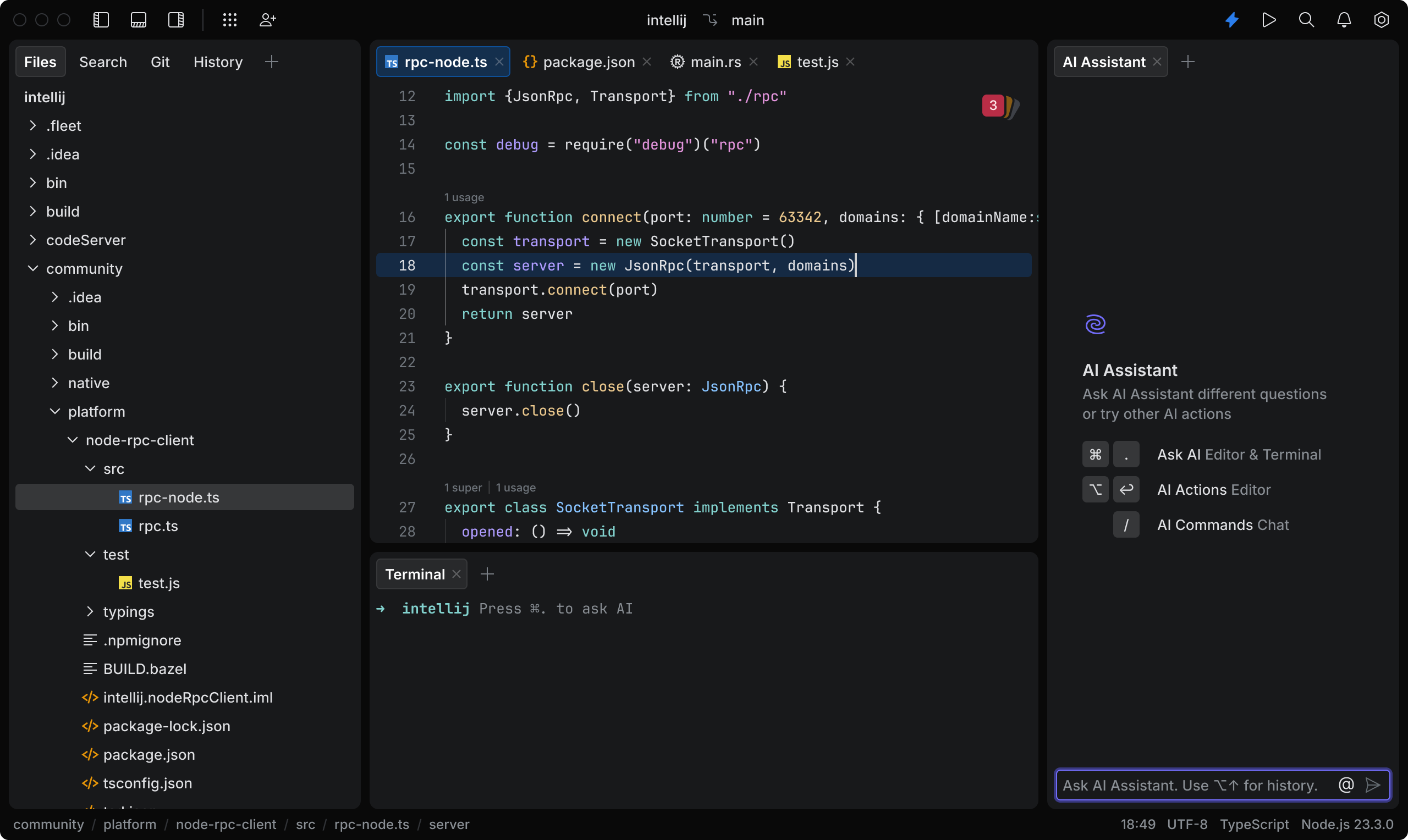
We’ve placed the island-like panels on a single canvas to build a modular and scalable layout system. The UI is split into easily distinguishable areas and elements like editor and tools that represent different parts of the development workflow and can be easily rearranged.
Fleet’s tab-based navigation further enhances the smooth and intuitive user experience. By allowing for flexible content arrangement, you can easily switch between different files, streamlining your workflow.
Enhanced editor
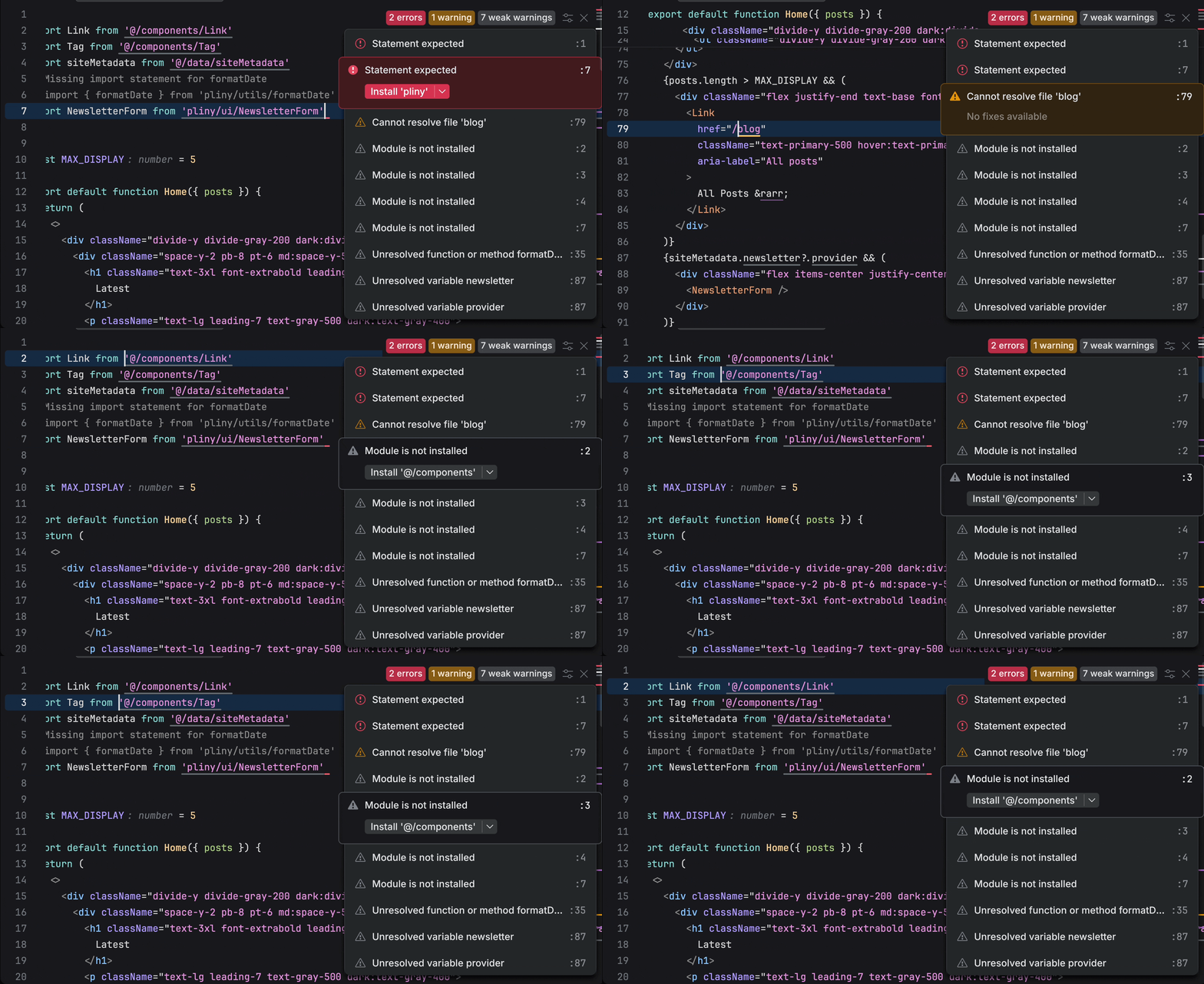
The editor has also seen significant updates, including a more streamlined and lightweight Search and Replace and an improved, visually refined Problems widget.
Pinned tabs
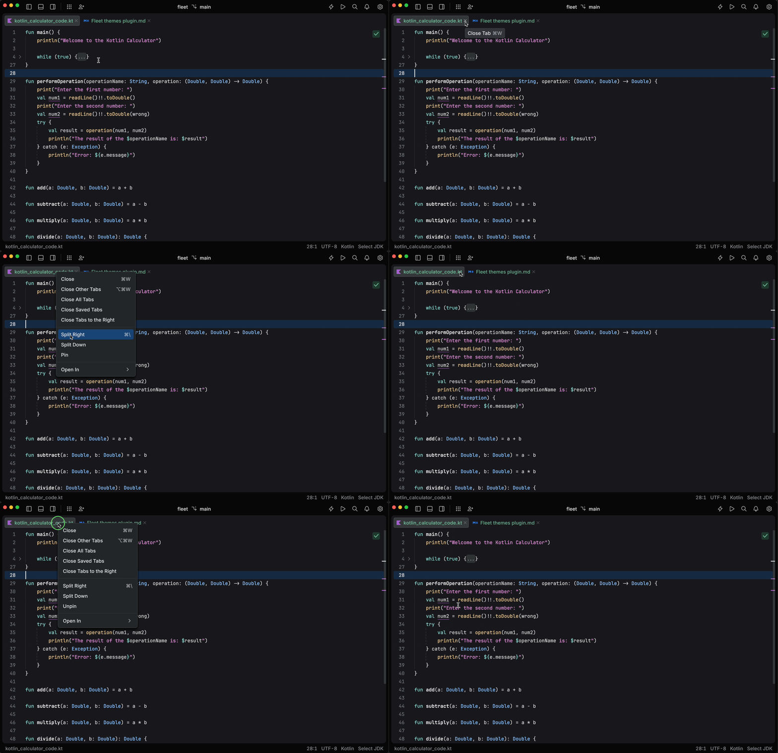
Fleet now also offers you the ability to pin tabs, allowing you to keep your most important tabs open at all times. Without a close icon, pinned tabs can’t be closed accidentally. To pin or unpin a tab, just right-click it and select Pin or Unpin from the popup menu. You can also drag a pinned tab outside a pinned group to unpin it.
Updated UI kit
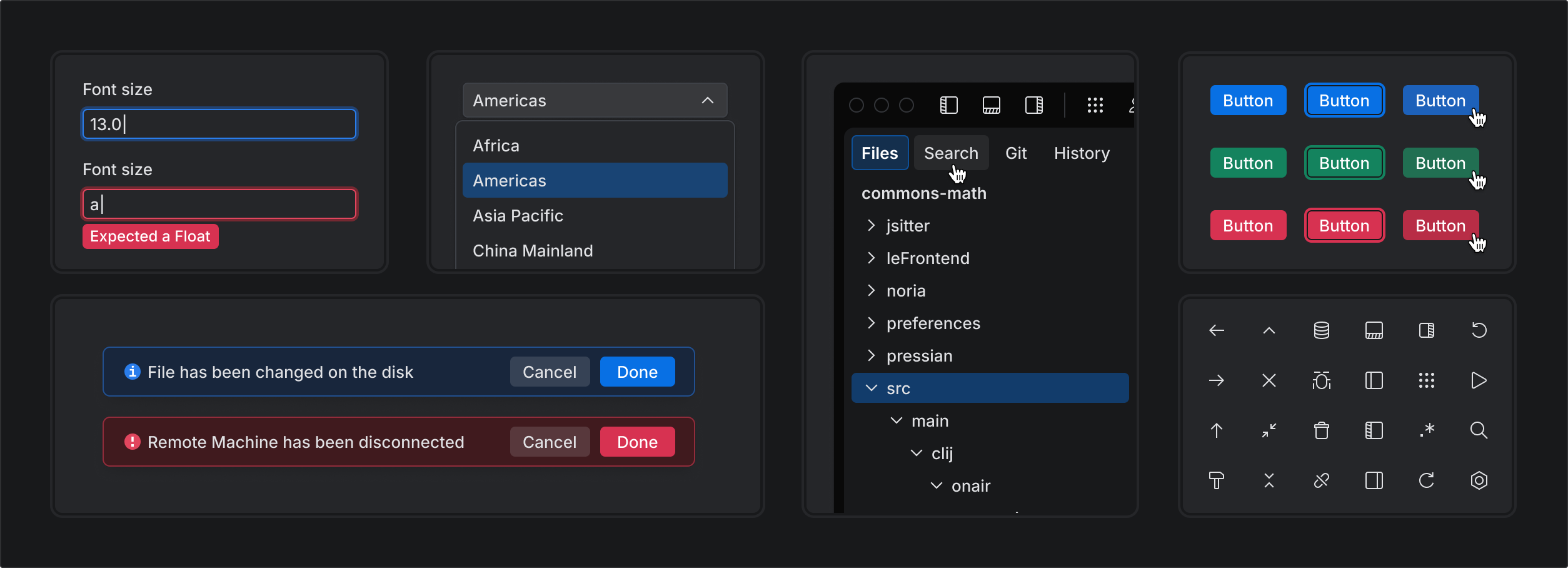
The UI kit has been fully revamped for the islands UI. All components have been refined to ensure a more polished and cohesive look aligned with the new visual style. The transparent style is used in buttons, tabs, and other components, ensuring clarity and strong contrast with backgrounds and text labels.
New color palette
For the new UI, we’ve designed a balanced color system that is scalable and allows you to create custom color palettes.
The UI’s color scheme ensures accessibility, as all text is clearly readable and compliant with Web Content Accessibility Guidelines (WCAG) guidelines.

Refined typography
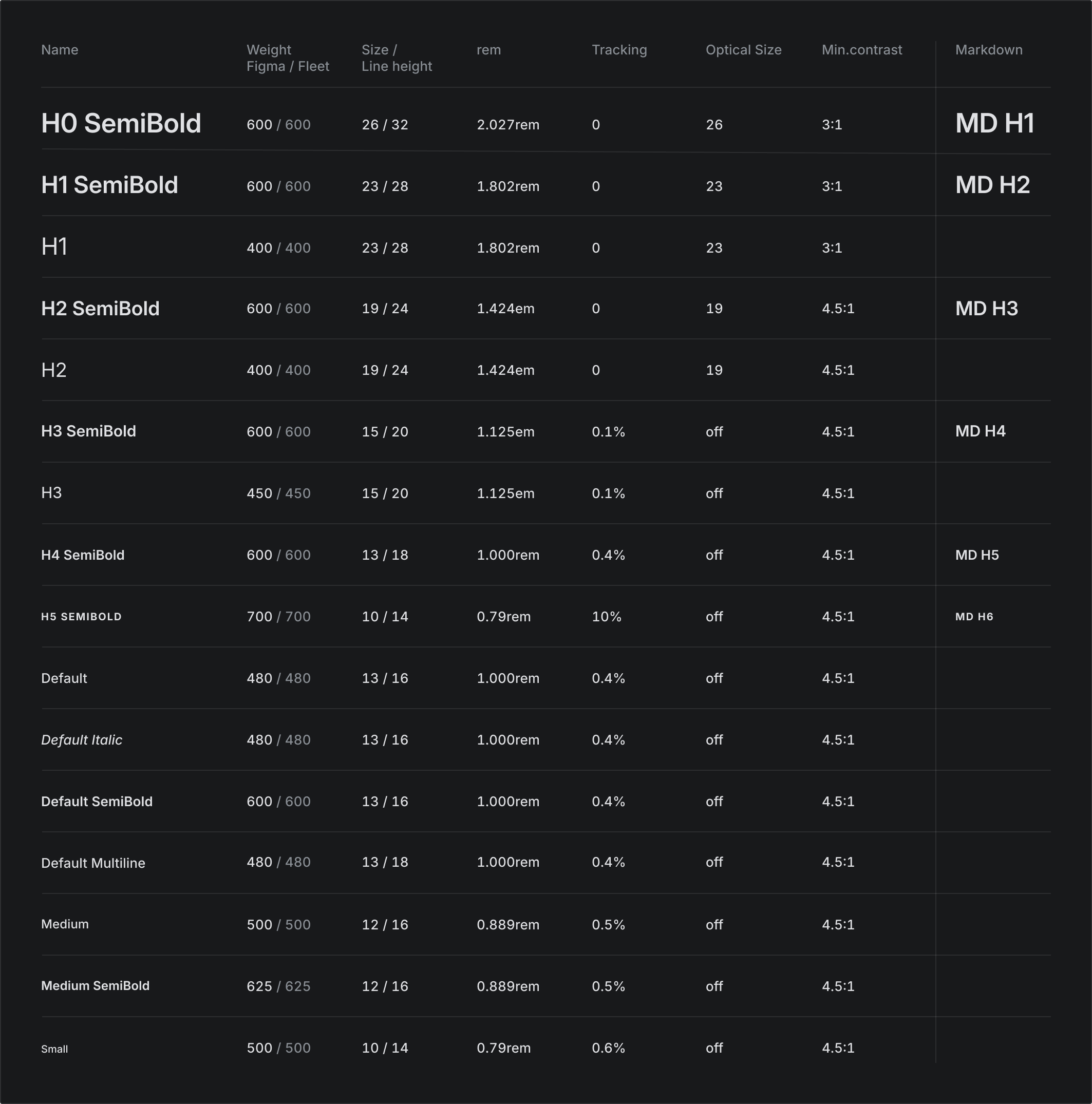
Our new typographic system now uses the Inter variable, providing improved control over weight adjustments for optimal readability in both dark and light themes.
The updated font styles follow a unified type scale, ensuring harmony and visual appeal.
Improved inline diff preview
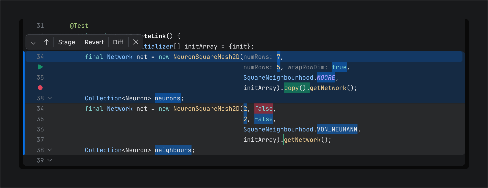
The inline diff preview in the editor has been updated with a new floating toolbar, allowing for quick access to popular actions.
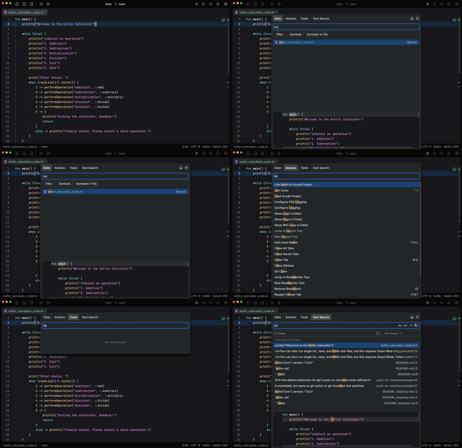
Redesigned Goto popup
To align with the new design, we’ve reworked the Goto popup, which now separates information more clearly.
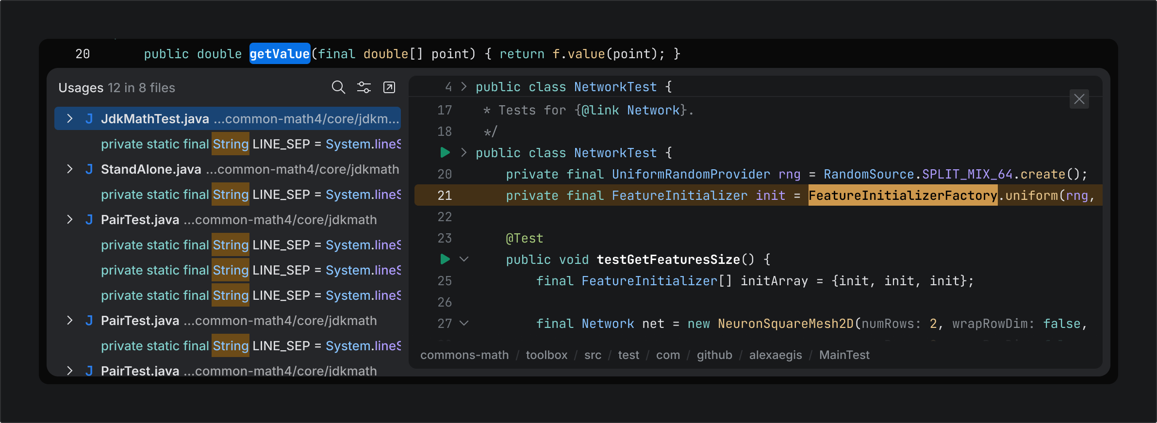
Updated interlines
We’ve also updated interlines by better separating the file preview and adding a status bar, clarifying the file’s source.
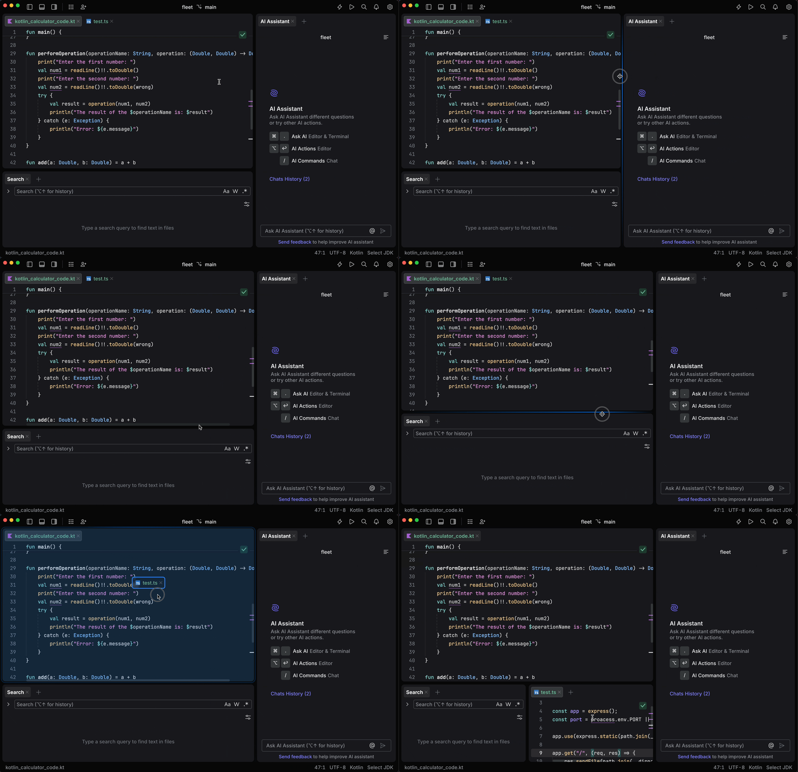
Drag-and-drop and resize
New drag-and-drop and resize functionality now includes improved visual accents, enhancing usability and providing clearer feedback for user actions.
Refreshed default themes
The new UI comes with updated dark, light, and purple themes. Any existing custom themes will revert to these new defaults, but you can personalize them as desired.
We want to hear from you!
Download and explore the new UI today, and let us know what you think in the comments below.

