Data Cleaning in Data Science
In this Data Science blog post series, we’ve talked about where to get data from and how to explore that data using pandas, but whilst that data is excellent for learning, it’s not similar to what we will term real-world data. Data for learning has often already been cleaned and curated to allow you to learn quickly without needing to venture into the world of data cleaning, but real-world data has problems and is messy. Real-world data needs cleaning before it can give us useful insights, and that’s the subject of this blog post.
Data problems can come from the behaviour of the data itself, the way the data was gathered, or even the way the data was input. Mistakes and oversights can happen at every stage of the journey.
We are specifically talking about data cleaning here rather than data transformation. Data cleaning ensures that conclusions you make from your data can be generalised to the population you define. In contrast, data transformation involves tasks such as converting data formats, normalising data and aggregating data.
Why Is Data Cleaning Important?
The first thing we need to understand about datasets is what they represent. Most datasets are a sample representing a wider population, and in working with this sample, you will be able to extrapolate (or generalise) your findings to this population. For example, we used a dataset in the previous two blog posts. This dataset is broadly about house sales, but it only covers a small geographical area, a small period of time and potentially not all houses in that area and period; it is a sample of a larger population.
Your data needs to be a representative sample of the wider population, for example, all house sales in that area over a defined period. To ensure that our data is a representative sample of the wider population, we must first define our population’s boundaries.
As you might imagine, it’s often impractical to work with the entire population, except perhaps census data, so you need to decide where your boundaries are. These boundaries might be geographical, demographical, time-based, action-based (such as transactional) or industry-specific. There are numerous ways to define your population, but to generalise your data reliably, this is something you must do before you clean your data.
In summary, if you’re planning to use your data for any kind of analysis or machine learning, you need to spend time cleaning the data to ensure that you can rely on your insights and generalise them to the real world. Cleaning your data results in more accurate analysis and, when it comes to machine learning, performance improvements, too.
Without cleaning your data, you risk issues such as not being able to generalise your learnings to the wider population reliably, inaccurate summary statistics and incorrect visualisations. If you are using your data to train machine learning models, this can also lead to errors and inaccurate predictions.
Try PyCharm Professional for free
Examples of Data Cleaning
We’re going to take a look at five tasks you can use to clean your data. This is not an exhaustive list, but it’s a good place to start when you get your hands on some real-world data.
Deduplicating data
Duplicates are a problem because they can distort your data. Imagine you are plotting a histogram where you’re using the frequency of sale prices. If you have duplicates of the same value, you will end up with a histogram that has an inaccurate pattern based on the prices that are duplicated.
As a side note, when we talk about duplication being a problem in datasets, we are talking about duplication of whole rows, each of which is a single observation. There will be duplicate values in the columns, and we expect this. We’re just talking about duplicate observations.
Fortunately for us, there is a pandas method we can use to help us detect if there are any duplicates in our data. We can use JetBrains AI chat if we need a reminder with a prompt such as:
Code to identify duplicate rows
Here’s the resulting code:
duplicate_rows = df[df.duplicated()]
duplicate_rows
This code assumes that your DataFrame is called df, so make sure to change it to the name of your DataFrame if it is not.
There isn’t any duplicated data in the Ames Housing dataset that we’ve been using, but if you’re keen to try it out, take a look at the CITES Wildlife Trade Database dataset and see if you can find the duplicates using the pandas method above.
Once you have identified duplicates in your dataset, you must remove them to avoid distorting your results. You can get the code for this with JetBrains AI again with a prompt such as:
Code to drop duplicates from my dataframe
The resulting code drops the duplicates, resets the index of your DataFrame and then displays it as a new DataFrame called df_cleaned:
df_cleaned = df.drop_duplicates()
df_cleaned.reset_index(drop=True, inplace=True)
df_cleaned
There are other pandas functions that you can use for more advanced duplicate management but this is enough to get you started with deduplicating your dataset.
Once you drop duplicates, it’s useful to confirm how many rows were removed so you understand the impact on your dataset:
# Compare row counts before and after deduplication
original_rows = len(df)
cleaned_rows = len(df_cleaned)

print(f"Rows before deduplication: {original_rows}")
print(f"Rows after deduplication: {cleaned_rows}")
print(f"Duplicates removed: {original_rows - cleaned_rows}")
Even a small number of duplicates can significantly distort summary statistics, so checking this step is always worthwhile.
Dealing with implausible values
Implausible values can occur when data is entered incorrectly or something has gone wrong in the data-gathering process. For our Ames Housing dataset, an implausible value might be a negative SalePrice, or a numerical value for Roof Style.
Spotting implausible values in your dataset relies on a broad approach that includes looking at your summary statistics, checking the data validation rules that were defined by the collector for each column and noting any data points that fall outside of this validation as well as using visualisations to spot patterns and anything that looks like it might be an anomaly.
You will want to deal with implausible values as they can add noise and cause problems with your analysis. However, how you deal with them is somewhat open to interpretation. If you don’t have many implausible values relative to the size of your dataset, you may want to remove the records containing them. For example, if you’ve identified an implausible value in row 214 of your dataset, you can use the pandas drop function to remove that row from your dataset.
Once again, we can get JetBrains AI to generate the code we need with a prompt like:
Code that drops index 214 from #df_cleaned
Note that in PyCharm’s Jupyter notebooks I can prefix words with the # sign to indicate to JetBrains AI Assistant that I am providing additional context and in this case that my DataFrame is called df_cleaned.
The resulting code will remove that observation from your DataFrame, reset the index and display it:
df_cleaned = df_cleaned.drop(index=214)
df_cleaned.reset_index(drop=True, inplace=True)
df_cleaned
When removing implausible values, it helps to track how much data you’re excluding:
print(f"Dataset size after removing implausible value: {len(df_cleaned)} rows")
If you find yourself removing large portions of the dataset, it may indicate a deeper data collection issue worth investigating.
Another popular strategy for dealing with implausible values is to impute them, meaning you replace the value with a different, plausible value based on a defined strategy. One of the most common strategies is to use the median value instead of the implausible value. Since the median is not affected by outliers, it is often chosen by data scientists for this purpose, but equally, the mean or the mode value of your data might be more appropriate in some situations.
Alternatively, if you have domain knowledge about the dataset and how the data was gathered, you can replace the implausible value with one that is more meaningful. If you’re involved in or know of the data-gathering process, this option might be for you.
How you choose to handle implausible values depends on their prevalence in your dataset, how the data was gathered and how you intend to define your population as well as other factors such as your domain knowledge.
Formatting data
You can often spot formatting problems with your summary statistics or early visualisations you perform to get an idea of the shape of your data. Some examples of inconsistent formatting are numerical values not all being defined to the same decimal place or variations in terms of spelling, such as “first” and “1st”. Incorrect data formatting can also have implications for the memory footprint of your data.
Once you spot formatting issues in your dataset, you need to standardise the values. Depending on the issue you are facing, this normally involves defining your own standard and applying the change. Again, the pandas library has some useful functions here such as round. If you wanted to round the SalePrice column to 2 decimal places, we could ask JetBrains AI for the code:
Code to round #SalePrice to two decimal places
The resulting code will perform the rounding and then print out the first 10 rows so you can check it:
df_cleaned['SalePrice'] = df_cleaned['SalePrice].round(2)
df_cleaned.head()
As another example, you might have inconsistent spelling – for example, a HouseStyle column that has both “1Story” and “OneStory”, and you’re confident that they mean the same thing. You can use the following prompt to get code for that:
Code to change all instances of #OneStory to #1Story in #HouseStyle
The resulting code does exactly that and replaces all instances of OneStory to 1Story:
df_cleaned[HouseStyle'] = df_cleaned['HouseStyle'].replace('OneStory', '1Story')
Addressing outliers
Outliers are very common in datasets, but how you address them, if at all, is very context-dependent. One of the easiest ways to spot outliers is with a box plot, which uses the seaborn and matplotlib libraries. I discussed box plots in my previous blog post on exploring data with pandas if you need a quick refresher.
We’ll look at SalePrice in our Ames housing dataset for this box plot. Again, I’ll use JetBrains AI to generate the code for me with a prompt such as:
Code to create a box plot of #SalePrice
Here’s the resulting code that we need to run:
import seaborn as sns
import matplotlib.pyplot as plt

# Create a box plot for SalePrice
plt.figure(figsize=(10, 6))
sns.boxplot(x=df_cleaned['SalePrice'])
plt.title('Box Plot of SalePrice')
plt.xlabel('SalePrice')
plt.show()
The box plot tells us that we have a positive skew because the vertical median line inside the blue box is to the left of the centre. A positive skew tells us that we have more house prices at the cheaper end of the scale, which is not surprising. The box plot also tells us visually that we have lots of outliers on the right-hand side. That is a small number of houses that are much more expensive than the median price.
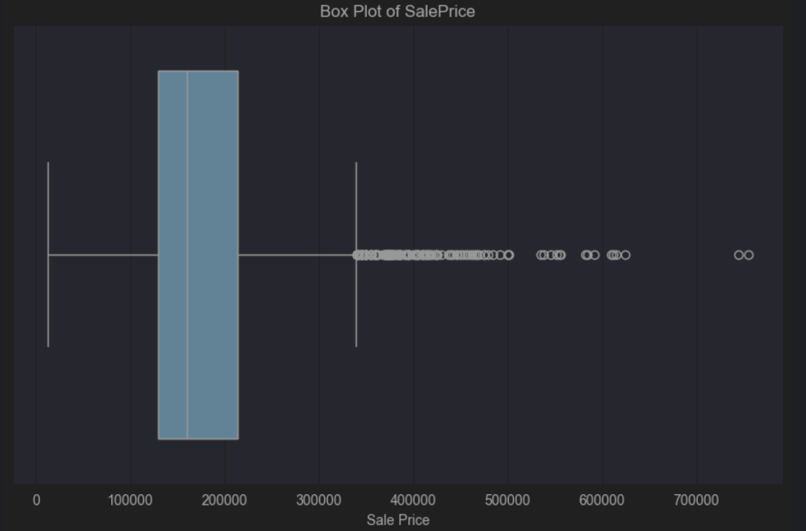
You might accept these outliers as it’s fairly typical to expect a small number of houses with a larger price point than the majority. However, this is all dependent on the population you want to be able to generalise to and the conclusions you want to draw from your data. Putting clear boundaries around what is and what is not part of your population will allow you to make an informed decision about whether outliers in your data are going to be a problem.
For example, if your population consists of people who will not be buying expensive mansions, then perhaps you can delete these outliers. If, on the other hand, your population demographics include those who might reasonably be expected to buy these expensive houses, you might want to keep them as they’re relevant to your population.
I’ve talked about box plots here as ways to spot outliers, but other options such as scatter plots and histograms can quickly show you if you have outliers in your data, so you can make an informed decision on if you need to do anything about them.
Addressing outliers usually falls into two categories – deleting them or using summary statistics less prone to outliers. In the first instance, we need to know exactly which rows they are.
Until now we’ve just been discussing how to identify them visually. There are different ways to determine which observations are and aren’t outliers. One common approach is using a method called the modified Z score. Before we look at how and why it’s modified, the Z-score is defined as:
Z-score = (data point value – mean) / standard deviation
The reason we then modify the Z-score for detecting outliers is that both the mean and the standard deviation are prone to outlier influence by virtue of how they are calculated. The modified Z-score is defined as:
Modified Z-score = (data point value – median) / median absolute deviation
As we learned when we talked about summary statistics, the median is not affected by outliers. The median absolute deviation is the median value of the dataset’s absolute deviations from the median. For example, if your data set contains these values:
1, 2, 2, 2, 3, 3, 3, 5,9
Then your median is 3 as the value in the middle of the dataset. The deviations from your median value of 3 are as follows in the order presented above:
2, 1, 1, 1, 0, 0, 0, 2, 5
When we sort these into ascending order we get:
0, 0, 0, 1, 1, 1, 2, 2, 5
Meaning the median absolute deviation in this example would be 1.
How do we calculate the Modified Z-score for our data set for SalePrice? Let’s give JetBrains AI this prompt:
Given:
Modified Z-score = (data point value – median) / median absolute deviation
Calculate the Modified Z-score for #SalePrice
That results in this code:
import pandas as pd
from scipy.stats import median_abs_deviation


# Assuming 'data' is your DataFrame and it contains the 'SalePrice' column


# Calculate the median for the SalePrice column
median_sale_price = data['SalePrice'].median()


# Calculate the Median Absolute Deviation (MAD) for the SalePrice column
mad_sale_price = median_abs_deviation(data['SalePrice'], scale='normal')


# Calculate the Modified Z-scores for the SalePrice column
data['Modified_Z_Score'] = (data['SalePrice'] - median_sale_price) / mad_sale_price


# Display the first few rows with the Modified Z-scores
print(data[['SalePrice', 'Modified_Z_Score']].head())
When we install the required packages and run this code, we can see we’re partway through, but now we need to decide what an outlier for our SalePrice is based on the modified Z-score. The general wisdom here is that an outlier is anything >=3 or <=-3 however, it’s worth noting that like most statistical decisions, it can and should be tailored to your dataset.
Let’s pass another prompt over to JetBrains AI so we can further tailor our output:
Just list those that have a #Modified_Z_Score of 3 or above or -3 or below
I’m going to take this snippet of code and replace it with the relevant rows above:
# Filter the rows where the Modified Z-score is 3 or above, or -3 or below
outliers = data[(data['Modified_Z_Score'] >= 3) | (data['Modified_Z_Score'] <= -3)]


# Print all the filtered rows, showing their index and SalePrice
outliers = (outliers[['SalePrice', 'Modified_Z_Score']])
outliers
I have modified this code to save the outliers in a new DataFrame called outliers and print them out so I can view them.
Our next step would be to remove these outliers from our DataFrame. Again we can use JetBrains AI to generate the code with a prompt like:
Create a new dataframe without the outliers
data_without_outliers = data.drop(index=outliers.index)


# Display the new DataFrame without outliers
print(data_without_outliers)
Our new DataFrame, data_without_outliers, excludes those values where the SalePrice variable is considered an outlier.
We can update our box plot code to look at the new DataFrame. It still shows our positive skew as we’d expect, but the values considered as outliers have been removed:
import seaborn as sns
import matplotlib.pyplot as plt


# Create a box plot for SalePrice
plt.figure(figsize=(10, 6))
sns.boxplot(x=data_without_outliers['SalePrice'])
plt.title('Box Plot of SalePrice')
plt.xlabel('SalePrice')
plt.show()
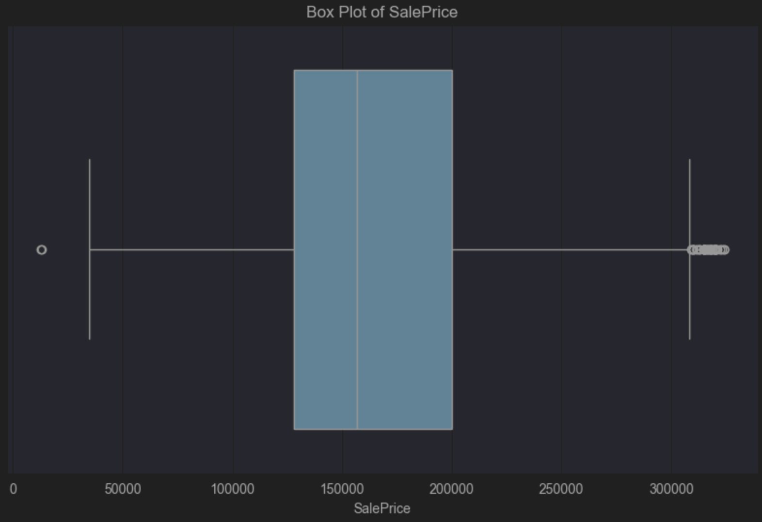
Before we finish up here, let’s take a look at how many observations were removed from our DataFrame as a percentage because we considered them to be outliers based on SalePrice.
We can use a prompt such as:
Calculate the percentage of observations removed between #data and #data_without_outliers
# Calculate the number of observations in the original and filtered DataFrames
original_count = len(data)
filtered_count = len(data_without_outliers)

# Calculate the number of removed observations
removed_count = original_count - filtered_count

# Calculate the percentage of observations removed
percentage_removed = (removed_count / original_count) * 100

# Display the percentage
print(f"Percentage of observations removed: {percentage_removed:.2f}%")
PyCharm tells us that 5.67% of observations have been removed. In other words, removing outliers reduced the dataset by a small but meaningful amount, which may improve model stability without sacrificing too much representativeness.
As I mentioned earlier, if you are keeping your outliers, consider using summary values less prone to being affected by outliers such as the median and interquartile range. You might consider using these measurements to form your conclusions when you’re working with datasets that you know contain outliers that you’ve not removed because they are relevant to the population you’ve defined and the conclusions you want to draw.
Missing values
The fastest way to spot missing values in your dataset is with your summary statistics. As a reminder, in your DataFrame, click Show Column Statistics on the right-hand side and then select Compact. Missing values in the columns are shown in red, as you can see here for Lot Frontage in our Ames housing dataset:

There are three kinds of missingness that we have to consider for our data:
- Missing completely at random
- Missing at random
- Missing not at random
Missing completely at random
Missing completely at random means the data has gone missing entirely by chance and the fact that it is missing has no relationship to other variables in the dataset. This can happen when someone forgets to answer a survey question, for example.
Data that is missing completely at random is rare, but it’s also among the easiest to deal with. If you have a relatively small number of observations missing completely at random, the most common approach is to delete those observations because doing so shouldn’t affect the integrity of your dataset and, thus, the conclusions you hope to draw.
Missing at random
Missing at random has a pattern to it, but we’re able to explain that pattern through other variables we’ve measured. For example, someone didn’t answer a survey question because of how the data was collected.
Consider in our Ames housing dataset again, perhaps the Lot Frontage variable is missing more frequently for houses that are sold by certain real estate agencies. In that case, this missingness could be due to inconsistent data entry practices by some agencies. If true, the fact that the Lot Frontage data is missing is related to how the agency that sold the property gathered the data, which is an observed characteristic, not the Lot Frontage itself.
When you have data missing at random, you will want to understand why that data is missing, which often involves digging into how the data was gathered. Once you understand why the data is missing, you can choose what to do. One of the more common approaches to deal with missing at random is to impute the values. We’ve already touched on this for implausible values, but it’s a valid strategy for missingness too. There are various options you could choose from based on your defined population and the conclusions you want to draw, including using correlated variables such as house size, year built, and sale price in this example. If you understand the pattern behind the missing data, you can often use contextual information to impute the values, which ensures that relationships between data in your dataset are preserved.
Missing not at random
Finally, missing not at random is when the likelihood of missing data is related to unobserved data. That means that the missingness is dependent on the unobserved data.
One last time, let’s return to our Ames housing dataset and the fact that we have missing data in Lot Frontage. One scenario for data missing not at random is when sellers deliberately choose not to report Lot Frontage if they consider it small and thus reporting it might reduce the sale price of their house. If the likelihood of Lot Frontage data being missing depends on the size of the frontage itself (which is unobserved), smaller lot frontages are less likely to be reported, meaning the missingness is directly related to the missing value.
Handling missing data in practice
Once you’ve identified the type and pattern of missingness in your dataset, the next step is deciding how to handle it. There is no single “correct” approach, and the right strategy depends on why the data is missing, how much is missing, and how you plan to use the data. Two of the most common approaches in pandas are removing missing values or imputing them.
Removing missing values with dropna()
If missing values are rare or missing completely at random, it may be reasonable to remove the affected rows or columns. Pandas provides the dropna() method for this purpose. For example, to remove rows that contain any missing values:
df_cleaned = df_cleaned.dropna()
You can also be more selective. For instance, if a particular column is critical to your analysis, you might drop only rows where that column is missing:
df_cleaned = df_cleaned.dropna(subset=['LotFrontage'])
Imputing missing values with fillna()
Imputation involves replacing missing values with plausible alternatives. A common and simple strategy is to use summary statistics such as the median, mean, or mode. For numerical data, median imputation is often preferred because it is less sensitive to outliers:
df_cleaned['LotFrontage'] = df_cleaned['LotFrontage'].fillna(
    df_cleaned['LotFrontage'].median())
For categorical variables, the most frequent value (the mode) is commonly used:
df_cleaned['GarageType'] = df_cleaned['GarageType'].fillna(
    df_cleaned['GarageType'].mode()[0])
More advanced imputation strategies may involve using correlated variables or predictive models, particularly when data is missing at random and the relationships between variables are important to preserve.
Regardless of the method you choose, it’s important to document your decisions clearly. How you handle missing data can have a significant impact on downstream analysis and model performance, so transparency and reproducibility are essential.
After handling missing values, it’s helpful to measure whether your dataset is now complete:
# Check remaining missing values
print(df_cleaned.isnull().sum())
Or, to summarize the effect:
missing_before = df.isnull().sum().sum()
missing_after = df_cleaned.isnull().sum().sum()
print(f"Missing values before cleaning: {missing_before}")
print(f"Missing values after cleaning: {missing_after}")
This gives you a clear before-and-after snapshot of how much missingness has been addressed.
Visualising missingness
Whenever data is missing, you need to establish whether there’s a pattern. If you have a pattern, then you have a problem that you’ll likely have to address before you can generalize your data.
One of the easiest ways to look for patterns is with heat map visualisations. Before we get into the code, let’s exclude variables with no missingness. We can prompt JetBrains AI for this code:
Code to create a new dataframe that contains only columns with missingness
Here’s our code:
# Identify columns with any missing values
columns_with_missing = data.columns[data.isnull().any()]

# Create a new DataFrame with only columns that have missing values
data_with_missingness = data[columns_with_missing]

# Display the new DataFrame
print(data_with_missingness)
Before you run this code, change the final line so we can benefit from PyCharm’s nice DataFrame layout:
data_with_missingness
Now it’s time to create a heatmap; again we will prompt JetBrains AI with code such as:
Create a heatmap of #data_with_missingness that is transposed
Here’s the resulting code:
import seaborn as sns
import matplotlib.pyplot as plt


# Transpose the data_with_missingness DataFrame
transposed_data = data_with_missingness.T


# Create a heatmap to visualize missingness
plt.figure(figsize=(12, 8))
sns.heatmap(transposed_data.isnull(), cbar=False, yticklabels=True)
plt.title('Missing Data Heatmap (Transposed)')
plt.xlabel('Instances')
plt.ylabel('Features')
plt.tight_layout()
plt.show()
Note that I removed cmap=’viridis’ from the heatmap arguments as I find it hard to view.
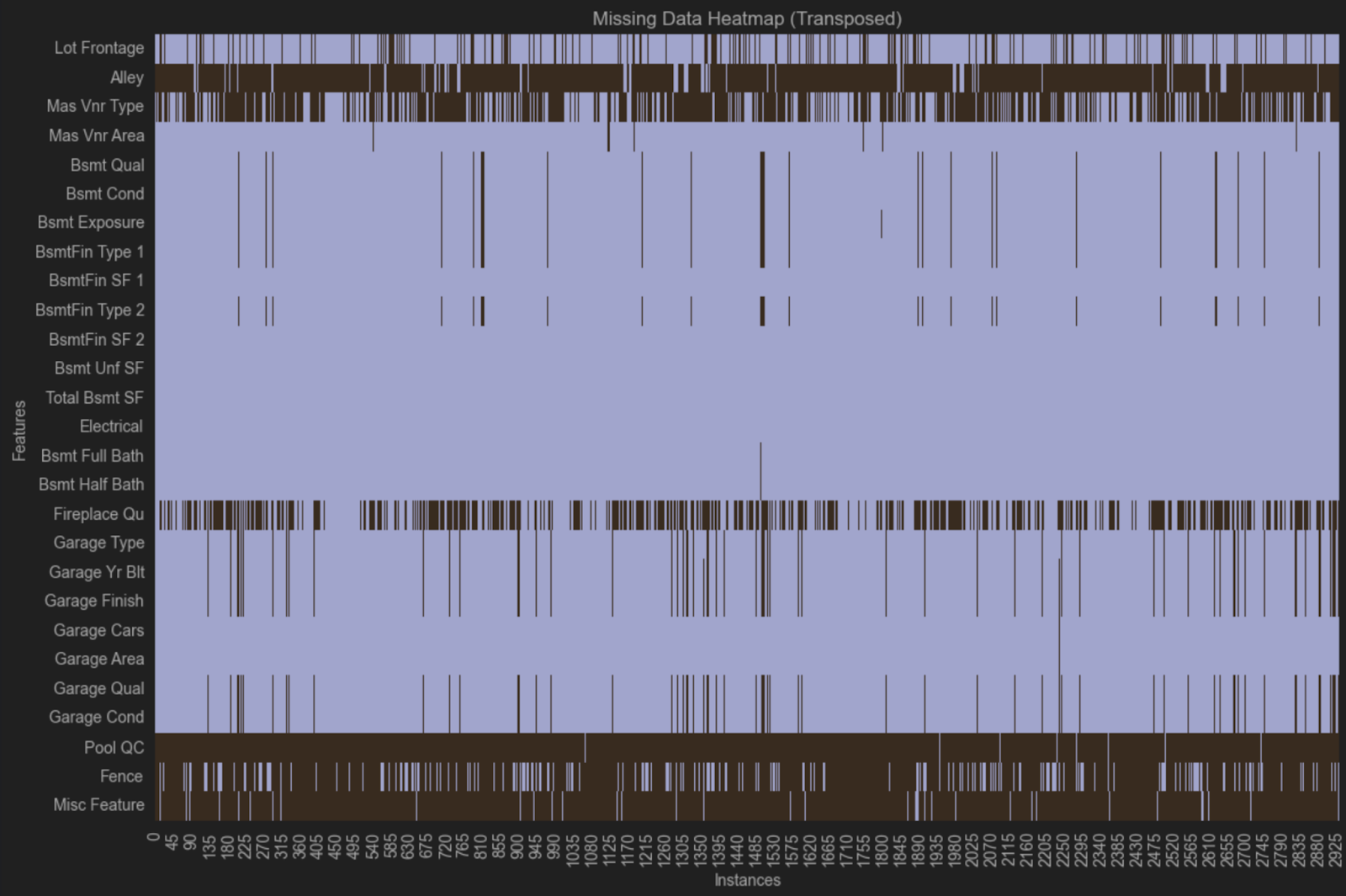
This heatmap suggests that there might be a pattern of missingness because the same variables are missing across multiple rows. In one group, we can see that Bsmt Qual, Bsmt Cond, Bsmt Exposure, BsmtFin Type 1 and Bsmt Fin Type 2 are all missing from the same observations. In another group, we can see that Garage Type, Garage Yr Bit, Garage Finish, Garage Qual and Garage Cond are all missing from the same observations.
These variables all relate to basements and garages, but there are other variables related to garages or basements that are not missing. One possible explanation is that different questions were asked about garages and basements in different real estate agencies when the data was gathered, and not all of them recorded as much detail as is in the dataset. Such scenarios are common with data you don’t collect yourself, and you can explore how the data was collected if you need to learn more about missingness in your dataset.
Best Practices for Data Cleaning
As I’ve mentioned, defining your population is high on the list of best practices for data cleaning. Know what you want to achieve and how you want to generalise your data before you start cleaning it.
You need to ensure that all your methods are reproducible because reproducibility also speaks to clean data. Situations that are not reproducible can have a significant impact further down the line. For this reason, I recommend keeping your Jupyter notebooks tidy and sequential while taking advantage of the Markdown features to document your decision-making at every step, especially with cleaning.
When cleaning data, you should work incrementally, modifying the DataFrame rather than the original CSV file or database, and ensuring you do it all in reproducible, well-documented code.
TL;DR
- Real-world data is messy and must be cleaned before it can be analysed or used for machine learning.
- Data cleaning is about ensuring accuracy, reliability, and the ability to generalise findings to a defined population.
- Common data cleaning tasks include removing duplicate records, fixing implausible values, standardising formatting, handling outliers, and addressing missing data.
- Outliers should be evaluated in the context of your population and goals, not removed automatically.
- Missing data can be completely random, at random, or not at random, and each type requires a different handling strategy.
- Pandas provides powerful tools like
dropna()andfillna()for managing missing values, alongside visual techniques such as heatmaps to identify patterns. - All data cleaning decisions should be reproducible, well-documented, and aligned with how you plan to analyse or model the data.
- Clean data leads to more trustworthy insights, better visualisations, and improved machine learning performance.
Summary
Data cleaning is a big topic, and it can have many challenges. The larger the dataset is, the more challenging the cleaning process is. You will need to keep your population in mind to generalise your conclusions more widely while balancing tradeoffs between removing and imputing missing values and understanding why that data is missing in the first place.
You can think of yourself as the voice of the data. You know the journey that the data has been on and how you have maintained data integrity at all stages. You are the best person to document that journey and share it with others.
Try PyCharm Professional for free

