Datalore
Collaborative data science platform for teams
Analyzing Financial Bubbles With Python and Datalore AI
This is a guest blog post by Ryan O’Connell, CFA, FRM.
Introduction
In the late 1990s, the world witnessed an unprecedented surge in technology stocks, when investors couldn’t throw money at dot-com companies fast enough. Fast-forward to 2024, and we find ourselves in the midst of another technological revolution – the AI boom.
As artificial intelligence reshapes industries and captures imaginations, tech valuations are once again soaring to dizzying heights. But are we seeing history repeat itself, or is this time truly different?
In this data research, we dive deep into the numbers, comparing the frenzied valuations of the dot-com era to today’s AI-fueled market. By examining key financial metrics of tech giants then and now, we aim to uncover patterns, disparities, and potential warning signs that could shed light on the sustainability of current tech valuations.
“Are we in another tech bubble, or are we witnessing the dawn of a new technological age that will redefine the very fabric of our economy? Or is there perhaps some truth to both statements?”

For those eager to see the full research, simply open this Datalore report. To save myself time and energy, I’ll use Datalore’s AI Assistant to help me generate Python code that forms the backbone of this analysis, demonstrating how AI itself is revolutionizing the way we conduct and present financial research.
Now, let’s dive into the data and see what stories it has to tell about these two pivotal eras in tech history.
Disclaimer: This article is for informational and educational purposes only and is not intended to serve as personal financial advice. Note: the data used in this research is from July 24, 2024.
The dot-com bubble: a NASDAQ rollercoaster
To understand the magnitude of the dot-com bubble and its subsequent burst, let’s start by examining the performance of the NASDAQ Composite Index, as represented by the QQQ ETF.
The NASDAQ (National Association of Securities Dealers Automated Quotations) is a global electronic marketplace for buying and selling securities, and it’s particularly known for its high concentration of technology and growth stocks. The NASDAQ Composite Index is a benchmark index that includes more than 3,000 stocks listed on the NASDAQ stock exchange, making it a key indicator of the technology sector’s performance.
The QQQ ETF, also known as the Invesco QQQ Trust, is an exchange-traded fund that tracks the NASDAQ-100 Index, which consists of the 100 largest non-financial companies listed on the NASDAQ. It’s widely regarded as a barometer for the performance of tech stocks and the broader technology sector.
In our analysis, we use adjusted close prices. These prices reflect the stock’s value after accounting for any corporate actions such as stock splits, dividends, and rights offerings. Using adjusted prices ensures that we’re comparing apples to apples across different time periods, providing a more accurate representation of the ETF’s performance over time.
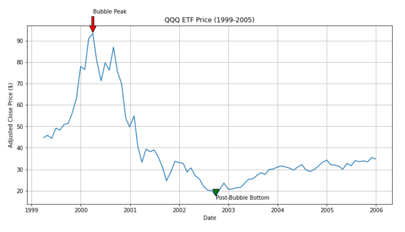
Looking at the graph, we can see the dramatic rise and fall of the QQQ ETF during the dot-com bubble:
- The bubble’s peak: On March 31, 2000, the QQQ reached its zenith at $93.34. This point represents the height of the dot-com mania, where tech valuations had skyrocketed to unprecedented levels.
- The brutal descent: Following the peak, we observe a steep and prolonged decline. The line graph plummets sharply, illustrating the rapid erosion of value in tech stocks.
- The painful bottom: The low was reached on September 30, 2002, when the QQQ hit a low of $17.66. This represents a staggering 81.08% drop from its peak value.
This fall from $93.34 to $17.66 translates to a loss of 81.08% of the ETF’s value. To put this into perspective, an investor who had put $10,000 into the QQQ at its peak would have seen their investment shrink to just $1,892 at the bottom – a sobering reminder of the risks associated with market bubbles.
The graph also shows a gradual recovery post-2002, but it’s worth noting that it took years for the NASDAQ to regain its dot-com era highs. This prolonged recovery period underscores the severe and lasting impact of the bubble’s burst on the tech sector and the broader market.
As we delve deeper into our comparison with the current AI boom, this stark visualization of the dot-com bubble’s impact will serve as a crucial reference point, reminding us of the potential consequences of unchecked market exuberance.
NASDAQ ETF adjusted close prices from 1999 to 2006

Microsoft: a tale of two tech booms
To bridge the gap between the dot-com era and the current AI boom, let’s examine Microsoft’s valuation metrics from 1995 to the present day. Microsoft serves as an excellent case study, having been a major player in both the dot-com bubble and the current AI revolution, particularly with its significant stake in OpenAI, the company behind ChatGPT.
Before we delve into Microsoft’s valuation journey, let’s first understand the key metrics we’re using to measure company valuations:
Understanding P/E and P/B ratios
Price-to-earnings (P/E) ratio
The P/E ratio is a fundamental valuation metric that compares a company’s stock price to its earnings per share (EPS). It essentially shows how much investors are willing to pay for each dollar of the company’s earnings.
P/E ratio = stock price / earnings per share
There are two types of P/E ratios:
- Trailing P/E: based on the past 12 months of actual earnings (the version we’re using in this analysis).
- Forward P/E: based on projected earnings for the next 12 months.
In our analysis, we’re using the trailing P/E ratio, which provides a snapshot based on actual historical performance rather than future projections. Forward P/E is often considered a better measure for rapid growth companies, but it is difficult to access historical forward P/E ratios, so this analysis will focus on the standard (trailing) P/E ratio.
Price-to-book (P/B) ratio
The P/B ratio compares a company’s market value to its book value (the net asset value on the balance sheet).
P/B ratio = stock price / book value per share
This ratio gives an idea of whether a stock is over or undervalued by comparing the market’s valuation to the company’s underlying assets.
Interpretation of P/E and P/B ratios
Generally, lower P/E and P/B ratios are considered to indicate better valuations for several reasons:
- Value for money: Lower ratios suggest investors are paying less for each dollar of earnings or net assets, potentially indicating a better “deal”.
- Margin of safety: Companies with lower ratios might have more room for growth and less risk of overvaluation, providing a cushion against market volatility.
- Mean reversion: Extremely high ratios often revert to historical averages over time, which can lead to price corrections.
- Comparative analysis: Lower ratios relative to industry peers or historical averages may indicate undervaluation.
However, it’s crucial to note that these ratios should not be used in isolation. High-growth companies or those in innovative sectors (like AI) often command higher ratios due to future earnings potential. The key is to balance these metrics with other factors like growth rates, industry trends, and company-specific circumstances.
Now, let’s examine Microsoft’s valuation metrics from 1995 to the present day, keeping these definitions and interpretations in mind.
Microsoft’s price-to-earnings (PE) ratio (1995 to present)
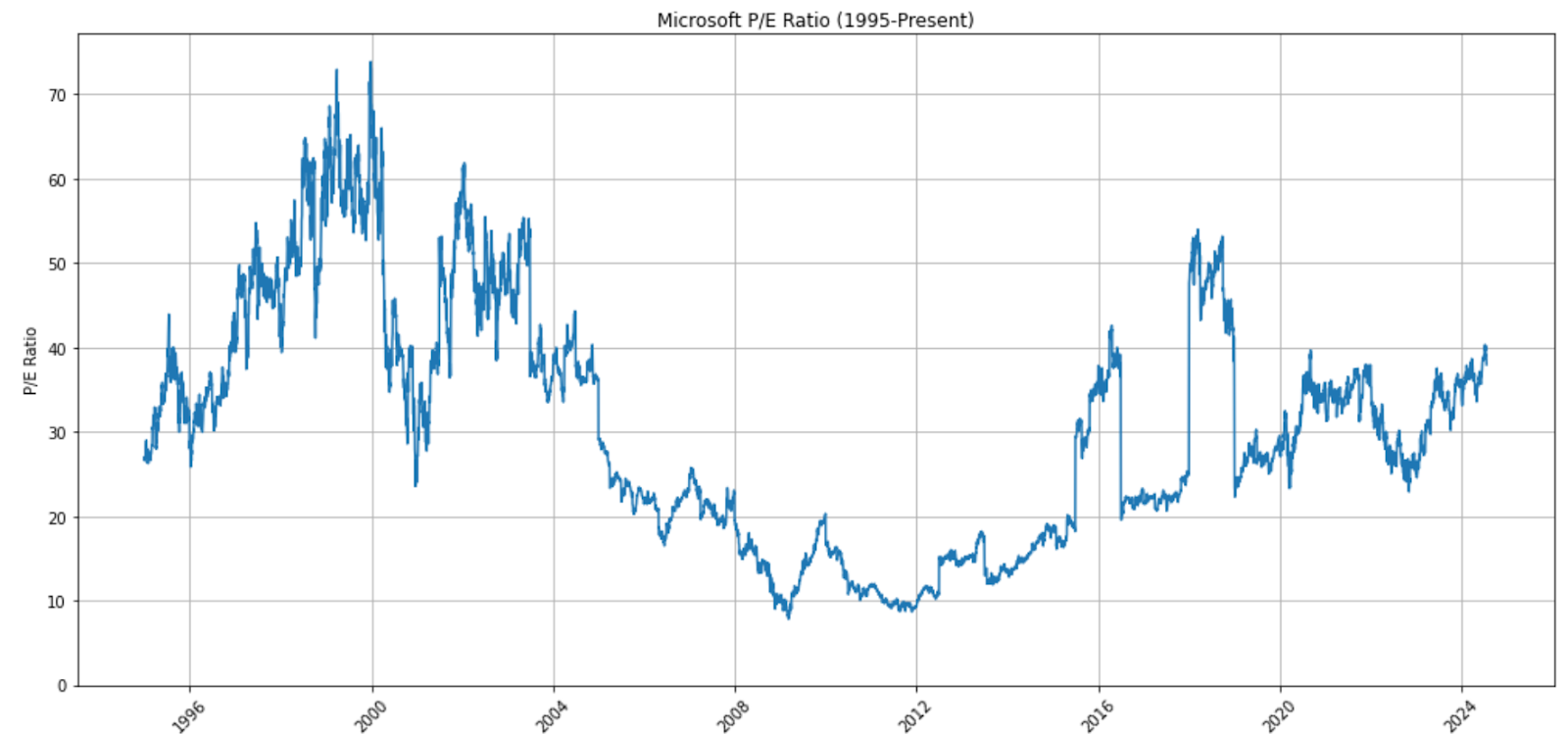
Price-to-earnings (P/E) ratio analysis
The P/E ratio graph reveals several key insights:
- Dot-com peak: Microsoft’s P/E ratio reached an astronomical high of 73.85 on December 27, 1999, epitomizing the exuberance of the dot-com era.
- Post-bubble normalization: Following the burst of the dot-com bubble, Microsoft’s P/E ratio significantly decreased and remained relatively stable for many years.
- Recent AI-driven growth: In the past few years, we’ve seen a notable uptick in Microsoft’s P/E ratio, with a recent peak of 40.31 on July 5, 2024.
- Current valuation: As of July 18, 2024, Microsoft’s P/E ratio stands at 37.97, which is elevated compared to historical averages but still well below the dot-com peak.
Microsoft’s price-to-book (PB) ratio (1995 to present)
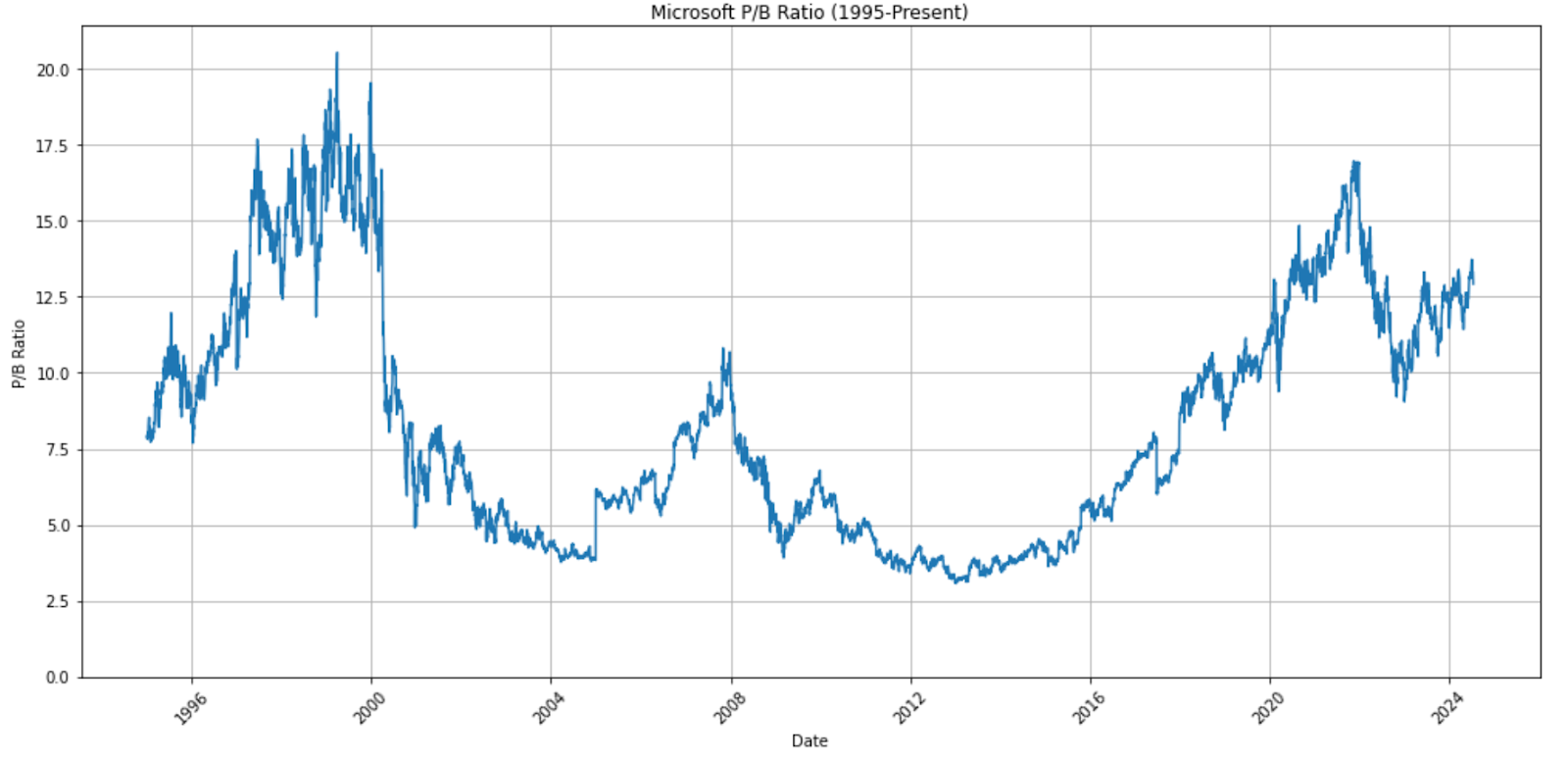
Price-to-book (P/B) ratio analysis
The P/B ratio graph tells a similar but distinct story:
- Dot-com peak: Microsoft’s P/B ratio hit an all-time high of 20.54 on March 30, 1999.
- Extended decline: Post-dot-com bubble, the P/B ratio experienced a prolonged decline, reaching its lowest points around 2012 following the global financial crisis (GFC).
- Recent resurgence: Since 2016, we’ve seen a steady climb in Microsoft’s P/B ratio, coinciding with its successful pivot to cloud computing and, more recently, its AI initiatives.
- AI era peak: The company’s P/B ratio reached a recent high of 16.97 on November 19, 2021, approaching but not surpassing the dot-com era peak.
- Current level: As of July 18, 2024, Microsoft’s P/B ratio stands at 12.93, showing a slight pullback from its recent peak but still elevated compared to most of its history.
Comparative analysis
While Microsoft’s current valuation metrics are elevated, they haven’t reached the extreme levels seen during the dot-com bubble:
- P/E ratio: The current P/E of 37.97 is about 51% of its dot-com peak (73.85).
- P/B ratio: The current P/B of 12.93 is approximately 63% of its dot-com high (20.54).
These figures suggest that while investor enthusiasm for Microsoft is high, likely driven by its AI potential and cloud dominance, valuations haven’t reached the irrational exuberance of the late 1990s.
However, it’s crucial to note that the current ratios are significantly higher than Microsoft’s long-term averages, indicating that investors are pricing in substantial future growth, particularly from AI-related innovations.
This analysis of Microsoft provides a valuable perspective on how market valuations have evolved from the dot-com era to the current AI boom. While we’re seeing elevated valuations, the market appears to be more measured in its enthusiasm compared to the dot-com bubble, perhaps reflecting lessons learned from that period and the more tangible revenue streams from cloud and AI technologies.
Dot-com era valuation analysis: a look at tech giants
The dot-com bubble of the late 1990s and early 2000s was a period of unprecedented valuation for many technology companies. By examining the P/E and P/B ratios of some of the most notable companies from this era, we can gain insights into the extent of market exuberance and compare it to today’s AI-driven tech boom.
P/E ratio analysis
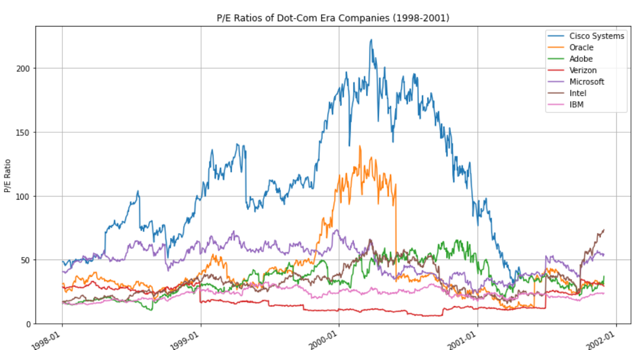
Looking at the P/E ratio graph, several key observations emerge:
- Cisco Systems stands out dramatically, with its P/E ratio skyrocketing to an astounding 222.41 on March 27, 2000. This extreme valuation reflects the immense optimism surrounding networking technology during the height of the dot-com boom.
- Oracle also experienced significant P/E expansion, peaking at 139.47 on February 25, 2000. This high valuation underscores the market’s enthusiasm for database and enterprise software companies.
- Microsoft, despite being a more established company at the time, saw its P/E ratio reach 73.85 on December 27, 1999, indicating that even larger, more mature tech companies were caught up in the market frenzy.
- Intel, another tech giant, peaked later with a P/E of 73.74 on November 30, 2001, suggesting that the semiconductor industry experienced a delayed but significant valuation surge.
- Adobe, IBM, and Verizon maintained comparatively lower P/E ratios, with peaks of 65.40, 32.57, and 34.80, respectively, indicating that not all tech-related companies were equally affected by the bubble.
P/B ratio analysis
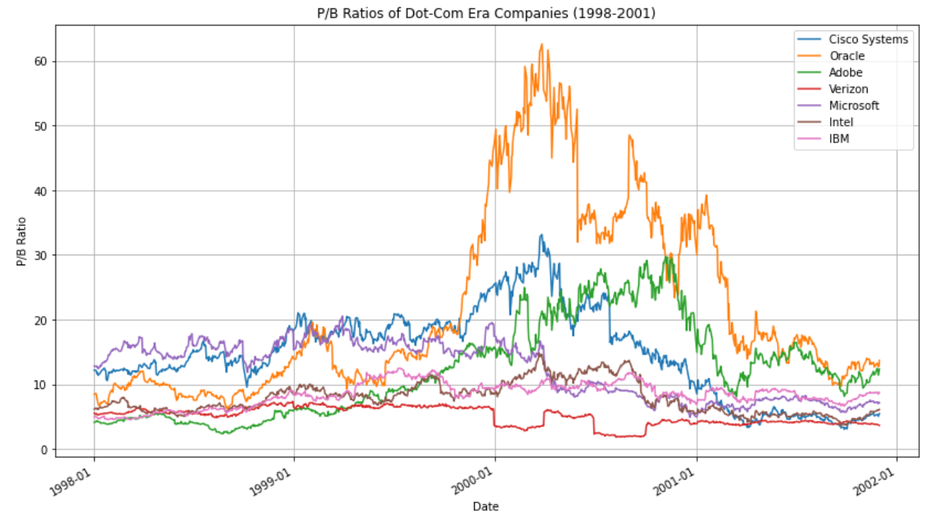
The P/B ratio graph provides additional insights:
- Oracle stands out with an extremely high peak P/B ratio of 62.63 on March 27, 2000, far exceeding other companies in the sample. This suggests that investors were placing an enormous premium on Oracle’s future growth prospects relative to its book value.
- Cisco Systems, while not as extreme as Oracle, still reached a significant P/B ratio of 33.15 on the same date, March 27, 2000, coinciding with its peak P/E ratio.
- Adobe and Microsoft both saw their P/B ratios exceed 20, peaking at 29.70 and 20.54, respectively, indicating substantial optimism about their future growth.
- Intel, IBM, and Verizon maintained more modest P/B ratios, all staying below 15 even at their peaks.
Key takeaways
- Valuation disparity: There was a wide disparity in valuations among tech companies, with networking and software firms like Cisco and Oracle seeing the most extreme ratios.
- Timing of peaks: Many companies reached their peak valuations in early 2000, particularly around March, which aligns with the generally accepted peak of the dot-com bubble.
- Sector differences: Hardware-focused companies like Intel and IBM generally had lower valuation multiples compared to software and networking companies.
- Magnitude of overvaluation: The extreme P/E and P/B ratios, particularly for Cisco and Oracle, highlight the degree of market irrationality during this period. These valuations implied unrealistic growth expectations that were ultimately unsustainable.
- Relative stability: Companies like IBM and Verizon maintained more stable valuations throughout this period, possibly due to their more established business models and revenue streams.
This analysis of dot-com era valuations provides a crucial benchmark for evaluating current tech company valuations, especially in the context of the AI boom.
Want to understand in detail how I gathered the data and presented the graphs? Check out this Datalore report.
AI era valuation analysis: examining today’s tech leaders
The current AI boom has ushered in a new era of excitement and investment in technology companies, reminiscent of the dot-com bubble but with its own unique characteristics. By analyzing the P/E and P/B ratios of key players in the AI space over the past few years, we can gain valuable insights into current market sentiment and valuation trends.
Now, let’s explore how the market is pricing the potential of AI and whether current valuations reflect rational exuberance or possibly unsustainable optimism.
P/E ratio analysis
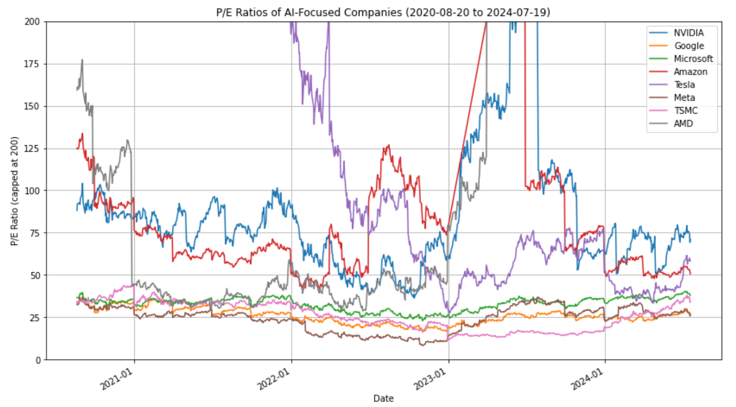
In this P/E ratio graph, I capped the vertical axis at 200 because there were a few observations that “broke” the scale. Tesla had a peak P/E ratio of 1,255, while AMD had a peak P/E ratio of 1,156. These are abnormally high values that did not last long. NVIDIA had a peak P/E ratio of 245 towards the end of their second quarter in 2023. This is because investors had correctly priced in massive earnings growth for that quarter. When the quarterly earnings were updated, the denominator in the P/E ratio was updated as well, bringing down the P/E ratio for NVIDIA.
Several key observations in the P/E graph emerge:
- Extreme valuations in 2023: Many of the analyzed companies experienced extremely high P/E ratios in 2023, frequently exceeding 200. This necessitated capping the chart to maintain readability, but it’s crucial to note these extreme values reflected very high growth expectations.
- Earnings delivery: Remarkably, many of these companies met or exceeded the lofty earnings expectations throughout 2023. As quarterly earnings were released, companies consistently matched or beat projections, leading to substantial increases in the earnings component of the P/E ratio.
- 2024 normalization: By July 2024, we observe more moderate P/E ratios for most companies. This doesn’t necessarily indicate a decrease in stock prices, but rather reflects the significant earnings growth that materialized, effectively lowering the P/E ratios by increasing the denominator (earnings).
- Current snapshot (July 2024):
- At a value of approximately 72.51, NVIDIA’s current P/E exceeds all of the other AI stocks.
- More established players like Google (26.81), Microsoft (37.69), and Meta (26.51) display more moderate P/Es, suggesting a balance between growth expectations and current earnings.
- Volatility: Despite the overall trend toward normalization, the data still shows significant volatility, particularly for companies like Tesla and AMD. This suggests the market remains highly reactive to news and performance in the AI sector.
- Industry variations: Hardware-focused AI companies (NVIDIA, AMD) generally show higher P/E ratios compared to more diversified tech giants, reflecting the market’s bullish view on specialized AI hardware.
- Forward P/E considerations: It’s crucial to note that for rapidly growing companies in the AI sector, particularly chip manufacturers like NVIDIA and AMD, forward P/E ratios can provide valuable additional context. While our analysis focuses on trailing P/E ratios due to data availability, forward P/E ratios are especially relevant for these companies as they factor in expectations of future growth. The high trailing P/E ratios we observe may appear more reasonable when considering analysts’ projections for future earnings. This is particularly pertinent in the AI chip sector, where demand is expected to continue growing exponentially. Therefore, while current P/E ratios offer important insights, investors and analysts often rely heavily on forward-looking metrics to value these high-growth AI technology companies.
P/B ratio analysis
The graph for price-to-book ratios has several fascinating insights:
- NVIDIA stands out: With a current P/B of 59.99 and a peak of 68.97, NVIDIA’s valuation relative to its book value is significantly higher than peers, suggesting strong investor confidence in its future prospects. The current P/B ratio for NVIDIA is nearly six times that of most of its peers. This is a sign of astronomically high investor expectations. Many value investors may look at this as a sign of a large overvaluation.
- Tesla: Peaking at 46.87, Tesla has experienced high P/B rations, though it currently stands at a more moderate 11.83. This aligns with its volatile P/E ratio pattern.
- Moderate range: Most companies (Google, Microsoft, Amazon, Meta, TSMC) have current P/B ratios between 7 and 13, indicating more modest premiums over their book values.
- AMD: There has been a significant decrease in AMD’s peak P/B of 32.67 to the current level of 4.38, suggesting a shift in how investors value its assets relative to its market price.
Overall observations:
- Valuation disparities: There’s a wide range of valuations among AI-focused companies, with hardware-focused firms like NVIDIA and AMD seeing higher multiples compared to more diversified tech giants.
- Cooling trend: Many companies show lower current ratios compared to their peaks, suggesting a possible cooling of investor enthusiasm or a normalization of valuations.
- Hardware premium: Companies directly involved in AI hardware (NVIDIA, AMD) generally show higher valuation multiples, reflecting the critical role of specialized processors in AI development.
- Established vs. emerging: More established companies like Google and Microsoft show more stable valuations compared to the emerging semiconductor companies undergoing significant transitions.
Comparative analysis: AI era vs. dot-com bubble valuations
To facilitate a direct comparison between the dot-com bubble and the current AI boom, we’ve aligned two distinct historical periods on a common 1,000-day timeline. This approach allows us to analyze how valuations evolved over similar timeframes in each era, irrespective of the actual calendar dates.
Timeline explanation:
- Horizontal axis: “Days into Analysis Period” (0 to ~1,000 days)
- Dot-Com Era: Day 1 = January 1, 1998; End = November 30, 2001
- AI Era: Day 1 = August 20, 2020; End = July 19, 2024
This alignment enables us to compare relative patterns, peak timing, volatility, and end-of-period valuations between the two eras. Blue lines represent AI era companies (with NVIDIA highlighted in dark blue), while red lines represent dot-com era companies.
P/B ratio analysis
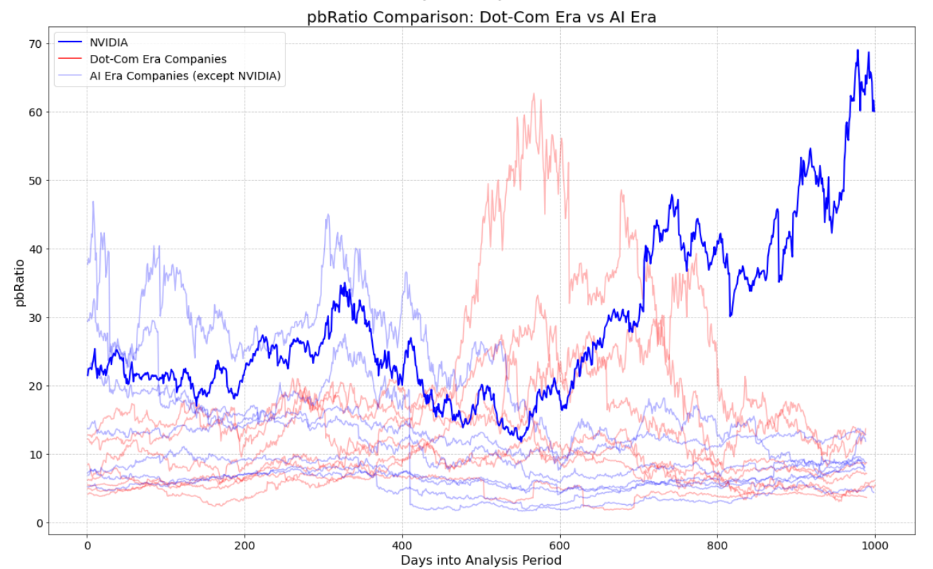
The most striking feature of the P/B ratio comparison is NVIDIA’s exceptional valuation. NVIDIA’s P/B ratio, reaching peaks above 60, significantly surpasses not only its AI-era peers but also the highest valuations seen during the dot-com bubble. This is a truly historic level of valuation for a major tech company.
Key observations:
- NVIDIA’s unprecedented valuation: NVIDIA’s P/B ratio is substantially higher than any company during the dot-com era, even at the bubble’s peak. This suggests an extraordinary level of investor confidence in NVIDIA’s future prospects and its role in the AI revolution.
- Potential justifications for NVIDIA’s high P/B:
- Market dominance: NVIDIA’s near-monopoly in AI chips gives it a unique position in a rapidly growing market.
- Growth expectations: The AI industry is projected to expand dramatically, and NVIDIA is seen as a key enabler of this growth.
- Scarcity premium: As one of the few “pure play” AI chip companies, NVIDIA may command a premium due to limited investment alternatives in this space.
- Arguments for a high NVIDIA valuation:
- First-mover advantage: NVIDIA’s early lead in AI chips could translate to long-term market dominance.
- Ecosystem lock-in: NVIDIA’s software and hardware ecosystem creates high switching costs for customers.
- Expanding addressable market: As AI applications grow, NVIDIA’s potential market expands significantly.
- Arguments against a high NVIDIA valuation:
- Unprecedented overvaluation: NVIDIA’s P/B ratio is at a level never before seen for a major tech company. Historically, such extreme valuations have often led to significant corrections, suggesting the stock may be overvalued and due for a pullback. The extraordinarily high valuation suggests the market has priced in near-perfect execution and growth. Any stumble in meeting these lofty expectations could lead to a sharp decline in stock price.
- Competition risk: Potential for increased competition from tech giants and startups entering the AI chip market.
- Regulatory concerns: Potential antitrust scrutiny due to NVIDIA’s dominant market position.
Most other AI-era companies (other than NVIDIA) show P/B ratios comparable to or lower than dot-com era peaks, suggesting more tempered valuations overall.
P/E ratio analysis
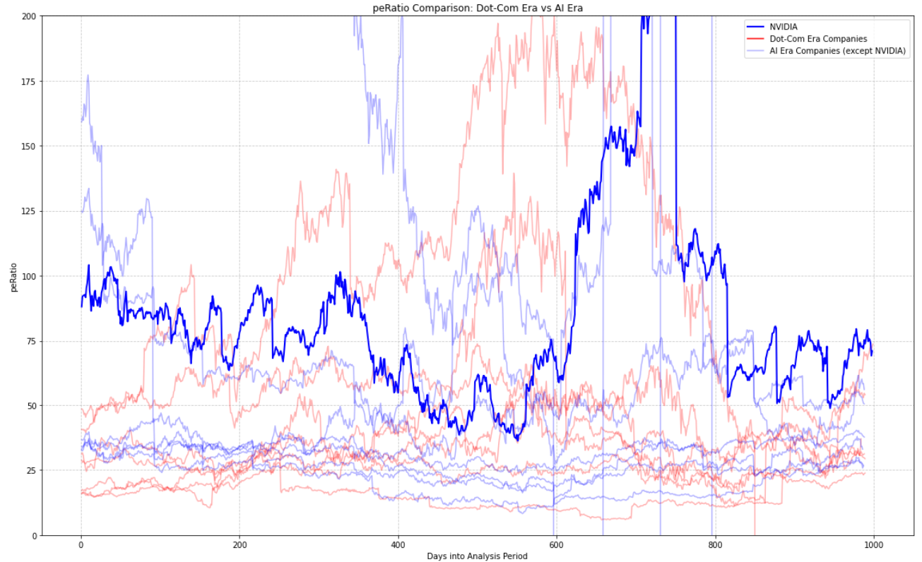
The P/E ratio comparison presents a more complex picture, with significant volatility and overlap between AI-era and dot-com era companies. However, focusing on the final 150 days reveals important insights:
- Current AI valuations vs. dot-com peak: While AI company P/E ratios can be quite high, they generally fall below the extreme levels seen at the peak of the dot-com bubble.
- Moderation from 2023 peaks: Current P/E ratios for AI companies are significantly lower than their 2023 levels, suggesting a normalization of valuations or improved earnings.
- NVIDIA’s position: NVIDIA currently has the highest P/E ratio among AI stocks, reflecting very high growth expectations.
- Valuation context: The elevated P/E ratios for AI companies, while high, are more grounded in current and expected earnings compared to the often speculative valuations of the dot-com era.
- Investor considerations: The sustainability of these valuations will depend on companies meeting or exceeding the high growth expectations built into their stock prices. Each investor must weigh the potential for continued AI-driven growth against the risks of overvaluation.
- Noise in the middle: There is significant overlap and volatility in P/E ratios between AI and dot-com era companies throughout much of the analysis period, making it difficult to draw clear conclusions except for the final 150 days.
In conclusion, while AI company valuations, particularly NVIDIA’s, are at historically high levels, they are generally more anchored in current earnings and near-term growth expectations than those seen during the dot-com bubble. However, NVIDIA’s exceptional P/B ratio stands out as a potential area of concern or opportunity, depending on one’s view of the company’s future prospects in the AI market. The comparison underscores the high growth expectations for AI companies, especially NVIDIA, but also suggests a more measured market approach compared to the dot-com era, with valuations more closely tied to actual financial performance.
If you are curious about the Python code behind this analysis, check out this Datalore report and try Datalore AI for yourself.
Key takeaways
- Historical perspective: The dot-com bubble’s dramatic rise and fall, as exemplified by the NASDAQ’s 81.08% drop, serves as a sobering reminder of the potential consequences of unchecked market exuberance.
- Valuation metrics: Both P/E and P/B ratios provide valuable insights into market sentiment. During the dot-com era, these ratios reached extreme levels across many tech companies, reflecting highly speculative valuations often disconnected from financial fundamentals.
- AI era comparisons: While current valuations for AI-focused companies are elevated, they generally haven’t reached the extreme levels seen during the dot-com peak. Most companies show more moderate valuations, with the notable exception of NVIDIA.
- NVIDIA as an outlier: NVIDIA’s current valuation stands out dramatically, with P/B ratios surpassing even the highest levels seen during the dot-com bubble. This reflects extraordinary investor confidence in NVIDIA’s role in the AI revolution but also raises concerns about potential overvaluation.
- Earnings vs. speculation: Unlike many dot-com era companies, today’s AI leaders are generally posting strong earnings to support their valuations. The moderation of P/E ratios in 2024 compared to 2023 peaks suggests that earnings growth is catching up to market expectations.
- Market maturity: The current market appears more discerning than during the dot-com era, with valuations more closely tied to actual financial performance and near-term growth prospects.
Looking ahead
While the AI boom shares some characteristics with the dot-com bubble, it also differs in important ways. Today’s tech leaders have proven business models, substantial revenue streams, and are delivering on earnings expectations. However, the unprecedented valuations of companies like NVIDIA suggest that investor enthusiasm may be outpacing even the considerable real-world potential of AI technologies.
As we navigate this new era of technological innovation, investors should remain vigilant. The lessons of the dot-com bubble remind us that even transformative technologies can lead to market excesses. While AI undoubtedly has the potential to revolutionize industries and create enormous value, individual company valuations must ultimately be justified by financial performance and realistic growth prospects.
The key question for investors moving forward is whether the current AI leaders can continue to meet or exceed the lofty expectations built into their stock prices. As history has shown, markets can remain irrational for extended periods, but eventually, fundamentals prevail. Whether we’re witnessing a new paradigm in tech valuations or the early stages of an AI bubble remains to be seen, but one thing is certain: the intersection of AI and the stock market will continue to be a fascinating and potentially volatile space to watch.