Kotlin
A concise multiplatform language developed by JetBrains
Lets-Plot, in Kotlin
You can understand a lot about data from metrics, checks, and basic statistics. However, as humans, we grasp trends and patterns way quicker when we see them with our own eyes. If there was ever a moment you wished you could easily and quickly visualize your data, and you were not sure how to do it in Kotlin, this post is for you!
Today I’d like to talk to you about Lets-Plot for Kotlin, an open-source plotting library for statistical data written entirely in Kotlin. You’ll learn about its API, the kinds of plots you can build with it, and what makes this library unique. Let’s start with the API.
ggplot-like API
Lets-Plot Kotlin API is built with layered graphic principles in mind. You may be familiar with this approach if you have ever used the ggplot2 package for R.
“This grammar […] is made up of a set of independent components that can be composed in many different ways. This makes [it] very powerful because you are not limited to a set of pre-specified graphics, but you can create new graphics that are precisely tailored for your problem.” Hadley Wickham, ggplot2: Elegant Graphics for Data Analysis
If you have worked with ggplot2 before, you may recognize the API’s style:
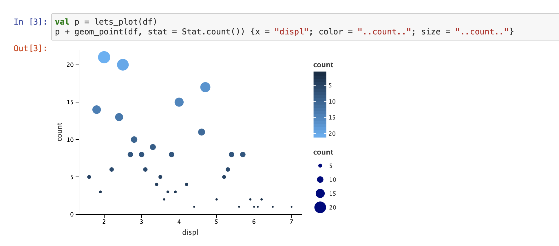
If not, let’s unpack what’s going on here. In Lets-Plot, a plot is represented by at least one layer. Layers are responsible for creating the objects painted on the ‘canvas’ and contain the following elements:
- Data – the subset of data specified either once for all layers or on a per-layer basis. One plot can combine multiple different datasets (one per layer).
- Aesthetic mapping – describes how variables in the dataset are mapped to the visual properties of the layer, such as color, shape, size, or position.
- Geometric object – a geometric object that represents a particular type of chart.
- Statistical transformation – computes some kind of statistical summary on the raw input data. For example,
binstatistic is used for histograms and smooth is used for regression lines. - Position adjustment – a method used to compute the final coordinates of geometry. Used to build variants of the same geometric object or to avoid overplotting.
To combine all these parts together, you need to use the following simple formula:
You can learn more about the Lets-Plot basics and get a better understanding of what the individual building blocks do by checking out the Getting Started Guide.
Customizable plots
Out of the box, Lets-Plot supports numerous visualization types – histograms, box plots, scatter plots, line plots, contour plots, maps, and more!
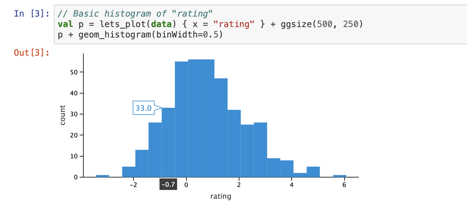
All of the plots are flexible and highly customizable, yet the library manages to keep the balance between powerful customization capabilities and ease of use. You can start with simple but useful visualizations like data distribution:
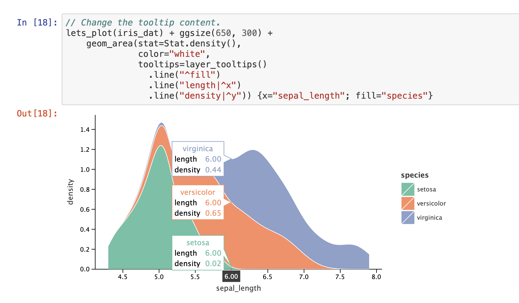
You have all the tools you need to create complex and nuanced visualizations, like this plot illustrating custom tooltips on a plot for Iris dataset:
Check out these tutorials to explore the available Lets-Plot visualizations and learn how to use them:
Integration with the Kotlin kernel for Jupyter Notebook
You may have noticed from the screenshots that these plots were created in Jupyter Notebook. Indeed, Lets-Plot integrates with the Kotlin kernel for Jupyter Notebook out of the box. If you have the Kotlin kernel installed (see the instructions on how to do so), all you need to do to start plotting is add the following line magic in your notebook:
That’s it! Plot away :)
Kotlin notebooks are also supported in JetBrains Datalore, an Online Data Science Notebook with smart coding assistance. Check out an example Datalore notebook that uses Lets-Plot.
Lets-Plot Internals
Finally, I wanted to share with you a little bit about the implementation of Lets-Plot, because it is a one-of-a-kind multiplatform library. Due to the unique multiplatform nature of Kotlin, the plotting functionality is written once in Kotlin and can then be packaged as a JavaScript library, JVM library, and a native Python extension.
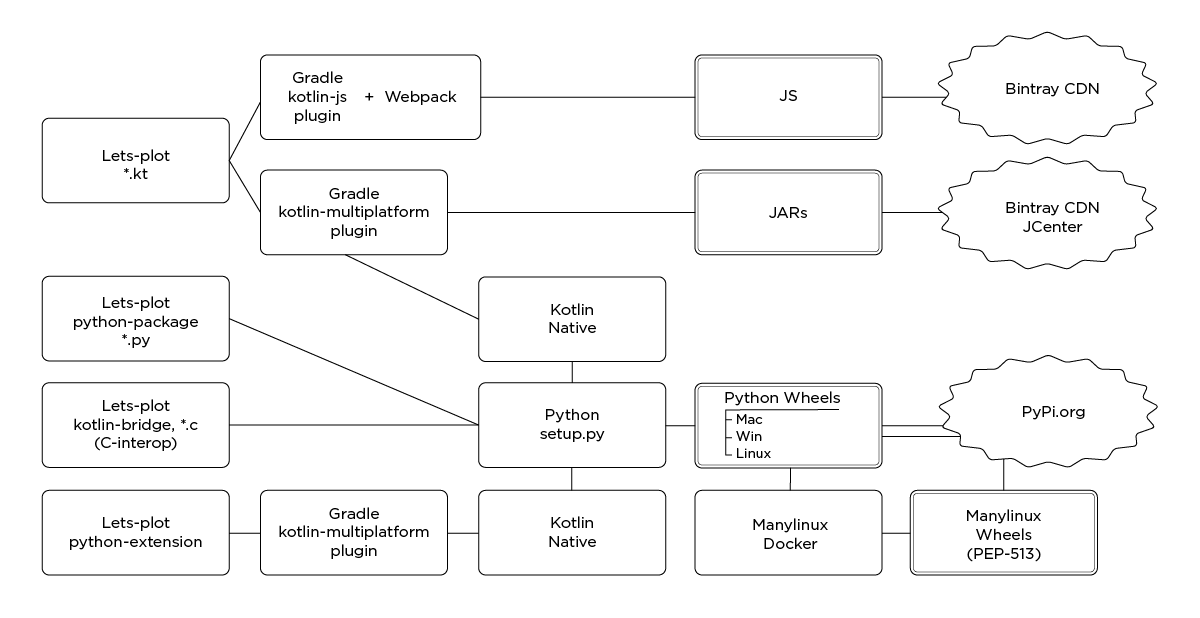
Whichever environment you prefer, you can use the same functionality and API to visualize your data with Lets-Plot!
The Kotlin API is built on top of the JVM jar, however, you can also use the JVM jar independently. For instance, you can embed the plots into a JVM application using either JavaFX or Apache Batik SVG Toolkit for graphics rendering.
Lets-Plot truly is an amazing example of Kotlin’s multiplatform potential and a great visualization tool for your data needs. I hope this post has sparked your interest and you’ll give it a go!


