Kotlin
A concise multiplatform language developed by JetBrains
Kandy: the new Kotlin plotting library by JetBrains
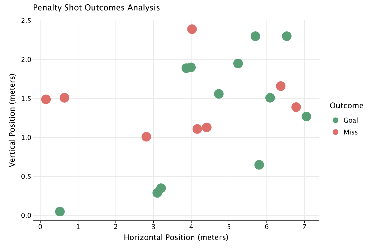
We are excited to introduce Kandy, a new Kotlin plotting library by JetBrains. It provides a new, powerful DSL for creating charts of various kinds. The first public preview version is ready for you to try, and we welcome any feedback and comments you may have.
How does it look and feel?
df.plot {
   points {
       x(xShot) { axis.name = "Horizontal Position (meters)" }
       y(yShot) { axis.name = "Vertical Position (meters)" }
       size = 8.5
       color(outcome) {
           scale = categorical(
               true to Color.GREEN, false to Color.RED
           )
           legend {
               name = "Outcome"
               breaksLabeled(true to "Goal", false to "Miss")
           }
       }
   }
   layout.title = "Penalty Shot Outcomes Analysis"
}

Why Kandy?
Our Kotlin for Data Analytics ecosystem is growing rapidly. However, until now, an important piece of the puzzle was missing: a plotting tool. That’s why we decided to create Kandy, a simple, idiomatic, readable, typesafe DSL for plotting, deeply integrated with our other tools – Kotlin DataFrame and Kotlin Notebook.
In Kotlin Notebook
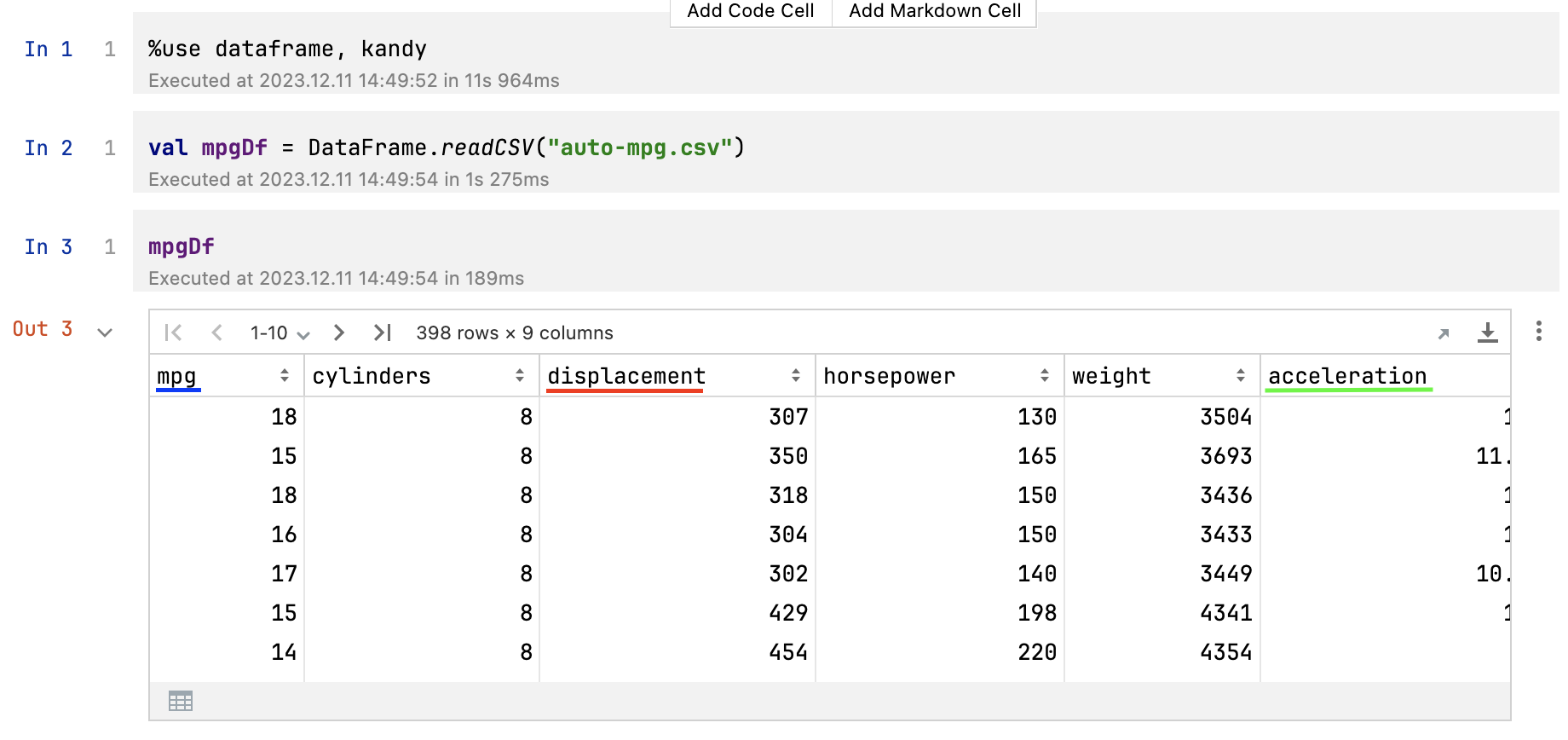
To start using Kandy in your notebook, just use the %use kandy line, which will automatically load the latest stable version of Kandy, add all necessary imports, and add plot rendering. Charts are rendered directly in the notebook cell outputs using Swing, and they are interactive – you can hover over a plot element to see tooltips. Plots are displayed with an automatic theme. They can also be saved in one of the available formats from outputs (via the output menu).
With Kotlin DataFrame
Kandy provides a direct continuation of the DataFrame workflow, adding the .plot {} extension for DataFrame, a quick and easy way to visualize your data. Moreover, when working in Kotlin Notebook or with the DataFrame plugin in IntelliJ IDEA, you can use auto-generated DataFrame extension property columns, making plotting even more typesafe and protecting against misspelled column names.


What kind of charts does Kandy support?
Kandy provides a wide range of charts, including the most popular ones:
And that’s not all of it! You can see Kandy plot in our gallery of examples.
How to get started
Can’t wait to try Kandy? Here are links to the quickstart and examples:
Have you found a bug? Or maybe you didn’t find the kind of chart or the feature you wanted, or you have another problem or suggestion. Feel free to visit our GitHub issues page to let us know what we can improve.
We also invite you to join the #datascience channel in the Kotlin Slack (get an invite here). In this channel, you can ask questions, participate in discussions, and get notifications about the new releases.
Let’s Kotlin and #use_kandy!


