Kotlin
A concise multiplatform language developed by JetBrains
Exploring Data Science With Kotlin: A Powerlifting Case Study

This is a guest post from Adele Carpenter. Adele is a Software Engineer and Consultant at Trifork Amsterdam, where she works on educational systems in the Kotlin/Java/Spring ecosystem and advises customers on their projects.
TL;DR
This blog post uses a dataset from the sport of powerlifting to get you up and running with Kotlin Notebooks, DataFrame, and Kandy, using a PostgreSQL data source for your analysis. It covers:
- Data science basics
- Connecting an external data source to your Kotlin Notebook
- Accessing and manipulating the data with DataFrame
- Plotting your findings with the Kandy Library
The sample project contains everything you need to create your first plot!
Have you ever wanted to play around with a dataset, but the thought of setting up a python development environment seemed like too much of a hassle?
Or was that only me?
In my work, I sit firmly in the Kotlin/JVM ecosystem. And I like it here. I also have a hobby that I am really passionate about: powerlifting. The sport where we wear funny little jumpsuits and try to lift as much weight as we can for one repetition in the squat, bench press, and deadlift.
Powerlifting is somewhat of a niche sport; however, it is growing rapidly and has a strong, supportive community. It is also a data-driven sport that has birthed an open-source dataset containing the results of powerlifting competitions held all over the world. The full dataset is over 3.3 million rows and counting. I was really interested to see what insights lay inside, but I had never written a line of Python before, and didn’t feel like dumping 3.3 million rows in Excel. It’s also not a very elegant solution for a software engineer.
Wouldn’t it be great to use a familiar language and IDE while I’m learning data science?
Enter Kotlin Notebook.
Kotlin for data science is nothing new: the JetBrains team has been doing great work in this area for some time, and the ecosystem just keeps getting better. You have all the building blocks you need to go from questions to answers in a very short time.
Kotlin Notebook is a plugin you can add to an IDE you’re already familiar with, IntelliJ IDEA, and can have you inspecting your dataset within minutes. The dataset does not have to be limited to niche hobbies. For example, has “the business” ever asked you a question for which you knew you had the data, but you didn’t know how to turn it into actionable information? Like the rate of adoption of a new feature you’d recently launched?
Getting started
To get started, just download the Kotlin Notebook plugin from JetBrains Marketplace.
The next step is to connect your data source. A lot of examples you find online will have you import a .csv and manipulate it in memory as a dataframe. This is a fine approach for smaller datasets (up to 100,000 rows), but for larger datasets, it can end up being slow and impractical.
The Kotlin DataFrame library provides several convenient functions for accessing your datasource and manipulating the results as a dataframe. A dataframe is a tabular data structure consisting of rows and columns, similar to a spreadsheet or an SQL table. It is a common and powerful abstraction used in data science.
The rest of this article is going to assume that you’re following along with the sample project. However, if you have a database you’d like to explore, you can of course connect it up and try to draw out your own insights!
The sample project looks at participation in the sport of powerlifting in 2023.
Open up the sample project and take a look at my-first-notebook.ipynb.
First, we import the Kotlin DataFrame and Kandy libraries.
%use kandy
%use dataframe
Kandy is an open-source plotting library for Kotlin based on the lets-plot visualization library. Data is nice, but seeing is believing. Kandy helps us turn rows and columns full of numbers into actionable insights.
But before we can get plotting, we need data. We connect to the containerized Postgres database using a URL, username, and password. Then, we can fetch the contents of the powerlifting_data table using readSqlTable.
val dbConfig = DbConnectionConfig(URL, USER_NAME, PASSWORD)
val data = DataFrame.readSqlTable(dbConfig, "powerlifting_data")
Importing the entire table defeats the purpose of creating a database, so I would not recommend making this your standard workflow (especially if you have more than 100,000 rows). But for today’s exploratory purposes, it’s a fine place to start. Later, I’ll show you how to use SQL queries and dataframes together to help you work more efficiently.
Understanding the dataset
In order to do data science well, you need to understand your dataset. Taking the time to get to know your dataset helps you avoid making incorrect assumptions and drawing (costly) incorrect conclusions. I cannot stress enough the importance of this step! This is why I started my data science journey with powerlifting. It’s a domain I have experienced firsthand, and it is much more than a dataset to me. Let me show you what I mean.
We can use the describe function from Kotlin Dataframe on the fetched data.
data.describe()
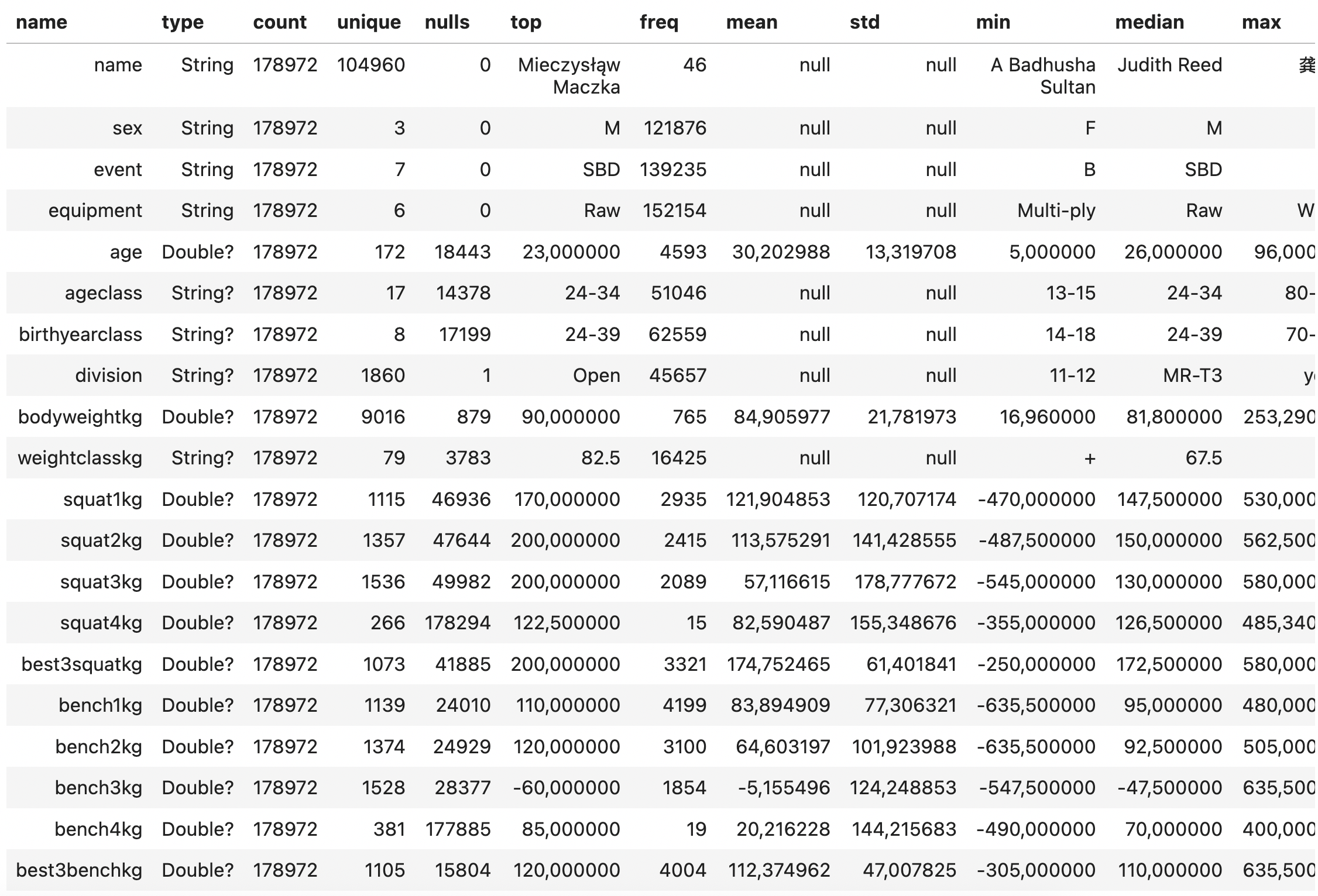
The describe() function gives us some essential information about our powerlifting dataset. The column names are listed on the left, in the name column, alongside some summary statistics. Using the output, we can say:
- The dataset has 178,972 rows.
- Of those, 104,960 are unique names (lifters).
- Name, sex, event, equipment, place, federation, date, country, and meetname are mandatory fields.
- All other fields are nullable (potentially empty).
- The most common event is SBD and with minimal equipment (aka Raw).
There are also some other curious things that may not be clear if you do not understand powerlifting:
1. The minimums for the squat, bench, and deadlift are all negative. This is how a missed lift is represented in the dataset. A missed lift is one that was attempted during the competition but was not completed successfully; therefore, it does not contribute to the final score or total for the lifter. This convention makes the mean and median values from the describe() function largely useless.
2. The entries squat4kg, bench4kg, and deadlift4kg have a large number of null values. Fourth attempts are rare and do not count toward the TotalKg. They are used for recording single-lift records (e.g. deadlift world record) and can only be taken under special circumstances. For most purposes, you can leave these values out of your analyses.
Answering your first research question
In a powerlifting meet, each competitor attempts three lifts: squat, bench press, and deadlift. They get three attempts per lift, for a total of nine attempts. The heaviest successful attempt in each lift is added together for their total score.
Prevailing powerlifting wisdom tells us that completing all lifts in a powerlifting meet to the required standard, aka going 9/9 (“nine for nine”), is the best way to have a successful meet. Here, success is defined not just in terms of maximizing your chances of a spot on the podium, but also for the mental benefits of achieving what you came for.
So, as a powerlifter myself, I was really curious to know:
Is it really better to go nine for nine when chasing a win? Or is that YOLO deadlift actually a good idea?
In order to answer this question, we can start by plotting a simple distribution of the number of winners at each number of successful attempts. That’s what we’ll be working through in the rest of this post.
Collecting only the data you need with SQL
As already mentioned, loading the whole database into memory to perform your analysis is next to impossible if your dataset is very large. So why not use SQL to only load the data that you need?
In order to answer the research question, I need to find the lifters who got first place in a meet, and then the number of successful lifts they made. Seems simple enough, right?
As data science practitioners, there is no teacher or answer book to tell us whether we are right or wrong. We need to combine our knowledge of the domain with sound data science practices and be able to defend any conclusions that we make.
In this case, from my experience in powerlifting, I know that
- In some competitions, there is only one lifter per weight class, which means they will be awarded first place no matter how poorly they do. For this reason, setting a minimum number of entrants per weight class makes sense.
- In the dataset, competitions are unique by
meetnameanddate. - For a specific competition, a class is unique not just by
weightclass, but also bydivision(e.g. juniors, open, and masters).
So that leads to the following query. You will see that I’ve filtered out null results in the query, but of course, you could do that directly in the dataframe using the filter function in the dataframe library.
You can see that I’ve written a function to return the string query. Of course, you can just write the string directly, but I like to create a function so that the query is easily modifiable with placeholders. For example, to look at a particular year/s or to quickly iterate on the number of entries (lifters) in a weight class. The ability to quickly iterate, learn, and discover is a key component of a successful data science workflow.
fun queryByTimePeriodAndEntries(startYear: String, endYear: String, entries: Int) =
    """
SELECT
    pd.*
FROM
    powerlifting_data pd
        JOIN
    (
        SELECT
            meet_name,
            date,
            weight_class_kg,
            division,
            COUNT(*) AS lifter_count
        FROM
            powerlifting_data
        WHERE
            date BETWEEN '$startYear-01-01' AND '$endYear-12-31'
        GROUP BY
            meet_name, date, weight_class_kg, division
        HAVING
            COUNT(*) >= $entries
    ) AS qualified_classes
    ON me.meet_name = qualified_classes.meet_name
        AND me.date = qualified_classes.date
        AND me.weight_class_kg = qualified_classes.weight_class_kg
        AND me.division = qualified_classes.division
WHERE
me.event = 'SBD'
  AND me.date BETWEEN '$startYear-01-01' AND '$endYear-12-31'
  AND me.squat1_kg IS NOT NULL
  AND me.squat2_kg IS NOT NULL
  AND me.squat3_kg IS NOT NULL
  AND me.bench1_kg IS NOT NULL
  AND me.bench2_kg IS NOT NULL
  AND me.bench3_kg IS NOT NULL
  AND me.deadlift1_kg IS NOT NULL
  AND me.deadlift2_kg IS NOT NULL
  AND me.deadlift3_kg IS NOT NULL
  AND me.best3_bench_kg IS NOT NULL
  AND me.best3_squat_kg IS NOT NULL
  AND me.best3_deadlift_kg IS NOT NULL
  AND place != 'NS'; -- no shows are excluded
    """
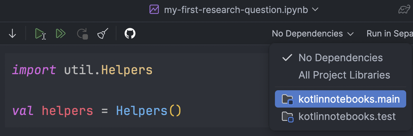
To run our query, we can use the readSqlQuery method provided by the DataFrame library. In my experience, I found it a little fussy with white space, so I prefer to create a helper function, which you can find in util.Helpers. The helper function is called fetchResults. Such a function is likely to be used a lot, across multiple analyses. Further, since it simply executes a string query, it also doesn’t change very much. This makes it a good candidate to put into an external Helpers class that we can import into the notebook. Externalising functionality like this means we can keep the boilerplate out of our notebook by defining it once and importing it.
If the Helpers class didn’t import, make sure you go to the settings for this notebook and click on Select Modules to Use in the Notebook. Once you change this setting, you will need to restart your Kotlin Notebook Kernel. Then, util.Helpers will be available to import.
So to start our analysis, we build the query by specifying the startYear, endYear, and the minimum number of entries (lifters) per event.
Then, we use the helper function to open the database connection, run the query, and then close the connection.
import util.Helpers

val helpers = Helpers()
val query = queryByTimePeriodAndEntries("2023", "2023", 3)
val data = helpers.fetchResults(query)
Now that we have the results, we can print the first 10 rows using the head function. This is a good habit to get into so you can check that your results make sense as you go and can identify any errors or curiosities early on. We could also run the describe function again to confirm the number of rows, and that we correctly removed null values for our nine lifts (squat1kg, squat2kg, squat3kg, bench1kg, etc.).
data.head(10)
data.describe()
With this filtered raw data, we can use the DataFrame library to collect our results into a frame of two columns: successfulLifts and count.
In order to take advantage of Kotlin’s strong typing as we process our data using Kotlin DataFrame, we can define the schema LifterData with the @DataSchema annotation.
So we can define our data as follows:
import org.jetbrains.kotlinx.dataframe.annotations.*

@DataSchema
interface LifterData {
    val place: String
    val squat1kg: Double
    val squat2kg: Double
    val squat3kg: Double
    val bench1kg: Double
    val bench2kg: Double
    val bench3kg: Double
    val deadlift1kg: Double
    val deadlift2kg: Double
    val deadlift3kg: Double
}

val successfulLifts = column<Int>("successfulLifts")
val count = column<Int>("count")
val columns = listOf(
    data.squat1kg, data.squat2kg, data.squat3kg,
    data.bench1kg, data.bench2kg, data.bench3kg,
    data.deadlift1kg, data.deadlift2kg, data.deadlift3kg
)
As discussed earlier, a positive value for a lift indicates that it was successful. If it is negative, the lift was attempted, but it was ruled a “no lift” and not counted towards the total or final score for the lifter.
So using this knowledge, and the data structure we have defined, we can create a function addNumberOfSuccessfulLifts to modify our raw data returned from our SQL query.
fun addNumberOfSuccessfulLifts(data: DataFrame<LifterData>, firstPlaceOnly: Boolean = true): AnyFrame {
    val df = if (firstPlaceOnly) data.filter { it.place == "1" } else data
    return df.add(successfulLifts) {
        columns.count { value -> it[value] > 0 }
    }
        .groupBy { it[successfulLifts] }
        .aggregate {
            count() into count
        }
        .drop { it[successfulLifts] in listOf(0, 1, 2) }
        .sortBy(successfulLifts)
}
Here’s a simple breakdown of what addNumberOfSuccessfulLifts does:
1. Counts successful lift attempts:
– It looks at nine columns: squat1kg, squat2kg, squat3kg, bench1kg, etc.
– If a value is greater than 0, it’s considered a successful attempt.
– It counts the number of successful attempts for each row and stores it in a new column called successfulLifts.
2. Groups the data by the number of successfulLifts.
3. Uses the aggregate function to count how many rows fall into each successfulLifts group (creating a count column).
4. Removes any anomalous rows where lifters have 0, 1, or 2 successful lifts.
5. Sorts the remaining data by successfulLifts in ascending order.
Tip!
To call addNumberOfSuccessfulLifts without typing errors, we need to cast data to the data schema LifterData we defined above.
val winnersDataFrame = addNumberOfSuccessfulLifts(data.cast<LifterData>())
After calling addNumberOfSuccessfulLifts, we can confirm that it does as intended, by printing the results and inspecting them. The head function is not necessary here, as the dataframe is small, but since it’s good practice, you can make a habit of using it. If you ask for more rows than exist in the dataframe, then it will simply return the entire dataframe.
winnersDataFrame // OR
winnersDataFrame.head(10)
Plotting your results with Kandy
Now the fun can begin… plotting our results with Kandy ?
Kandy is a declarative plotting library for Kotlin that allows for easy and intuitive data visualization. Lucky for us, Kandy and DataFrame are a match made in heaven.
Kandy uses code blocks to define plot elements and supports custom styles, themes, and layout adjustments.
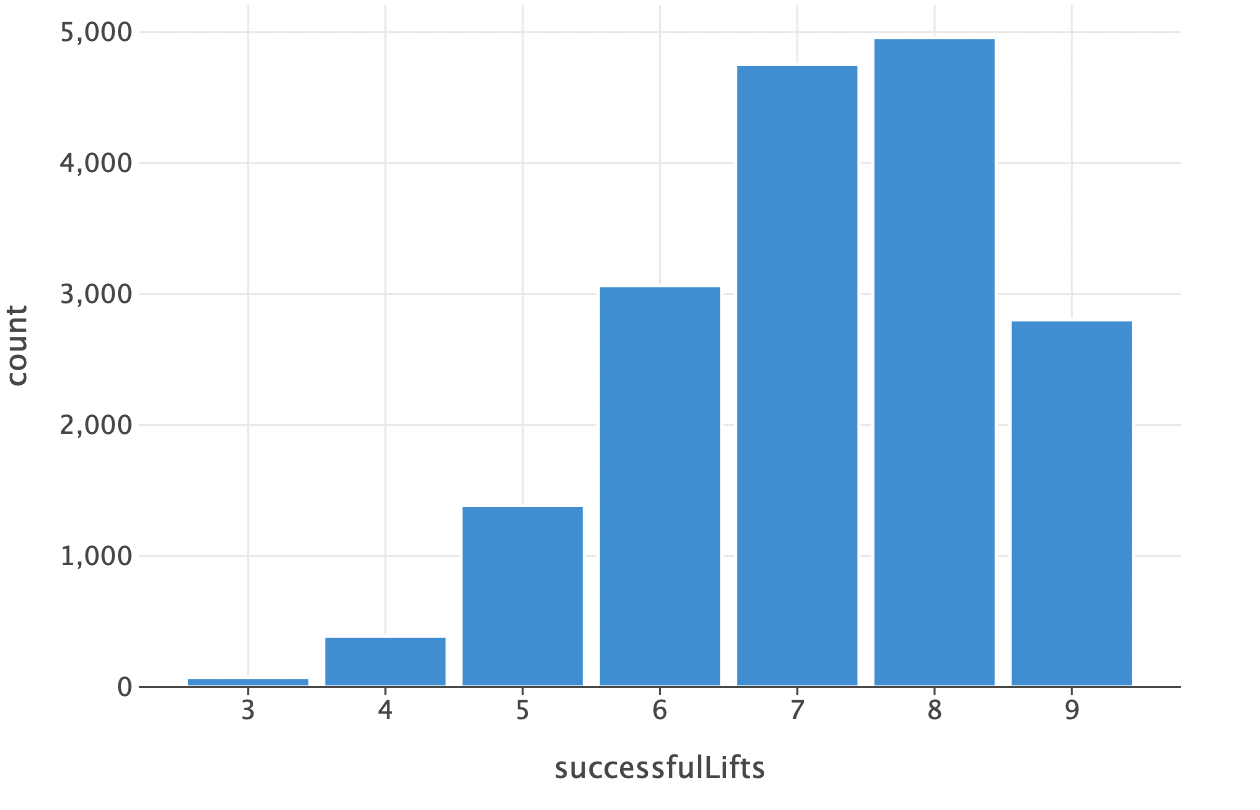
Let’s start with a simple bar chart to visualize the distribution of winners at each number of successful lift attempts. All we need to do is specify which column to map to the x-axis and which to map to the y-axis!
plot(winnersDataFrame) {
    bars {
        x(successfulLifts)
        y(count)
    }
}
Which gives us:
Plotting in this simple fashion will make use of default formatting and will use axis labels that are the same as the dataframe accessors. This is not ideal, so we can customize it a bit more. And while it looks like a lot of code, its declarative nature makes it easy to follow.
kandyConfig.themeApplied = false

plot(winnersDataFrame) {
    bars {
        x(successfulLifts)
        y(count) {
            axis.name = "Number of Winners"
            axis {
                breaks(listOf(500,1000,1500,2000,2500,3000,3500,4000,4500,5000), format = "d")
            }
        }
        fillColor = Color.hex("#fec92e")
        borderLine {
            color = Color.hex("#777777")
            width = 0.5
        }
    }

    layout {
        title = "Distribution of Winners by Successful Attempts"
        caption = "Data: Open powerlifting meets 2023"
        size = 600 to 300 // default is 600 to 400
        xAxisLabel = "Successful Attempts" // alternative to axis.name used for the y axis
        style {
            global {
                text {
                    fontFamily = FontFamily.custom("Helvetica Neue")
                }
                plotCanvas {
                    title {
                        hJust = 0.5 // center the title
                        margin = Margin(10.0)
                        fontSize = 17.0
                    }
                    caption {
                        hJust = 1.0 // align right
                        margin = Margin(10.0, 0.0, 0.0, 0.0)
                    }
                    margin = Margin(0.0, 30.0, 0.0, 5.0)
                }
            }
        }
    }
}.save("distribution-of-winners-custom-formatting.svg")
As you can see, we have added a title and axis labels, changed the font, centered the title, and set some margins. We also set custom axis intervals, or breaks at multiples of 500.
Tip!
Kotlin notebooks will apply your chart formatting on top of your IDE theme. So to see what your chart will look like when exported with the .save() function, you can set kandyConfig.themeApplied = false.
And so with these small changes applied, our chart now looks like this:
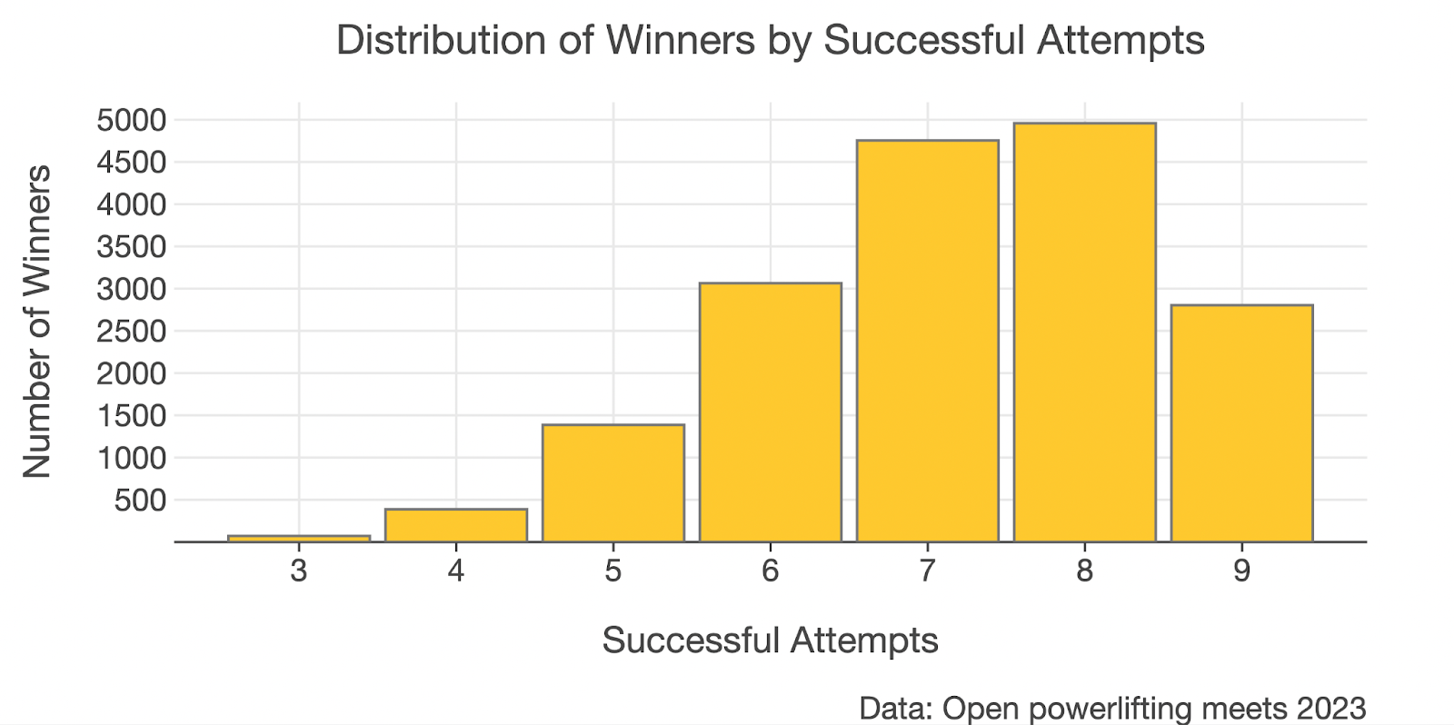
Looking at this chart, it may be tempting to conclude that actually going 8/9 is the superior strategy in a powerlifting meet, since there are the most winners in this group. This stumped me for a few minutes as well until I realized that lifters who go nine for nine are a special breed and are probably just simply outnumbered. With this in mind, let’s do the visualization again to answer the question:
Out of all lifters that achieve X number of successful attempts, what percentage of those get first place?
You may have already spotted the firstPlaceOnly boolean in the addNumberOfSuccessfulLifts function. By default, it is set to true. Now we can call the function again on our dataframe with firstPlaceOnly set to false, so that we get the distribution of successful attempts for all lifters.
val allLiftersDataFrame = addNumberOfSuccessfulLifts(data, false)
Now we merge the two dataframes winnersDataFrame and allLiftersDataFrame into a new dataframe dfRatioWinners and calculate the proportion of winners at each number of successful attempts.
val dfRatioWinners =
    dataFrameOf(winnersDataFrame.rename(count).into(winners).columns() + allLiftersDataFrame.select(count).rename(count).into(allLifters).columns())
        .add(ratioWinners) {
            (it[winners].toDouble() / it[allLifters].toDouble()) * 100.0
        }
Here’s what the code does:
– Renames the count column in the winnersDataFrame to winners.
– Selects and renames count in the allLiftersDataFrame to allLifters. The select is important as otherwise you are attempting to add the column successfulLifts into your new dataframe twice, which will throw a runtime error.
– Combines both columns into the new dataframe.
– Adds a new column ratioWinners.
– Calculates winners as a percentage of alllifters. They are each cast to a double so that the division of Int is not rounded to zero before being multiplied by 100 (don’t ask me how long it took me to spot this bug the first time ?).
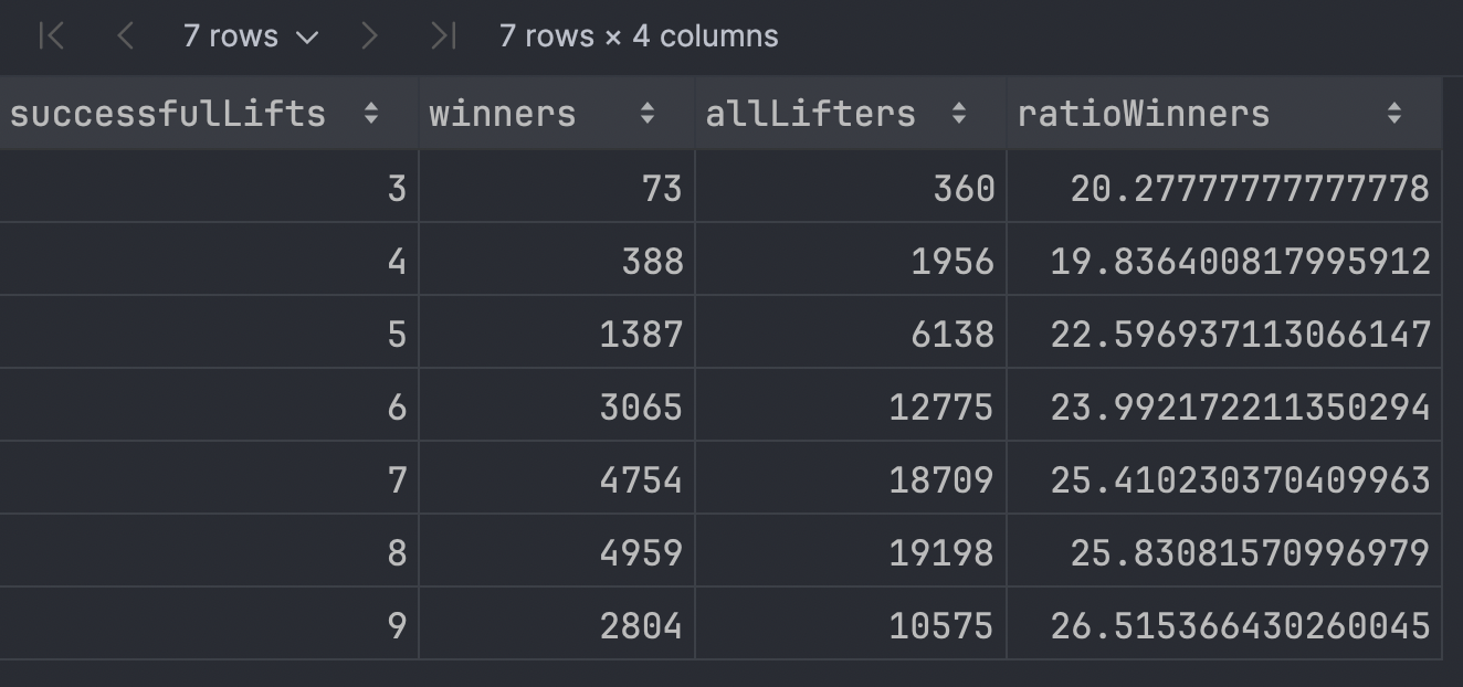
If we print the resulting dataframe, we get:
dfRatioWinners
Plotting this with Kandy allows us to identify any trend a little easier. You can see this time I’ve assigned the plot to a variable. I prefer this as it provides a little more flexibility in saving the plot or making use of multiplots such as plotBunch (more on this later).
val plotRatioWinners = plot(dfRatioWinners) {
    bars {
        x(successfulLifts)
        y(ratioWinners) {
            axis.name = "Percentage"
            axis {
                breaks(listOf(5,10,15,20, 25), format = "{.0f}%")
            }
        }
        fillColor = Color.hex("#fec92e")
        borderLine {
            color = Color.hex("#777777")
            width = 0.5
        }
    }
    layout {
        title = "Percentage of First Places by Successful Lifts"
        subtitle = "At least 3 lifters in weight class"
        caption = "Data: Open powerlifting meets 2023"
        size = 600 to 300
        xAxisLabel = "Successful Attempts"
        style {
            global {
                text {
                    fontFamily = FontFamily.custom("Helvetica Neue")
                }
                plotCanvas {
                    title {
                        hJust = 0.5
                        margin = Margin(10.0)
                        fontSize = 14.0
                    }
                    subtitle {
                        hJust = 0.5
                        margin = Margin(5.0)
                        fontSize = 11.0
                    }
                    caption {
                        hJust = 1.0
                        margin = Margin(10.0, 0.0, 0.0, 0.0)
                    }
                    margin = Margin(5.0, 30.0, 20.0, 5.0)
                }
            }
        }
    }
}

plotRatioWinners
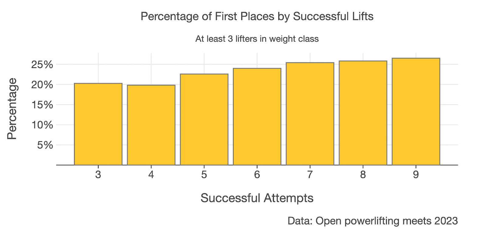
Now that we have removed the bias due to different group sizes, the story is now a little clearer and lends support to the hypothesis that going 9/9 increases your chances of winning.
Although there were far more winners in 2023 who went 8/9 over 9/9, when we look at the percentage of lifters who went 9/9 and who won, we see that the rate of winning is 26.5% in the 9/9 group compared to 25.8% in the 8/9 group.
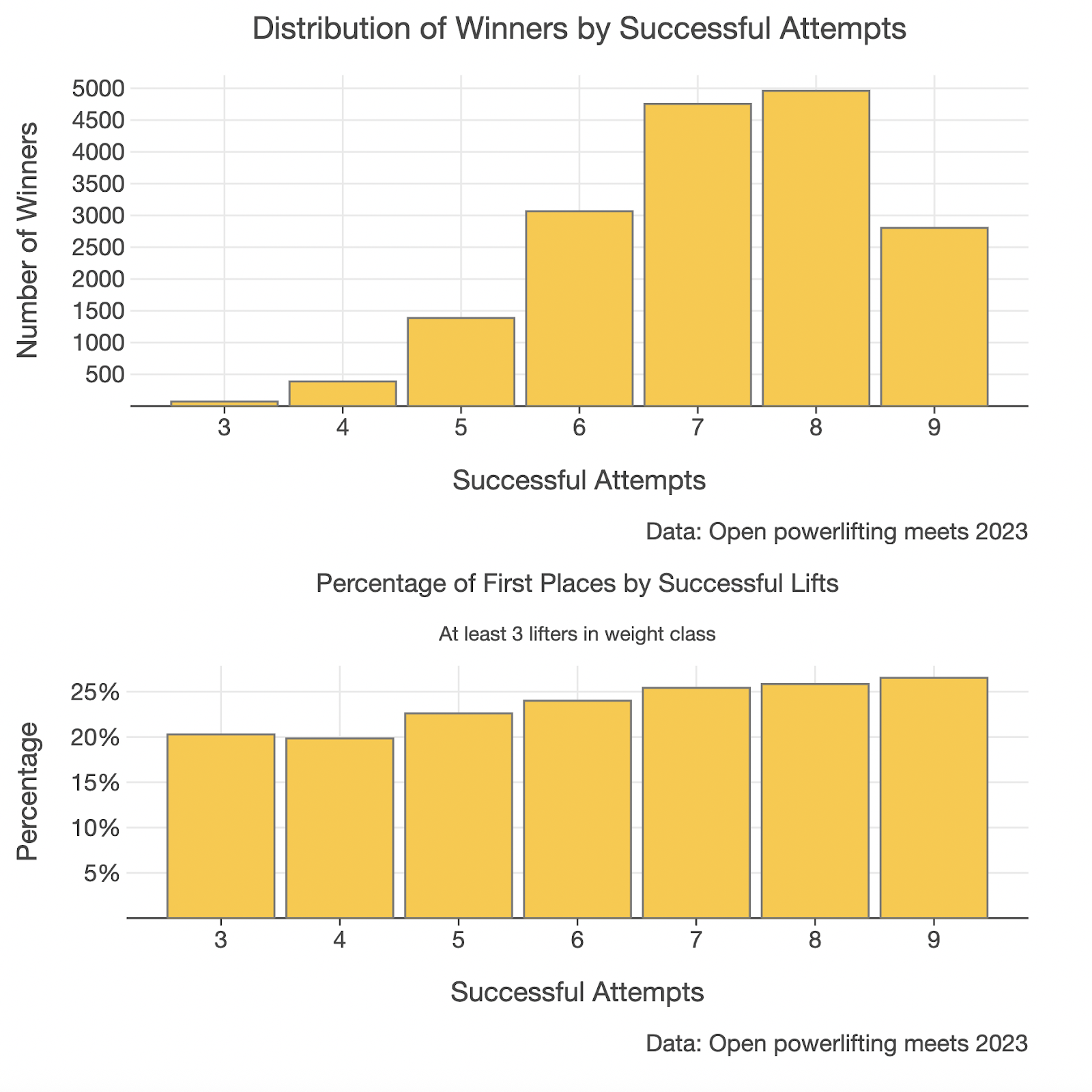
We can now create a multiplot to make a comparison of the two charts a little easier.
Comparing multiple plots with `plotBunch`
To compare both charts, you can use plotBunch. plotBunch is really handy as you can specify exactly how you want your charts arranged.
plotBunch {
    add(plotWinners, 0, 0, 600, 300) // top x position, top y position, width, height
    add(plotRatioWinners, 0, 300, 600, 300) // top y position set to height of chart on top (300)
}
Answering the research question
With this simple analysis, we managed to show that there is indeed a higher rate of winning in the 9/9 group.
So, is this it? Does this mean we can say for certain that going 9/9 is always better? Not quite. We can still improve our analysis by:
- Trying to replicate this finding over a longer time, e.g. five or ten years.
- Trying to see if this finding holds for five or ten competitors per weight class.
- Trying to find if this holds at the elite level (elite level can be inferred by filtering on the value in the
federationcolumn. For example, if the federation isIPF, then these are international competitions).
Data science is as much about storytelling as it is about data. Call me old-fashioned, but what we’re calling AI in 2025 is really just supercharged data science. The models and methods driving the development of LLMs have their foundation in data science.
This is why it’s important to be critical of these models and the stories that they’re telling you. Ask any seasoned data scientist, and they will tell you just how easy it is to make a mistake and draw an incorrect conclusion.
Just because the tools exist and are easy to use doesn’t mean that they are always going to give you the right answer.
The way that we can guard against costly mistakes is not just a sound understanding of data science basics, but also by understanding the domain in which we are operating.
Data science mindset
Earlier, I mentioned the importance of having a quick and iterative workflow. The reason for this is so that we can run multiple simulations quickly, test assumptions, and get feedback. Doing this helps us build a deep and intimate knowledge of our dataset.
When it comes to data science, iterating quickly is of more importance than your code being production-ready. It’s okay to “cheat” a little and write code you’re maybe a little bit ashamed of. If it helps you iterate quickly, then being a little bit ashamed is a trade-off worth making.
Kotlin Notebook, Kotlin DataFrame, and Kandy provide a nice balance here. They work seamlessly together to allow us to balance discovery with features we enjoy as backend developers, like type-checking and code completion. Further, by working in a familiar development environment such as IntelliJ IDEA and connecting to an external data source, we can start to interact with our data right away. Learning and discovering within minutes.
So what are you waiting for? What is something you are curious about? Is there a dataset for it? If so, you already have the tools to start discovering! ?
Where to from here?
- If you haven’t already, clone the sample repo. A bonus analysis can be found at the bottom of
my-first-research-question.ipynb. - Inspired to investigate a topic of your own? Find a dataset about a topic you care about, Kaggle is a great place to start. No matter your chosen topic, remember to stay curious and iterate quickly!
- Apply this in your day job. What are you or “the business” curious about? Connect an existing SQL data source and see what insights can be found.
- Use the sample repo as a source of inspiration for your analysis and let me know what you find. You can find me on Bluesky.
About the author