Interactive Visualizations in PyCharm and Datalore
The Lets-Plot library is an open-sourced interactive plotting library developed by JetBrains for Python and Kotlin. Its architecture was inspired by the ggplot library for the R language, and is built with layered graphic principles in mind.
But what sets Lets-Plot apart from the well-known Matplotlib and Seaborn Python libraries? With Lets-Plot you can produce interactive visualizations, and do it with just a few lines of code. The Lets-Plot library can be easily configured in SciView in PyCharm Professional edition, and comes already pre-installed in Datalore, the collaborative data science platform by JetBrains.
Read this blog post to learn how to make your data plots more engaging. Or check out the published Lets-Plot tutorials.
Complete Lets-Plot usage guide
Why Lets-Plot library?
Make your data interactive
When you take a look at basic scatter plots and histogram plots, you can grasp the general trends. However, it can be difficult to understand the exact numbers for each plot element along the axis. With the Lets-Plot library, you can just hover over part of the plot and instantly get the exact values.
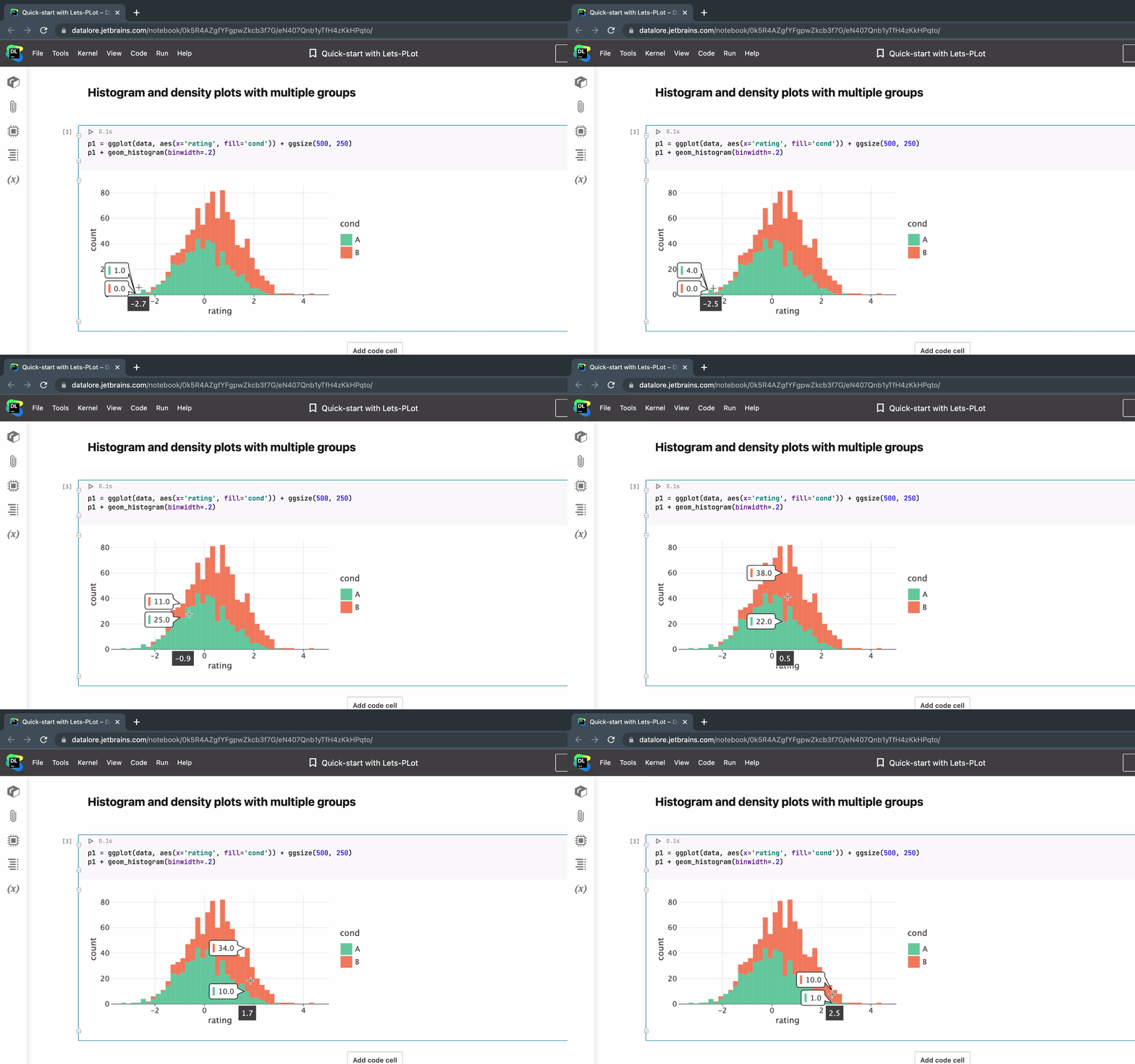
Check out this quick start tutorial.
Plot geo-spatial data
Lets-Plot comes with an in-built geocoding API, support for the GeoPandas library, and out-of-the-box interactive maps.
Geocoding API enables converting names of places into geographic coordinates. The GeoPandas library comes with default datasets containing the coordinates of the countries and some of their attributes.
In a nutshell, Lets-Plot makes it possible to create interactive maps and present geospatial data in a more engaging and informative way.
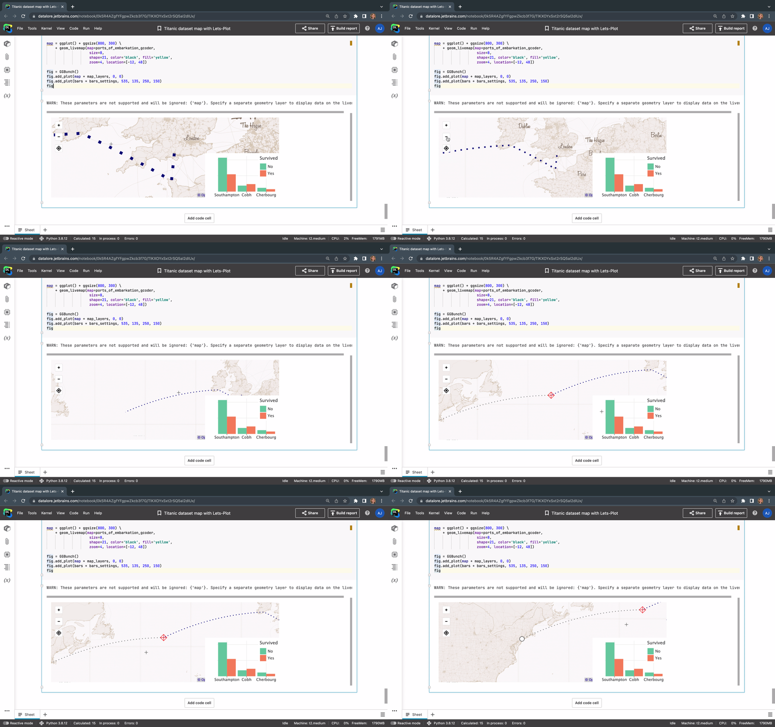
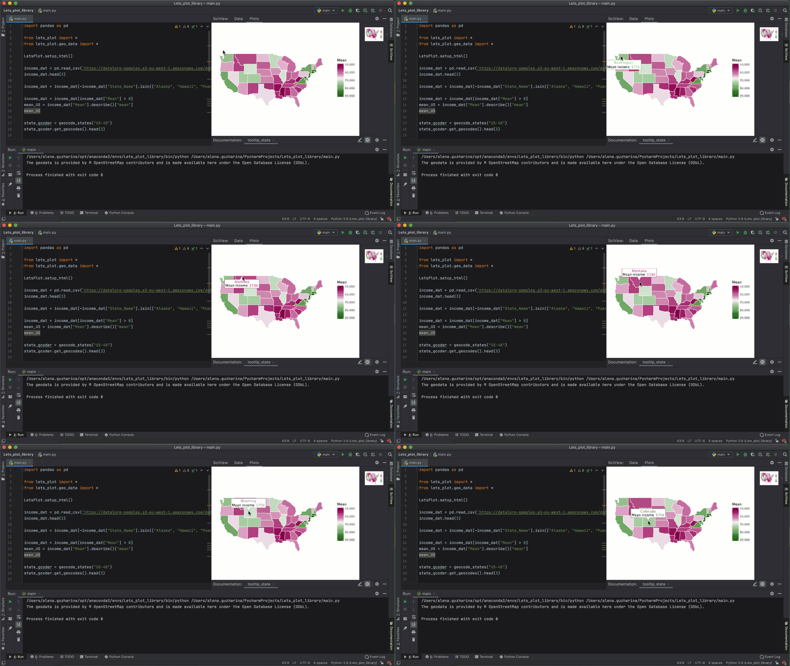
You can plot any custom geospatial data on these maps and visualize the results. Take a look at how we created an interactive map with just a few lines of code:
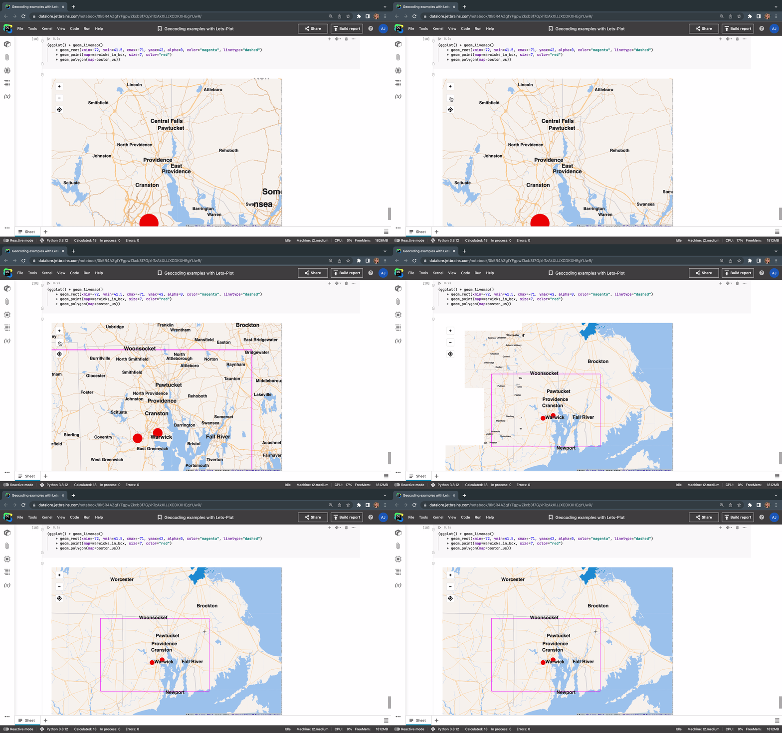
Note, that geom_livemap() is not supported in PyCharm yet and could only be used in Datalore.
More tutorials on maps and plotting geospatial data:
- Quick-start with maps in Lets-Plot
- Titanic dataset with Lets-Plot
- Geocoding examples
- Geocoding reference
- Geopandas examples
- Basemap gallery
- Geopandas Kotlin island
- Airports data on a map with Lets-Plot
Customizable plots
Lets-Plot supports numerous visualization types, including histograms, box plots, scatter plots, line plots, contour plots, maps, and more. The plots can be easily customized with tooltips, descriptions, and legends.
Take a look at this published Datalore notebook with a complete Lets-Plot tutorial.
Setting everything up
Full Lets-Plot docs for Python are available here.
Let’s plot API in PyCharm SciView
When working with data in PyCharm, you might want to visualize the results of a function right inside your Python project. Creating a package and importing it to a Jupyter notebook to visualize the data might be too much work for the sake of one visualization.
In PyCharm you can use the Lets-Plot API within your Python console or directly in .py or .ipynb files. Make sure the SciView window tab is opened.
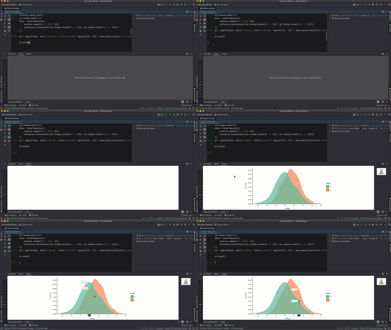
For example, you might be executing cell by cell, and at some point you’ll have a data frame. First, you can take a look at the data frame contents presented in the SciView tab. But then you can type ggplot(df) + geom_density(...) and get an instant interactive visualization of your data in the plot tab inside SciView.
Follow these steps to install Lets-Plot in PyCharm Professional:
- Install or update the Lets-Plot Plugin for the Scientific View.
- Create a new Python project.
- Go to Terminal inside PyCharm and use the command
pip install lets-plot.
Make sure that your Python version is 3.6 or higher and the iPython module is installed.
Lets-Plot in Datalore
The Lets-Plot library comes pre-installed in Datalore. After you create a notebook, just import the package and start creating interactive plots right away.
If you have experience with the R language and ggplot2 API, then working with Lets-Plot will be especially familiar to you.
Try playing around with it in this quick start guide, or go straight to a complete Lets-Plot tutorial.
Lets-Plot in Kotlin
Using Kotlin? Make sure to check out this blog post to learn how to use Lets-Plot for visualizations in Kotlin.
Lets-Plot internals
In Lets-Plot, the plot is represented by at least one layer. It can be built based on the default dataset with the aesthetics mappings, set of scales, or additional features applied.
The Layer is responsible for creating the objects painted on the ‘canvas’ and it contains the following elements:
- Data – the set of data can be specified either once for all layers or on a layer-by-layer basis basis. One plot can combine multiple different datasets (one per layer).
- Aesthetic mapping – describes how variables in the dataset are mapped to the visual properties of the layer, such as color, shape, size, or position.
- Geometric object – a geometric object that represents a particular type of plot.
- Statistical transformation – computes a statistical summary on the raw input data. For example, bin statistics is used for histograms and smooth is used for regression lines. Most stats take additional parameters to specify details of the statistical transformation of data.
- Position adjustment – a method used to compute the final coordinates of geometry. Used to build variants of the same geom object or to avoid overplotting.
The typical code fragment that renders a plot looks as follows:
from lets_plot import *
p = ggplot()
p + geom_(mapping=aes('x', 'y', =''), stat=, position=)
To learn more about the Lets-Plot basics and get a better understanding of what the individual building blocks do, check out this Lets-Plot Usage Guide or Getting Started Guide.
We hope the Lets-Plot library will serve you as a powerful and aesthetic library to make your data plots more interactive.
Resources:
- Lets-Plot documentation and examples on Github
- Lets-Plot quick-start guide in Datalore
- Lets-Plot usage guide in Datalore


