Mastering the New UI
Hi everyone!
We’re excited to introduce a new series of blog posts showcasing our favorite RubyMine features. Join us as we explore tips, tricks, and enhancements that will boost your productivity and streamline your development process.
In the first blog post, we’ll dive into RubyMine’s freshly-introduced user interface (UI). We revamped the IDE’s look and feel to reduce visual complexity, provide easy access to essential features, and gradually reveal advanced functionality when needed.
Starting from version 2022.3, you can enable the New UI in the IDE settings in Settings | Appearance & Behavior | New UI.
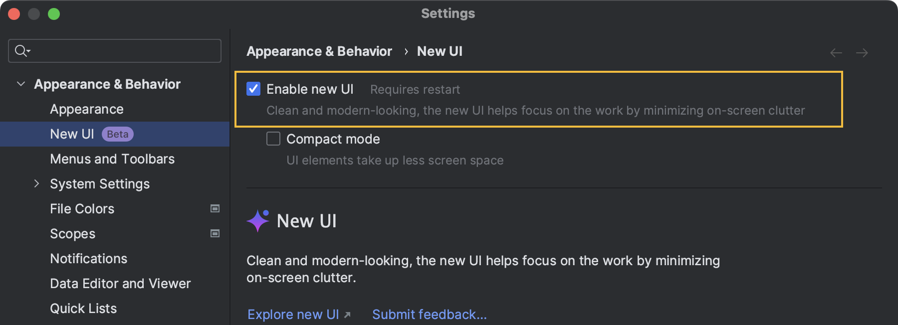
New users of the 2023.2 EAP have the New UI enabled by default.
Themes, icons, and fonts
- Experience improved contrast and a consistent color palette with our new Light, Light with Light Header, and Dark themes.
 To change your theme quickly from the editor, press Ctrl+`, click Theme in the Switch popup, and choose the desired theme.
 - The New UI comes with a new set of icons that have more distinguishable shapes and colors designed for legibility and visual balance.

- In the New UI, the Inter font is used on all supported OSs. The Classic UI used the default OS fonts, which differed depending on the platform.

Navigation bar
The navigation bar has been relocated to the bottom of the main window, providing a fresh perspective.
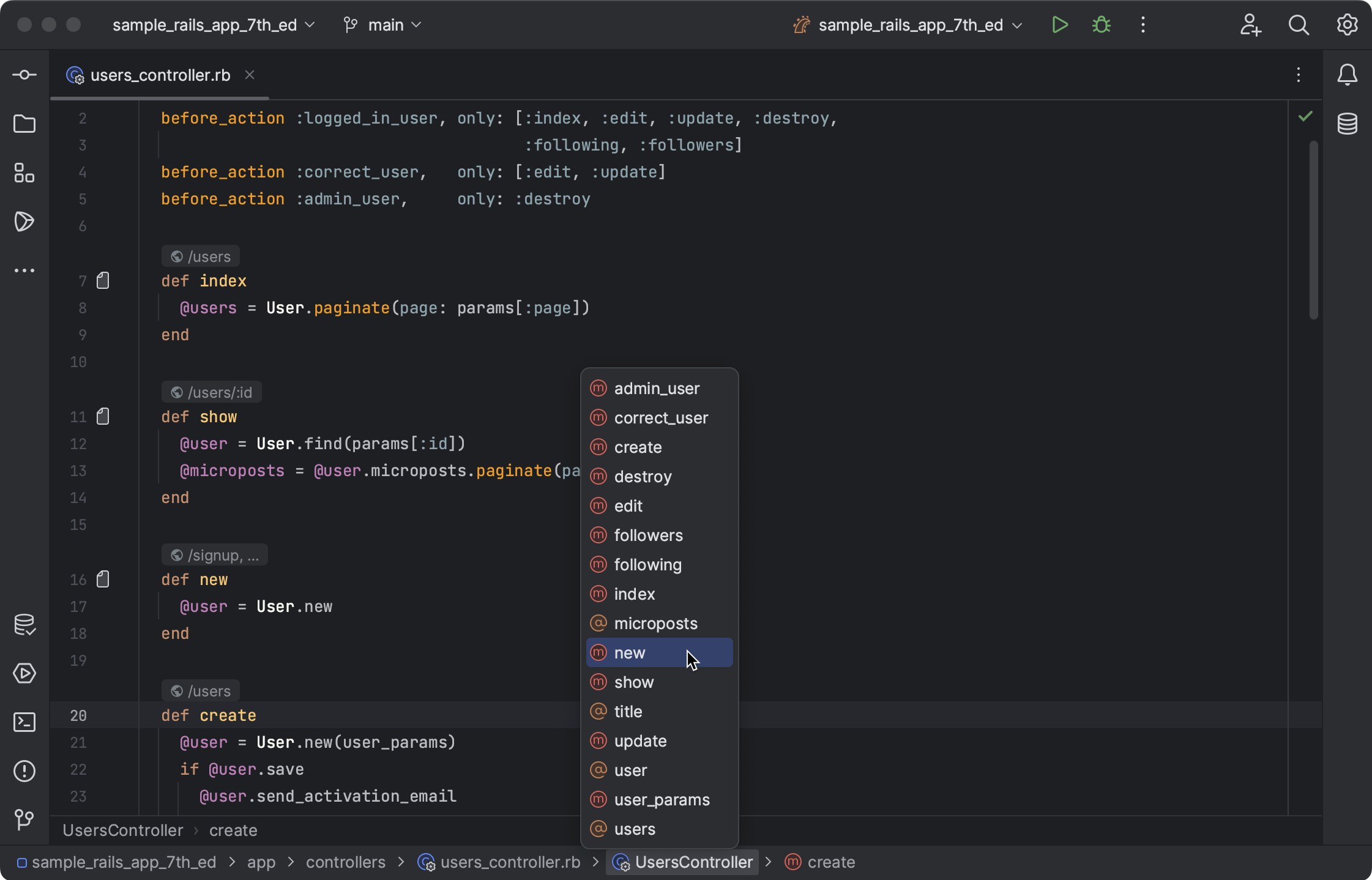
If you prefer the previous location, you can easily move it back to the top or hide it entirely. Simply go to the main menu and select View | Appearance | Navigation Bar.
Compact mode
The New UI comes with the Compact mode, which is perfect for working on smaller 11’’ – 13’’ screens. It reduces toolbar and tool window header heights, optimizes spacing and padding, and features smaller icons and buttons.
Enable the Compact mode by selecting View | Appearance | Compact Mode from the main menu.
Window header
We simplified the main window header while adding new widgets for quick access to useful features. New widgets hide actions in drop-down menus to simplify the layout.

- Main menu
For Windows and Linux users, the main menu is now accessible via the hamburger icon. Use the Alt+\ shortcut to open the main menu using your keyboard.You can bring back the full menu by enabling the Show main menu in separate toolbar option in Settings | Appearance & Behavior | New UI. - Project widget
Use the Project widget to switch between recent projects, create new ones, or access existing ones. - VCS widget
With the new VCS widget, you can view the current branch, easily switch between your repository’s branches, and quickly access the most popular VCS actions like updating the project, committing, and pushing changes.It has replaced the branch widget previously located in the status bar and VCS action icons in the navigation bar. - Run widget
With the updated Run widget, you can select and start run/debug configurations, choose the mode (run or debug), and manage existing configurations.It also displays the state of the process when running or debugging, providing convenient options to restart or stop the process.
Editor
In the New UI, we’ve made improvements to RubyMine’s editor tabs and gutter to achieve better legibility.
Editor tabs now use more space and feature a larger font. Working with multiple editor tabs is now more convenient: You can choose between using a scroll bar or squeezing the tabs to fit the screen. Go to Settings | Editor | General | Editor Tabs | Show tabs in and select the desired option.

The gutter has also received an update, with breakpoints now placed over line numbers by default, saving horizontal space. Additionally, folding icons now appear on hover, and we’ve introduced a new color scheme for annotations (Git Blame) to help you identify recent changes faster.
Tool windows
Customize your IDE’s layout for quick access to frequently-used tool windows. Drag tool window icons to the desired location and organize them to your preference. Use vertical and horizontal splits to arrange tool windows, and hide or display tool windows under the More tool windows popup.
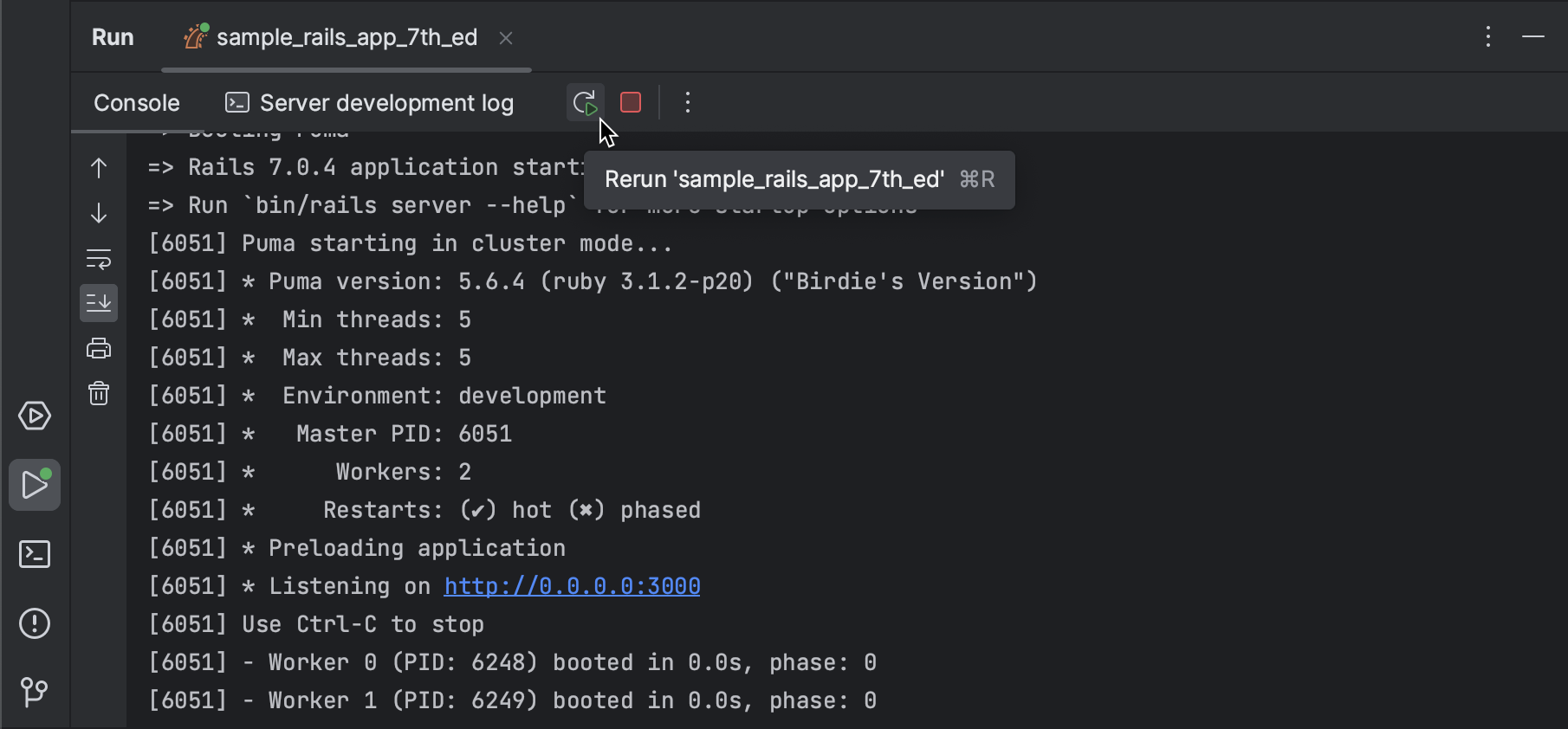
Run tool window
We moved the toolbar with run actions to the tool window tabs for easier access.
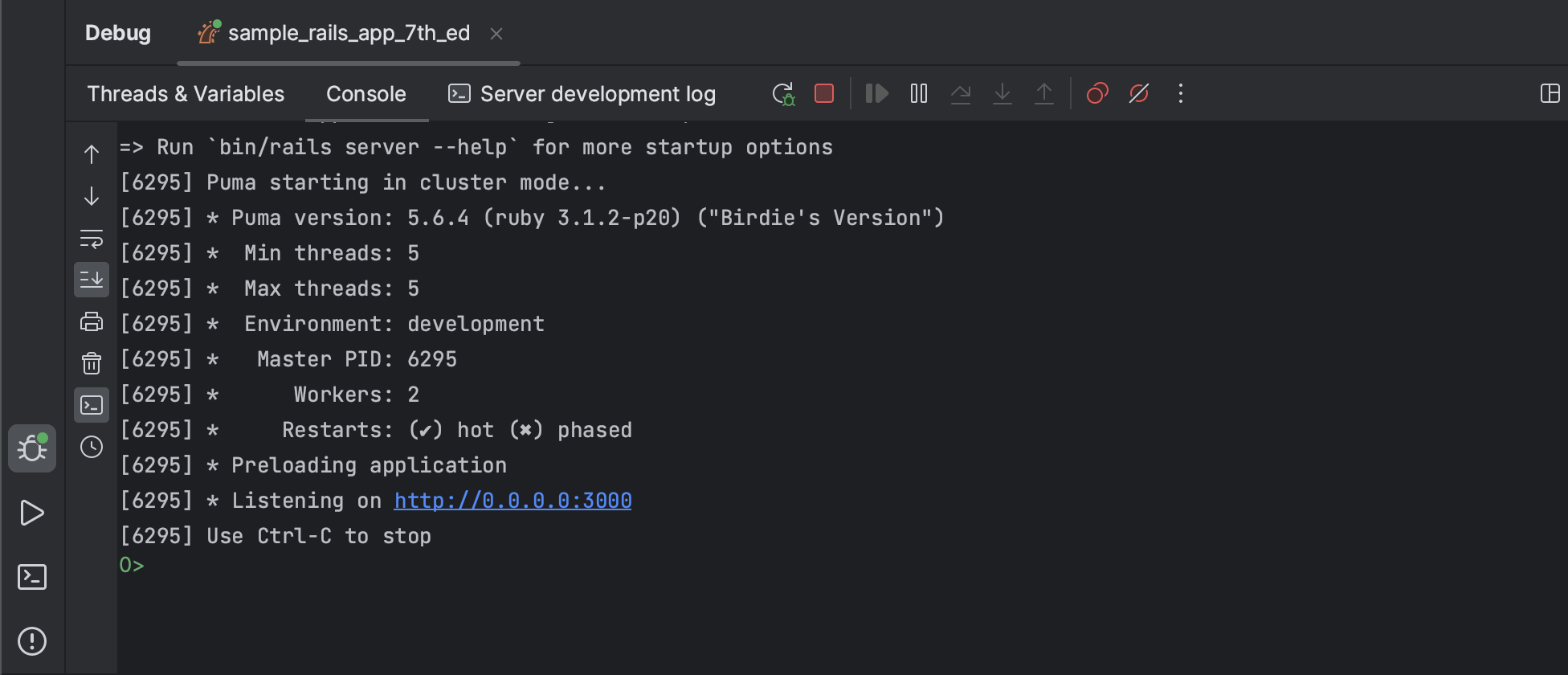
Debug tool window
We’ve consolidated separate toolbars for main debug actions, optimizing screen space.
Additionally, when there is a single running configuration, tabs for switching between the Threads & Variables view and Console now appear in the tool window tabs.
These changes to RubyMine’s new UI are designed to enhance your development experience with a streamlined and visually pleasing environment. We encourage you to give it a try and, if you come across any problems or have suggestions for new features, share your feedback in our issue tracker. Stay tuned for more upcoming posts in this series, where we’ll explore other exciting features.
Happy developing!
The RubyMine team


