Anomaly Detection in Time Series

How do you identify unusual patterns in data that might reveal critical issues or hidden opportunities? Anomaly detection helps identify data that deviates significantly from the norm. Time series data, which consists of data collected over time, often includes trends and seasonal patterns. Anomalies in time series data occur when these patterns are disrupted, making anomaly detection a valuable tool in industries like sales, finance, manufacturing, and healthcare.
As time series data has unique characteristics like seasonality and trends, specialized methods are required to detect anomalies effectively. In this blog post, we’ll explore some popular methods for anomaly detection in time series, including STL decomposition and LSTM prediction, with detailed code examples to help you get started.
TL;DR:
- Time series data has trends and seasonality that must be removed before anomalies can be identified.
- STL decomposition separates a series into trend, seasonal, and residual components. Large residuals reveal anomalies.
- LSTM prediction estimates future values. Large gaps between predicted and actual values indicate potential anomalies.
- PyCharm supports the full workflow with notebooks, plotting, and environment management.
Time series anomaly detection in businesses
Time series data is essential to many businesses and services. Many businesses record data over time with timestamps, allowing changes to be analyzed and data to be compared over time. Time series are useful when comparing a certain quantity over a certain period, as, for example, in a year-over-year comparison where the data exhibits characteristics of seasonalities.
Sales monitoring
One of the most common examples of time series data with seasonalities is sales data. As a lot of sales are affected by annual holidays and the time of the year, it is hard to draw conclusions about sales data without considering the seasonalities. Because of that, a common method for analyzing and finding anomalies in sales data is STL decomposition, which we will cover in detail later in this blog post.
Finance
Financial data, such as transactions and stock prices, are typical examples of time series data. In the finance industry, analyzing and detecting anomalies in this data is a common practice. For example, time series prediction models can be used in automatic trading. We’ll use a time series prediction to identify anomalies in stock data later in this blog post.
Manufacturing
Another use case of time series anomaly detection is monitoring defects in production lines. Machines are often monitored, making time series data available. Being able to notify management of potential failures is essential, and anomaly detection plays a key role.
Medicine and healthcare
In medicine and healthcare, human vitals are monitored and anomalies can be detected. This is important enough in medical research, but it’s critical in diagnostics. If a patient at a hospital has anomalies in their vitals and is not treated immediately, the results can be fatal.
Why is it important to use special methods for time series anomaly detection?
Time series data is special in the sense that it sometimes cannot be treated like other types of data. For example, when we apply a train test split to time series data, the sequentially related nature of the data means we cannot shuffle it. This is also true when applying time series data to a deep learning model. A recurrent neural network (RNN) is commonly used to take the sequential relationship into account, and training data is input as time windows, which preserve the sequence of events within.
Time series data is also special because it often has seasonality and trends that we cannot ignore. This seasonality can manifest in a 24-hour cycle, a 7-day cycle, or a 12-month cycle, just to name a few common possibilities. Anomalies can only be determined after the seasonality and trends have been considered, as you will see in our example below.
Methods used for anomaly detection in time series
Because time series data is special, there are specific methods for detecting anomalies in it. Depending on the type of data, some of the methods and algorithms we mentioned in the previous blog post about anomaly detection can be used on time series data. However, with those methods, the anomaly detection may not be as robust as using ones specifically designed for time series data. In some cases, a combination of detection methods can be used to reconfirm the detection result and avoid false positives or negatives.
STL decomposition
One of the most popular ways to use time series data that has seasonality is STL decomposition – seasonal trend decomposition using LOESS (locally estimated scatterplot smoothing). In this method, a time series is decomposed using an estimate of seasonality (with the period provided or determined using an algorithm), a trend (estimated), and the residual (the noise in the data). A Python library that provides STL decomposition tools is the statsmodels library.
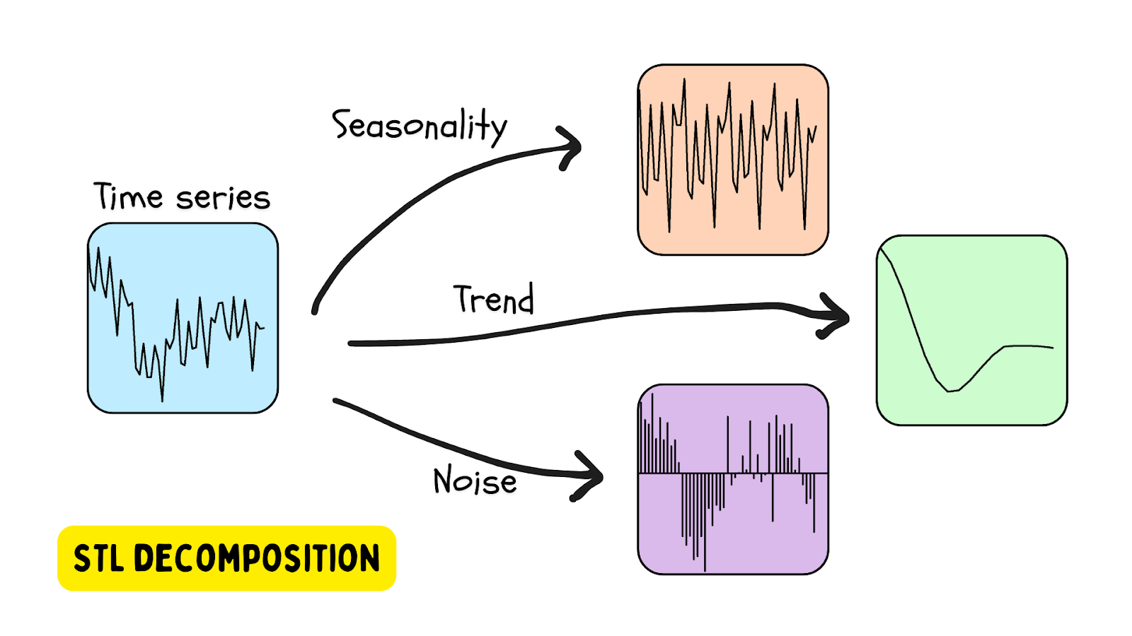
An anomaly is detected when the residual is beyond a certain threshold.
Using STL decomposition on beehive data
In an earlier blog post, we explored anomaly detection in beehives using the OneClassSVM and IsolationForest methods.
In this tutorial, we’ll analyze beehive data as a time series using the STL class provided by the statsmodels library. To get started, set up your environment using this file: requirements.txt.
1. Install the library
Since we have only been using the model provided by Scikit-learn, we will need to install statsmodels from PyPI. This is easy to do in PyCharm.
Go to the Python Packages window (choose the icon at the bottom of the left-hand side of the IDE) and type in statsmodels in the search box.
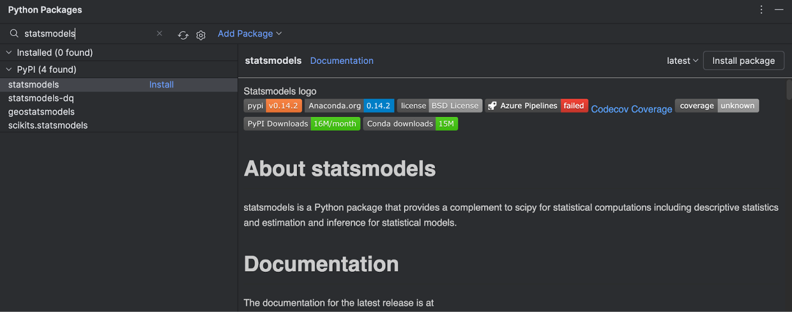
You can see all of the information about the package on the right-hand side. To install it, simply click Install package.
2. Create a Jupyter notebook
To investigate the dataset further, let’s create a Jupyter notebook to take advantage of the tools that PyCharm’s Jupyter notebook environment provides.
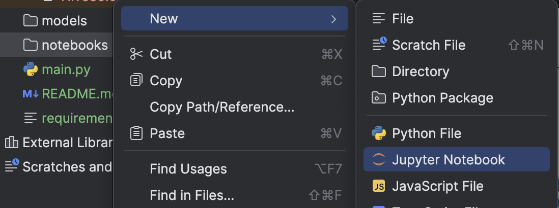
We will import pandas and load the .csv file.
import pandas as pd

df = pd.read_csv('../data/Hive17.csv', sep=";")
df = df.dropna()
df
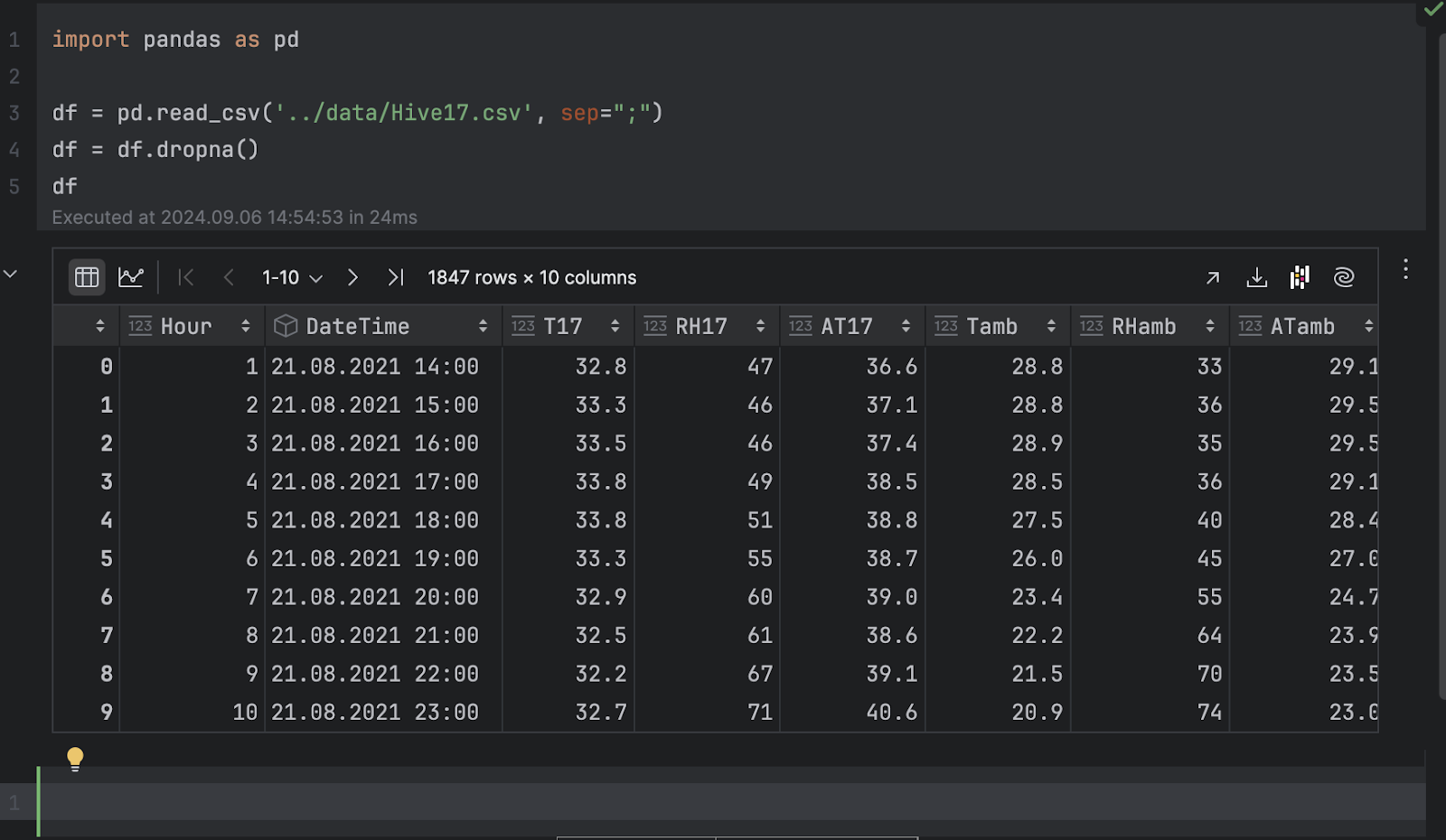
3. Inspect the data as graphs
Now, we can inspect the data as graphs. Here, we would like to see the temperature of hive 17 over time. Click on Chart view in the dataframe inspector and then choose T17 as the y-axis in the series settings.
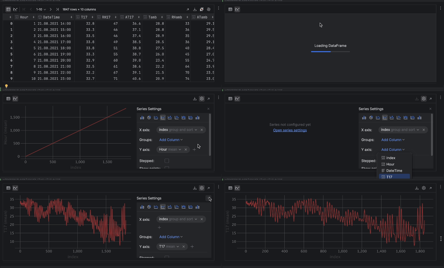
When expressed as a time series, the temperature has a lot of ups and downs. This indicates periodic behavior, likely due to the day-night cycle, so it is safe to assume there is a 24-hour period for the temperature.
Next, there is a trend of temperature dropping over time. If you inspect the DateTime column, you can see that the dates range from August to November. Since the Kaggle page of the dataset indicates that the data was collected in Turkey, the transition from summer to fall explains our observation that the temperature is dropping over time.
4. Time series decomposition
To understand the time series and detect anomalies, we will perform STL decomposition, importing the STL class from statsmodels and fitting it with our temperature data.
from statsmodels.tsa.seasonal import STL

stl = STL(df["T17"], period=24, robust=True)
result = stl.fit()
We will have to provide a period for the decomposition to work. As we mentioned before, it is safe to assume a 24-hour cycle.
According to the documentation, STL decomposes a time series into three components: trend, seasonal, and residual. To get a clearer look at the decomposed result, we can use the built-in plot method:
result.plot()
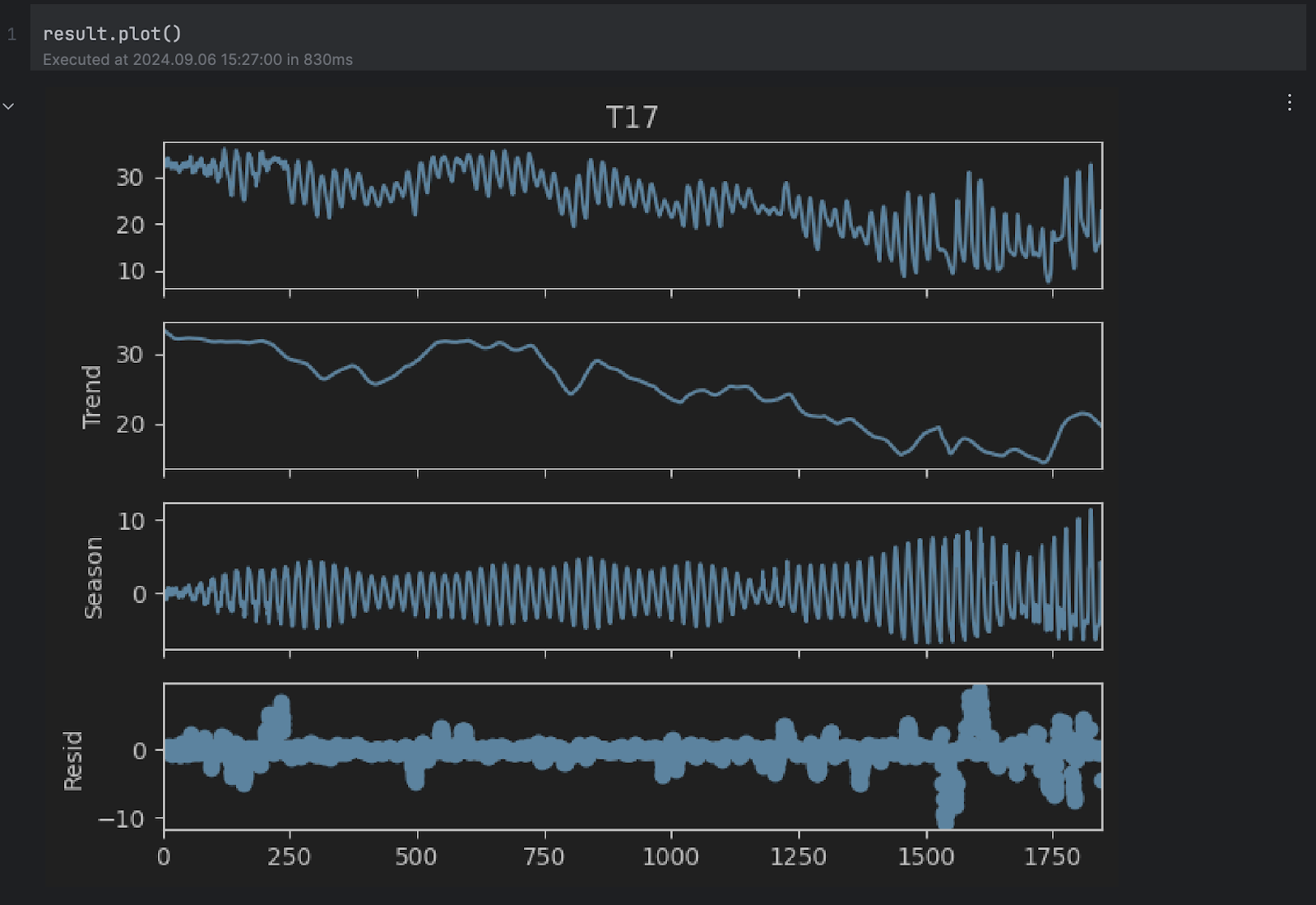
You can see the Trend and Season plots seem to align with our assumptions above. However, we are interested in the residual plot at the bottom, which is the original series without the trend and seasonal changes. Any extremely high or low value in the residual indicates an anomaly.
5. Anomaly threshold
Next, we would like to determine what values of the residual we’ll consider abnormal. To do that, we can look at the residual’s histogram.
result.resid.plot.hist()
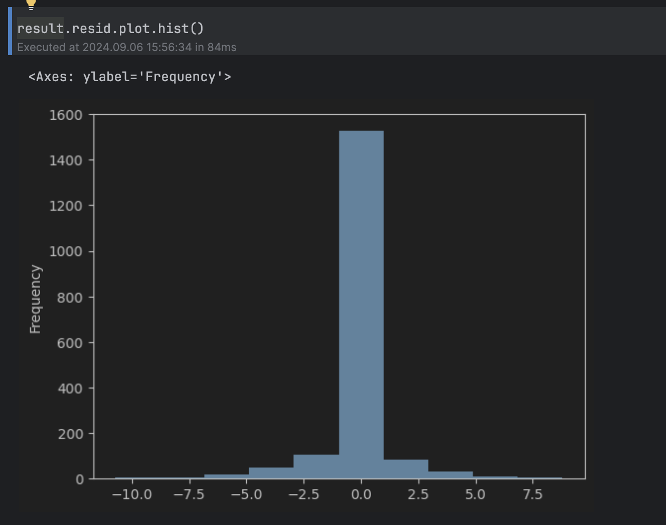
This can be considered a normal distribution around 0, with a long tail above 5 and below -5, so we’ll set the threshold to 5.
To show the anomalies on the original time series, we can color all of them red in the graph like this:
import matplotlib.pyplot as plt

threshold = 5
anomalies_filter = result.resid.apply(lambda x: True if abs(x) > threshold else False)
anomalies = df["T17"][anomalies_filter]

plt.figure(figsize=(14, 8))
plt.scatter(x=anomalies.index, y=anomalies, color="red", label="anomalies")
plt.plot(df.index, df['T17'], color='blue')
plt.title('Temperatures in Hive 17')
plt.xlabel('Hours')
plt.ylabel('Temperature')
plt.legend()
plt.show()
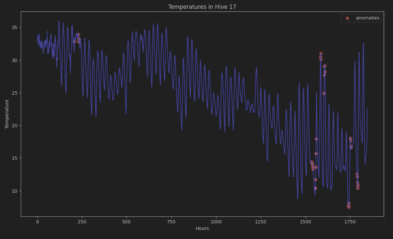
Without STL decomposition, it is very hard to identify these anomalies in a time series consisting of periods and trends.
LSTM prediction
Another way to detect anomalies in time series data is to do a time series prediction on the series using deep learning methods to estimate the outcome of data points. If an estimate is very different from the actual data point, then it could be a sign of anomalous data.
One of the popular deep learning algorithms to perform the prediction of sequential data is the Long short-term memory (LSTM) model, which is a type of recurrent neural network (RNN). The LSTM model has input, forget, and output gates, which are number matrices. This ensures important information is passed on in the next iteration of the data.
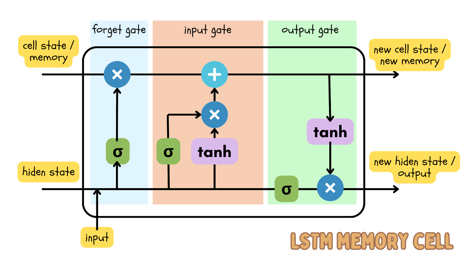
Since time series data is sequential data, meaning the order of data points is in sequence and should not be shuffled, the LSTM model is an effective deep learning model to predict the outcome at a certain time. This prediction can be compared to the actual data and a threshold can be set to determine if the actual data is an anomaly.
Using LSTM prediction on stock prices
Now let’s start a new Jupyter project to detect any anomalies in Apple’s stock price over the past 5 years. The stock price dataset shows the most up-to-date data. If you want to follow along with the blog post, you can download the dataset we are using.
1. Start a Jupyter project
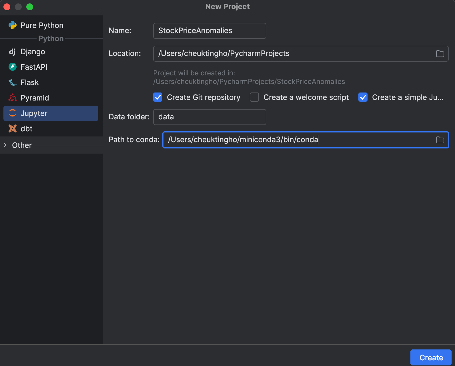
When starting a new project, you can choose to create a Jupyter one, which is optimized for data science. In the New Project window, you can create a Git repository and determine which conda installation to use for managing your environment.
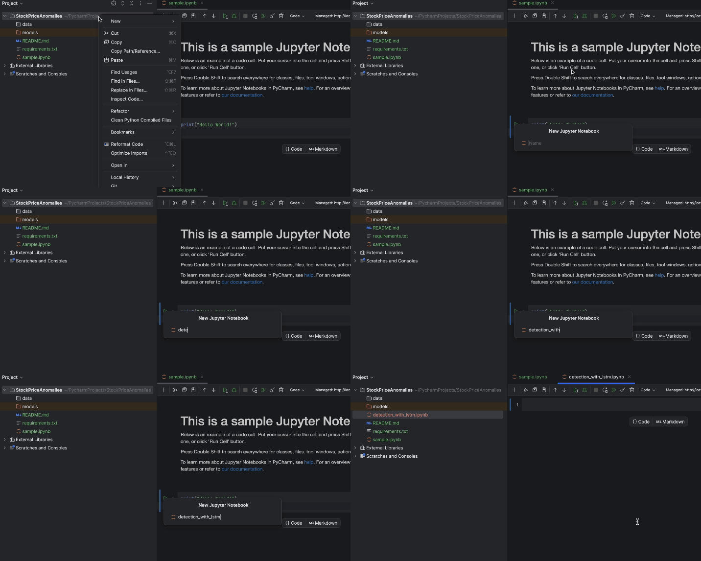
After starting the project, you will see an example notebook. Go ahead and start a new Jupyter notebook for this exercise.
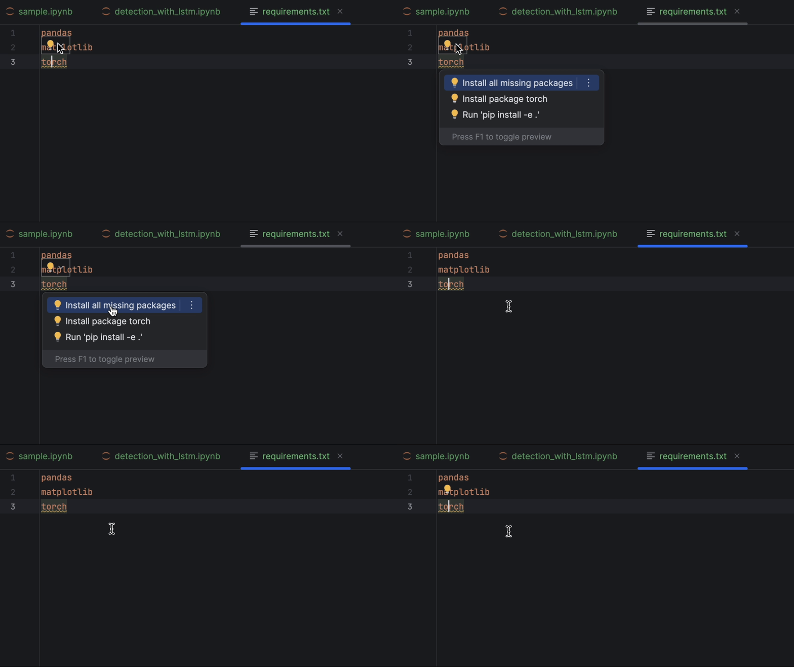
After that, let’s set up requirements.txt. We will need pandas, matplotlib, and PyTorch, which is named torch on PyPI. Since PyTorch is not included in the conda environment, PyCharm will tell us that we are missing the package. To install the package, click on the lightbulb and select Install all missing packages.
2. Loading and inspecting the data
Next, let’s put our dataset apple_stock_5y.csv in the data folder and load it as a pandas DataFrame to inspect it.
import pandas as pd

df = pd.read_csv('data/apple_stock_5y.csv')
df
With the interactive table, we can easily see if any data is missing.
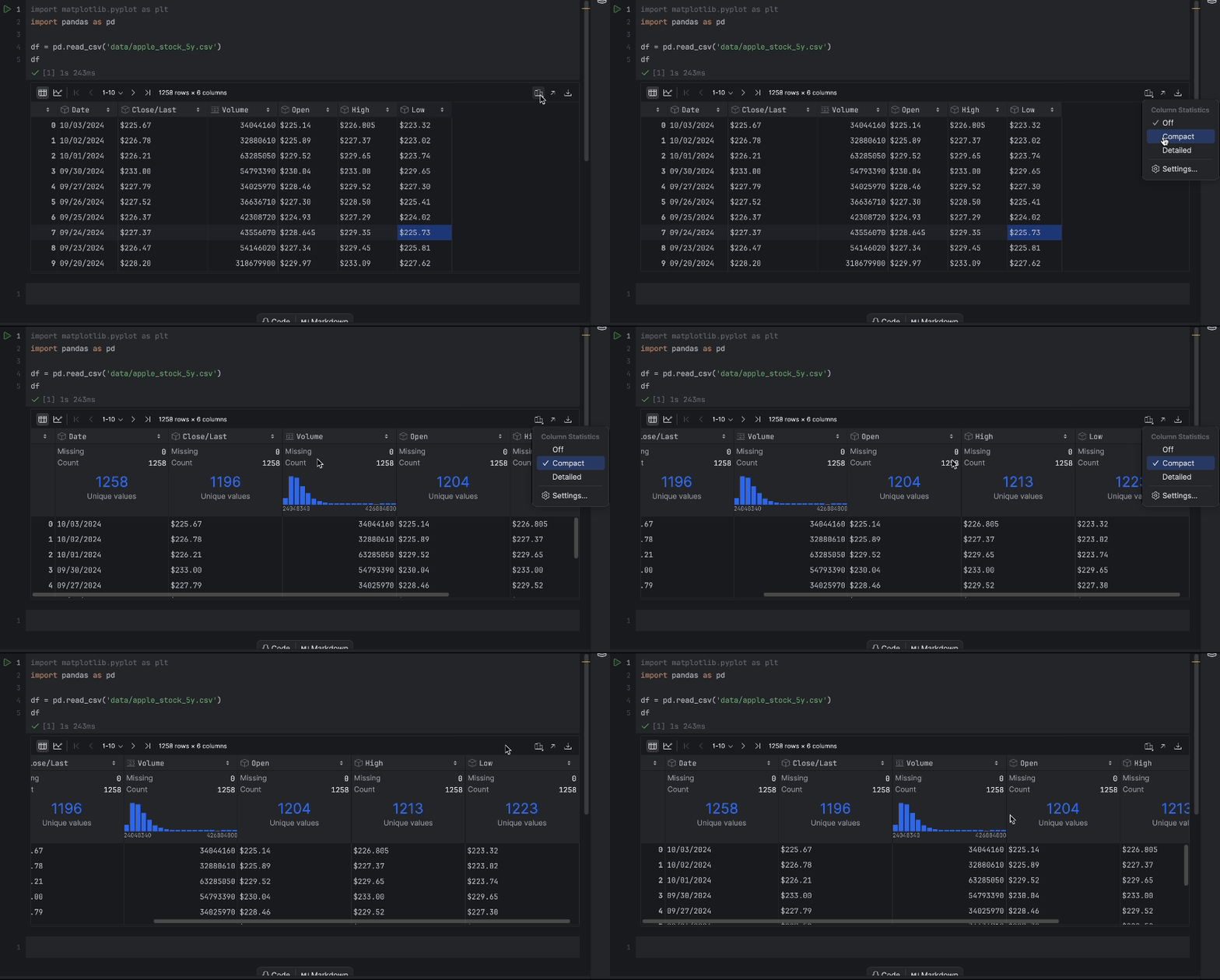
There is no missing data, but we have one issue – we would like to use the Close/Last price but it is not a numeric data type. Let’s do a conversion and inspect our data again:
df["Close/Last"] = df["Close/Last"].apply(lambda x: float(x[1:]))
df
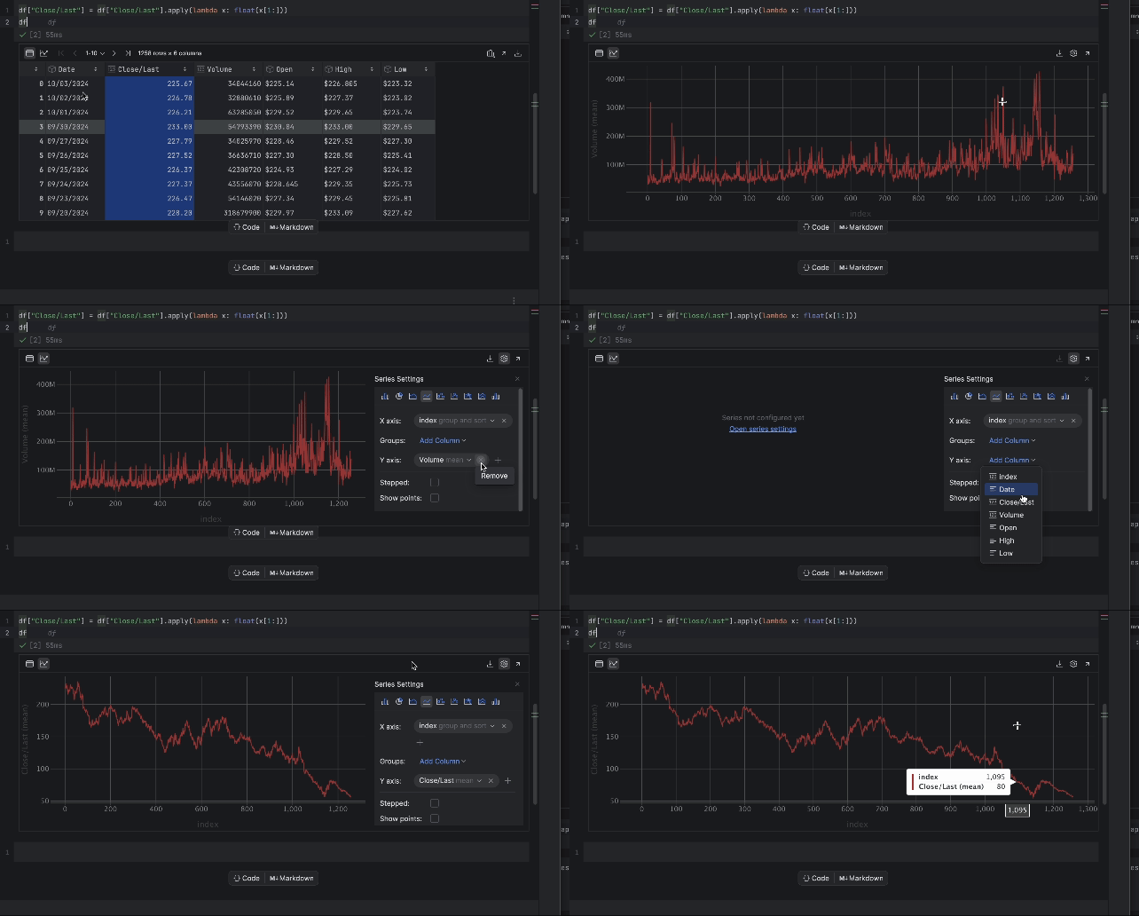
Now, we can inspect the price with the interactive table. Click on the plot icon on the left and a plot will be created. By default, it uses Date as the x-axis and Volume as the y-axis. Since we would like to inspect the Close/Last price, go to the settings by clicking the gear icon on the right and choose Close/Last as the y-axis.
3. Preparing the training data for LSTM
Next, we have to prepare the training data to be used in the LSTM model. We need to prepare a sequence of vectors (feature X), each representing a time window, to predict the next price. The next price will form another sequence (target y). Here we can choose how big this time window is with the lookback variable. The following code creates sequences X and y which will then be converted to PyTorch tensors:
import torch

lookback = 5
timeseries = df[["Close/Last"]].values.astype('float32')

X, y = [], []
for i in range(len(timeseries)-lookback):
    feature = timeseries[i:i+lookback]
    target = timeseries[i+1:i+lookback+1]
    X.append(feature)
    y.append(target)

X = torch.tensor(X)
y = torch.tensor(y)

print(X.shape, y.shape)
Generally speaking, the bigger the window, the bigger our model will be, since the input vector is bigger. However, with a bigger window, the sequence of inputs will be shorter, so determining this lookback window is a balancing act. We will start with 5, but feel free to try different values to see the differences.
4. Build and train the model
We can build the model by creating a class using the nn module in PyTorch before we train it. The nn module provides building blocks, such as different neural network layers. In this exercise, we will build a simple LSTM layer followed by a linear layer:
import torch.nn as nn

class StockModel(nn.Module):
    def __init__(self):
        super().__init__()
        self.lstm = nn.LSTM(input_size=1, hidden_size=50, num_layers=1, batch_first=True)
        self.linear = nn.Linear(50, 1)
    def forward(self, x):
        x, _ = self.lstm(x)
        x = self.linear(x)
        return x
Next, we will train our model. Before training it, we will need to create an optimizer, a loss function used to calculate the loss between the predicted and actual y values, and a data loader to feed in our training data:
import numpy as np
import torch.optim as optim
import torch.utils.data as data

model = StockModel()
optimizer = optim.Adam(model.parameters())
loss_fn = nn.MSELoss()
loader = data.DataLoader(data.TensorDataset(X, y), shuffle=True, batch_size=8)
The data loader can shuffle the input, as we have already created the time windows. This preserves the sequential relationship in each window.
Training is done using a for loop which loops over each epoch. For every 100 epochs, we will print out the loss and observe while the model converges:
n_epochs = 1000
for epoch in range(n_epochs):
    model.train()
    for X_batch, y_batch in loader:
        y_pred = model(X_batch)
        loss = loss_fn(y_pred, y_batch)
        optimizer.zero_grad()
        loss.backward()
        optimizer.step()
    if epoch % 100 != 0:
        continue
    model.eval()
    with torch.no_grad():
        y_pred = model(X)
        rmse = np.sqrt(loss_fn(y_pred, y))
    print(f"Epoch {epoch}: RMSE {rmse:.4f}")
We start at 1000 epochs, but the model converges quite quickly. Feel free to try other numbers of epochs for training to achieve the best result.
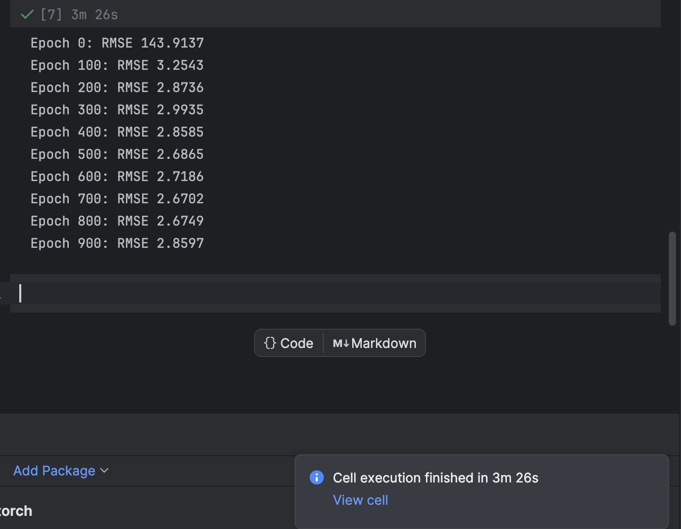
In PyCharm, a cell that requires some time to execute will provide a notification about how much time remains and a shortcut to the cell. This is very handy when training machine learning models, especially deep learning models, in Jupyter notebooks.
5. Plot the prediction and find the errors
Next, we will create the prediction and plot it together with the actual time series. Note that we will have to create a 2D np series to match with the actual time series. The actual time series will be in blue while the predicted time series will be in red.
import matplotlib.pyplot as plt

with torch.no_grad():
    pred_series = np.ones_like(timeseries) * np.nan
    pred_series[lookback:] = model(X)[:, -1, :]

plt.plot(timeseries, c='b')
plt.plot(pred_series, c='r')
plt.show()
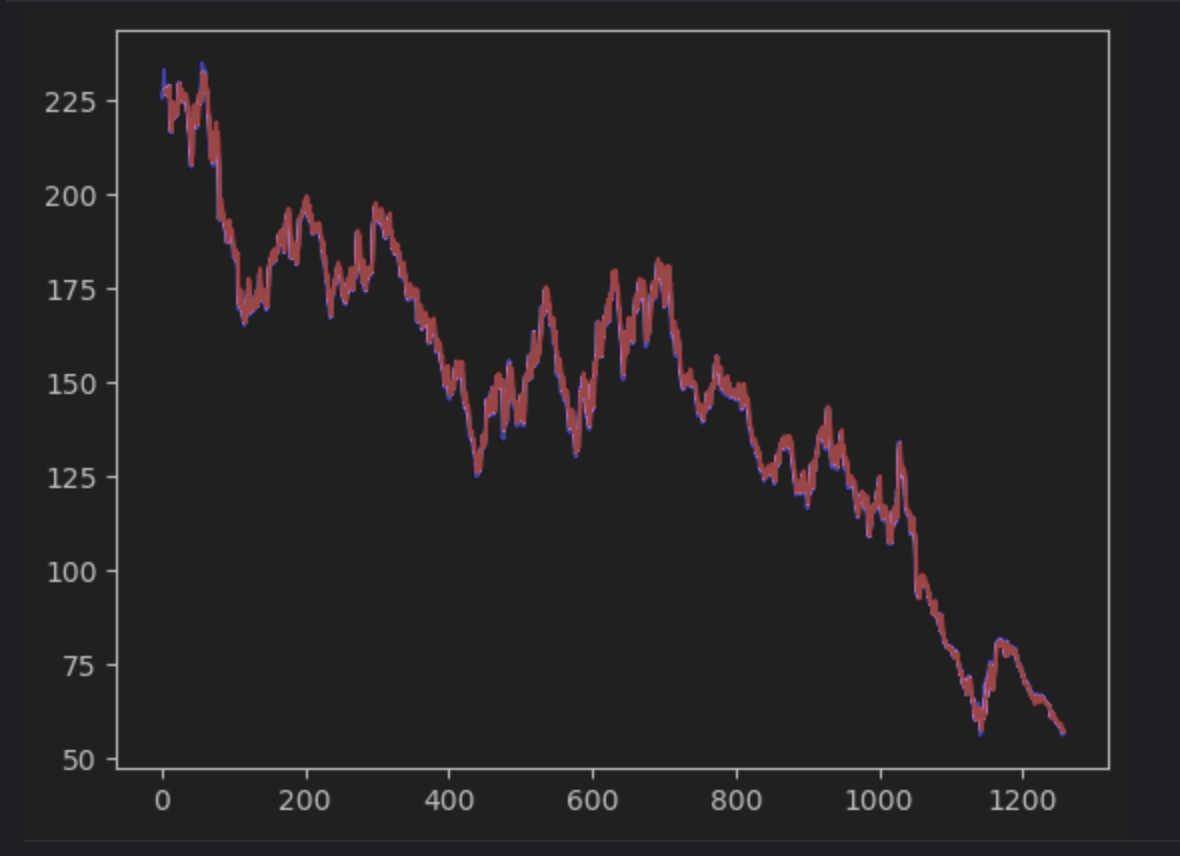
If you observe carefully, you will see that the prediction and the actual values do not align perfectly. However, most of the predictions do a good job.
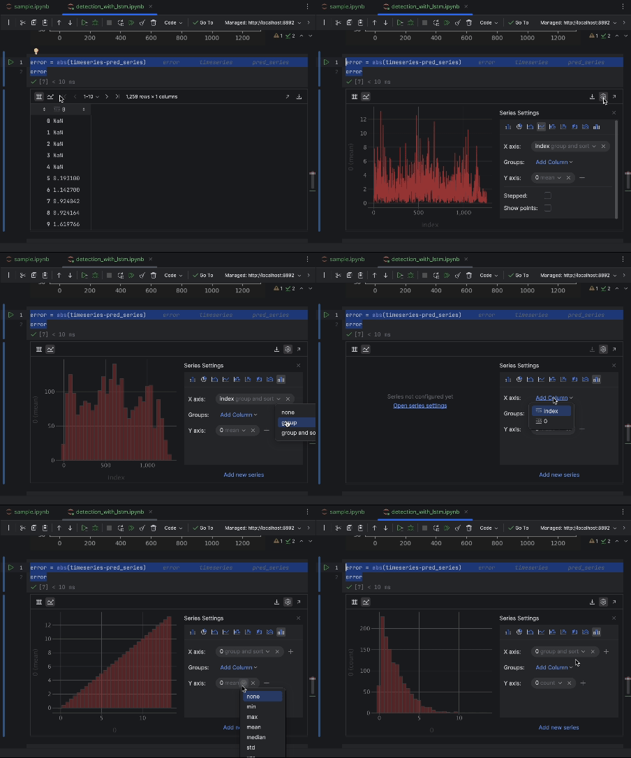
To inspect the errors closely, we can create an error series and use the interactive table to observe them. We are using the absolute error this time.
error = abs(timeseries-pred_series)
error
Use the settings to create a histogram with the value of the absolute error as the x-axis and the count of the value as the y-axis.
6. Decide on the anomaly threshold and visualize
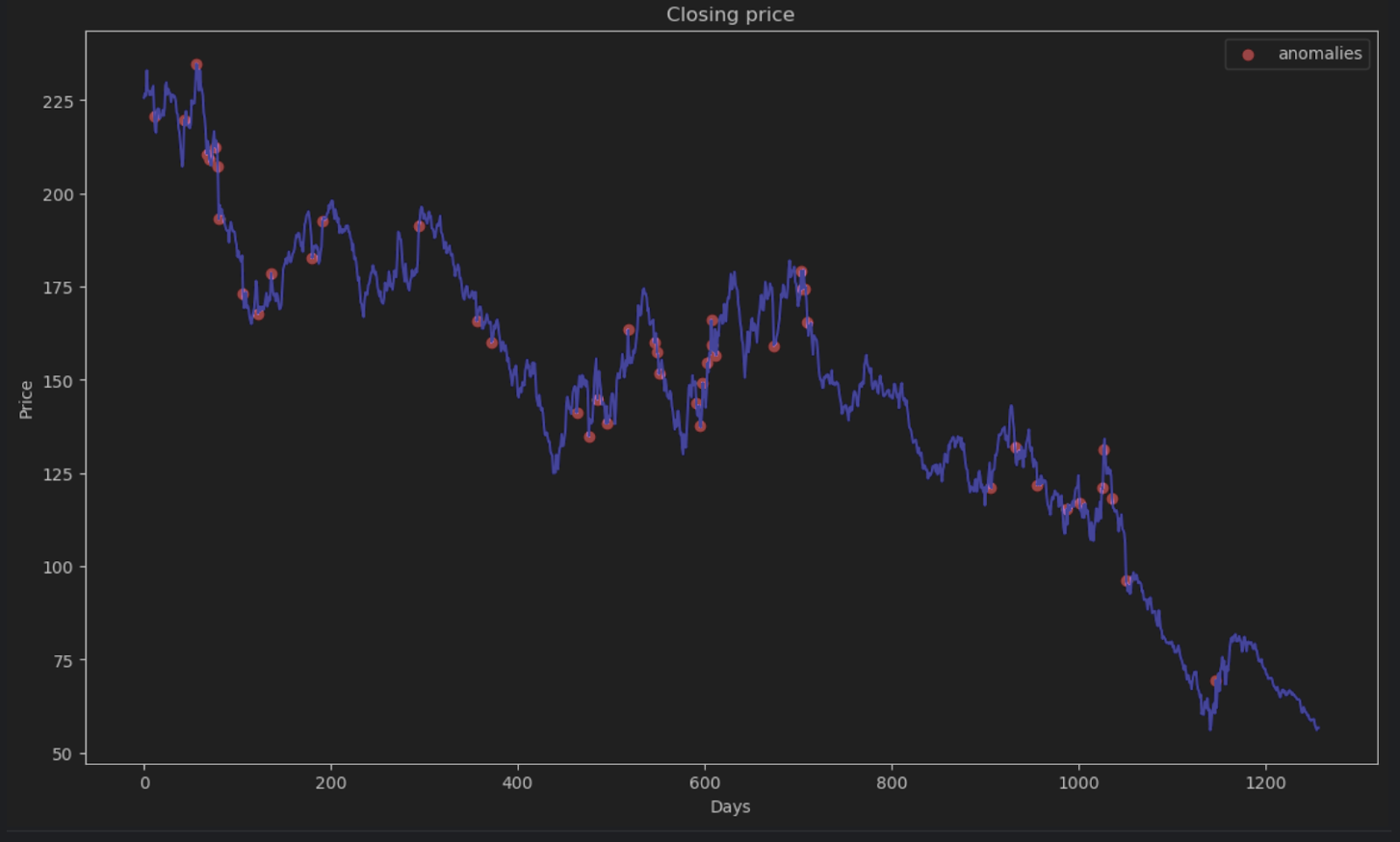
Most of the points will have an absolute error of less than 6, so we can set that as the anomaly threshold. Similar to what we did for the beehive anomalies, we can plot the anomalous data points in the graph.
threshold = 6
error_series = pd.Series(error.flatten())
price_series = pd.Series(timeseries.flatten())

anomalies_filter = error_series.apply(lambda x: True if x > threshold else False)
anomalies = price_series[anomalies_filter]

plt.figure(figsize=(14, 8))
plt.scatter(x=anomalies.index, y=anomalies, color="red", label="anomalies")
plt.plot(df.index, timeseries, color='blue')
plt.title('Closing price')
plt.xlabel('Days')
plt.ylabel('Price')
plt.legend()
plt.show()
Summary
Time series data is a common form of data used in many applications including business and scientific research. Due to the sequential nature of time series data, special methods and algorithms are used to help determine anomalies in it. In this blog post, we demonstrated how to identify anomalies using STL decomposition to eliminate seasonalities and trends. We have also demonstrated how to use deep learning and the LSTM model to compare the predicted estimate and the actual data in order to determine anomalies.
FAQ
- What is anomaly detection in time series?
Anomaly detection highlights data points that break the expected pattern once trend and seasonality are accounted for. - Which algorithms are best for time series anomaly detection (STL, LSTM, etc.)?
STL works for stable seasonal data, classical models suit simpler signals, and LSTMs help when patterns are complex or non-linear. - How do I choose between STL decomposition and LSTM models?
Use STL when seasonality and trend are predictable. Use an LSTM when the structure shifts over time or depends on non-linear relationships. - What is the minimum amount of time series data needed for anomaly detection?
You need enough data to capture several cycles of the underlying pattern. For daily seasonality, this typically means multiple weeks. - How do I handle seasonality when the period isn’t obvious?
Estimate it using domain knowledge, visual inspection, or automated methods such as periodograms or autocorrelation plots. - Can I combine multiple anomaly detection methods?
Yes. Using more than one method can help confirm results and reduce false positives, especially when the dataset is noisy. - What are common causes of false positives in time series anomaly detection?
Unmodelled seasonality, missing values, sudden but normal operational changes, and poorly chosen thresholds can all trigger false flags. - How do I evaluate the accuracy of an anomaly detection model?
Compare predictions to labeled anomalies when available, or track error distributions and threshold performance over time. - Does PyCharm provide tools that help with anomaly detection workflows?
PyCharm supports Jupyter notebooks, scientific libraries, plotting, and environment management, making it easier to build and inspect models.
Detect anomalies using PyCharm
With the Jupyter project in PyCharm Professional, you can organize your anomaly detection project with a lot of data files and notebooks easily. Graphs output can be generated to inspect anomalies and plots are very accessible in PyCharm. Other features, such as auto-complete suggestions, make navigating all the Scikit-learn models and Matplotlib plot settings a blast.
Power up your data science projects by using PyCharm, and SQL-powered data-analysis IDE to streamline your data science workflow.


