Datalore
Collaborative data science platform for teams
Financial Data Analysis and Visualization in Python With Datalore and AI Assistant
This is a guest blog post by Ryan O’Connell, CFA, FRM.
Picture this: You’re a financial analyst, staring at endless Excel spreadsheets. Every time you need to update a spreadsheet, a substantial amount of manual work needs to be done on your part. This manual work often leads to embarrassing errors. I found myself in a similar position in every analyst role I occupied.
The financial ecosystem relies heavily on Excel, but as data grows, it’s showing its limitations. It’s time for a change.
Disclaimer: This article is for informational and educational purposes only and is not intended to serve as personal financial advice.
Why choose Python for financial data analysis?
- Excel has limitations when it comes to handling large datasets, collaborative work, and advanced data visualization techniques.
- Python offers a flexible and scalable environment with a rich ecosystem of Python libraries for financial analysis, such as pandas, NumPy, and Matplotlib.
- Python’s syntax is relatively easy to learn, making it accessible to both beginners and experienced programmers.
Moreover, with the integration of Datalore and its AI-assisted code completion, even those without extensive programming experience can leverage the power of Python for their financial data analysis. Datalore’s user-friendly interface, combined with its AI-driven code suggestions and interactive financial data visualization tools, makes it an ideal platform for transitioning from spreadsheets to a more robust and efficient workflow.
In this Python data analysis tutorial, you’ll learn how to:
- Retrieve historical data for various asset classes.
- Calculate risk and return metrics.
- Create informative visualizations using Python data visualization libraries and Datalore.
- Analyze the impact of macroeconomic factors on asset class performance.
- Follow financial data analysis best practices.
By the end of this article, you’ll have a solid understanding of how Python can enhance your financial data analysis capabilities and empower you to make data-driven decisions with confidence. If you have experience with Python, you can access the example notebook created later in this tutorial here.
So, let’s dive in and discover the potential of Python, Datalore, and AI in unlocking valuable insights from financial data!
Our financial data analysis task for today
In this article, we’ll explore different asset classes and their performance. We’ll be focusing on seven different asset classes:
- U.S. Stocks
- International Stocks
- U.S. Bonds
- Real Estate
- Commodities
- Gold
- Cash (3-Month U.S. Treasury Bills)
To conduct a comprehensive analysis of these asset classes, we’ll follow these steps:
- Use AI to retrieve the highest market cap ETF for each category and create a list of their tickers.
- Fetch the monthly data for each ETF using yFinance.
- Calculate monthly returns for each asset class.
- Annualize the monthly returns for each asset class.
- Create a bar chart to visualize and compare the annualized returns of each asset class.
- Visualize the growth of a hypothetical $100,000 investment in each asset class over the last 20 years using a line chart.
- Calculate the correlations between the asset classes and create a heatmap to visualize their relationships.
- Calculate and visualize the risk of each asset class using standard deviation.
- Evaluate the risk-adjusted performance of each asset class by calculating and visualizing Sharpe ratios.
- Retrieve relevant macroeconomic data using the FRED API.
- Merge the macroeconomic data with the asset class returns data.
- Analyze the impact of macroeconomic factors on asset class performance using a correlation heatmap.
Installing financial libraries into our Datalore notebook
Datalore notebooks come with most common Python packages already pre-installed. This tutorial will require installing two finance-specific packages. To get started, simply go to the Environment tab and search for the following packages:
- yfinance
- Fredapi
Getting a list of ETFs
The first step in our comprehensive financial data analysis is to identify the most significant ETFs representing each asset class we’re focusing on. This involves finding the highest market cap ETFs for each asset class. The purpose is to ensure we’re analyzing the most impactful ETFs that accurately reflect the performance of their respective asset classes.
| Prompt for AI |
| Provide a list of seven ETF tickers, each representing the highest market cap within their respective asset classes: U.S. Stocks, International Stocks, U.S. Bonds, Real Estate, Commodities, Gold, and Cash (3-Month U.S. Treasury Bills). |
The following code was produced by Datalore AI using this prompt to effectively complete the task:
# ETF tickers representing the highest market cap in their respective asset class.
etf_tickers = {
    "U.S. Stocks": "VTI",  # Vanguard Total Stock Market ETF
    "International Stocks": "VXUS",  # Vanguard Total International Stock ETF
    "U.S. Bonds": "BND",  # Vanguard Total Bond Market ETF
    "Real Estate": "VNQ",  # Vanguard Real Estate ETF
    "Commodities": "GSG",  # iShares S&P GSCI Commodity-Indexed Trust
    "Gold": "GLD",  # SPDR Gold Trust
    "Cash (3-Month U.S. Treasury Bills)": "BIL"  # SPDR Bloomberg Barclays 1-3 Month T-Bill ETF

}

# Print the ETF tickers.
for asset_class, ticker in etf_tickers.items():
    print(f"The ETF with highest Market Cap in {asset_class} is {ticker}")
Retrieving monthly data
After identifying the ETFs with the highest market cap for each asset class, our next step involves gathering their historical data. This stage is pivotal for our analysis as it involves fetching the monthly price data for each selected ETF. The historical data will enable us to calculate performance metrics, visualize growth trends, and analyze the asset classes’ performance over the past 20 years. Ensuring comprehensive and precise data retrieval is crucial for an accurate analysis.
I have also included a slider by which you can select the number of years of historical data you want to select in the lookbook period. Altering the number of years in the lookback period can significantly impact the results of financial analyses, as it captures different market cycles and economic conditions that can distort the perceived performance of an asset. Consequently, relying solely on past returns as predictors of future performance is risky, as historical trends do not guarantee future outcomes due to the unpredictable nature of financial markets.
| Prompt for AI |
| Write a Python script to retrieve the monthly price data for a list of ETFs over the last 20 years. Use an appropriate financial data library in Python. |
The following code was produced by Datalore AI using this prompt to effectively complete the task:
from pandas_datareader import data as pdr
import yfinance as yf
yf.pdr_override()
import pandas as pd

import datetime
end_date = datetime.date.today()
start_date = end_date - datetime.timedelta(days=20*365)

# Empty DataFrame to store fetched data
etf_data = pd.DataFrame()

# Iterate, fetch data and update DataFrame
for asset_class, ticker in etf_tickers.items():
    try:
        ticker_data = pdr.get_data_yahoo(ticker, start=start_date, end=end_date, interval = "1mo")
        # Keep only the Adjusted Close price, which accounts for splits and dividends
        ticker_data = ticker_data[['Adj Close']]
        ticker_data.columns = [asset_class]
        if etf_data.empty:
            etf_data = ticker_data
        else:
            etf_data = etf_data.join(ticker_data, how='outer')
    except Exception as e:
        print(f"There was an issue fetching the data for {ticker}: {str(e)}")
print(etf_data)
Calculate monthly returns
Having successfully fetched the monthly price data for each ETF, the next crucial step in our analysis is to calculate the monthly returns. Monthly returns provide a standardized measure of an asset’s performance over a specific period, allowing for meaningful comparisons across different asset classes and time frames. By calculating the monthly returns for each ETF, we lay the groundwork for further analysis, such as examining the distribution of returns, evaluating risk and volatility, and ultimately assessing the overall performance of each asset class.
| Prompt for AI |
| Calculate the monthly returns for each asset class using the adjusted close prices and store the results in a DataFrame while handling any missed data. |
The Datalore AI produced a very simple and effective solution for this problem:
# Calculate monthly returns
etf_returns = etf_data.pct_change()

# Handle missed data/NA values
etf_returns.fillna(0, inplace=True)

# Display the monthly returns
print(etf_returns)
Annualize monthly returns
While monthly returns provide valuable insights into the short-term performance of each asset class, annualized returns offer a more comprehensive picture of their long-term behavior. Annualizing returns allows investors to compare the performance of different asset classes over a standardized timeframe, making it easier to evaluate their relative strengths and weaknesses. By converting monthly returns into annualized returns, we can better assess the potential long-term growth and profitability of each asset class.
| Prompt for AI |
| Convert the monthly returns of each asset class into annualized returns, store the results in a new DataFrame, and create a horizontal bar chart using Plotly to visualize the annualized returns for each asset class. |
The Datalore AI produced the following code to solve this problem:
# Import plotly
import plotly.graph_objects as go
# Calculate the annualized returns
annualized_returns = (1 + etf_returns).mean()**12 - 1
# Format the annualized returns as percentages with two decimal places
annualized_returns_pct = annualized_returns.apply(lambda x: '{:.2%}'.format(x))
# Create a bar chart
fig = go.Figure(data=[
    go.Bar(x=annualized_returns, y=annualized_returns.index, orientation='h',
           text=annualized_returns_pct, textposition='auto')
])

# Customize plot layout
fig.update_layout(
    title='Annualized Returns per Asset Class',
    xaxis_title='Annualized Return',
    yaxis_title='Asset Class',
    autosize=False,
    width=800,
    height=500,
    margin=dict(l=100),
    bargap=0.15
)

# Display the plot
fig.show()
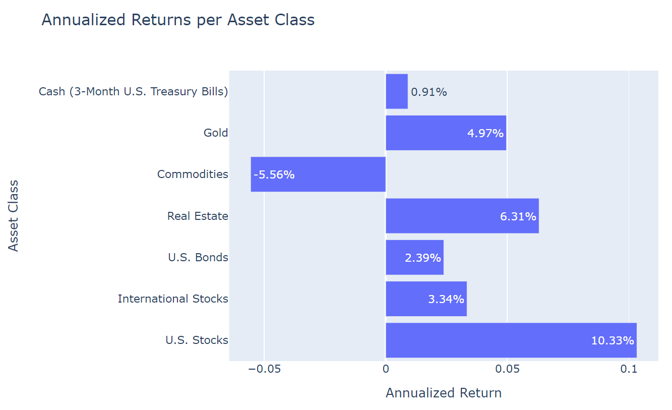
The bar chart visualization can be seen here, showing that on a purely returns-based evaluation, U.S. Stocks and Real Estate far outperformed all other asset classes. Meanwhile, Commodities underperformed for the selected time period.
Visualizing portfolio growth
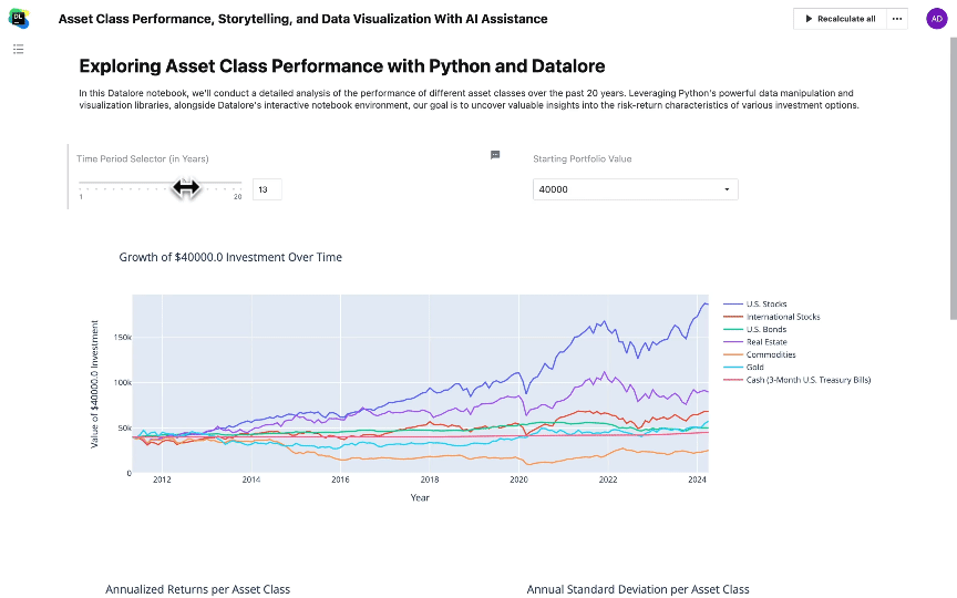
This step focuses on illustrating the growth trajectory of a $100,000 investment across different asset classes over the past 20 years through line charts. These visualizations aim to compare the long-term investment outcomes and highlight the variability in performance between asset classes.
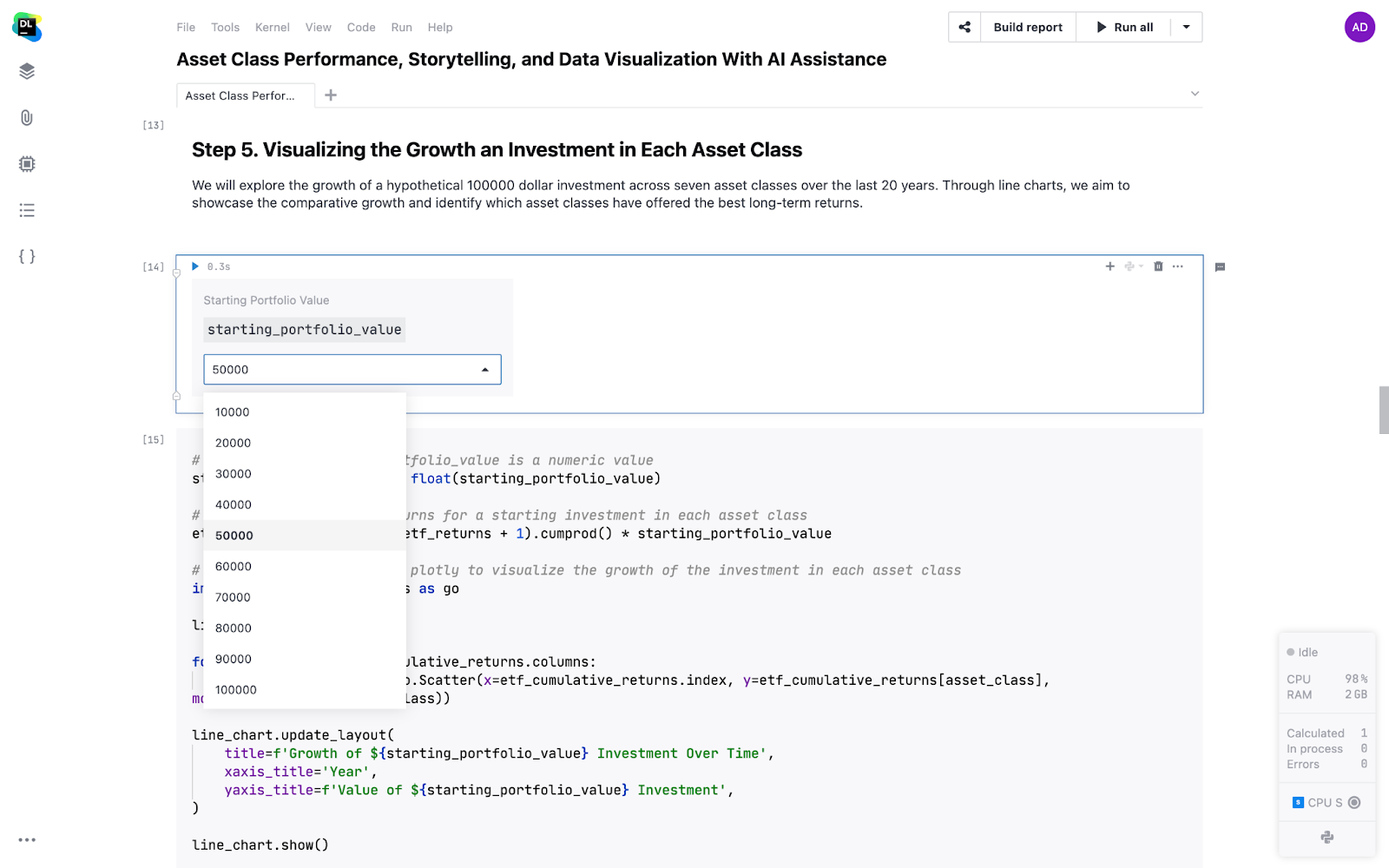
I have created a drop-down list using Datalore that will allow you to select different starting values:
| Prompt for AI |
| Convert the monthly returns of each asset class into annualized returns, store the results in a new DataFrame, and create a horizontal bar chart using Plotly to visualize the annualized returns for each asset class. |
The Datalore AI solved this puzzle with the following code:
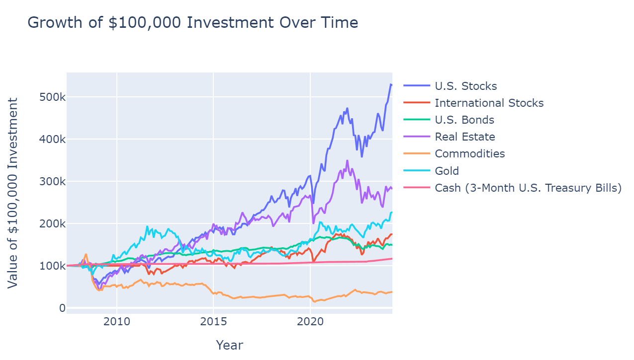
# Calculate cumulative returns for a $100,000 investment in each asset class
etf_cumulative_returns = (etf_returns + 1).cumprod() * 100000

# Create a line chart with plotly to visualize the growth of $100,000 investment in each asset class
import plotly.graph_objects as go
line_chart = go.Figure()
for asset_class in etf_cumulative_returns.columns:
    line_chart.add_trace(go.Scatter(x=etf_cumulative_returns.index, y=etf_cumulative_returns[asset_class], mode='lines', name=asset_class))
line_chart.update_layout(
    title='Growth of $100,000 Investment Over Time',
    xaxis_title='Year',
    yaxis_title='Value of $100,000 Investment',
)
line_chart.show()
Here is the resulting graph that shows the extent to which US Stocks outperformed all other asset classes over the last 20 years, resulting in a portfolio of $100,000 eclipsing $500,000 in value.
Exploring correlations between asset classes with a heatmap
This step aims to understand how different asset classes move in relation to each other by calculating and visualizing their correlations over the past 20 years. A heatmap will be used to represent these correlations, providing a clear visual tool for identifying patterns of co-movement or independence among the asset classes.
| Prompt for AI |
| Calculate correlations between asset classes over 20 years and visualize with a heatmap. |
The following code was generated by Datalore AI:
# Import seaborn and matplotlib's pyplot
import seaborn as sns
import matplotlib.pyplot as plt

# Calculate correlation matrix
correlation_matrix = etf_returns.corr()

# Create a heatmap
sns.heatmap(correlation_matrix, annot=True, cmap='coolwarm', fmt='.2f')

# Display the plot with a title
plt.title('Correlations between Asset Classes over 20 Years')
plt.show()
The following heatmap image is produced, displaying the correlations between asset classes.
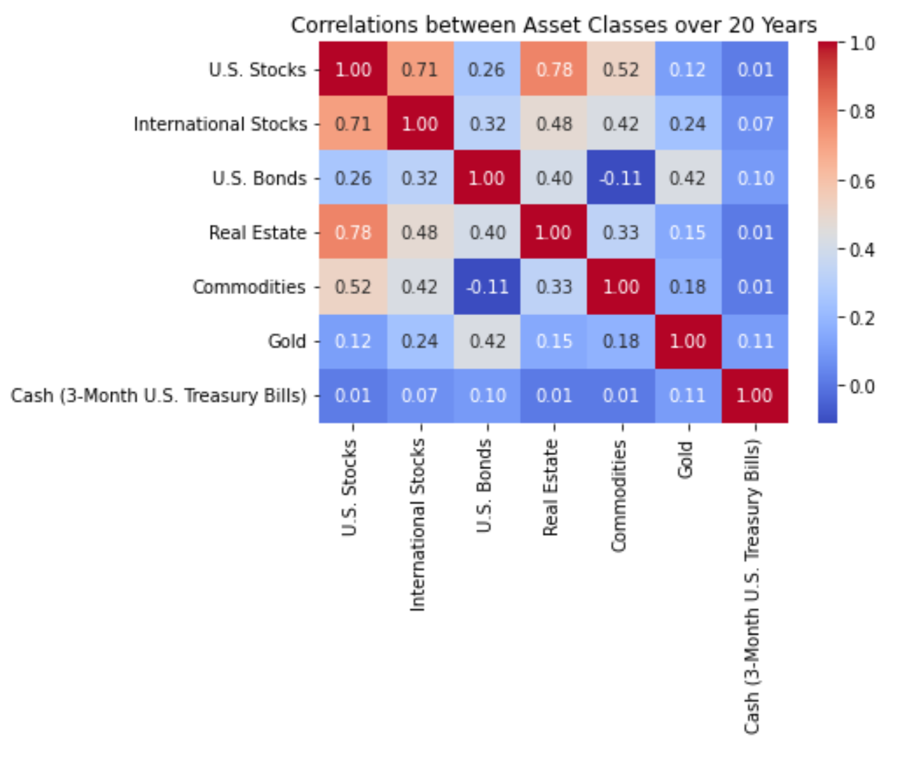
From this heatmap, we can make a few important observations:
- U.S. Stocks are highly positively correlated to both International Stocks and Real Estate.
- Commodities have low negative correlation to U.S. Bonds.
- Gold and 3-Month U.S. Treasury Bills have very little correlation to any other asset class.
Diversifying a portfolio with assets that are either uncorrelated or negatively correlated with one another is beneficial for lowering risk and potentially achieving higher risk-adjusted returns. This diversification strategy leverages the effect of correlations to reduce overall portfolio volatility, helping investors navigate through market uncertainties more effectively. This makes Gold and Cash potentially appealing asset classes despite their relatively lower returns.
Understanding and visualizing risk across asset classes
This combined step aims to quantify and visualize the risk of each asset class by calculating their annual standard deviations over the past 20 years. This measure of volatility will then be represented visually, offering a clear comparison of the risk levels associated with different investment options.
| Prompt for AI |
| Calculate and visualize the annual standard deviation for asset classes over the selected time period. |
The following code wasis generated by Datalore AI:
# Import numpy
import numpy as np

# Calculate annual standard deviations
annual_std_dev = etf_returns.std() * np.sqrt(12)

# Format the annual std devs as percents with two decimal places
annual_std_dev_pct = annual_std_dev.apply(lambda x: '{:.2%}'.format(x))

# Create a bar chart
fig_std = go.Figure(data=[
    go.Bar(x=annual_std_dev, y=annual_std_dev.index, orientation='h',
           text=annual_std_dev_pct, textposition='auto')

])
# Customize plot layout
fig_std.update_layout(
    title='Annual Standard Deviation per Asset Class',
    xaxis_title='Standard Deviation',
    yaxis_title='Asset Class',
    autosize=False,
    width=800,
    height=500,
    margin=dict(l=100),
    bargap=0.15
)

# Display the plot
fig_std.show()
The following bar chart is displayed:
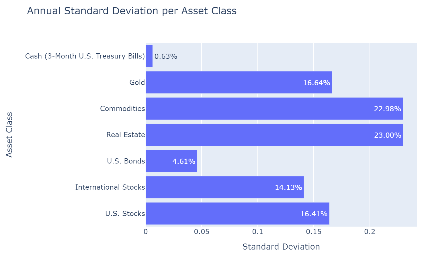
All else held constant, it is preferable for an investment to have lower standard deviation (or volatility). We have found that over the last 20 years, Commodities and Real Estate appear to have the highest standard deviation. This information, paired with the fact that Commodities had low annual return, shows us that Commodities were an under-performing asset class over our selected time period. But we can confirm this intuition, by analyzing the Sharpe ratio of each asset class in the next section.
Assessing performance: the Sharpe ratio of each asset class
This step is dedicated to evaluating the performance of each asset class by calculating their Sharpe ratios over the past 20 years. The Sharpe ratio, a measure of risk-adjusted return, helps investors understand how much excess return they are receiving for the extra volatility endured by holding a riskier asset.
| Prompt for AI |
| Calculate the Sharpe ratios for asset classes over 20 years. Then, create a scatter plot with each point representing an asset class, where the x-axis is the annualized return, the y-axis is the annual standard deviation, and the size of each point is proportional to the Sharpe ratio, highlighting that higher Sharpe ratios indicate better risk-adjusted performance. |
Datalore AI output the code below:
# Import libraries
import numpy as np
import matplotlib.pyplot as plt

# Set risk-free rate
risk_free_rate = 0.02  # assuming a risk-free rate of 2%

# Calculate excess returns for each asset class
excess_returns = etf_returns - risk_free_rate / 12  # we divide by 12 to annualize the risk-free rate

# Calculate Sharpe Ratio
sharpe_ratio = excess_returns.mean() / excess_returns.std()
sharpe_ratio = sharpe_ratio * np.sqrt(12)  # adjust for annualization

# Create scatter plot
plt.figure(figsize=(10, 7))
plt.scatter(annualized_returns, annual_std_dev, c=sharpe_ratio,
            cmap='coolwarm', s=sharpe_ratio*400, alpha=0.6, edgecolors='w')  # sizing points by Sharpe Ratio
plt.colorbar(label='Sharpe Ratio')
plt.xlabel('Annualized Return')
plt.ylabel('Annual Std Dev')
plt.title('Asset Class Performance: Sharpe Ratio, Return & Risk')

# Annotate asset class labels
for i, txt in enumerate(etf_tickers.keys()):
    plt.annotate(txt, (annualized_returns[i], annual_std_dev[i]))
plt.show()
The following visualization is displayed:
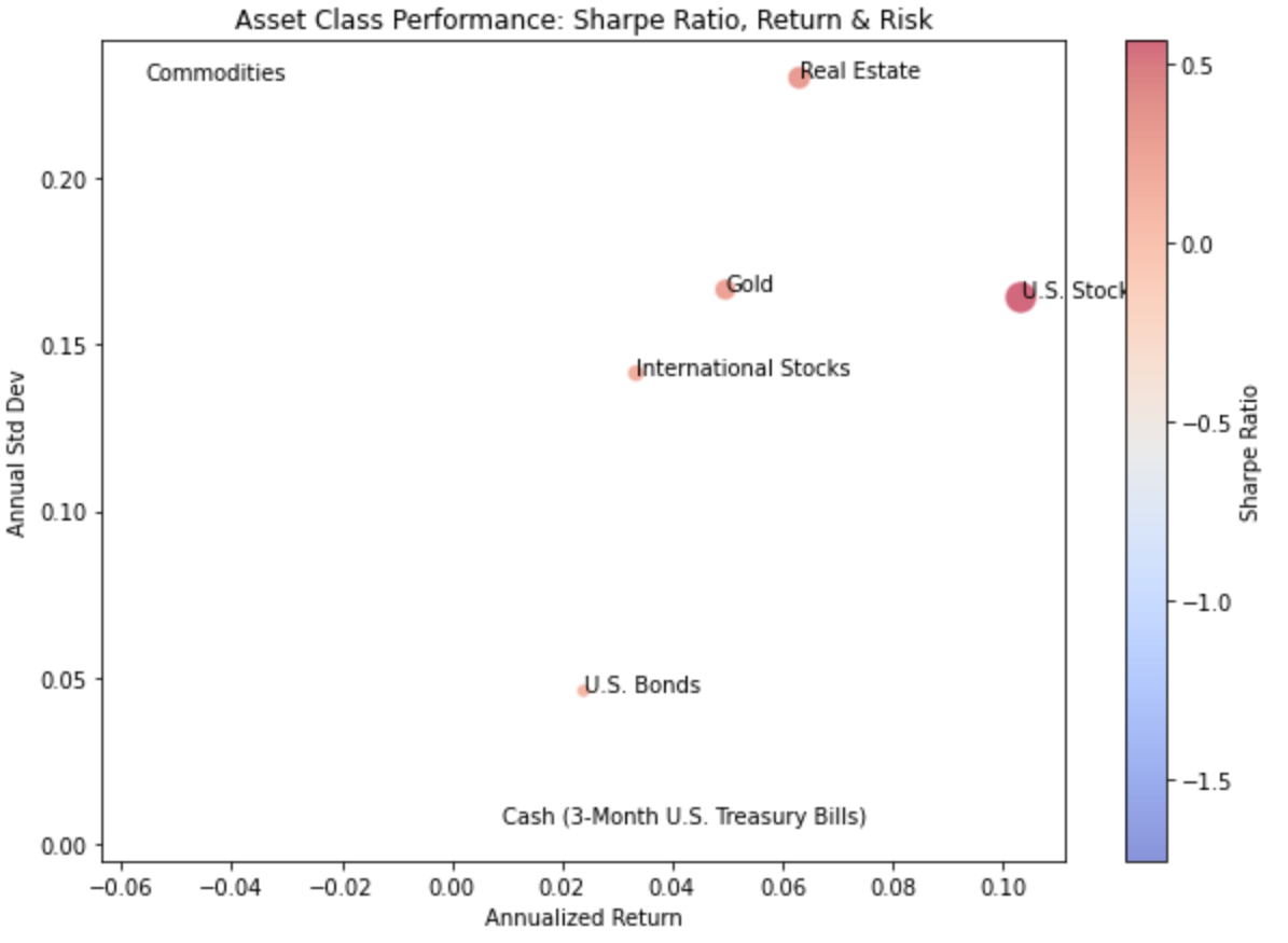
Remember, in our prompt, we told the AI to create the size of the dot in proportion to the Sharpe ratio. From this, we can see that U.S. Stocks had by far the highest Sharpe ratio, followed by Real Estate, and then Gold. Whereas Commodities and Cash had the lowest Sharpe ratios.
Now let’s compare how these asset classes perform in different economic states.
Integrating macroeconomic insights: retrieving key economic indicators
This step involves fetching key macroeconomic data, including inflation rates (CPI and Core CPI), unemployment rate, federal funds rate, 10-year Treasury yield, industrial production, housing starts, and retail sales, using the FRED API. This data will provide a broader economic context to our asset class performance analysis.
| Prompt for AI |
| Fetch monthly economic data from the FRED API, ensuring correct handling of timezone information and avoiding errors related to delisted symbols. Specifically target CPI, Core CPI, unemployment rate, federal funds rate, and 10-year Treasury yield for the lookback period in years selected above. |
The following code was produced using generative Datalore AI:
# Import necessary packages
from pandas_datareader import data as pdr
import pandas as pd

# Define the list of indicators to fetch data for
indicator_list = ['CPIAUCNS', 'CPILFESL', 'UNRATE', 'FEDFUNDS', 'GS10']

# Define a mapping dictionary for the indicator codes to their names
indicator_names = {
    'CPIAUCNS': 'CPI',
    'CPILFESL': 'Core CPI',
    'UNRATE': 'Unemployment Rate',
    'FEDFUNDS': 'Federal Funds Rate',
    'GS10': '10-Year Treasury Yield'

}

# Empty DataFrame to store fetched data
economic_data = pd.DataFrame()

# Iterate over each indicator, fetch data and update DataFrame
for indicator in indicator_list:
    try:
        # Fetch data from FRED API
        series_data = pdr.get_data_fred(indicator, start=start_date, end=end_date)
        # Resample data to monthly frequency, aggregating with mean
        series_data = series_data.resample('M').mean()
        series_data.columns = [indicator_names[indicator]]
        if economic_data.empty:
            economic_data = series_data
        else:
            economic_data = economic_data.join(series_data, how='outer')
    except Exception as e:
        print(f"There was an issue fetching the data for {indicator}: {str(e)}")
print(economic_data)
Unveiling economic influences: correlation heatmap analysis
In this section, we’ll create a visually appealing heatmap to explore the correlations between the monthly returns of the asset classes and key macroeconomic indicators. By merging the asset class returns data with the macroeconomic data from FRED, handling missing values, and focusing on the specific correlations between these two sets of variables, we can gain valuable insights into how economic conditions influence the performance of different asset classes. The heatmap will enable us to identify the strongest relationships between macroeconomic factors and asset classes, providing investors with information to make more informed decisions based on the potential impact of economic conditions on their portfolios.
| Prompt for AI |
| Merge the monthly returns data of the asset classes (etf_returns) with the macroeconomic data from FRED (economic_data) into a single DataFrame. From the merged DataFrame, create a subset of the correlation matrix that only includes the correlations between the asset class returns and the macroeconomic indicators, excluding the correlations within each group. Use Seaborn to create a visually appealing heatmap of this subset of correlations, ensuring proper labeling of the axes and a clear title. Adjust the figure size, colormap, and other visual settings to enhance readability and interpretability. |
The following code was produced by the Datalore AI:
# Merge etf_returns and economic_data into one DataFrame
merged_data = etf_returns.join(economic_data, how='outer')

# Fill NaN values with 0
merged_data.fillna(0, inplace=True)

# Calculate correlation matrix
correlation_matrix = merged_data.corr()

# Select the relevant parts of the correlation matrix
asset_classes = etf_returns.columns
economic_indicators = economic_data.columns
correlation_matrix_subset = correlation_matrix.loc[asset_classes, economic_indicators]

# Create a heatmap using Seaborn
plt.figure(figsize=(10, 8))
sns.heatmap(correlation_matrix_subset, annot=True, cmap='coolwarm', fmt='.2f',
            linewidths=0.5, annot_kws={"size": 10}, cbar_kws={"shrink": 0.8})

# Set the title and labels
plt.title('Correlations between Asset Class Returns and Macroeconomic Indicators')
plt.xlabel('Macroeconomic Indicators')
plt.ylabel('Asset Classes')

# Rotate x-axis labels for better readability
plt.xticks(rotation=45, ha='right')
# Adjust the layout and display the plot
plt.tight_layout()
plt.show()
The following heatmap was displayed, showing the correlations between the various asset classes and economic indicators:
The heatmap of correlations between asset class returns and macroeconomic indicators reveals several interesting insights. One key takeaway is that most asset classes, including U.S. Stocks, International Stocks, U.S. Bonds, and Real Estate, have negative correlations with inflation measures like CPI and Core CPI, as well as with the unemployment rate. This suggests that during periods of rising inflation and unemployment, these asset classes may experience lower returns. Investors should be aware of this relationship and consider adjusting their portfolios accordingly when these economic conditions are present.
Another notable observation is that cash (3-month U.S. Treasury Bills) has the strongest negative correlation with all five macroeconomic indicators among the asset classes analyzed. This implies that cash investments may provide a buffer against the negative impact of rising inflation, unemployment, and interest rates on portfolio returns. However, it’s important to note that while cash may offer stability during challenging economic times, it also typically provides lower long-term returns compared to other asset classes. Investors should carefully consider their investment objectives and risk tolerance when deciding on the appropriate allocation to cash in their portfolios.
Common challenges and pitfalls in financial data
When working with financial data, analysts often encounter various challenges and pitfalls that can impact the accuracy and reliability of their analyses. These issues can range from missing or incomplete data to outliers, inconsistencies, and data formatting problems.
To ensure the integrity of financial data analysis, it’s crucial to address these challenges through proper data preparation and cleaning techniques. Common strategies include handling missing values through imputation methods, removing or adjusting for outliers, standardizing data formats, and cross-referencing data from multiple sources. By implementing these best practices, analysts can minimize the risk of errors and inconsistencies in their financial data, leading to more accurate and meaningful insights.
For a more detailed discussion on how to prepare your dataset for machine learning and analysis, check out this informative article from the Datalore blog.
Data storytelling and reporting for financial analysts
Effective communication of financial analysis insights is just as crucial as the analysis itself. To make your findings accessible and engaging for stakeholders, it’s essential to transform your Jupyter notebook into an interactive, visually appealing report. With Datalore’s Report builder, you can easily create a polished, professional report that allows stakeholders to explore your analysis at their own pace. By selecting key elements from your notebook, such as charts, tables, and text, and arranging them in a logical flow, you can craft a compelling narrative that highlights the most important insights and guides readers through your analysis. The Report builder also enables you to hide complex code, making your report more focused and understandable for non-technical audiences. To learn more about the principles and best practices of data storytelling, we recommend checking out this informative whitepaper. If you’d like to view the executive report for this analysis, click here to access the interactive version created using Datalore’s Report builder.
Final thoughts
In this Python data analysis tutorial, we’ve showcased the power of combining Python’s extensive libraries for financial analysis and data visualization with the user-friendly and AI-assisted Datalore platform. By leveraging tools such as pandas, NumPy, Matplotlib, Seaborn, and Plotly, we conducted a comprehensive analysis of the performance, risk, and relationships of various asset classes over a 20-year period. The interactive nature of Datalore allowed for seamless integration of code, visualizations, and narrative, making it an ideal tool for financial data analysis and storytelling.
Throughout the analysis, we demonstrated how to retrieve and manipulate historical price data, calculate key metrics, and create visually appealing and informative charts and heatmaps. We also incorporated macroeconomic data to provide a more comprehensive view of the factors influencing asset class performance, using a heatmap to identify potential relationships between asset returns and economic indicators. By following best practices and leveraging the capabilities of Python and Datalore, investors and analysts can gain valuable insights, communicate their findings effectively, and make data-driven decisions with confidence in an ever-evolving financial landscape.