

New icons in IntelliJ Platform 2018.2

One of the main goals of all the products we create at JetBrains is to increase our productivity as developers. And we’re ready to go the extra mile to achieve this.
This year IntelliJ IDEA turned 18. Through all these years, the IDE has got lots of nice features, and for many of them, dedicated icons were added. As a result, there are colorful icons all over the interface.
![]() Main toolbar in IntelliJ IDEA 2017.3. Almost all icons have at least two colors and complex shapes.
Main toolbar in IntelliJ IDEA 2017.3. Almost all icons have at least two colors and complex shapes.
Such abundance of color and detail distracts from the main purpose of the IDE – working with code efficiently. To help maintain focus and productivity, a clearer UI was needed.
Two years ago we updated the Project tree icons. We made them flat and systematized the colors.
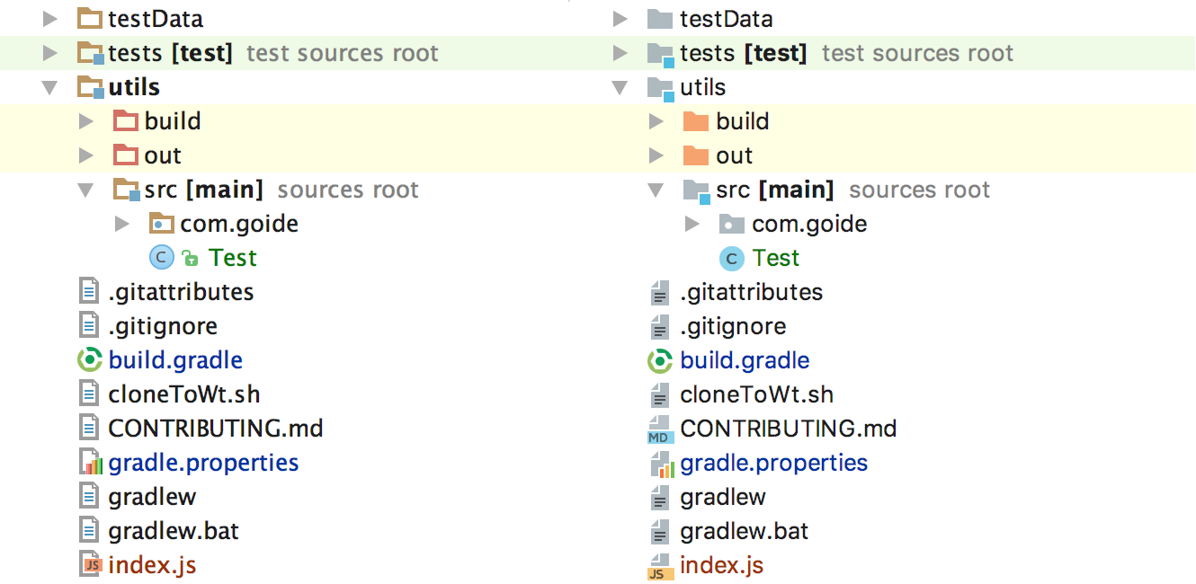
Project tree icons in 2016.2 vs. 2016.3
The next step was then to improve the toolbars. There have been no significant changes in the toolbar structure since the earliest versions. If you compare the main toolbar in the different versions of IntelliJ IDEA, they are pretty similar:
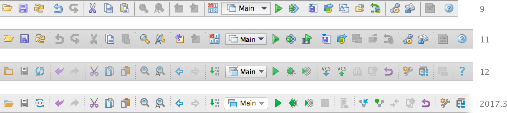 Main toolbar across the different IntelliJ IDEA versions: 9, 11, 12, and 2017.3
Was it still necessary to have so many icons on the toolbars? Do most users actually click all these icons? To answer these questions, we collected usage statistics and used these insights to analyze the toolbars.
![]() Main toolbar in 2017.3, reflecting the statistics of how many users usually click each icon. Green stands for ‘used by the greatest number of users’, while red means ‘used by the least number of users.’
Main toolbar in 2017.3, reflecting the statistics of how many users usually click each icon. Green stands for ‘used by the greatest number of users’, while red means ‘used by the least number of users.’
We identified the icons that were being used by less than 5% of all users, and removed them. These icons will no longer distract the other 95% of users. With fewer icons on the toolbar, it’s also faster to find the one you need.
![]() 2018.1 main toolbar with removed rarely used icons
2018.1 main toolbar with removed rarely used icons
In addition to removing the rarely used icons, we have also redesigned the remaining ones. The toolbar icons had not been updated since 2012 (for 6 years!), looking rather inconsistent and somewhat outdated.
There are about 4,000 unique icons in IntelliJ-based products. Structured and clear guidelines for icons, therefore, was a prerequisite for a redesign. We’ve developed a guide like that, and here are some main points.
1. Style and forms
The common style unites several icons into a set. The unified style makes the icons cohesive and recognizable.
The majority of IntelliJ Platform icons are rather small — 16px x 16px. So we’ve settled on a flat geometric icon style with straight corners and edges. Flat icons work better and remain legible even at small sizes.
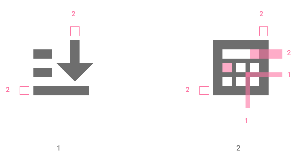
 (1) Flat shapes over complex 3d forms; (2) straight corners over a mix of corners; and
(3) straight lines over curves.
At the same time, we wanted the icons to be simple. Clean and simple icons ensure readability and reduce visual clutter.
 Each icon is reduced to its minimal form, without losing its significance.
The new icon shapes were designed using a grid and keyline shapes. The grid and basic shapes help make the icons visual proportions and placement consistent.
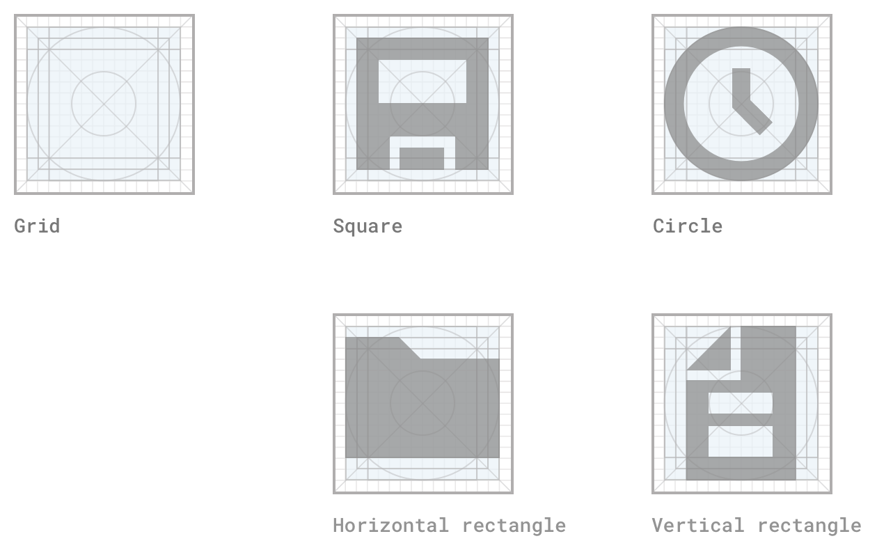
Grid and keyline shapes help make the icons’ visual proportions and placement consistent.
As the main drawing line, we use a 2px stroke. Using the same line weights across icons keeps the icons consistent.
 (1) Consistent stroke width. (2) The thinner stroke can be used for subtle tweaks
to the legibility of an icon and for optical correction.
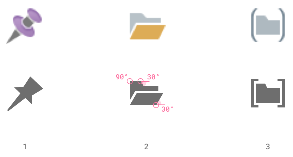
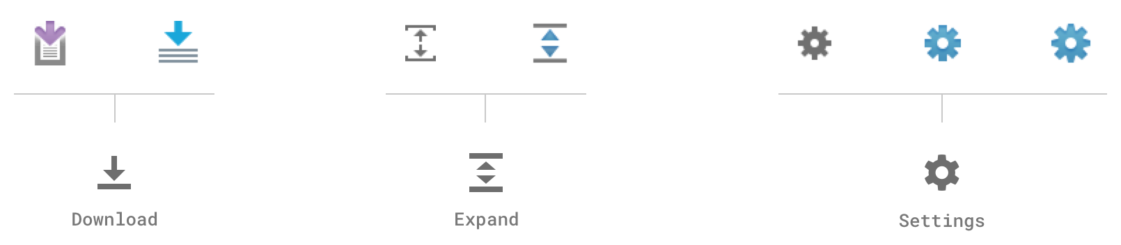
One of the subtasks was to unify a huge variety of arrows.
 Arrow icons, unified. Arrowheads of 90°, 2px body ends in a square stroke.
Orientation: horizontal, vertical, 45° or round.
In the old set, some icons used several versions of the same metaphor, while others had specific metaphors that could be replaced with a more generic one. We worked to unify the metaphors and merge any duplicates.
 Duplicated icons, merged. When similar icons are responsible for the same functions, things get confusing.
2. Colors
Many of the icons from the old set did not follow any guidelines on colors. The color was often just used for decoration.
We’ve rethought how we use color and systematized the color palette. Now, color is always used to convey specific information. For instance, green is used for start actions, and red stands for ‘stop’ or destructive actions.
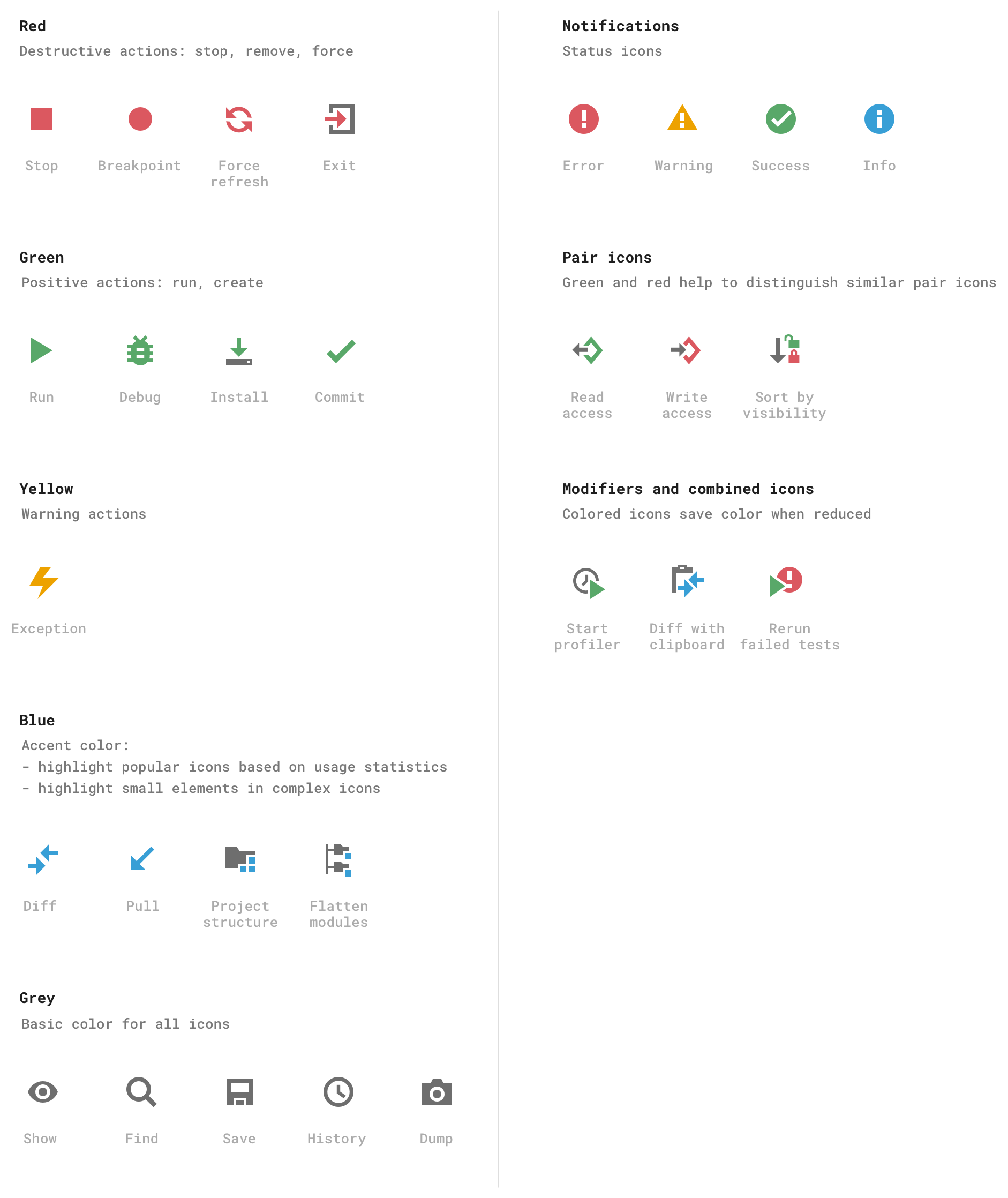
Tool window buttons
The biggest controversy was caused by the tool window button icons. We’ve made all tool window icons grey.
![]() New tool window buttons
New tool window buttons
We reasoned as follows:
- The tool window buttons appear along the whole perimeter of the IDE. The monochromatic icons make the environment less distracting and help you concentrate on the code.
- All primary tool windows are more or less equivalent in terms of usage, so it does not seem that any of them should stand out.
- Using tool window buttons is more about muscle memory: you are likely to remember the button position and just move the mouse to this place.
- Unlike the toolbar icons, tool window buttons have labels to help identify them and their.
We’ve received some feedback about the new tool window icons. Many people inside JetBrains and external EAP users like the new simplified forms of the tool window button icons. However, some users have complained about the lack of color (IDEA-192025).
The color helped them find icons faster, and now it takes more time to read labels. The second problem is that tool windows from some 3rd-party plugins still have colored icons, and they are too bright in comparison to the new grey icons.
Thank you all for the feedback! We are still thinking about what version of icons should be used. If the new icons are not as useful for you, please use the “ToolWindow Colorful Icons” plugin that colors the tool window button icons.
![]() New tool window buttons with the ‘ToolWindow Colorful Icons’ plugin
New tool window buttons with the ‘ToolWindow Colorful Icons’ plugin
We look forward to continuing this dialog and collecting more feedback. We will use your feedback to come up with future plans.
Summary
We have updated many of the icons in the most common toolbars, and we intend to continue these efforts.
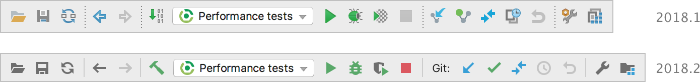 Main toolbars in 2018.1 vs. 2018.2.
A “Git” label was added to help new users find out that Version Control is supported in the IDE.
Organizing the color palette and paying attention to icon shapes helped us make the UI visually simpler. A clear interface now helps minimize distraction from the source code, thus improving your focus and productivity.
Please try the preview of IntelliJ IDEA 2018.2 or other IntelliJ-based IDEs and tell us what you think!
Subscribe to JetBrains Blog updates


