

Datalore
Collaborative data science platform for teams
What Is Ad Hoc Analysis? A Python Example in Datalore
What is ad hoc analysis?
In Latin, ad hoc means “created or done for a particular purpose as necessary”. Accordingly, ad hoc analysis is conducted only once and is designed to answer a specific data question.
Regular reporting vs. ad hoc reporting
For most important business metrics, analysts perform regular reporting. Reports can be generated on a regular basis (daily, weekly, or monthly) and delivered in the form of dashboards, spreadsheets, and email newsletters.
Now, imagine a situation in which we have a new, unique question that our regular analysis and reporting doesn’t cover. We need to dig into the data by conducting a specific ad hoc analysis so we can answer this question and get insights.
How to implement ad hoc analysis with Python
Ad hoc analysis is easier to implement using a programming language, such as Python. Python provides users with many powerful tools for data analysis and data visualization, which nonetheless are easy enough to pick up and be used for ad hoc analysis even by those who don’t have a lot of technical expertise or any knowledge of programming.
Let’s look at an ad hoc analysis example and get visual answers to our question. For this tutorial, we will use the Amazon Data Science Books dataset.
Suppose you want to determine whether there is a connection between a book’s rating and its length. You also want to see whether people tend to buy and review shorter books rather than longer ones. Could it be that readers care more about how long it takes them to finish the book than the content itself? Let’s dig into the data and find out!
Data analysis with Python
To upload the data, we will use Pandas. You don’t need to install Pandas, as it is already pre-configured in Datalore. Datalore is a collaborative data science platform, where you can do analytics in Jupyter notebooks with Python, SQL, R, and Scala.
Open this tutorial in Datalore
Let’s use the following code to upload and examine the data:
import pandas as pd
df = pd.read_csv('final_book_dataset_kaggle.csv')
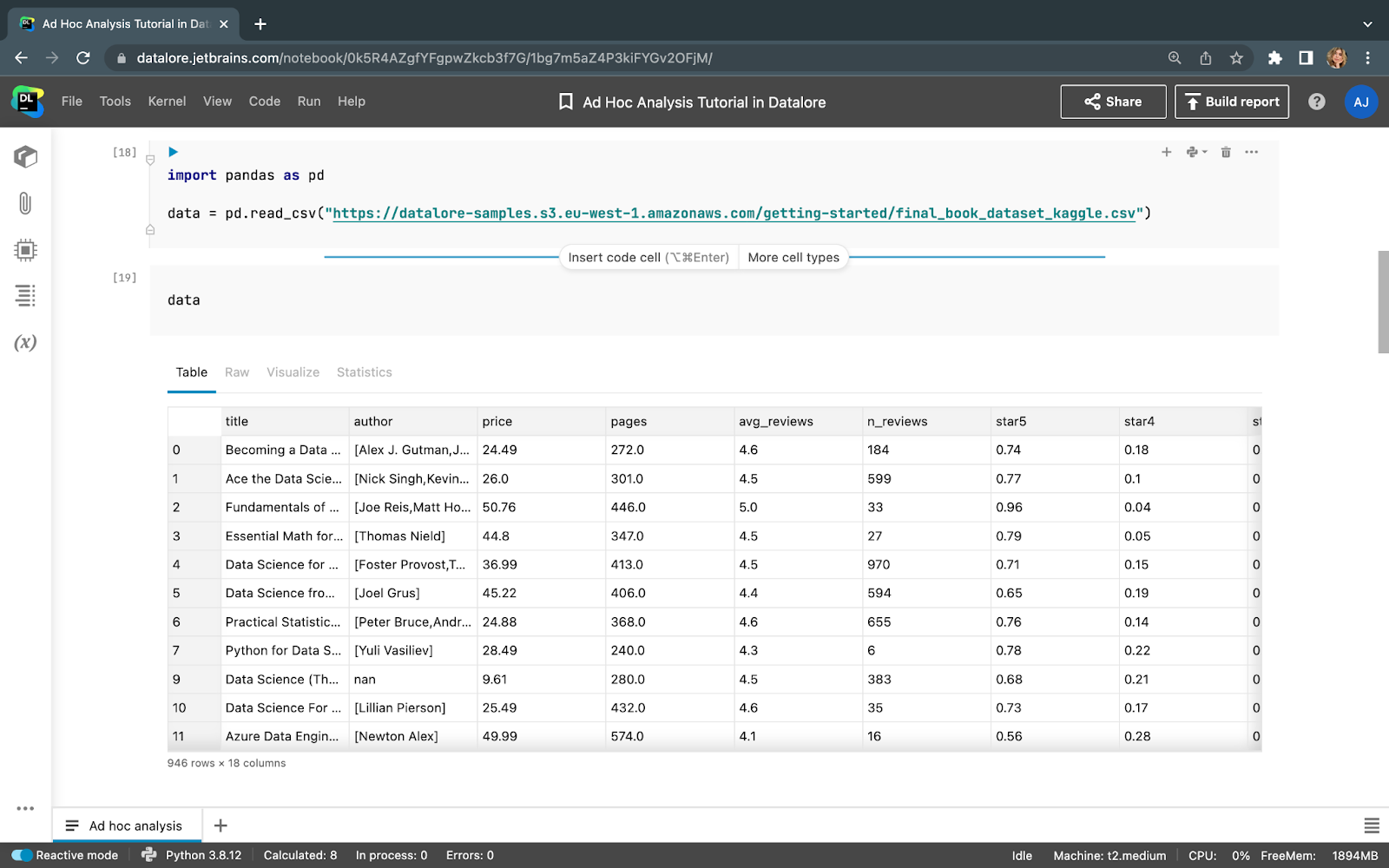
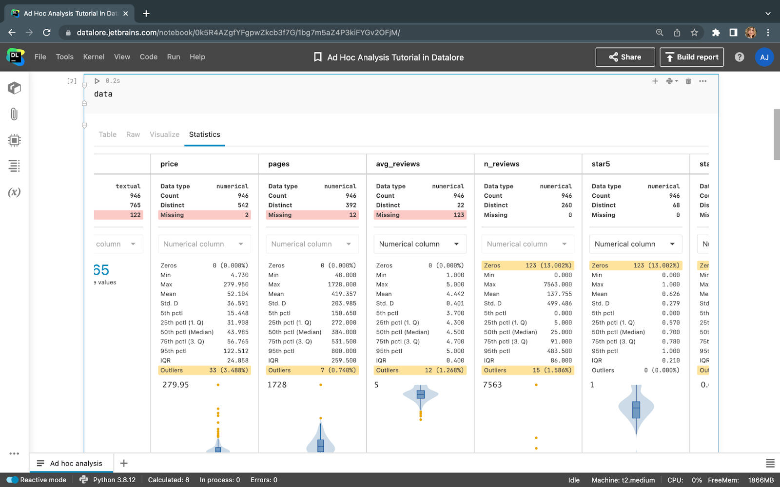
Our dataset consists of 946 rows (books) and 18 columns (features). One of the great things about Datalore is that it can help you understand data without any coding. Let’s open the Statistics tab and get the most important data quality metrics and descriptive statistics.
Here, we can see that there are some missing values in “pages” and “avg_reviews”. That’s a pity, as these two features are valuable for our current analysis. However, the 123 missing “avg_reviews” values make up only 13% of the total, so that shouldn’t affect our conclusions much. The percentage of missing values for “pages” is even smaller. Let’s not fill in these values, as we discussed in our other article about EDA; instead, we’ll just drop the rows with missing values. This can be done with just one line of code:
df.dropna(subset=['avg_reviews', 'pages'], inplace=True)
The data now looks as follows:
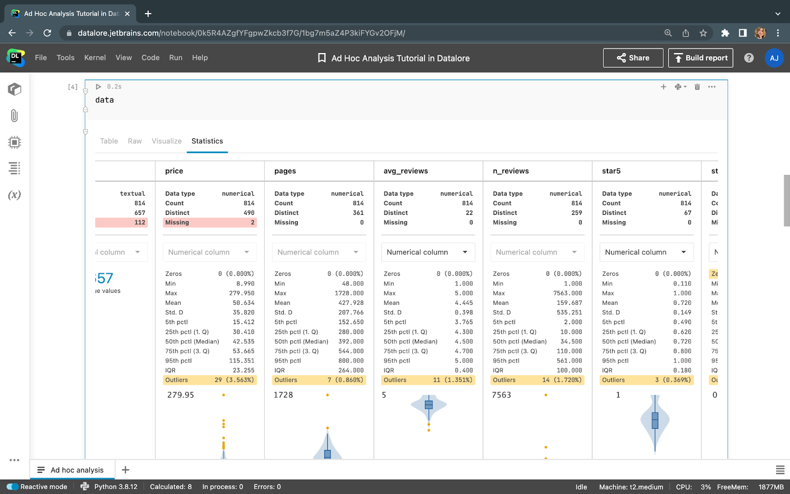
There are no more missing values for “avg_reviews” and “pages”, and we can move on to visualizing the features we’re interested in.
Visualize to analyze
In Datalore, you can get automatic visualizations for dataframes without writing any code to produce point, line, bar, correlation, or area plots. Once your data is uploaded, go to the Visualize tab and choose which values you want to plot.
Let’s choose Point as a Plot type, “pages” for the X axis, and “avg_reviews” for the Y axis. Also, let’s set “n_reviews” as a Color.
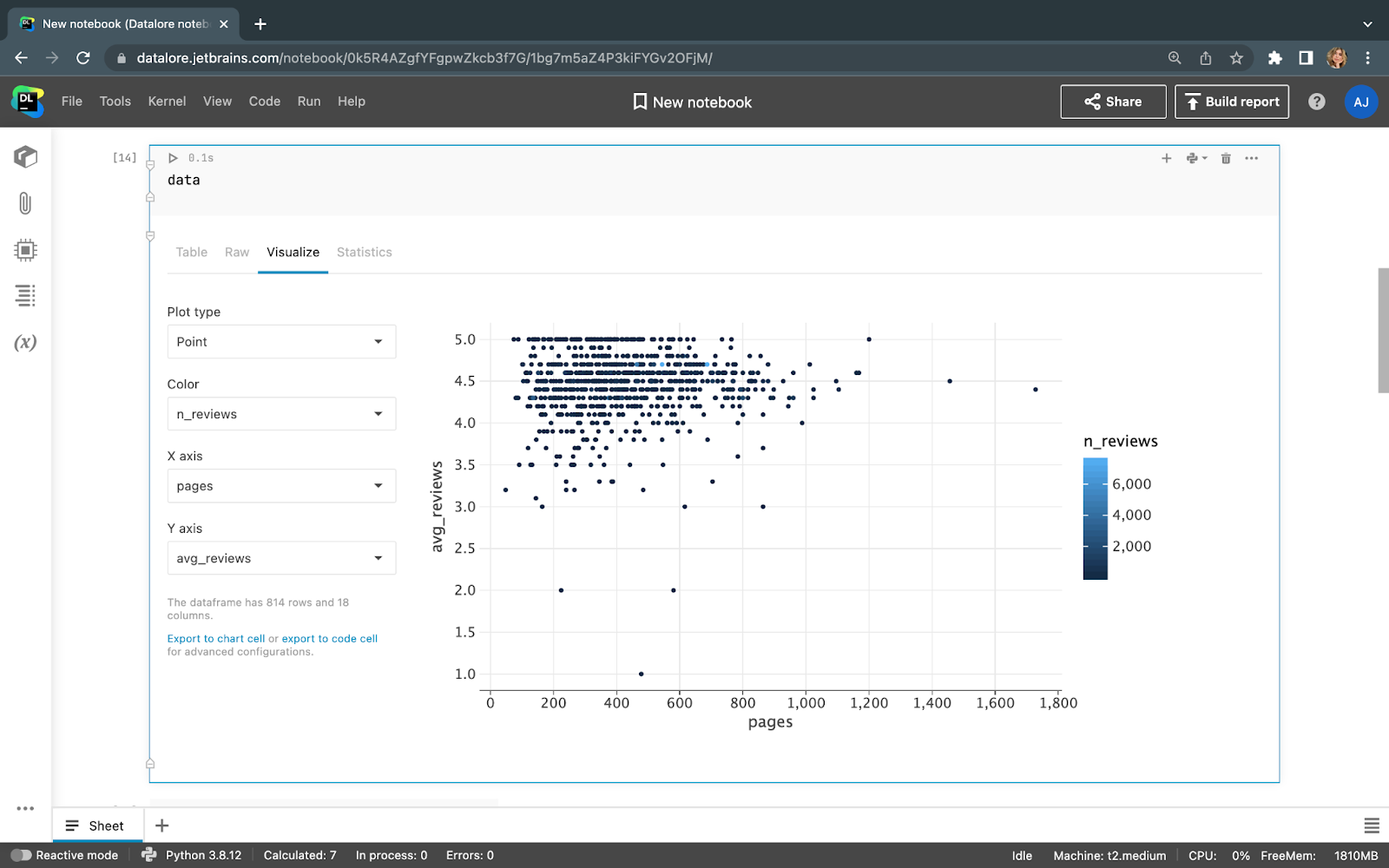
From the first glance at this point plot, we can say that there are more books with a smaller number of pages, and, subsequently, there are more five-star reviews for such books.
Let’s take a look at the correlation plot, which will help us to see whether there’s any significant correlation between “avg_reviews” and other columns. The correlation coefficient between “pages” and “avg_reviews” equals 0.06, which suggests extremely low correlation. There doesn’t appear to be any correlation between “price” and “avg_reviews”, either.
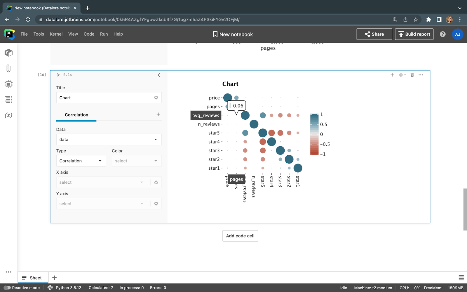
Now we can answer the initial question: The data we’ve seen doesn’t support the claim that people give significantly higher reviews to shorter books. That is the ultimate conclusion of our ad-hoc analysis.
Sharing the insights
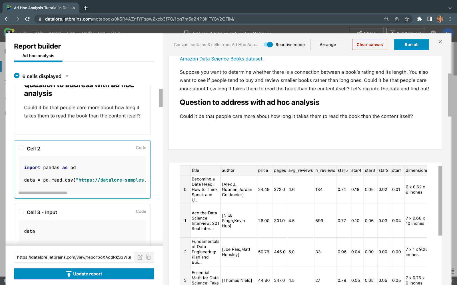
To share this ad hoc analysis with stakeholders, you can publish a Static or Interactive report in Datalore. You’ll be able to hide the intermediate steps and only display the visualization and Markdown descriptions for your audience to see.
Open this tutorial in Datalore
Conclusion
We conducted an ad hoc analysis using basic Python coding and then published a visual report in Datalore. Sharing the insights is as easy as sending the report link to your stakeholders, which they’ll be able to open in their web browsers.


