JetBrains Academy
The place for learning and teaching computer science your way
EduTools Plugin v.4.1 Is Out
The latest EduTools plugin version 4.1 is now ready for you to try! It has improved integration with JetBrains Academy, new features for course creators, and some fresh UX changes.
Start learning with an improved UX
JetBrains Academy: switching between topics, stages, and more
For educators: images for dark themes, and more course publishing options
Start learning with an improved UX
If you have been using the EduTools plugin for some time, you may have noticed that over the last few months we’ve reworked the welcome UI significantly. We’ve been focusing on the first steps that users take to choosing their learning path – we talked to our users, brainstormed with UX designers, and then implemented the best ideas. We’ve strived for a clearer UI and made the first experience when starting easier, though there is still work to be done. EduTools v4.1 also brings with it some fresh new changes.
Reworked info messages
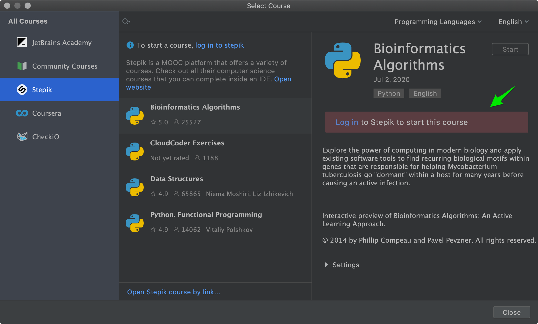
We have reworked the information messages. If you need some extra steps before you can start learning, your IDE will now help you with this:
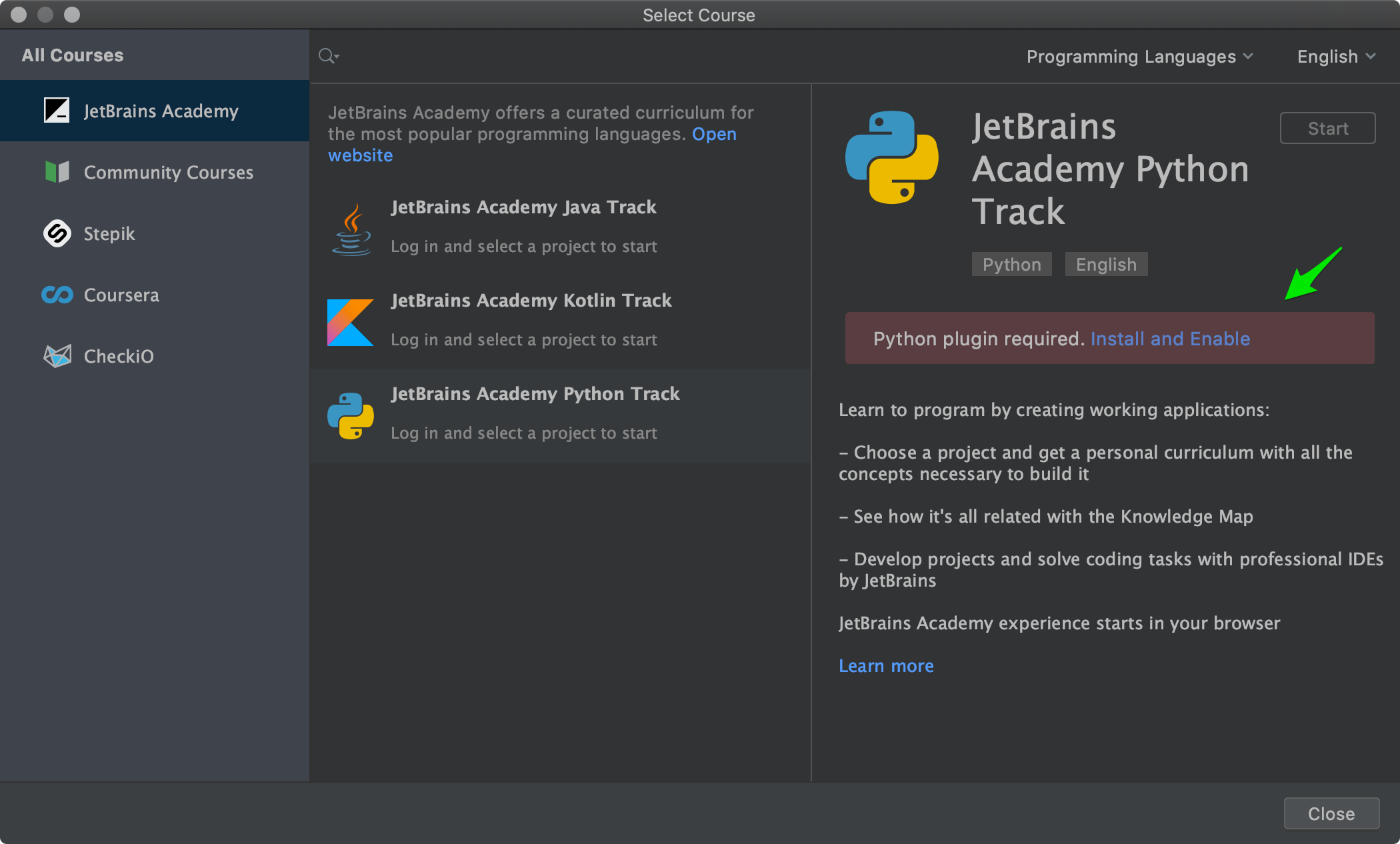
If you’re curious about what major changes are coming in this field, you may want to try out the most recent IntelliJ IDEA EAP 2020.3 with EduTools v4.1. You will find a completely reworked Welcome screen there. We will definitely be writing more about this with the next releases.
JetBrains Academy
Good news for JetBrains Academy students: we now focus on smoother switching between the web and your IDE.
If you’re not yet a JetBrains Academy member, consider registering before October 1 to get 50% off your monthly subscription fee for the next 12 months. Go ahead, sign up today and experience enthralling learning!
Switching between topics, stages, and more
If you have not installed your IDE, or it is not open, there is now a more accurate message warning you about that:

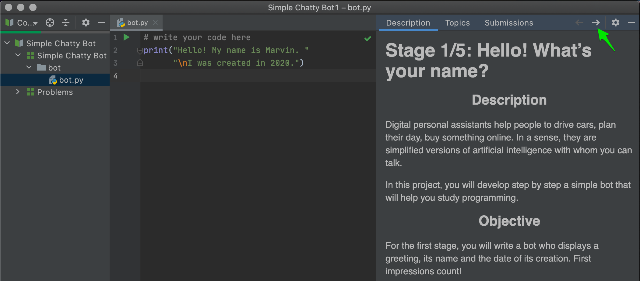
If everything is OK with your IDE, and you’re working on a project stage, please take a closer look at the Task Description panel. We’ve improved the style of the tabs here, and now seems as good a time as any to remind you, that you’re welcome to use those tabs.
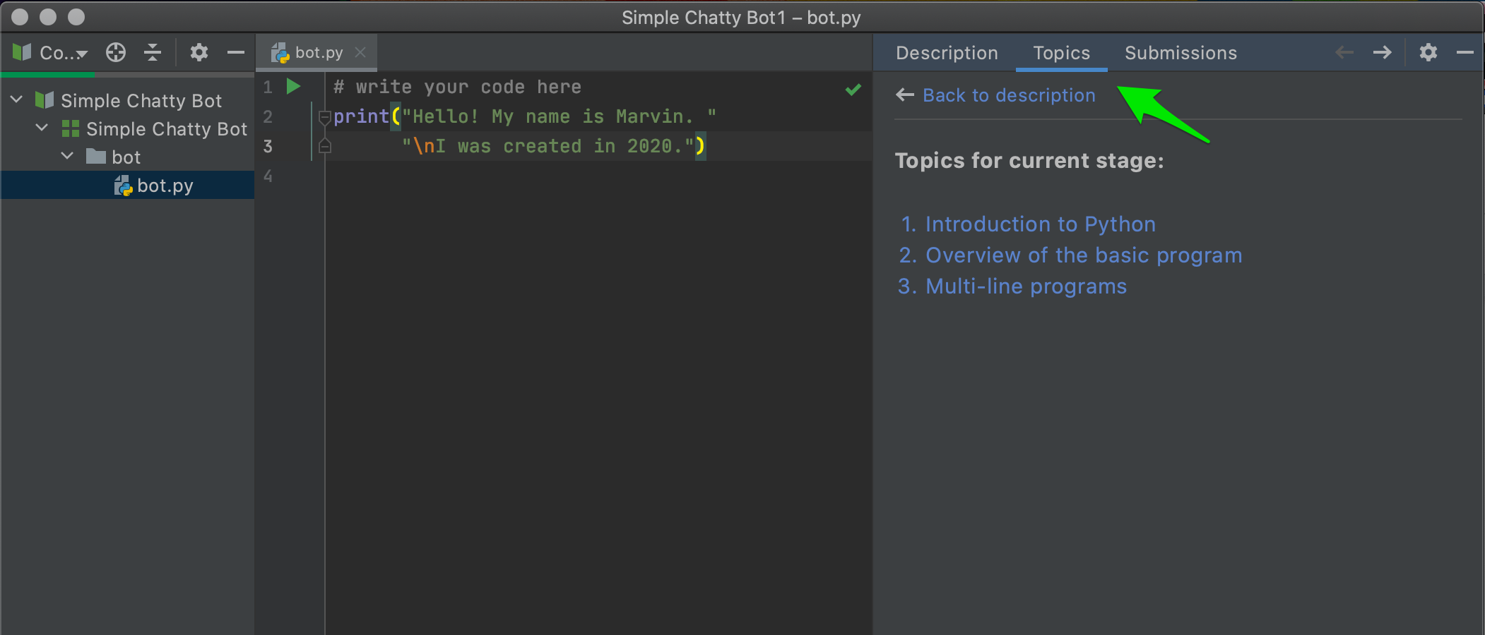
When you are working on a stage of the project, you can find the topics that you may need to know about to complete the stage. With one click you can return to the web and read about a topic:
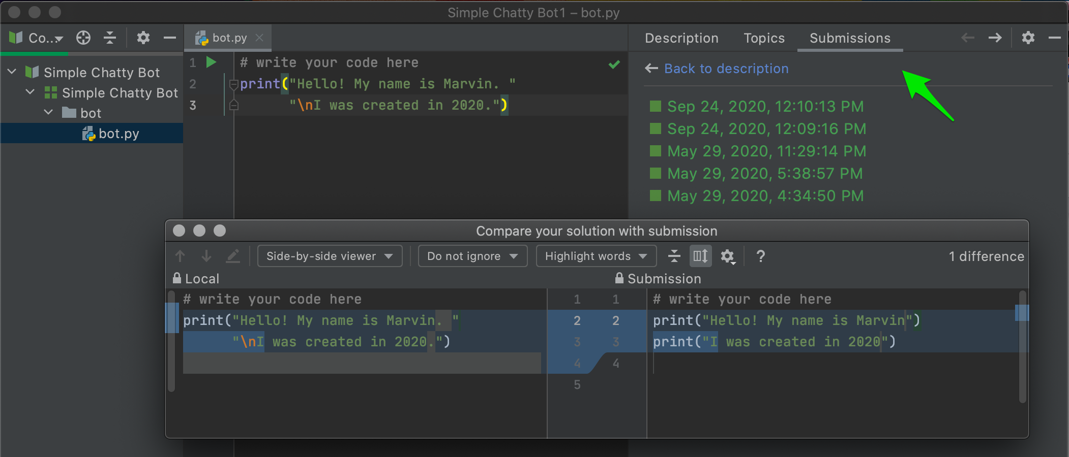
You can also go back to your submissions to reflect on your code:
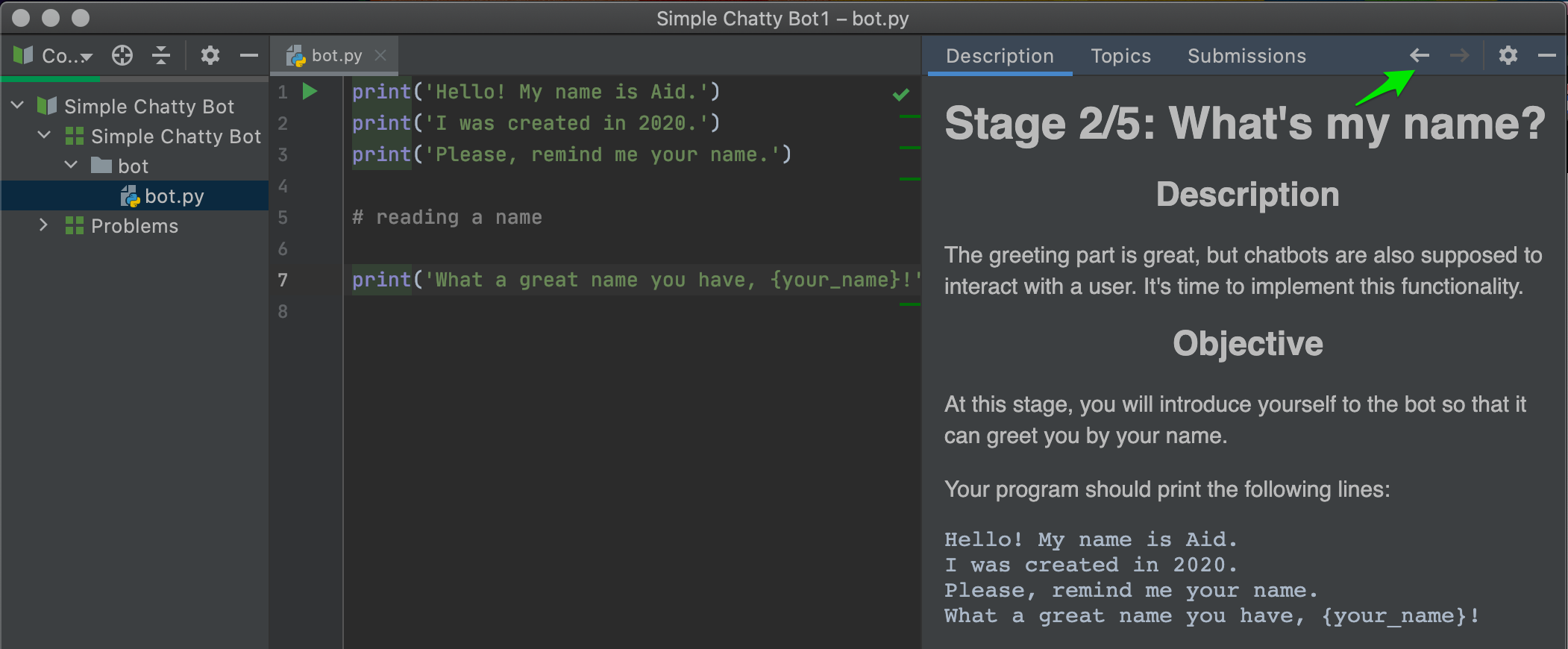
Also, you can always go to solutions from previous stages, and then return to the stage you’re working on:
For educators
Images for dark themes
If you’re an educator and use images in your task descriptions, you may be glad to know that now you can add both dark and light images for your students who prefer light or dark IDE themes.
For local images, please add a light image, and add dark images with a “_dark” postfix:
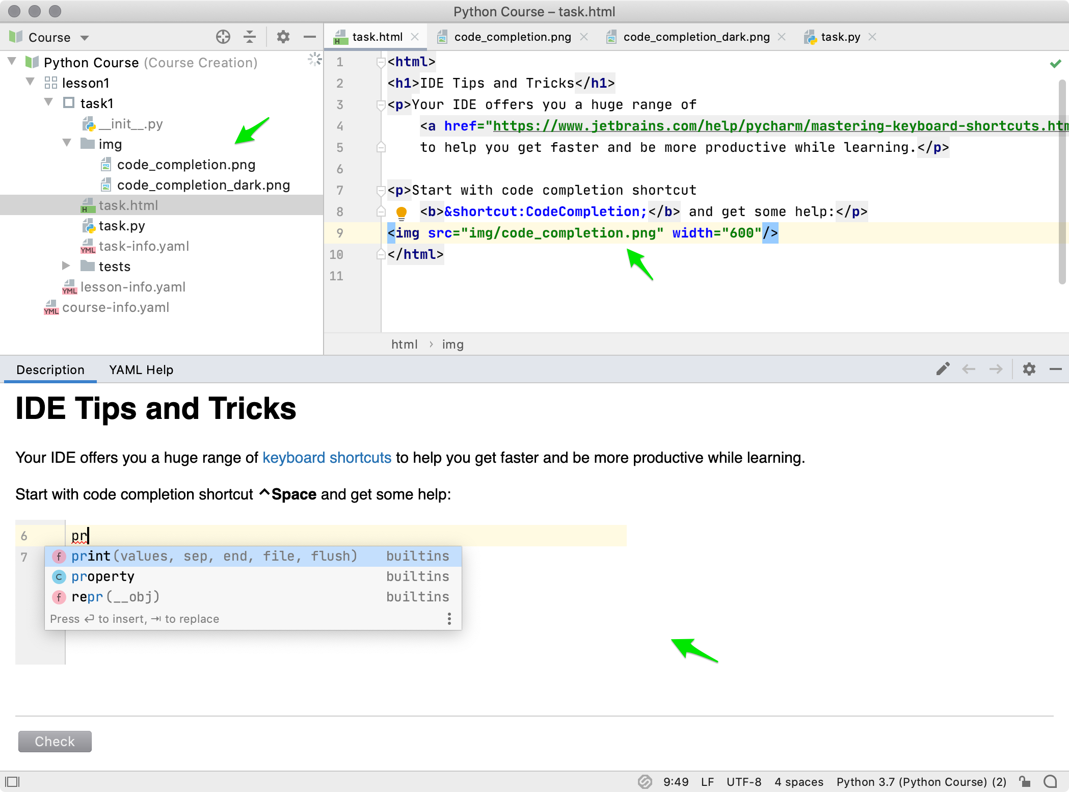
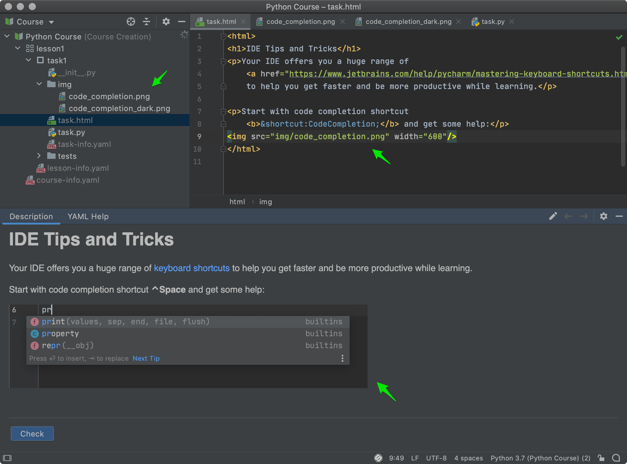
Please note that both images should be stored in one folder and should not be excluded from the course.
For remote images, please use the srcset attribute:
<img class=image-fullsize src=https://light.png srcset=https://dark.png width=400</img>
More course publishing options
You can now also list the files that you don’t want to be a part of your course archive when sharing with your students. Please use a special .courseignore configuration file for that:
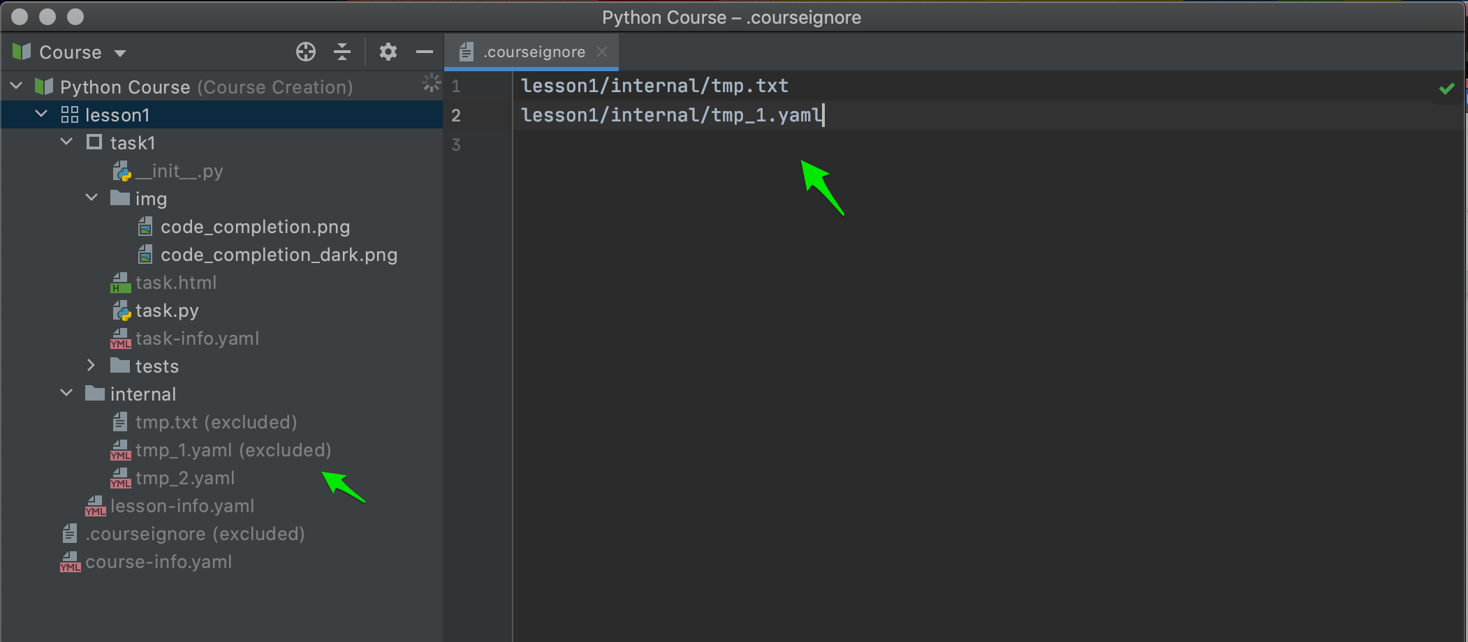
Visit our webhelp for more detailed instructions.
Other improvements include better Codeforces and Stepik integration, and some bug fixes. For the full list of features, improvements, and bug fixes, please see the release notes.
To download the latest versions of IntelliJ IDEA Edu and PyCharm Edu, visit our website, use the Toolbox App, or use a snap package (for Ubuntu).
Please share your feedback here in the comments, on Twitter, or through our issue tracker. We appreciate your thoughts and ideas!
Your Educational Products team
Subscribe to JetBrains Academy updates


