Kotlin
A concise multiplatform language developed by JetBrains
Compose for Desktop: Milestone 4 Released
More desktop UI goodies are coming your way! Milestone 4, the latest version of Compose for Desktop, comes packed with features to help you build even better Kotlin desktop applications with modern, declarative user interfaces based on Google’s modern toolkit.

In this post, we’ll walk you through some of the highlights of this release. They include:
- A new, experimental API for managing windows, dialog boxes, menu bars, and tray icons, now based on the
@Composablemechanism - Support for tooltips
- Better support for pointer events, including access to native events to distinguish between the different mouse buttons
- Text field improvements surrounding undo/redo, as well as selections
- Rendering improvements, including an all-new Metal-based renderer on macOS, and the ability to switch between integrated and discrete video cards for hardware acceleration
For further information, including a selection of bugs that we fixed in this release, have a look at the full changelog. Let’s learn more about these new features!
Composable Window APIs
One of the biggest changes in this milestone release of Compose for Desktop is the introduction of a new experimental set of abstractions for Window, Dialog, MenuBar, and Tray. Unlike their predecessors, these new implementations are all @Composables, meaning they adhere to the same concepts of state management, behavior, and conditional rendering as any other component in your application.
To use these new composable components from the entry point of your application, you can use the application function (or, in the context of a suspending function, awaitApplication):
Please note that these new composable versions require different imports than their predecessors, so you may have to adjust your statements accordingly to try out this new API:
androidx.compose.desktop.Windowbecomesandroidx.compose.ui.window.Windowandroidx.compose.ui.window.v1.Traybecomesandroidx.compose.ui.window.Trayandroidx.compose.ui.window.v1.MenuBarbecomesandroidx.compose.ui.window.MenuBarandroidx.compose.ui.window.v1.Dialogbecomesandroidx.compose.ui.window.Dialog
Being able to use a declarative approach to defining how your windows, dialogs, menu bars and tray icons behave makes it much easier to express your intent and manage the state of your application beyond a single screen. It also allows you to apply what you know about Compose across your whole application.
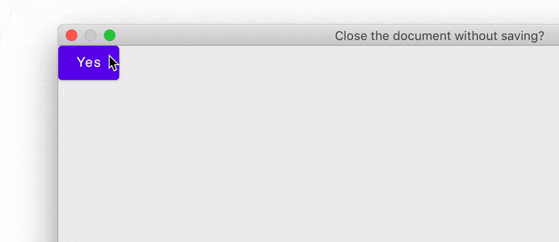
For example, to prompt the user with a confirmation dialog when closing a window, you can use the new APIs to declare a temporary Dialog composable, which is only shown once the user has requested to close the current window:
Likewise, managing properties like the title of a window or the image file for a tray icon can now also be done in a declarative manner – once again delegating the actual state management to the framework:
To get started with these new APIs, check out the updated official Compose for Desktop tutorials for window management and tray management, which describe these new APIs in detail.
We have also created a new sample project called Notepad, which showcases a combination of the features available in the new composable window APIs: creating dialogs, opening additional windows, managing the state of tray icons, and more:

You can explore the source code for this sample project in the repository on GitHub.
We are introducing this new set of APIs as experimental in Milestone 4. We are planning to finalize the design and behavior and use it as the new default in the next version of Compose for Desktop. At that point, we will deprecate the previous approach of managing windows, dialog boxes, menu bars, and trays, in favor of these new composables.
Tooltips
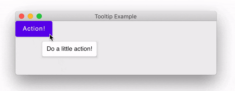
If you want to provide your users with additional information about the behavior of your user interface components, you can now use tooltips – a small information window that displays when the user hovers over an element in your UI. Milestone 4 introduces the BoxWithTooltip component, which allows you to specify hints in the form of a tooltip composable. You can also customize when and where these tooltips should show up: you can specify a delay, or override the offset, which specifies the position at which the tooltip is rendered:
To learn more about tooltips in Compose for Desktop, check out the tutorial in the project’s repository.
Pointer support improvements
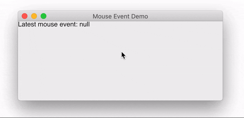
If you need to know which mouse buttons your user has pressed when working with PointerEvents, as provided by the pointerInput modifier, Compose for Desktop M4 now exposes a mouseEvent: MouseEvent property. It contains all the information included in the underlying native Swing event, including for example the pressed button, or which modifiers are pressed:
We are also looking into providing an API that is shared between Compose’s Desktop and Android targets to retrieve which mouse buttons or keyboard modifiers were pressed. We hope to provide such a common abstraction in a future version. If you are interested in this topic, you can follow the discussion in the issue tracker.
Undo, redo, and selection improvements for Text and Text Fields Composables
In Milestone 3, we introduced functionality around undo/redo and selection functionality. In this release, the undo and redo features have been upstreamed, meaning they also work on text related composables in multiplatform applications targeting Jetpack Compose for Android. As previously, undo and redo are supported out of the box, along with the corresponding OS-wide shortcuts. Rolling back and reapplying modifications to a text field is managed by the framework, so no configuration is necessary.
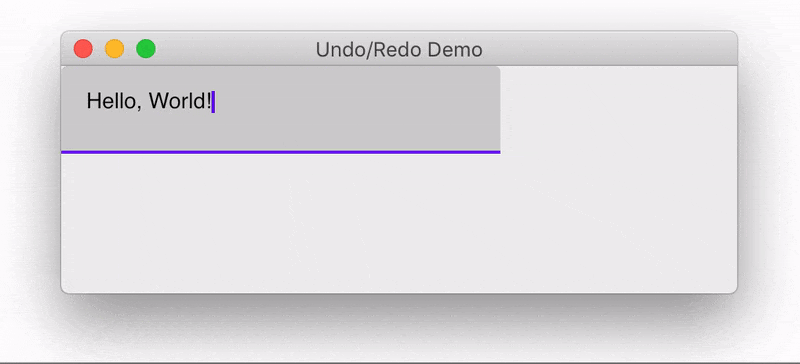
This release also introduces improvements for selecting text with the keyboard and mouse. You can now use the shift key together with the arrow keys to create selections, and use the double and triple click to select a word or line of text:
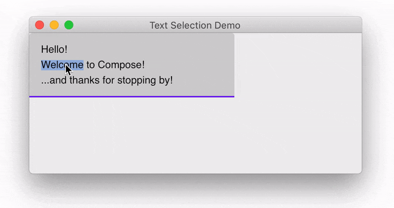
These new ways of selecting text work for TextField composables, as well as Text composables inside a SelectionContainer.
Rendering improvements
Metal renderer for macOS
Starting with Milestone 4, Compose for Desktop will use Apple’s Metal for hardware-accelerated rendering on macOS. This replaces the previous rendering backend based on OpenGL, a technology which is officially deprecated on devices running macOS Mojave 10.14 and above (though these OS versions can still run OpenGL applications). The new Metal rendering API is enabled by default, so no change in your code is required to benefit from this new rendering mechanism.
If you want to explicitly change the renderer used by your application, like the software or OpenGL renderers, you can do so by setting the environment variable SKIKO_RENDER_API or the JVM system property skiko.renderApi to SOFTWARE, OPENGL, or METAL respectively, though this should not be necessary in most cases.
Switching between integrated and discrete video cards
For the Metal and DirectX rendering targets (on macOS and Windows respectively), Compose for Desktop now gives you the option to choose which graphics device should be used to render your user interfaces by adjusting the GPU priority of skiko, the graphics library powering Compose for Desktop. This can be done via the JVM system properties skiko.metal.gpu.priority and skiko.directx.gpu.priority:
autois the default setting, and tries to use the integrated video card by default. If the user has configured their operating system to always use a discrete video card, or it is not possible for skiko to use the integrated video card, the discrete GPU will be used.integratedforces skiko to use the integrated graphics card for rendering Compose for Desktop user interfacesdiscreteforces skiko to use a discrete GPU for rendering.
Version updates
This milestone release also comes with all-around updates for the underlying dependencies. Compose for Desktop M4 is built with and supports Kotlin 1.5, and the Compose Gradle plugin now supports Gradle 7. In light of the sunsetting of Bintray / JCenter, we have also made sure that all dependencies are now provided on Maven Central, helping to further future-proof this version of Compose for Desktop.
Try out Milestone 4!
As with the previous versions, we hope you’ll give Compose for Desktop Milestone 4 a try! You can find up-to-date information about how to get started in the Getting Started section of the Compose for Desktop tutorials.
If you have used previous versions of Compose for Desktop, updating to this latest version is as easy as adjusting the plugins block of your application:
Please note that Compose for Desktop M4 requires Kotlin 1.5.0 or higher.
Pre-release notes
This is the fourth milestone release of Compose for Desktop, and we will continue to work hard to provide you with the best experience possible. Please keep in mind that some of the APIs provided by Compose for Desktop may still change before a stable release. We are quickly progressing toward the first stable, production-ready release, and continue to rely heavily on your feedback to help us achieve this.
Give feedback and join the discussion!
Your feedback is particularly important during Milestone releases because it allows us to fix critical issues or include additional features before the stable release. Should you encounter any problems while working with Compose for Desktop, or identify any use cases that are not yet covered by our desktop-specific APIs, please share them with us in the project’s issue tracker.
If you want to talk to other developers and team members, we also invite you to join the discussion on the Kotlin Slack. In #compose-desktop you can find discussions about Compose for Desktop, and in #compose you can discuss general topics involving Compose and Jetpack Compose on Android.
We look forward to seeing your next user interfaces built with Compose for Desktop!
See also
- Compose for Desktop: Milestone 3 Released
- Compose for Desktop: Milestone 2 Released
- Compose for Desktop: Milestone 1 Released
- Technology Preview: Jetpack Compose for Web


