Remote Development on Raspberry Pi: Analyzing Ping Times (Part 2)

Last week we created a script that records ping times on a regular basis. We developed the script remotely on a Raspberry Pi, and then added it to Cron to make sure that times are recorded every 5 minutes into a PostgreSQL database.
This week we’ll work on visualizing the data we’ve recorded. For this we’ll create a basic Flask app where we use Matplotlib to create a graph. Furthermore, we’ll take a look at some cool PostgreSQL features.
Let’s see some results
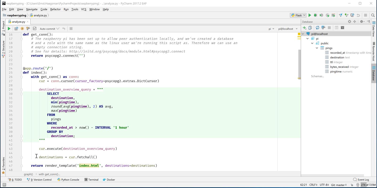
It’s no good to just record pings if we can’t see some statistics about them, so let’s write a small Flask app, and use matplotlib to draw a graph of recent ping times. In our Flask app we’ll create two routes:
- On ‘/’ we’ll list the destinations that we’ve pinged in the last hour with basic stats (min, average, max time in the last hour)
- On ‘/graphs/<destination>’ we’ll draw a graph of the pings in the last 3 hours
The first route is simple, we just execute a query to get the data we’re interested in, and pass that to the template. See the full code on GitHub. Let’s make sure that everything works right by putting a breakpoint on the call to render_template:
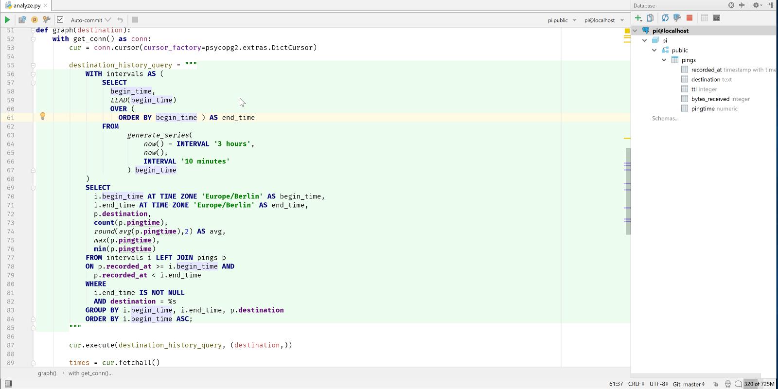
The graph route is a lot more complex, first we have to get the ping averages for the past three hours in reasonably sized bins (let’s say 10 minutes), and then we have to draw the graph.
To obtain those binned ping times, we could either get all times from the past three hours, and then use a scientific python library to handle the binning. Or we could write a monster SQL query which does everything for us. As I’ve recently read a book about PostgreSQL and got excited about it, I chose the second option.
Querying the Data
So the data we’re looking for is:
- For each 10 minute period in the last 3 hours
- Get the minimum, average, and maximum ping time to a specified destination
The first part makes this a fairly complex query. Even though PostgreSQL has support for intervals, date ranges, and a way to generate a series of dates, there is no way to generate a series of ranges (that I know of). One solution to this problem is a common table expression (CTE), this is a way to execute a subquery which you can later refer to as if it were a real table.
To get a series of timestamps in over the last three hours in 10 minute intervals is easy:
select begin_time from generate_series(now() - interval '3 hours', now(), interval '10 minutes') begin_time;
The generate_series function takes three arguments: begin, end, and step. The function works with numbers and with timestamps, so that makes it easy. If we wanted pings at exactly these times, we’d be done now. However, we need times between the two timestamps. So we can use another bit of SQL magic: window functions. Window functions allow us to do things with rows before or after the row that we’re currently on. So let’s add end_time to our query:
select
 begin_time,
 LEAD(begin_time) OVER (ORDER BY begin_time ASC) as end_time
from generate_series(now() - interval '3 hours', now(), interval '10 minutes') begin_time;
LEAD takes the value of the next row in the results, as ordered in the way specified in the over clause. You can use LAG to get the previous row in a similar way. So now we can wrap this query with WITH intervals as ( … query goes here … ) to make it a CTE. Then we can join our pings table and get the results we’re looking for:
WITH intervals AS (
   SELECT
     begin_time,
     LEAD(begin_time)
     OVER (
       ORDER BY begin_time ) AS end_time
   FROM
         generate_series(
             now() - INTERVAL '3 hours',
             now(),
             INTERVAL '10 minutes'
         ) begin_time
)
SELECT
 i.begin_time AT TIME ZONE 'Europe/Berlin' AS begin_time,
 i.end_time AT TIME ZONE 'Europe/Berlin' AS end_time,
 p.destination,
 count(p.pingtime),
 round(avg(p.pingtime),2) AS avg,
 max(p.pingtime),
 min(p.pingtime)
FROM intervals i LEFT JOIN pings p
ON p.recorded_at >= i.begin_time AND
 p.recorded_at < i.end_time
WHERE
 i.end_time IS NOT NULL
 AND destination = %s
GROUP BY i.begin_time, i.end_time, p.destination
ORDER BY i.begin_time ASC;
Now you might think “That’s nice, but won’t it be incredibly slow?”, so let’s try it out! If you don’t see the ‘execute’ option when you right click an SQL query, you may need to click ‘Attach console’ first to let PyCharm know on which database you’d like to execute your query:
At the time of writing, my pings table has about 12,500 rows. And this query takes about 200-300ms. Although we could say that this is acceptable for our use case, let’s have a look at how we could speed this up. To see if there’s a way to improve the query, let’s have a look at the query plan:
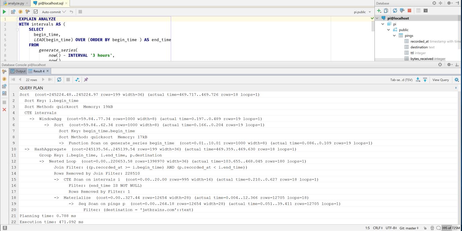
EXPLAIN ANALYZE shows us both how PostgreSQL decided to retrieve our results, and how long it took. We can see that the query took 471 ms. This is a bit painfully slow, and in the query plan we can see why: there’s a nested loop, and then a sequential scan. This means that for each of the 18 time buckets (6 buckets per hour, 3 hours), we do a full table scan. Right now the table fits in memory, so we first load the table in memory, and then we scan it 18 times in memory (you can see loops=18 on the materialize node). Imagine how slow this will be after the Pi collected a year’s worth of pings.
We can improve though, we’re querying our pings by the recorded_at column, using a ‘>=’ and a ‘<’ operator. A standard B-tree index supports these operations on a timestamptz column. So let’s add an index:
CREATE INDEX pings_recorded_at ON pings(recorded_at);
Now let’s look at the output of EXPLAIN ANALYZE again:
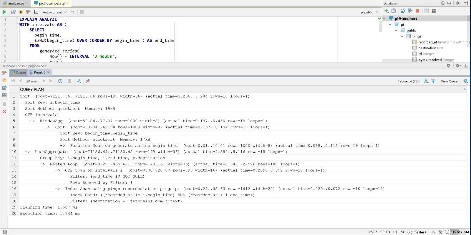
5.7ms: much better.
Graphing the Data
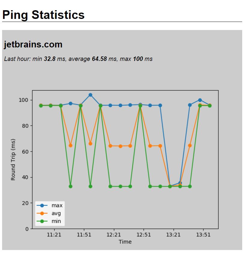
After getting the data, matplotlib is used to generate a line graph with lines for the minimum, average, and maximum ping time per bin. Matplotlib makes it easy to plot time-based data using the plot_date function.
When the plot is ready, it’s ‘saved’ as a PNG to a StringIO object, which is then used to create an HTTP response. By setting the content_type header to image/png, everything is arranged.
So let’s take a look at the final result:
If you want to see the full code, check out analyze.py on GitHub.
Querying the Data with Pandas
If the query above is a little much for you, you can achieve the same results with a couple of lines of code using the Pandas library. If we’d like to use Pandas, we can use a simple query to obtain the last three hours of pings, and then use the resample method to place the times in 10-minute buckets.
Important: To load PostgreSQL data into a Pandas dataframe, we need to have SQLAlchemy installed as well. Pandas needs SQLAlchemy for all database engines except SQLite.
Then we can do the same as with the SQL query, and use Matplotlib to plot it:
@app.route('/pandas/<destination>')
def pandas(destination):
    engine = create_engine('postgres:///pi')

    with engine.connect() as conn, conn.begin():

        data = pd.read_sql_query("select recorded_at, pingtime from pings where recorded_at > now() - interval "
                                 "'3 hours' and "
                                 "destination='jetbrains.com'; ", conn)

    engine.dispose()

    df = data.set_index(pd.DatetimeIndex(data['recorded_at']))

    # We have this information in the index now, so let's drop it
    del df['recorded_at']

    result = df.resample('10T').agg(['min', 'mean', 'max'])

    fig = Figure()
    ax = fig.add_subplot(111)

    ax.plot(
        result.index,
        result['pingtime', 'max'],
        label='max',
        linestyle='solid'
    )

    ax.plot_date(
        result.index,
        result['pingtime', 'mean'],
        label='avg',
        linestyle='solid'
    )

    ax.plot_date(
        result.index,
        result['pingtime', 'min'],
        label='min',
        linestyle='solid'
    )

    ax.xaxis.set_major_formatter(DateFormatter('%H:%M'))

    ax.set_xlabel('Time')
    ax.set_ylabel('Round Trip (ms)')
    ax.set_ylim(bottom=0)

    ax.legend()

    # Output plot as PNG
    # canvas = FigureCanvasAgg(fig)
    png_output = StringIO.StringIO()

    # canvas.print_png(png_output, transparent=True)
    fig.set_canvas(FigureCanvasAgg(fig))
    fig.savefig(png_output, transparent=True)

    response = make_response(png_output.getvalue())
    response.headers['content-type'] = 'image/png'
    return response
Now let’s have a look at what’s faster, the large SQL query, or a simple SQL query and Pandas. Pandas uses Numpy for math, which is largely written in native code for high performance. We add the code to get the appropriate data in both ways to benchmark.py, creating two functions: get_with_sql() and get_with_pandas(). We can use the Python standard library’s timeit function to run the methods 1000 times, and then get the total time it took to execute the function.
Let’s open the Python console, and take a look: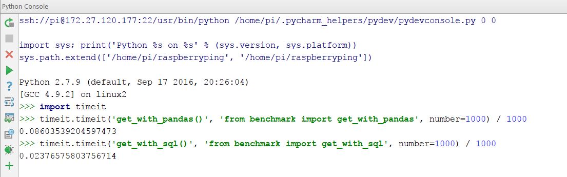
In other words: using Pandas it takes about 86ms to obtain the data, and with the large SQL statement it takes under 24ms. In other words: Pandas takes 262% longer. We’ve found that with a larger dataset this gap widens further.
In this specific case, it takes about 800ms to generate the graph, with the vast majority of that time taken by Matplotlib. So if we were really looking to improve performance, we’d hand off charting to a JavaScript library and just provide the data as a JSON object from the server.
Final Words
While working on this blog post, there have been a couple of times that I forgot that I was working on a remote computer. After setting up the remote interpreter, PyCharm handles everything in the background.
As you can see, PyCharm makes developing code for a remote server very easy. Let us know in the comments what projects you’re interested in running on remote servers! We’d also appreciate your feedback about SQL, let us know if you’d like to see more SQL content (or less of course) in further blog posts!