Space
The intelligent code collaboration platform
Space and SpaceCode will be discontinued on June 1, 2025. Learn more → →
Bringing the Dark Theme to Space
Whether you tend to the light side or the dark side, Space now supports both themes!
While the dark theme has already been available on mobile devices, with this update you can switch to the dark theme in Space on all your devices and apps. These include the web version, the iOS and Android mobile apps, and all desktop apps – Windows, macOS, and Linux.
Whenever you’re working in the dark, or even if you just want to turn the lights down, this update allows you to give your eyes a rest. The dark theme also benefits anyone with low vision or who combats insomnia by reducing blue light before bed. On top of that, the dark theme makes your screen look way cooler and way more mysterious, right?
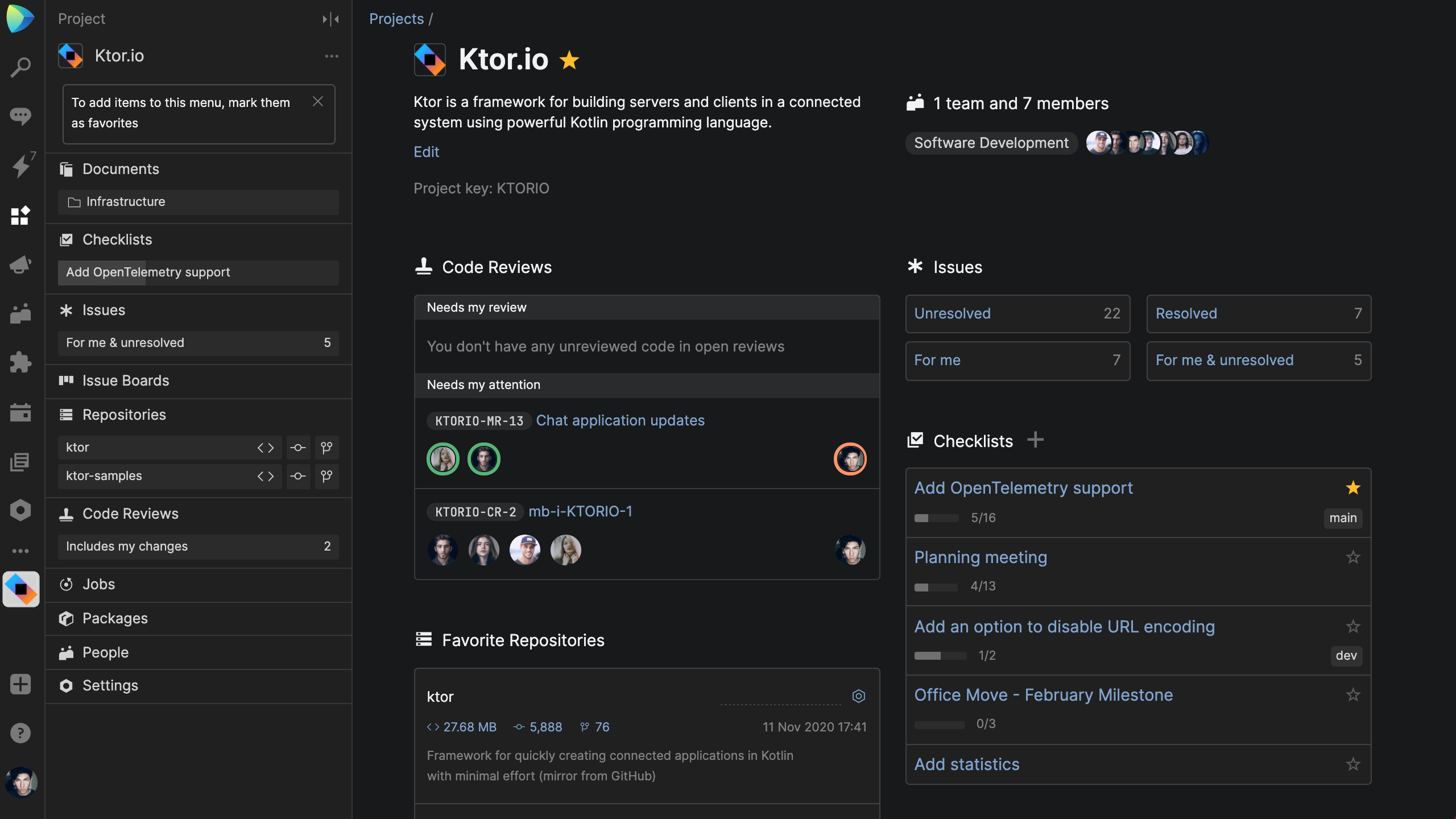
In this blog post, we’ll look at how to turn on the dark theme, and give you a behind-the-scenes look at how this feature was implemented.
How to Enable the Dark Theme in Space
On web and desktop applications
To manage your Space theme in the web and desktop apps, click on your profile picture, go to My Profile | Workspace, and select the theme.
You can either:
- Enable the Light Theme
- Enable the Dark Theme
- Set the Dark Theme to turn on or off automatically
The last option automatically adjusts your Space theme throughout the day to keep it in alignment with your OS settings. On macOS, the dark mode can be enabled via System Preferences | General | Appearance, and the process of turning it on is similar on other operating systems.
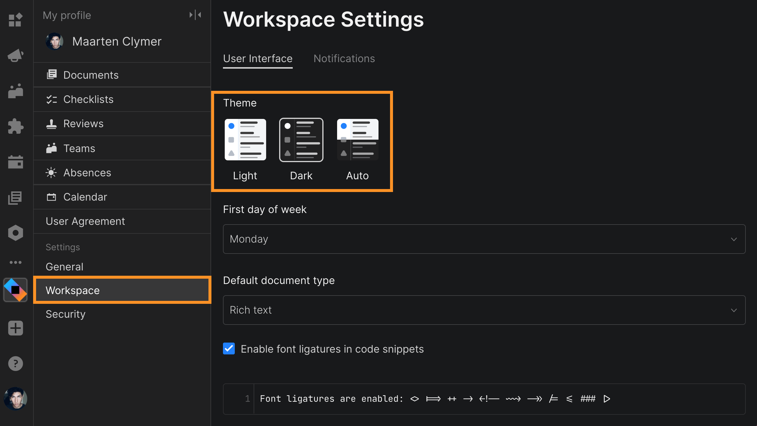
In the Workspace settings, you can also manage the accent color that is applied when the dark theme is inactive. You can choose to have your sidebar in blue, black, or white.
On mobile applications
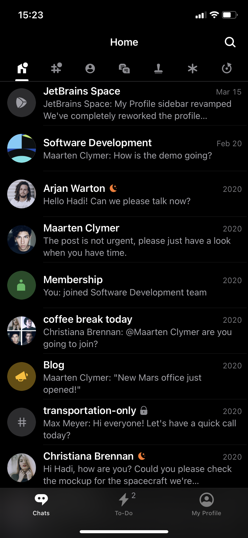
To manage the Space theme on your mobile app, you need to enable the system-wide dark mode on your device.
If you enable the automatic dark mode on Android or iOS, then the Space mobile app will switch to the dark theme at sunset or at a specific time, depending on your device settings.
On iOS
- Go to Settings.
- Tap Display & Brightness.
- Select Dark.
On Android
- Go to Settings.
- Tap Accessibility.
- Under Display, turn on Dark Theme.
You can actually enable the dark theme in the Android app without leaving Space. To do so, follow these steps:
- Go to My Profile.
- Click on the three dots in the top-right corner of the Dashboard screen.
- Select Change Theme and choose Dark Theme.
That’s it! Now you can enable the dark theme on all your devices whenever you want.
How We Developed the Dark Theme in Space
Crafting the dark theme wasn’t anything new to us. At JetBrains, we had already gone through a similar process with other tools and IDEs. And we relied on that experience to maintain uniformity across all our products. This way people who are already familiar with IntelliJ IDEA’s dark theme, will have an easy time getting used to Space’s dark theme.
When we started working on the dark theme, we already had a palette of 50+ colors in Space, and we didn’t think it would be too difficult to come up with their dark theme counterparts. However, once we looked more closely at our codebase and systematized the palette for the dark theme, we ended up with over 250 colors!
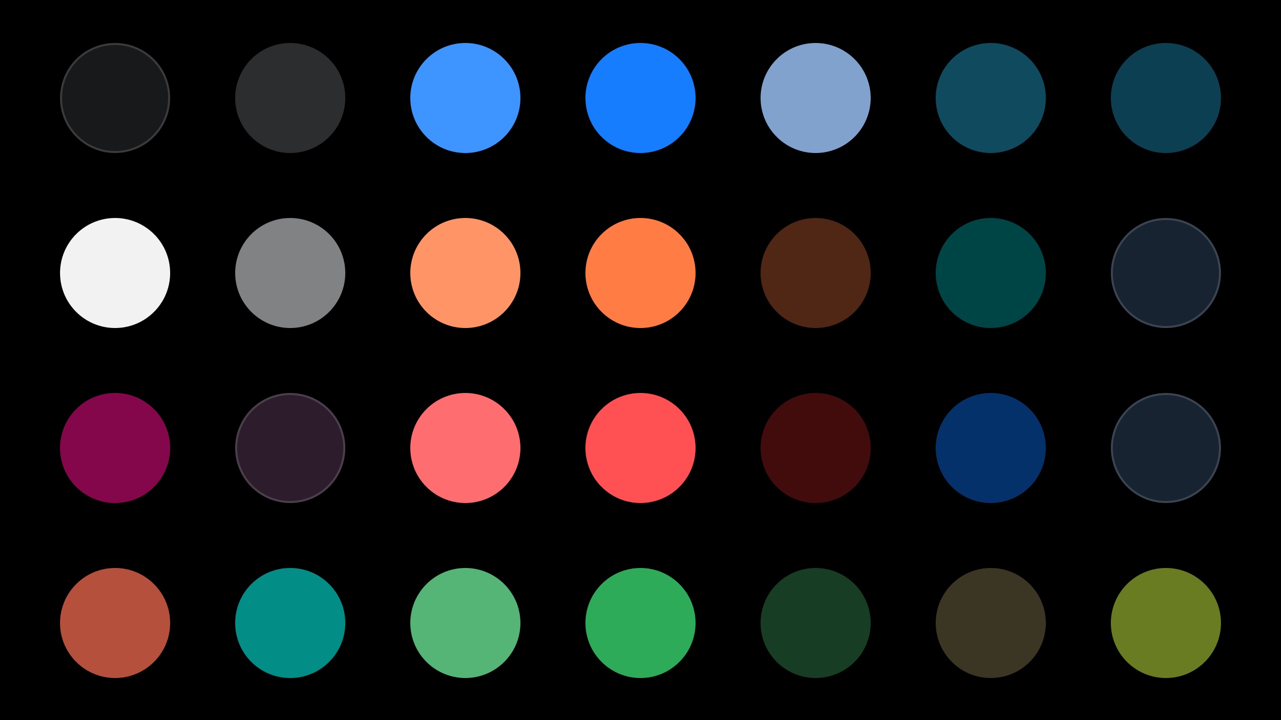
A few of the colors on Space’s Dark Theme palette.
While the light theme doesn’t require that many colors, the dark theme needed more advanced fine-tuning for various use cases. The reason is that some colors look good after being inverted, while others just don’t. Certain shades of yellow, for example, look “dirty” and have to be replaced with other colors.
One of the most complicated parts of building the dark theme was colorizing code to make browsing and code review easier and clearer. Another obstacle we faced was the variation in how different monitors behave in the dark, so we had to polish the colors with that in mind.
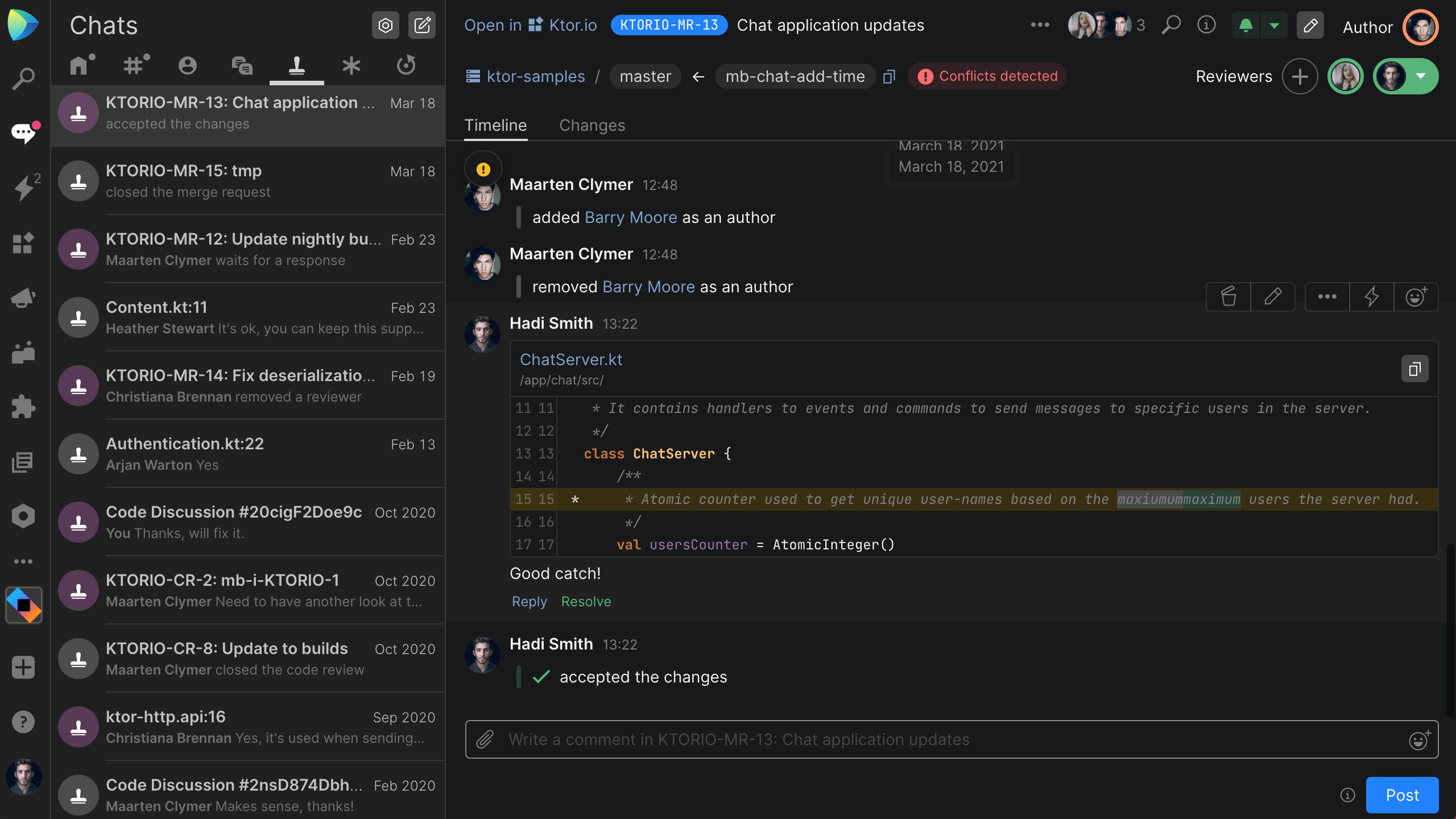
To implement the dark theme in Space, we used a design system that featured a collection of reusable components. This approach allowed us to build the dark theme quite quickly with a team of just two people – a designer who was responsible for the style and UI components library, and a software developer who was in charge of the technical implementation. When it comes to the technical implementation, the theme’s colors are provided to components using CSS variables and, sometimes, React contexts. Some rarely-used colors are computed from theme colors in runtime.
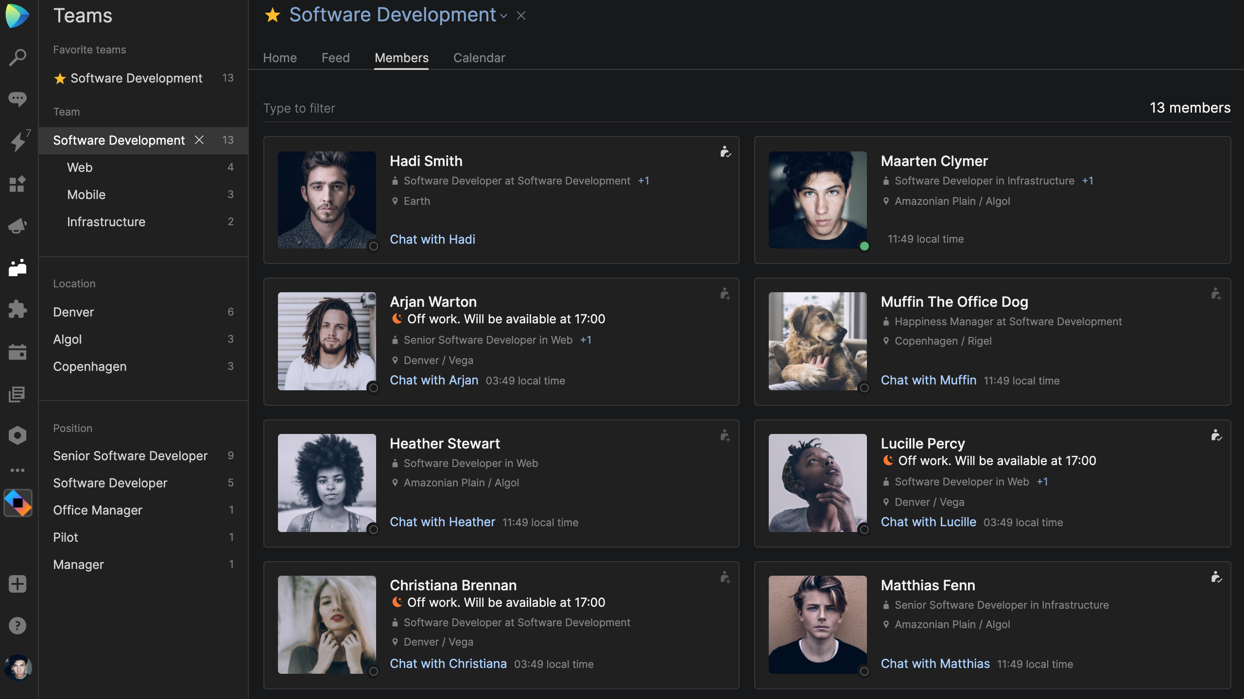
Following the practice of dogfooding, we enabled the dark theme for our entire Space organization and made sure to listen to the feedback we got from our colleagues.
However, our work is not yet complete. We will continue to polish and refine the dark theme to help you get the most out of your Space experience.
Have you already given our dark theme a try? If you have any feedback or questions, please feel free to share them in the comments below!


