TeamCity
Powerful CI/CD for DevOps-centric teams
Quest for a better (My) Changes page
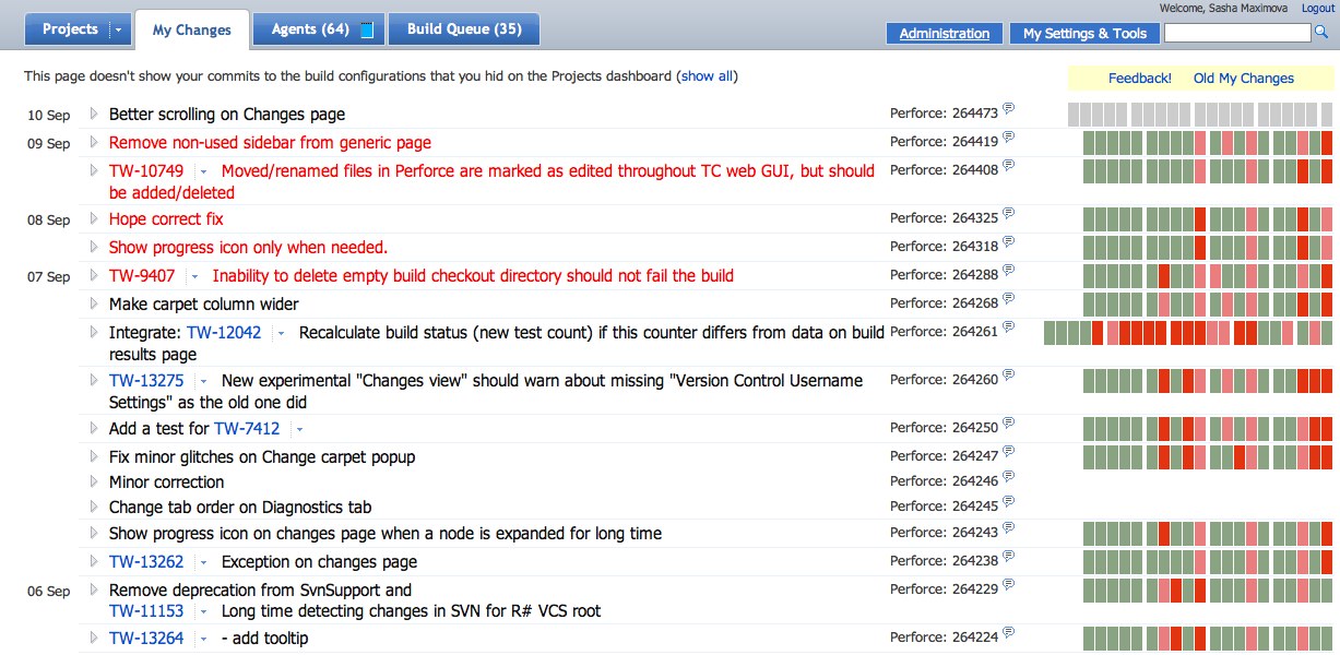
The previous post showed no pictures of the new Changes page, as some have pointed out :) Here’s an attempt to correct it and explain a bit more about the reasons behind the new concept.
For the developer it is critical to understand whether his commit brought a build to failure or not. For project leads it’s not less important to see who’s broken what and take steps to assure the build is green and running again.
We want to change the current My Changes page to address those needs better:
- First and most, get rid of the generic commit status. You must see where your commit failed and whether it might be the reason for failure or not.

- Do not put commits in collapsible sections, don’t hide them. Show them as a keyboard navigable list and put the dates as a humble “timeline” at the page side.

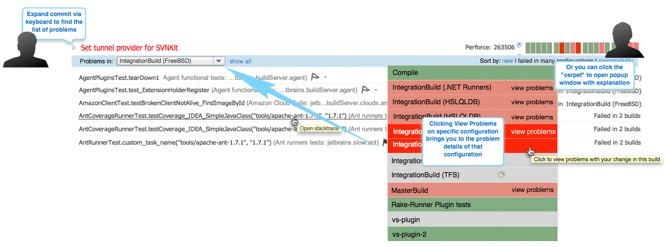
- Facilitate problem finding. Let the developer immediately (we aim at two click or two key press availability) see the details of the build configuration failure: failed tests, compilation errors, etc. (not yet implemented)

- And last but not least! Improve page performance, make it fly, not crawl.
These are the goals we set for the first iteration.
But it’s all about developers you might say. Where’s the manager’s use case support? It’s all cooking as well! The next page iteration might bring viewing commits of other people, commit statistics and sophisticated filtering.
In the first EAP we show you a rather basic and bare-bones concept of the page. We’ll be glad to hear any thought and ideas you might have after trying it. Bearing in mind the “raw” nature of the UI, we’re looking for the same level, “conceptual” feedback. Do tell us what you think and how you use the page. Tell us if you don’t use it – and why. This all will help us to ship a useful thing already in the TeamCity 6.0. And usefulness and convenience is all we’re looking for with our tool.
For those who’re upset missing the old My Changes page, there’s still a link to it on the new screen! But even switching to the old version, please do consider clicking the Feedback link nearby :)
Subscribe to TeamCity Blog updates


