TeamCity
Powerful CI/CD for DevOps-centric teams
Build React Apps with TeamCity
Greetings, everyone!
In this blog post we will talk about building a React application with TeamCity using one of the newest TeamCity features – Docker integration, introduced in TeamCity 2017.2 EAP1. (At the moment the TeamCity-Docker support can run on Mac/Linux build agents).
We’ve created an example on GitHub based on Create React App and Storybook, and set up a demo project on the public TeamCity server with the VCS Root pointing to the project on GitHub.
We used the Command Line build step for our build configuration.
Command Line Build Step
We are going to execute the following script:
#!/bin/bash

set -e -x
yarn

yarn test-ci

yarn build

yarn build-storybook
Here yarn is used for installing dependencies and running scripts, but it is possible to use npm as well.
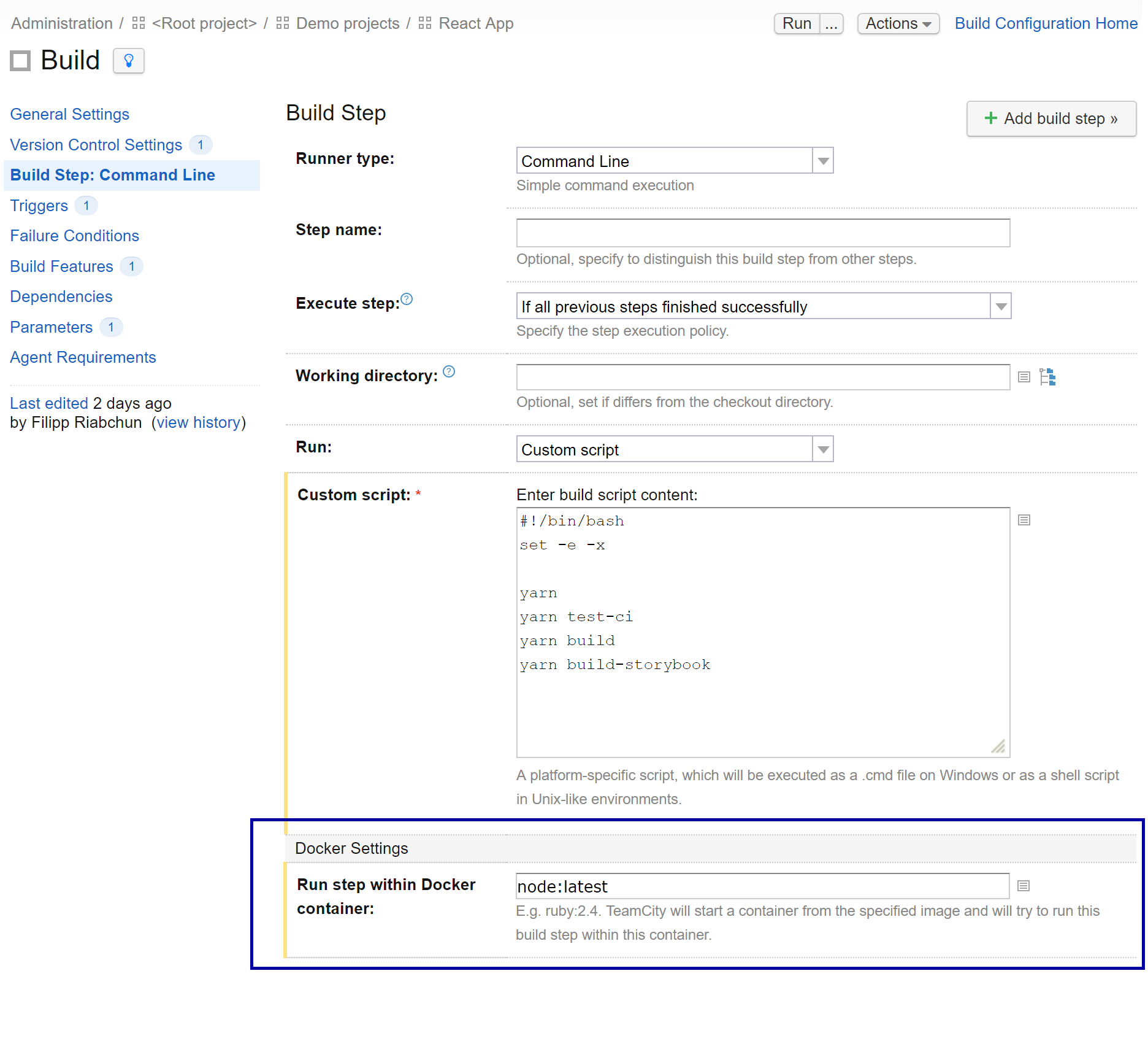
Our command line will run in a docker container – in TeamCity 2017.2 EAP the Command Line runner settings have the Docker settings section where you can specify the image for the container:
TeamCity will start the container and run this build step in it. node:latest in the Docker settings section stands for Docker’s official node image):

Report tabs
test-ci in our script runs tests with the jest-teamcity-reporter plugin (see this commit).
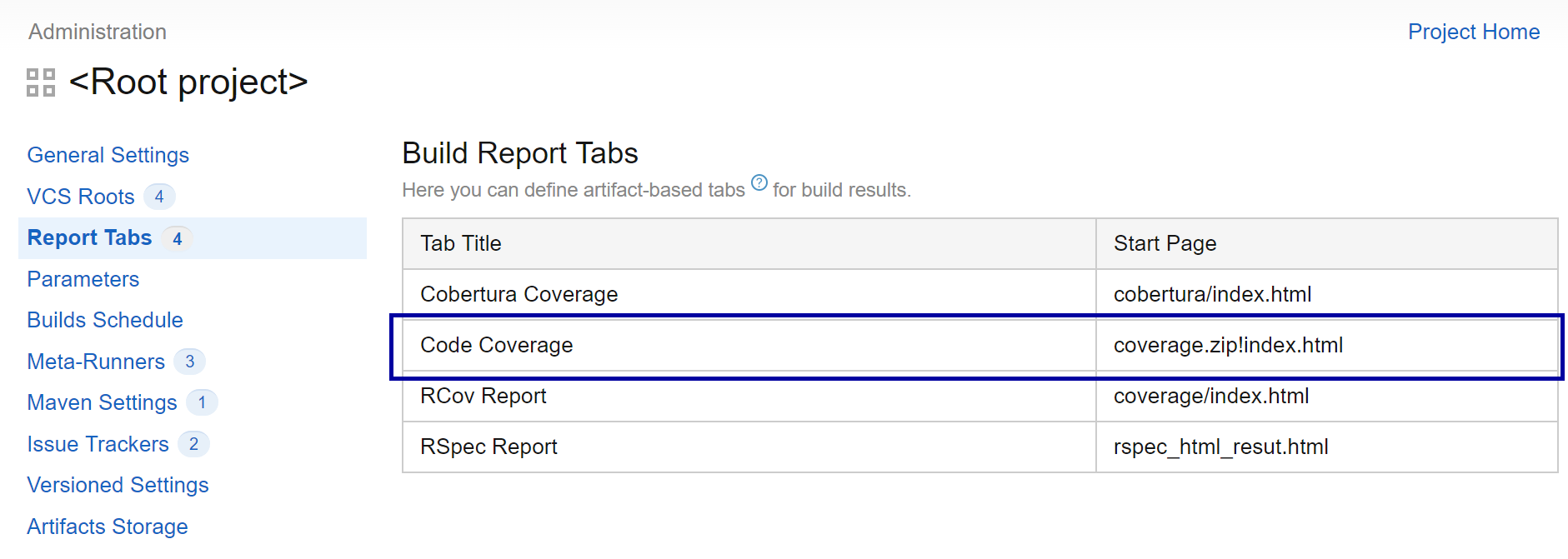
In the line react-scripts test --env=jsdom --coverage --testResultsProcessor=jest-teamcity-reporter, the --coverage option turns on generating a code coverage report, which will be displayed in a dedicated build tab. TeamCity has the report tabs feature, and on our server the Root project – the parent of the demo project – has a predefined Code Coverage tab which expects the report to be at coverage.zip!index.html:

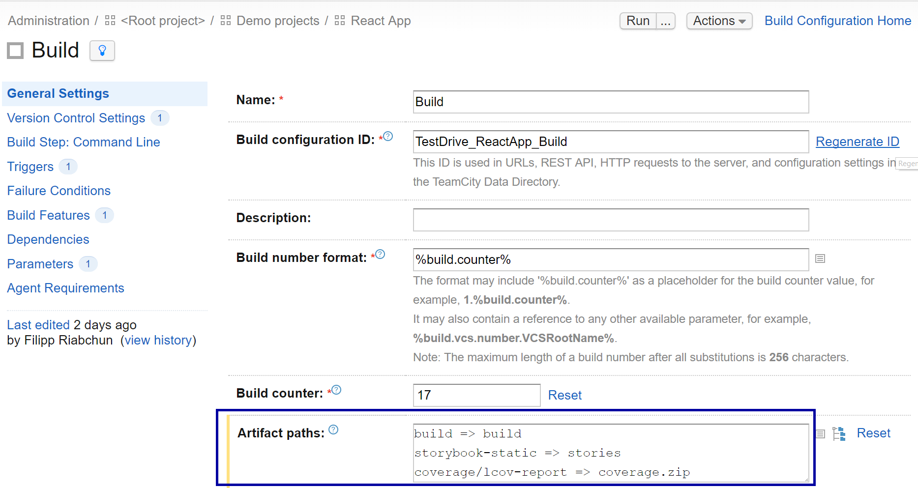
All we have to is specify the artifact path coverage/lcov-report => coverage.zip in the General Settings section of our build configuration:

We also added the artifact path for the build directory (build => build), so that it is available in the artifacts and can be deployed to some server later, which is out of scope for this post.
After running the build, the Code Coverage report is available on the build results page.

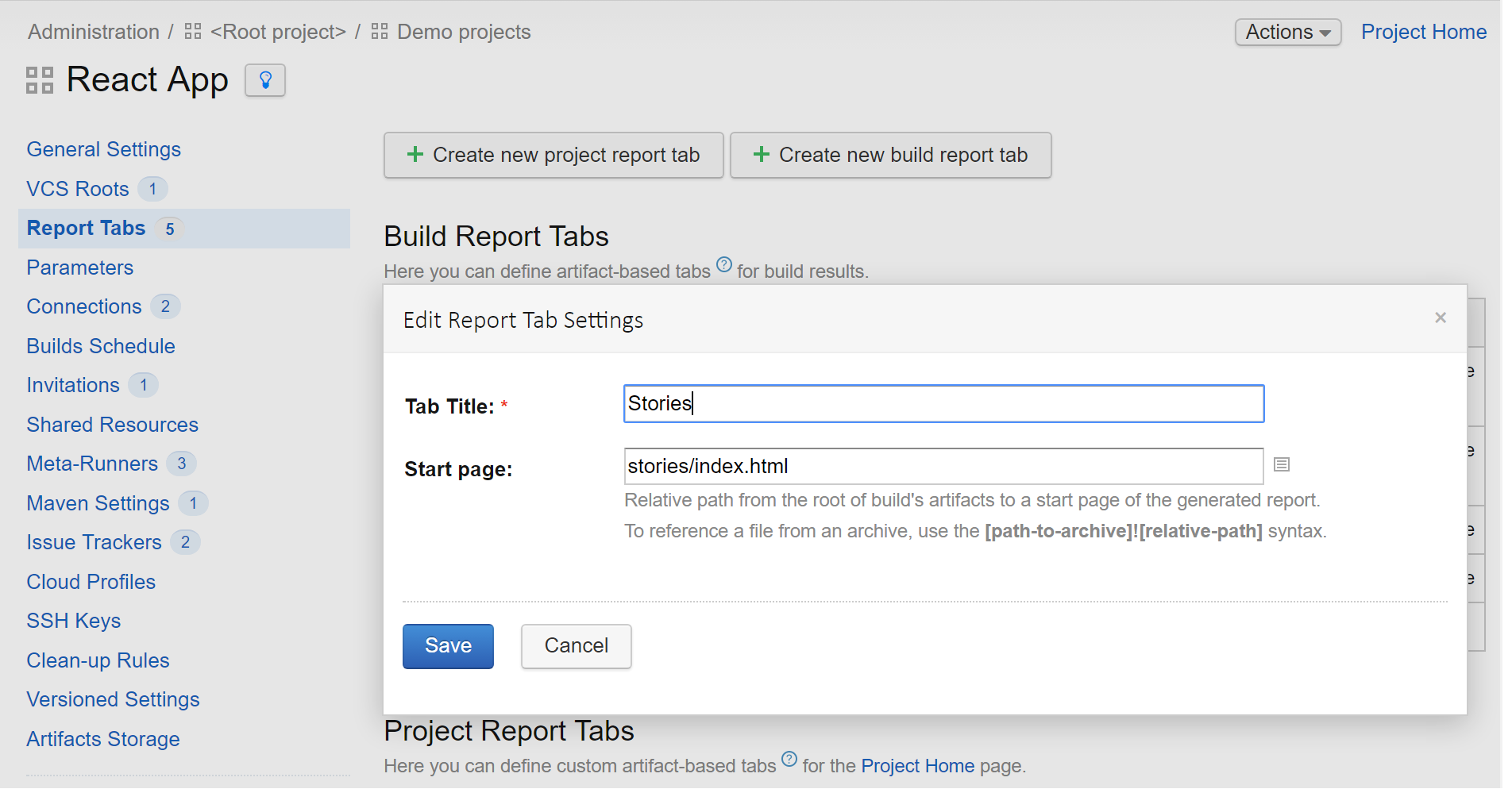
In our build the build-storybook script generates a living style guide for your component base using Storybook. It will be handy to use another build tab to display it, so the storybook-static => stories artifact path has been added. Then we set up a custom tab in the “React App” project settings using the Report tabs section:

Note that this Stories tab available on the build results page is generated per build, so you can see how your components change over time and, for example, detect at which point something started looking and/or behaving in a strange way.

Your feedback is always welcome in our forum and tracker!
Happy building!


