

Datalore
Collaborative data science platform for teams
Top 4 Ways to Plot Data in Python Using Datalore
While tabular data works best for calculating descriptive statistics, you will need plotting to compare values and find complex insights. One of the easiest and most flexible ways to visualize and explore your data is by using Python charts. In this article, we will show you how to plot using Python libraries and Datalore.

Plotting in Python
With the Python programming language, you can create charts of any type and style using a variety of visualization libraries.
Datalore comes with most of these libraries already pre-installed, so you can easily create a new Jupyter notebook and start building charts right away.
The best plot libraries for Python
Here are some of the most popular Python plotting tools:
- Matplotlib is the most popular Python library for plotting. It is available in every Python environment, shell, and UI toolkit. Because Matplotlib generates plots as images, you can use it to create visuals for scientific papers, for example. The power of Matplotlib is that you can visualize anything, but the drawback is how many lines of code you have to write to achieve that. So if you want to plot something unusual and/or interactive, it might be better to use another library that supports more concise code. Also, keep in mind that Matplotlib is only a 2D tool.
- Seaborn is a wrapper around Matplotlib. When creating a modern visual experience, Seaborn lets you use the full power of Matplotlib but with fewer lines of code. This is possible thanks to Seaborn’s color palettes and styles. The only challenge of using Seaborn is that it requires prior knowledge of Matplotlib.
- Plotly is a web-based toolkit for conveniently creating interactive Python plots. It also lets you build 3D visualizations, which is very useful for exploratory data analysis of big and uncorrelated datasets.
Some other, less-popular plotting libraries that could be useful for your specific tasks include gleam, plotnine, altair, and bokeh. If you work with geographic data, you can use lets-plot, geoplotlib, or folium to create map visualizations.
How to plot in Python using Datalore
Now let’s go through some code examples that use the Python plotting libraries mentioned above. At the end of this article, we will also share an editable notebook tutorial and describe how to make your data visualization even easier with Datalore’s prebuilt visualization tool.
Python plotting examples
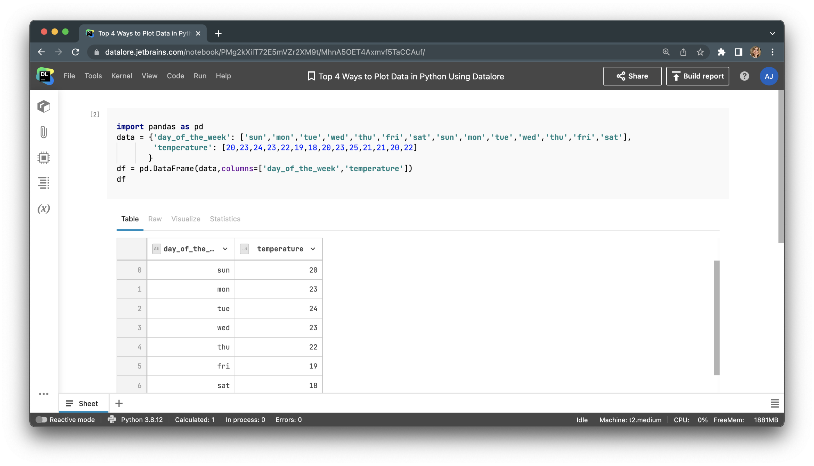
Let’s prepare a simple table with data to plot. We will create a table of temperatures in Celsius over two weeks.
import pandas as pd
data = {'day_of_the_week': ['sun','mon','tue','wed','thu','fri','sat','sun','mon','tue','wed','thu','fri','sat'],
        'temperature': [20,23,24,23,22,19,18,20,23,25,21,21,20,22]
       }
df = pd.DataFrame(data,columns=['day_of_the_week','temperature'])
print (df)
The dataframe should be as follows:
Plotting in Python with Matplotlib.
Let’s build a bar plot with Matplotlib. For that, we’ll need to import pyplot from Matplotlib, create a figure, and call the method for the chart type we want, which in this case is bar.
import matplotlib.pyplot as plt
fig = plt.figure()
plt.bar(df.day_of_the_week,
       df.temperature)
plt.show()
This is what our Matplotlib bar plot looks like:
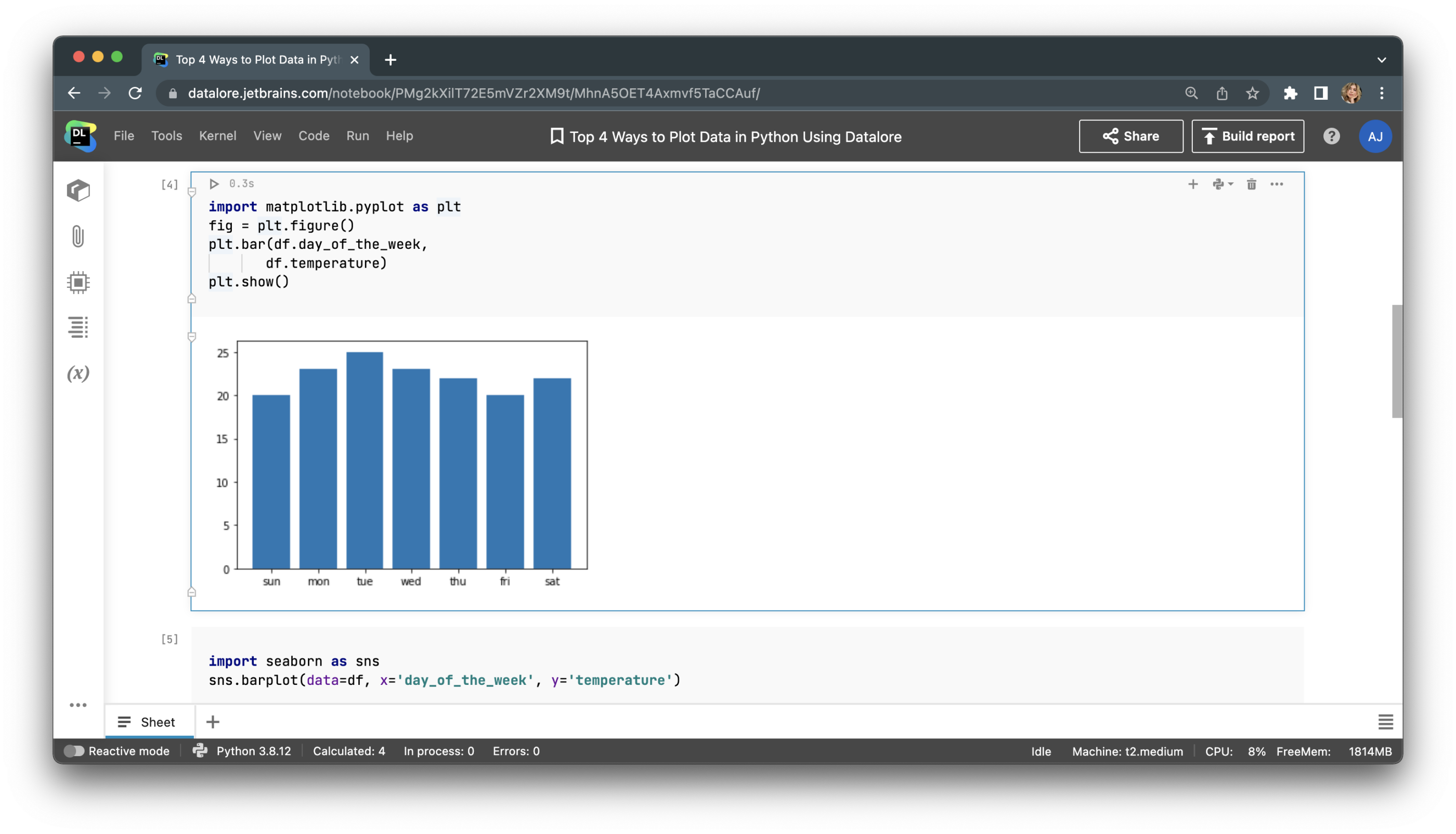
Plotting with Seaborn.
Let’s build the same plot with Seaborn. This time, we’ll need only one line of code, and the result is much prettier!
import seaborn as sns
sns.barplot(data=df, x='day_of_the_week', y='temperature')
plt.show()
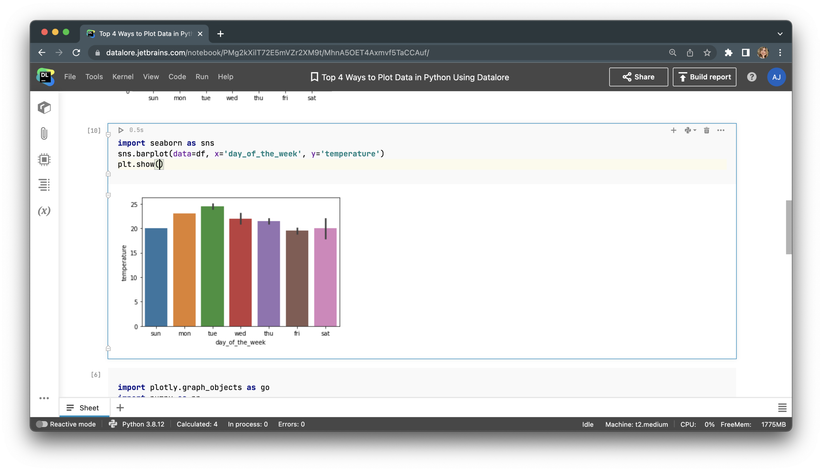
The savings of time and effort don’t look substantial when it’s just 1 line of code versus 2. However, the difference becomes much more pronounced when you are building complex plots, such as grid, correlation, regression, or violin plots, and trying to add informative descriptions to your visualization, like axis names, labels, legends, and so on.
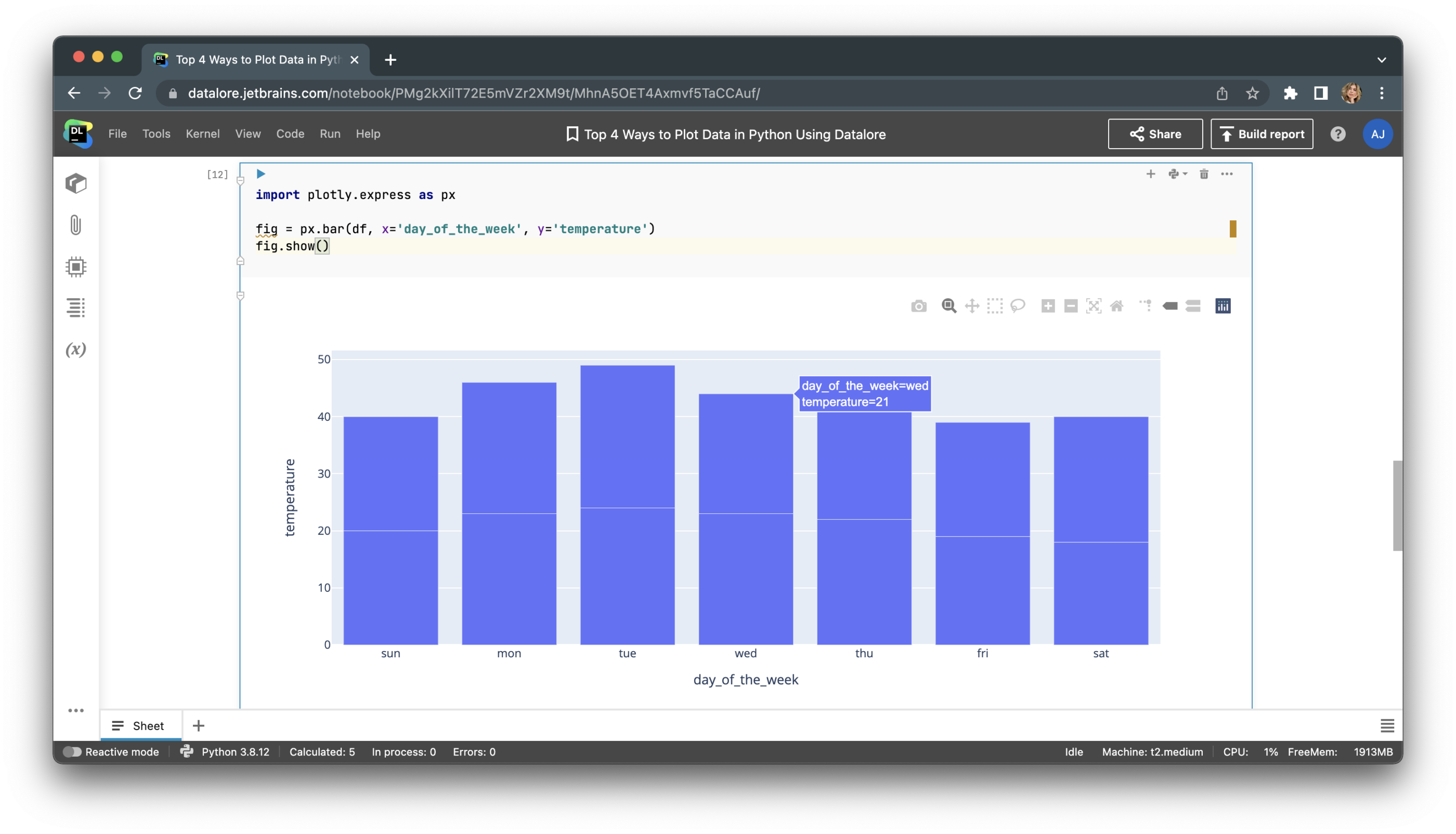
Plotting with Plotly
If we plot the same data with Plotly, we can make the chart interactive to let users visually drill down its parts. Users can also hover over the visualization to see tooltips that will help them understand the exact data values on the plot.
What makes Plotly even more interesting is that it helps you plot data in 3D. Let’s plot a helix equation using the following code:
import plotly.graph_objects as go
import numpy as np
t = np.linspace(30, 50, 100)
x, y, z = np.cos(t), np.sin(t), t
fig = go.Figure(data=[go.Scatter3d(x=x, y=y, z=z,
                                   mode='markers')])
fig.show()
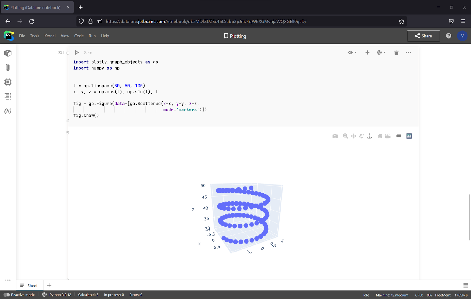
With Plotly, you can even rotate Python graphs! For more examples of creating complex 3D plots and interactive visualizations, consult the Plotly documentation.
Automatic plotting with Datalore’s Visualize tab
With Datalore’s built-in Visualize tab, you can build charts for your dataframes without writing a single line of code. Simply upload the data, read it to a pandas dataframe, write the dataframe’s name, and run the cell. Then, just choose the plot type, color, and values for the X and Y axes on the Visualize tab, and voila! Here’s how it works:
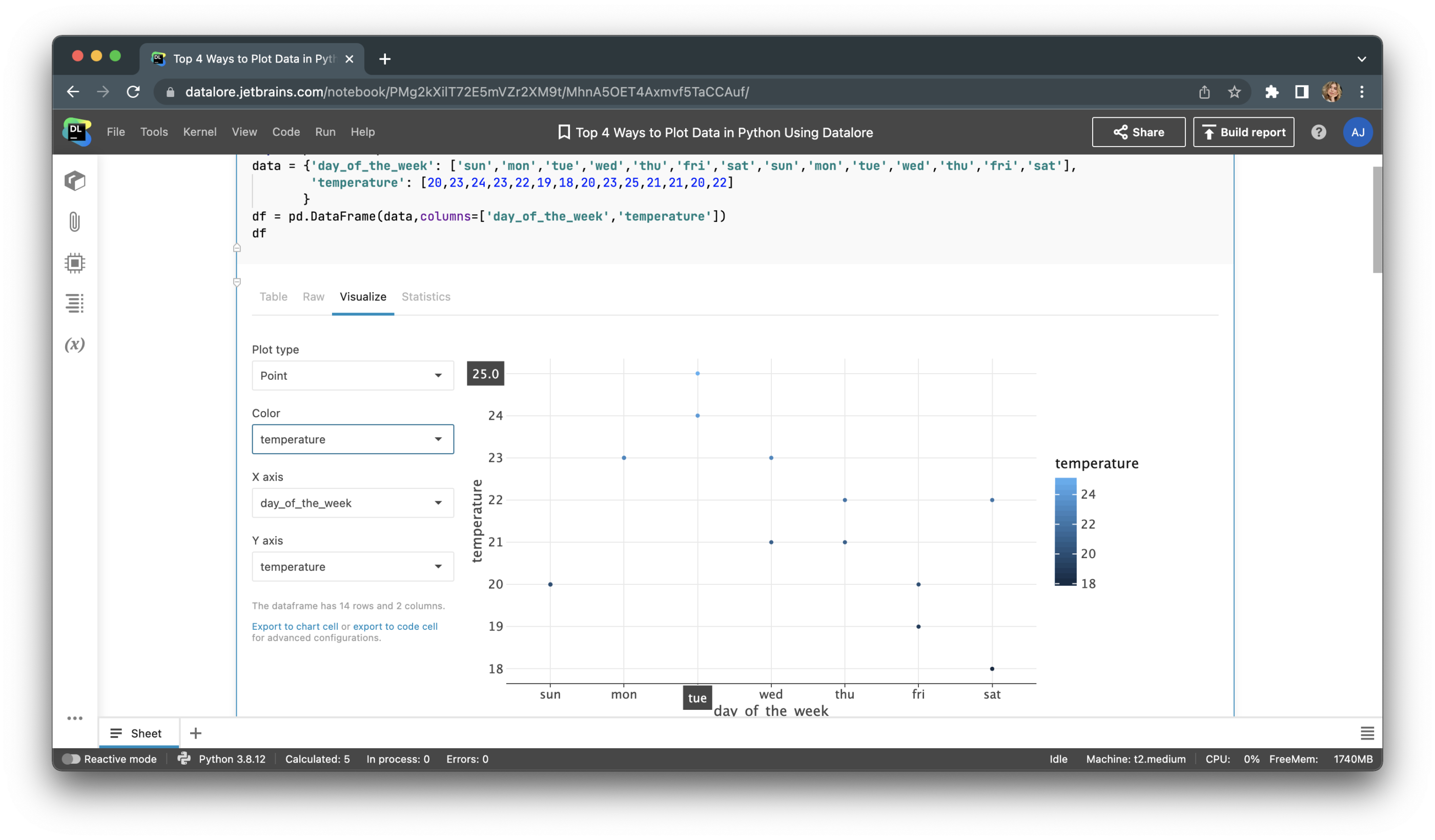
This screenshot shows the point, or scatter, plot of our data. You don’t need to write any code to build this plot! The other chart types available include line, bar, area, and even correlation.
If you want to add this visualization to your notebook, you can export it to a code or chart cell. Exporting to a code cell will give you options to configure the chart with Python, using the Lets-plot package. Exporting to a chart cell will allow you to build multi-layered visualizations and customize the axis names and scales.
Conclusion
Python offers a variety of plotting libraries, each designed for specific visualization tasks and programming levels. In this article we’ve discussed the basic set of packages, including Matplotlib, Seaborn, and Plotly, that should cover most of your plotting needs. Alternatively, you can turn to the Visualize tab in Datalore to help you save lots of time on your routine visualization tasks.


