Jupyter, PyCharm and Pizza
Hi there! Have you tried Jupyter Notebooks integration in PyCharm 2019.2? Not yet? Then let me show you what it looks like!
In this blog post, we’re going to explore some data using PyCharm and its Jupyter Notebook integration. First, of course, we’ll need said data. Whenever I need a new dataset to play with, I typically head to Kaggle where I’m sure to find something interesting to toy with. This time a dataset called "Pizza Restaurants and the Pizza They Sell" caught my attention. Who doesn’t love pizza? Let’s analyze these pizza restaurants and try to learn a thing or two from it.
Since this data isn’t a part of any of my existing PyCharm projects, I’ll create a new one.
Make sure to use PyCharm Professional Edition, the Community Edition does not include Jupyter Notebooks integration.
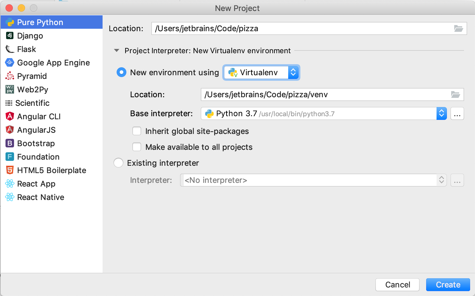
Tip: When using Jupyter notebooks in the browser, I tend to create multiply temporary notebooks just for experiments. It would be quite tedious to create a PyCharm project for each of them, so instead, you can have a single project for such experiments.
I like my things organized, so once the project is created, I’ll add some structure to it – a directory for the data where I’ll move the downloaded dataset, and another directory for the notebooks.
Once I create my first pizza.ipynb notebook, PyCharm suggests to install Jupyter package and provides a link in the upper right corner to do that.

Once the Jupyter package is installed, we’re ready to go!
The first thing that probably 90% of data scientists do in their Jupyter notebooks is type import pandas as pd. At this point, PyCharm will suggest installing pandas in this venv and you can do it with a single click:

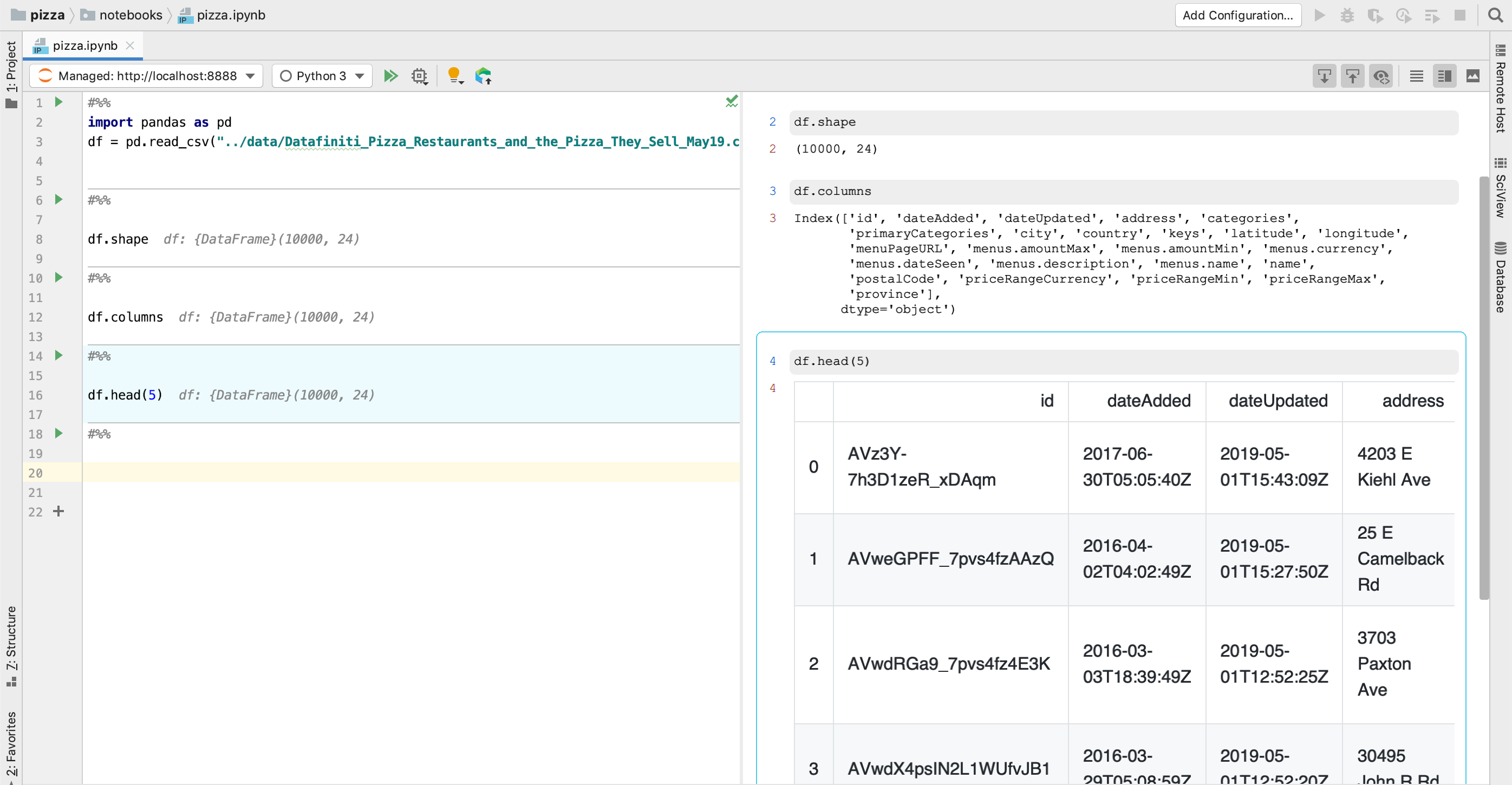
Once we have pandas installed, we can read the data from the csv into a pandas DataFrame:
df = pd.read_csv("../data/Datafiniti_Pizza_Restaurants_and_the_Pizza_They_Sell_May19.csv")
To execute this cell, hit Shift+Enter, or click the green arrow icon in the gutter next to the cell.
When you run a cell for the first time, PyCharm will launch a local Jupyter server to execute the code in it – you don’t need to manually do this from your terminal.
Let’s get to know the data. First, we’ll learn the basic things about this dataset – how many rows does it have? What are the columns? What does the data look like?
I have a suspicion that this data contains information only on restaurants in the US. To confirm this, let’s count the values in the country column:

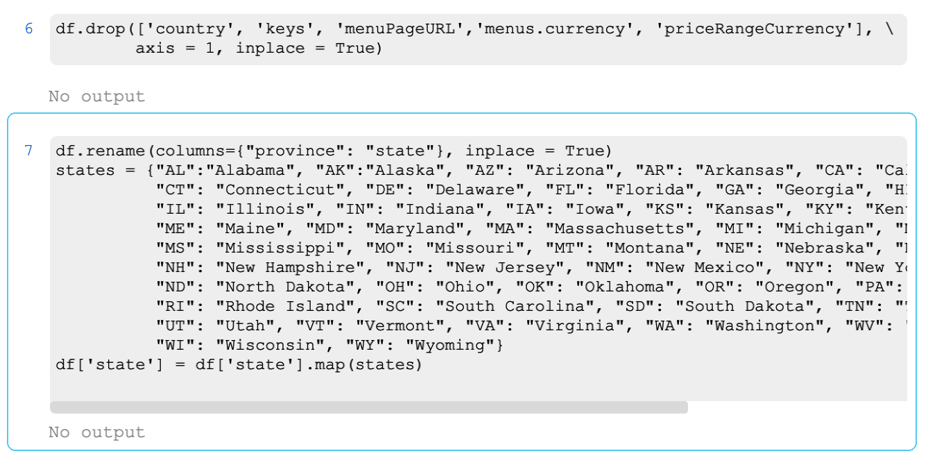
Yep, the only country presented in this dataset is US, so it’s safe to drop the country column altogether. Same goes for menus.currency and priceRangeCurrency, those values too are all the same – USD. I’ll also drop menuPageURL as it doesn’t add much value to the analysis, and key as it duplicates the information from other columns (country, state, city, etc.).
Another cleanup that I’ll do here is rename province column into states as it makes more sense in this context, and for better readability, I’ll replace the state acronyms with full names of the states.
Once we’re done with cleaning the data, how about we plot it? As humans, we are better at understanding information when it’s presented visually.
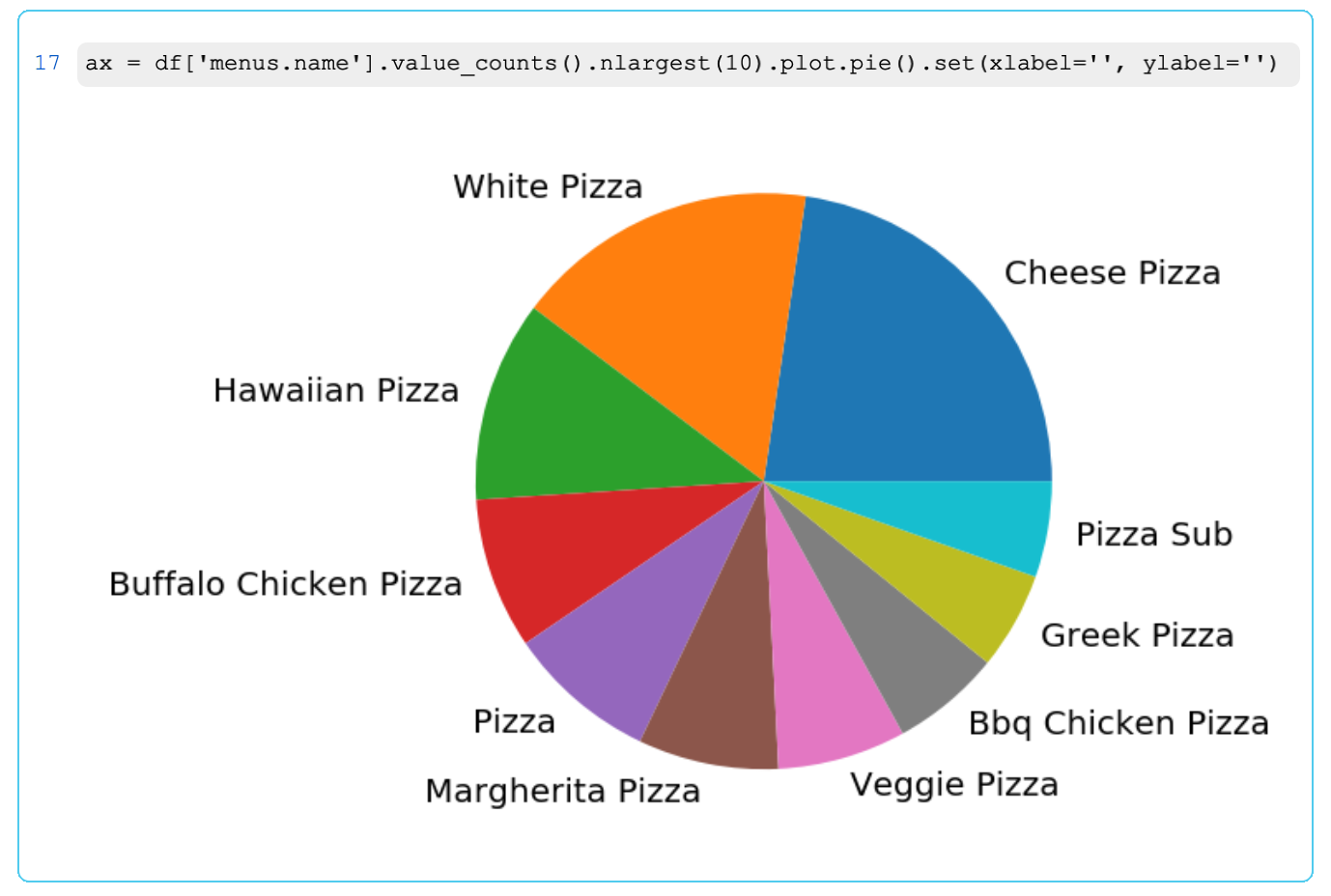
First, let’s see what are the most common types of pizza we have in this dataset. Given the theme, it feels appropriate to visualize this as a pie with matplotlib :)

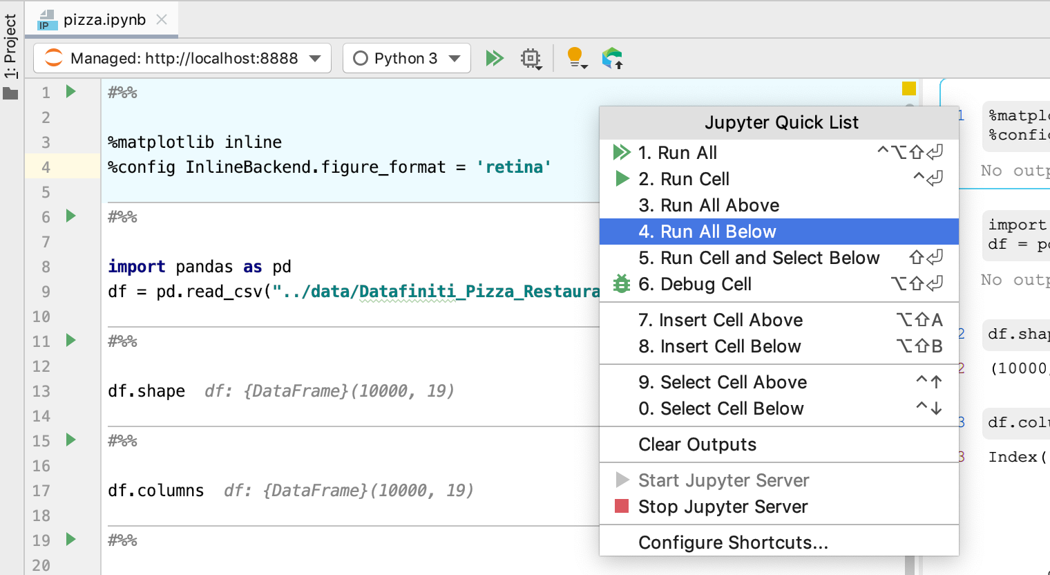
Oops, where’s my pie? To have it displayed, I need to add %matplotlib inline magic command for IPython, and while I’m at it, I’ll add another magic command to let IPython know to render the plots appropriately for retina screen.
I could add these lines to the same cell and run it again, but I prefer to have this type of magic commands defined at the very beginning of the notebook.
To navigate to the very beginning of the notebook, you can use Cmd+[ (Ctrl+Alt+Left on Windows). Inserting a new cell is as easy as typing #%% (if you prefer a shortcut to insert a cell above your current one, there’s one! Option+Shift+Aon mac, or Alt+Shift+A on Windows). Now all I need to do is add the magic commands and run all cells below:
And voila! Now we know that the most common type of pizza is Cheese Pizza closely followed by White Pizza.
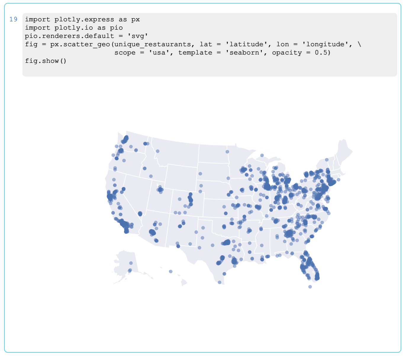
What about the restaurants? We have their geographical locations in the dataset, so we can easily see where they are located.
Each restaurant has a unique id and can have multiple entries in the dataset, each entry representing a pizza from that restaurant’s menu. So to plot the restaurants and not the pizza, we’ll need to group the entries by restaurant id.

Now we can plot them on a map. For geographical plotting, I like to use plotly. Make sure to grab the latest version of it (4.0.0) to have plotly outputs rendered nicely in PyCharm.
What else can we learn from this data? Let’s try something a little more complicated. Let’s see what states have the most pizza restaurants in them. To make this comparison fair, we’ll count the restaurants per capita (per 100 000 residents). You can get the population data for the US and multiple other datasets at https://www.census.gov/.
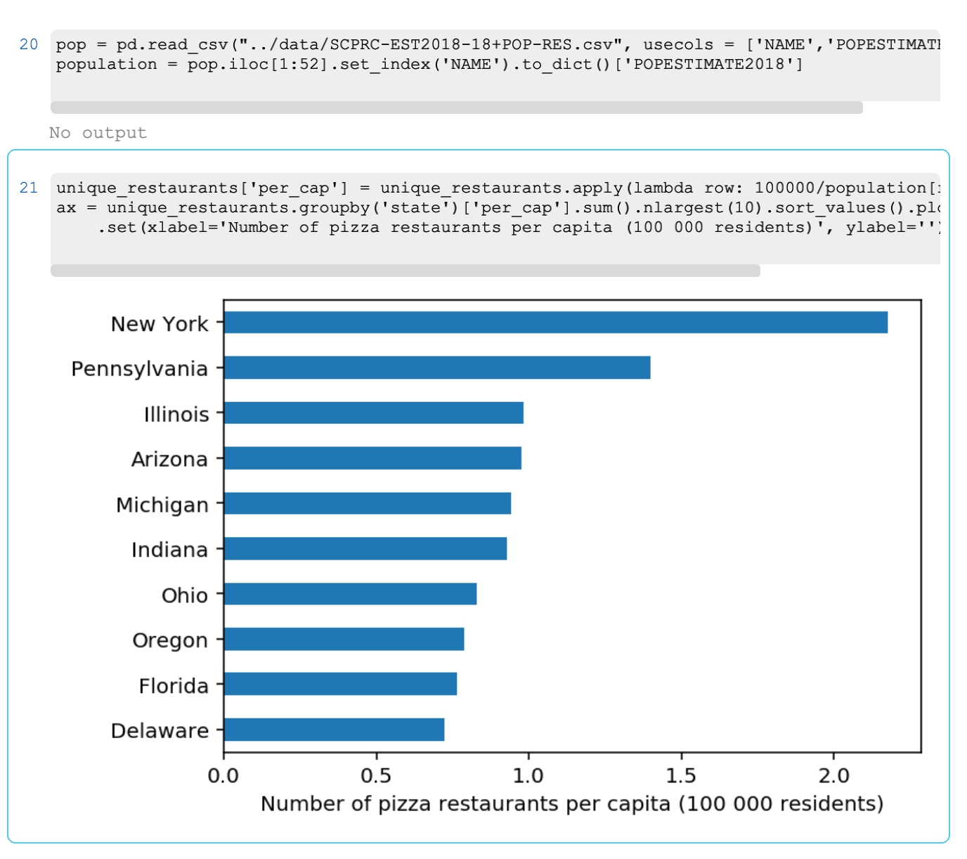
And the winner is… New York!
One can think of a number of questions we can try to get answered with this dataset, like, what city has the most/least expensive Veggie Pizza? Or what are the most common pizza restaurant chains? If you want to toy with this dataset and answer these or other questions, you can grab it on kaggle and run your own analysis. The notebook used in this blog post is available on GitHub. And if you want to try it with PyCharm, make sure you’re using PyCharm 2019.2 Professional Edition.


