YouTrack
Powerful project management for all your teams
Behind the Scenes with Experimental Features
In YouTrack 2019.1, we introduced a redesigned version of the Issues List as an experimental feature. Thanks to your feedback we think we’ve learned all the pain points. Today we want to share with you some details on how we work on experimental features, and on the new issue list as a specific example.
We first introduced experimental features as a replacement for our early access programs back in YouTrack 2017.2. Experimental features are in early or intermediate stages of development, and they let us get your feedback for a feature as we work on it, to better understand what the community wants to see in the final product.
How did we start working on the Issue List?
Based on our statistics, the Issue list page is the most visited page in YouTrack – not very surprising as it lets you find and manage your issues. The page was first designed 10 years ago, and even though it had some UI problems, no major improvements had been done to it until recently. After we redesigned YouTrack, it was finally time to give the Issue list page a fresh look and feel, too.
We started by analyzing feature requests and issues from our customers and made a list of must-have improvements. Then we got feedback from our internal users – our peers at JetBrains.
We learned that the biggest pain points of using the page were:
- It was the only page with the old design.
- The dark theme was missing.
- The number of issues on the page was limited.
- It was not obvious how the sidebar and context selector worked.
What happened next?
There is no rocket science here. After we analyzed the collected feedback, we started working on the page. We love dogfooding, so when the first iteration of anу experimental feature is ready, we make it available to the YouTrack team first. We spend a few weeks testing it inside the team and making more improvements. Then we turn the feature on for the rest of our colleagues at JetBrains. Only after fixing bugs and polishing the feature are we ready to release it as an experimental feature to the YouTrack community.
What could go wrong?
On the one hand, experimental features let us test any controversial decisions before the release, without which the product cannot move forward. On the other hand, finding the silver bullet is never obvious. When is the right time to decide that a feature is ready to be released, even as an experimental one? The story of the Issue list is a good example.
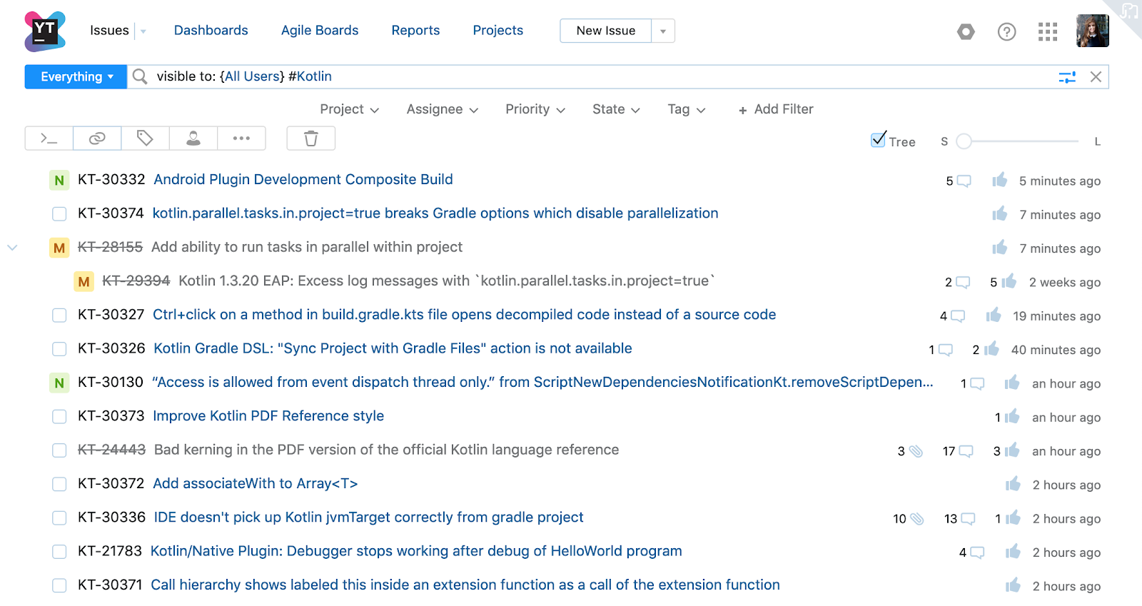
When we released it, we introduced a new layout and some of the newly added productivity features:
- The page uses the dark theme (when enabled in your profile settings).
- Tree mode is supported for all levels of issue detail.
- New filters that help you write search queries are located under the search box.
However, a couple of features were not ready yet, including the issue counter and saved searches functionality, so we decided it was not that important to include them in the 2019.1 release. Unfortunately, some users couldn’t use the page at all in that mode, apparently because our experiments were too radical. For example, to show more information for each issue, we no longer used a fixed width for custom field values. To reduce visual noise, we removed the horizontal separators. Because of these design decisions, the page turned out poorly readable.
When switching back to the old view, we added a feedback form to make sure we didn’t miss anything, and immediately asked users why they were switching. But then we ran into another problem: because of those radical changes, most of the feedback was only about them.
Why is that bad?
In general, we only get one chance to get our users to try something new and to participate in the experiment. When we release experimental features, we promote them in the blog post, social media, in the YouTrack UI, etc. But we can’t make users try something twice, screaming “hey, we’ve fixed that issue, please try it again!”. A few people will give it another try, but most won’t. And so we lose valuable feedback.
What have we done since then?
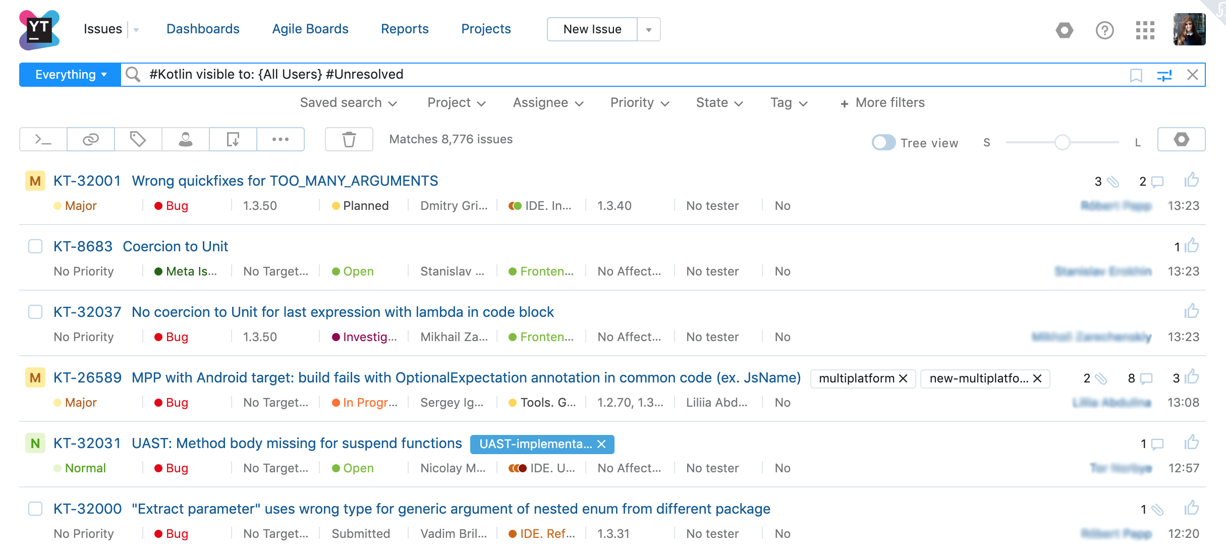
Even though the experiment didn’t work the way we wanted, we still got a chance to improve the page and its readability, by adding the following functionality:
- A table view of the custom fields.
- The issue counter.
- Saved searches.
- The view of the dates and icons.
- Horizontal separators between issues in medium and large views.
We’ve also colored custom fields. In the next few weeks, we’ll add the ability to select all of the issues in the list and perform batch operations as well as an updated interface for adding sort criteria.
That’s it for now. Thank you for reading this story! If you are up for it, please try this feature again and let us know what you think. Your feedback really helps us to make YouTrack better!
If you have any questions, please contact our support team.
