.NET Tools
Essential productivity kit for .NET and game developers
Colored background highlighting in dotCover 2017.1
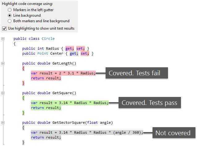
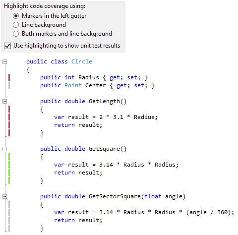
Right after dotCover 2016.3 introduced a new way to highlight code coverage (markers in the gutter instead of colored backgrounds), we immediately got a flurry of “Bring it back!” comments. Indeed, there is a range of tasks where the “old-style” highlighting could be more useful, e.g. when you need to quickly evaluate uncovered parts of code.
Some technological limitations prevented us from keeping the colored-background highlighting along with the new markers in 2016.3. Fortunately, now all the limitations are left behind, and dotCover 2017.1 gets the old highlighting back. And it’s even better than before!
The main improvement is that now background highlighting is able to show test results. To switch between highlighting types, use the option Highlight code coverage using in ReSharper | Options… | dotCover | Highlighting.
Here’s a short summary of how it works:
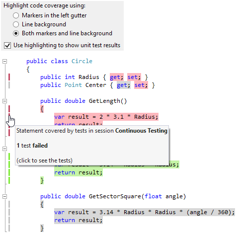
Finally, you can combine both highlighting styles by selecting the option Both markers and line background. Why does that make sense? Because this way, you can use one of the markers’ advantages – the ability to see and navigate to covering tests in one click.
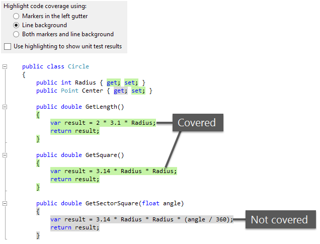
Note that if you want to get the “plain vanilla” highlighting from dotCover 2016.2 (where test results were not taken into account), simply switch off the option Use highlighting to show unit test results.
As always, we invite you to download the latest ReSharper Ultimate and try the “new old” highlighting in practice.

