

How do you like ‘em apples? The story of AppCode logo

If you have an apple and I have an apple and we exchange these apples then you and I will still each have one apple. But if you have an idea and I have an idea and we exchange these ideas, then each of us will have two ideas.
~ George Bernard Shaw
Today we’re going to look behind the scenes and tell you how we created the product logo for AppCode, one of our latest and greatest IDEs. We launched AppCode as an Objective-C IDE about 18 months ago, and now it has the recognizable logo that users are familiar with. Well, before going public AppCode was code-named CIDR. We already had C, IDE so all it was missing was that R at the end. We cut out the E in the style of Flickr, Razr and such.
This name also had the convenient association with the internationally-known apple-based alcoholic beverage.
Our CIDR logo then looked like this:
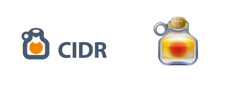
Well, the name didn’t quite make it. The guys from transgaming.com had a product named Cider, so they contacted us and asked to change the name. Fair enough.
The team tossed around a number of ideas before settling on a new name. Finally, we cut through to the core of the apple concept. An apple grows from a seed and has a core, whereas the core of a programming app is the code. Exploring this chain of associations, we went from Apple Core to AppCore to AppCode. One thing’s for sure: apple consumption definitely went up around that time at the office!
Here is a shortlist of logo options that the product team agonized over to determine the winner:
![]()
The selection process involved dozens of people, using our patented advanced voting mechanism called Majority Wins. :)
Logos on the left turned out to be ‘bad apples’ for a few fairly obvious reasons. Either they were too weakly associated with apples, or bore too strong a resemblance to oranges and orange peel. We wouldn’t want to mix apples and oranges, would we?
The cartoonish logos on the right looked cute, but didn’t make the final cut. They just weren’t consistent with the existing portfolio of JetBrains product logos. So it came down to logo candidates in the middle column.
After the team selected the top two designs, the next challenge was the color choice. The design team tried two color combinations: orange as one of the official company colors, represented in the JetBrains company logo, plus blue or grey as the second color. Here’s what they came up with:
![]()
The design team tried two color combinations: orange as one of the official company colors, represented in the JetBrains company logo, plus blue or grey as the second color. Here’s what they came came up with:
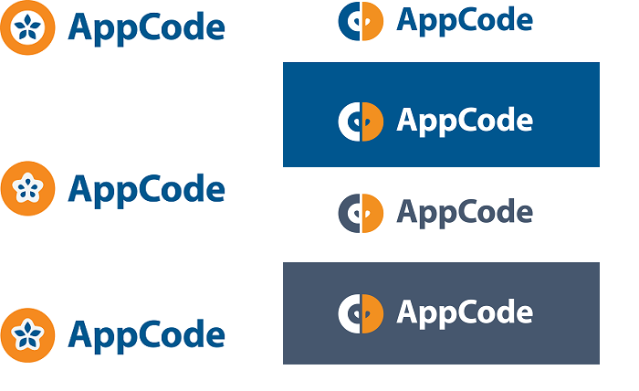
Faced with the final decision, the judges set their sights on the usage of main letters ‘A’ and ‘C,’ which seemed to say ‘we’re coding for Apple.’ The logo options on the left were missing the C-component.
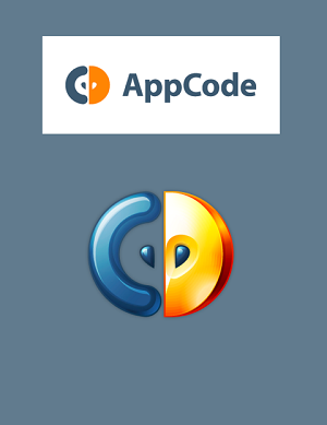
Finally, after a month of deliberation, the team approved the winner in orange and grey combination. It was a combination of an apple slice with two seeds, and the letter C as the epitome of coding:
We hope you enjoyed this little story. Eat apples, stay tuned for more behind-the-scene episodes, and do give us your feedback.
Keep developing and designing with pleasure!
– JetBrains team


