

Datalore
Collaborative data science platform for teams
New in Datalore: Kernel Changes, New Automatic plots, Tutorials, and More
Greetings from the Datalore team!
We have been busy this month laying the foundations for future features. This work will enable us to take some big steps with Datalore over the coming year.
IPython kernel changes
Over the last month, we’ve been reworking our infrastructure supporting Jupyter kernels. From a user’s perspective, there should be no noticeable differences. Let us know on the Datalore forum if you spot any!
Internally, though, this rewrite allows us to work towards supporting more programming languages inside Jupyter notebooks and gives us some extra space for creativity in computation modes. More updates are coming very soon – stay tuned!
Can you guess which language Datalore will support next? Let us know in the comments below!
New plot types inside the Visualize tab
When you print a pandas DataFrame, Datalore will automatically show you a bunch of visualization options inside the Visualize tab.
Last month we added new plot types:
- Point plots
- Area plots
- Correlation plots
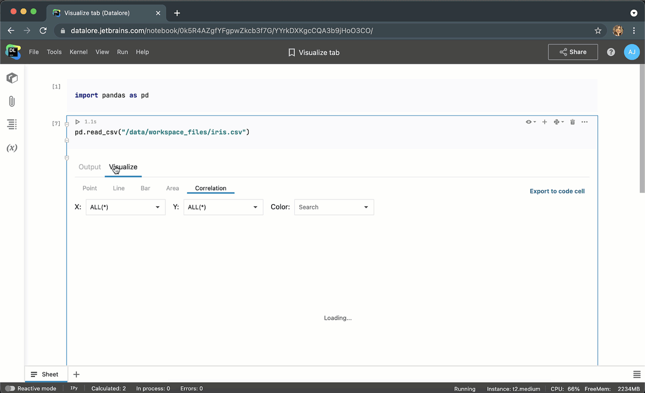
If you want to further customize each plot, click the ‘Export to code cell’ button in the upper-left corner and continue the configuration with the Lets-plot library.
Dropped Zeppelin support
You might have noticed that the Zeppelin kernel disappeared from the Create new notebook dialog. Although Zeppelin has a lot of cool visualization features and polyglot notebooks, very few Datalore users chose this kernel for their projects. Therefore, we have decided to stop supporting it and will instead focus on improving the visualization capabilities of the Jupyter kernel and add support for multiple languages there.
Getting started Tutorial
It’s been a while since we’ve updated our Getting started notebook – below you can find the new edition.
Even though you might be an experienced Datalore user, you can still find some helpful tips for working with Datalore there.
Binary Classification Tutorial
We’ve prepared an overview of binary classification models on the Android apps dataset.
Our models deduce if an app is malware or not based on the permissions it requires and the distribution of ratings. This tutorial also contains some interesting insights about Android applications in general.
We invite you to take a look, copy the notebook and start exploring it for yourself!
If you’d like to embed cells from Datalore notebooks on your website or in your Medium article, you can do so by publishing a notebook and clicking on the Embed button.
Quality marathon
It is easy to end up with tasks in the backlog that seem to get endlessly postponed because of other priorities. To fight this problem, we introduced a Quality marathon, where our developers and designers concentrated on fixing the bugs submitted on public forums, via the feedback form, or during product evaluation interviews.
Here are just a few things we fixed:
- It’s now possible to select a language, an environment, and an agent type for a new notebook when you create it from another notebook.
- You can now delete cells with the DD shortcut in Command mode. To switch to Command mode, press Esc. For more shortcuts check out Help|Shortcuts.
- Clicking on the Datalore logo in the upper-left corner now redirects you to the current workspace.
- The notification to restart the kernel is now more visible.
- When publishing a notebook, link sharing for the static copy is enabled by default.
- Attached images are no longer lost when printing to PDF or exporting to HTML.
- Variable viewer is now available inside Kotlin notebooks.
- Fixed the storage-quota display for the on-premises version of Datalore.
- Fixed crashing fonts when exporting notebook with a lot of outputs.
- Added Create New Notebook dialog when pressing File|New notebook inside the editor.
- Fixed a bunch of front-end bugs for users with view access.
- The notebook filename is now updated when republishing a notebook.
- Inside the Shared with you folder, it’s now easier to distinguish view/edit access.
- Fixed a bug when a duplicated Plotly output was not printed upon publishing.
- After an uncaught exception, cells now interrupt execution.
- Cmd+M shortcut now works in Safari.
- Fixed a bunch of issues with sliders.
- Fixed a bunch of issues with ignored symbols in Published notebooks.
That’s all for now. Follow us on Twitter @JBDatalore to hear about our updates!
Happy data sciencing!
The Datalore team


