

Datalore
Collaborative data science platform for teams
A Comparison of Python vs. R for Data Science
As we highlighted in our previous article, Python and R are suitable for data manipulation tasks because of their ease of use and their huge number of libraries for working with data science tasks.
Both languages are good for data analysis tasks with certain features. R is developed for statistical and academic tasks, so its data visualization is really good for scientific research. There are a lot of machine learning libraries and statistical methods in R. Its syntax may not be so easy for programmers but is generally intuitive for mathematicians. R supports operations with vectors, which means you can create really fast algorithms, and its libraries for data science include Dplyr, Ggplot2, Esquisse, Caret, randomForest, and Mlr.
Python, on the other hand, supports the whole data science pipeline – from getting the data, processing it, training models of any size, and deploying them for use in production. Python libraries for data science include pandas, scikit-learn, TensorFlow, and PyTorch.
| Python | R | |
| Primary use case | Creating complex ML models and production deployment | Statistical data analysis |
| EDA packages | Pandas Profiling, DTale, autoviz | GGally, DataExplorer, skimr |
| Visualization packages | Plotly, Matplotlib, Seaborn | Ggplot2, Lattice, Esquisse |
| ML packages | PyTorch, Tensorflow | Caret, Dplyr, mlr3 |
In this article, we will focus on the strong points of R and Python for their primary uses instead of comparing their performance for training models.
One great option for experimenting with Python and R code for data science is Datalore – a collaborative data science platform from JetBrains. Datalore brings smart coding assistance for Python and R to Jupyter notebooks, making it easy and intuitive for you to get started.
Using Python and R for data science in Datalore
The 2 most crucial parts of any data science project are data analysis and data visualization.
How to visualize data with R in Datalore
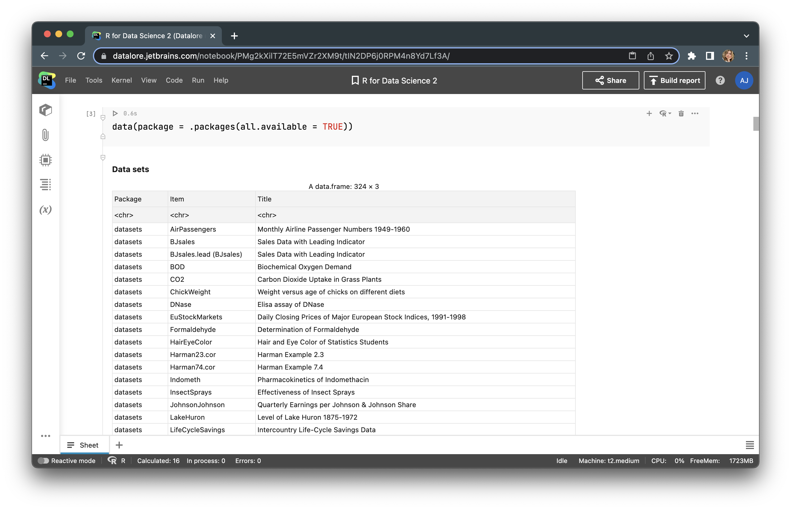
R provides users with built-in datasets for each package, so there is no need to upload external data for test purposes. To observe all available datasets, type data(package = .packages(all.available = TRUE)).
Let’s choose “Fuel economy data from 1999 to 2008 for 38 popular car models” from the ggplot2 package, which is named mpg. Next, we’ll upload this dataset and look at the first 5 rows with head(mpg).
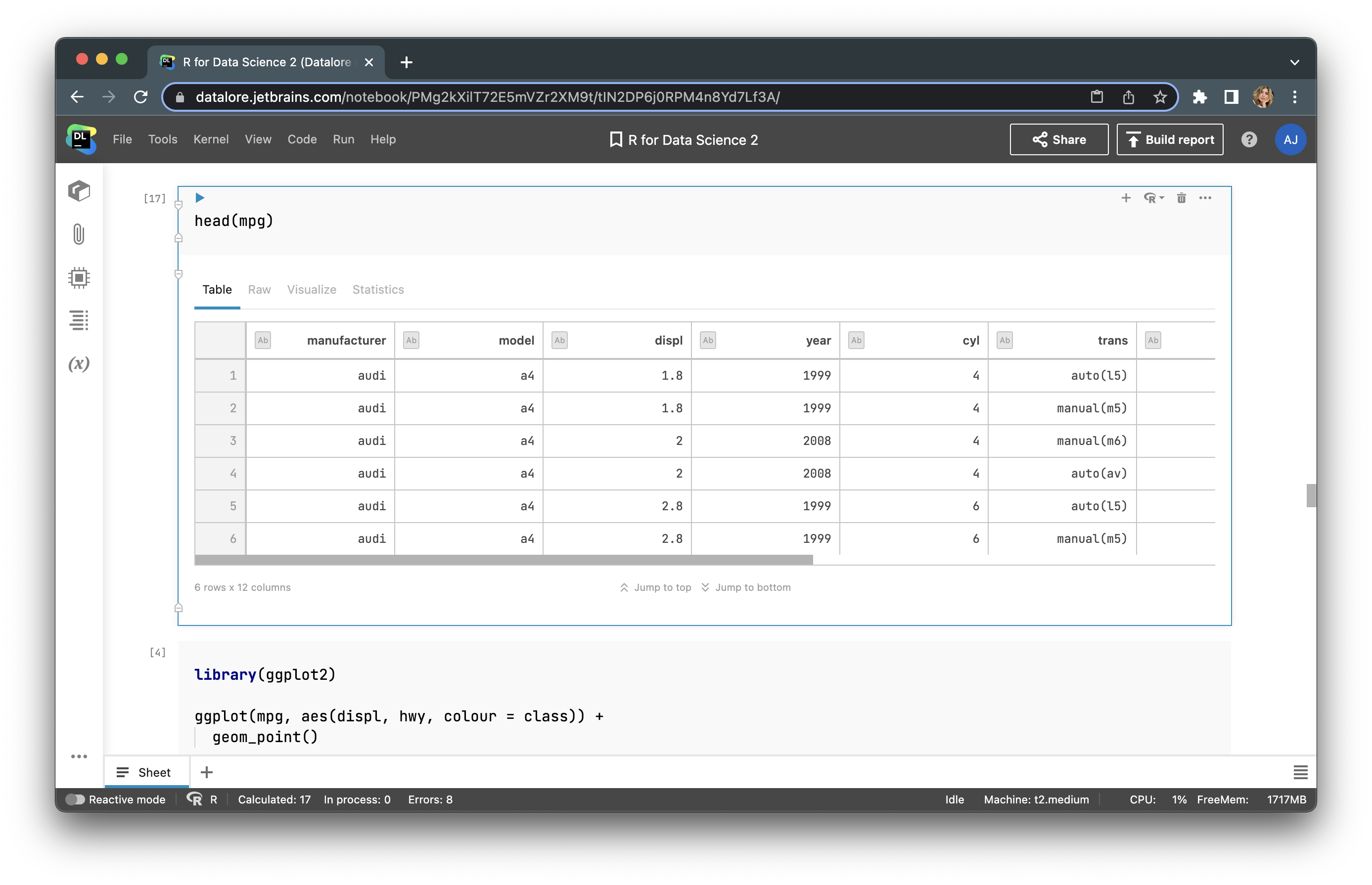
Here, we have features, such as car manufacturer, model, engine displacement (displ), the number of cylinders (cyl), etc. Let’s build a plot with the ggplot2 library. First, we need to upload this library with library(ggplot2). After that, we can build a plot using aesthetic mapping – aes(). Our plot will display the car manufacturer, engine displacement (displ), and city miles per gallon (cty). The final code will look like this:
<strong>library</strong>(ggplot2)
ggplot(mpg, aes(displ, cty, colour = manufacturer)) + geom_point()
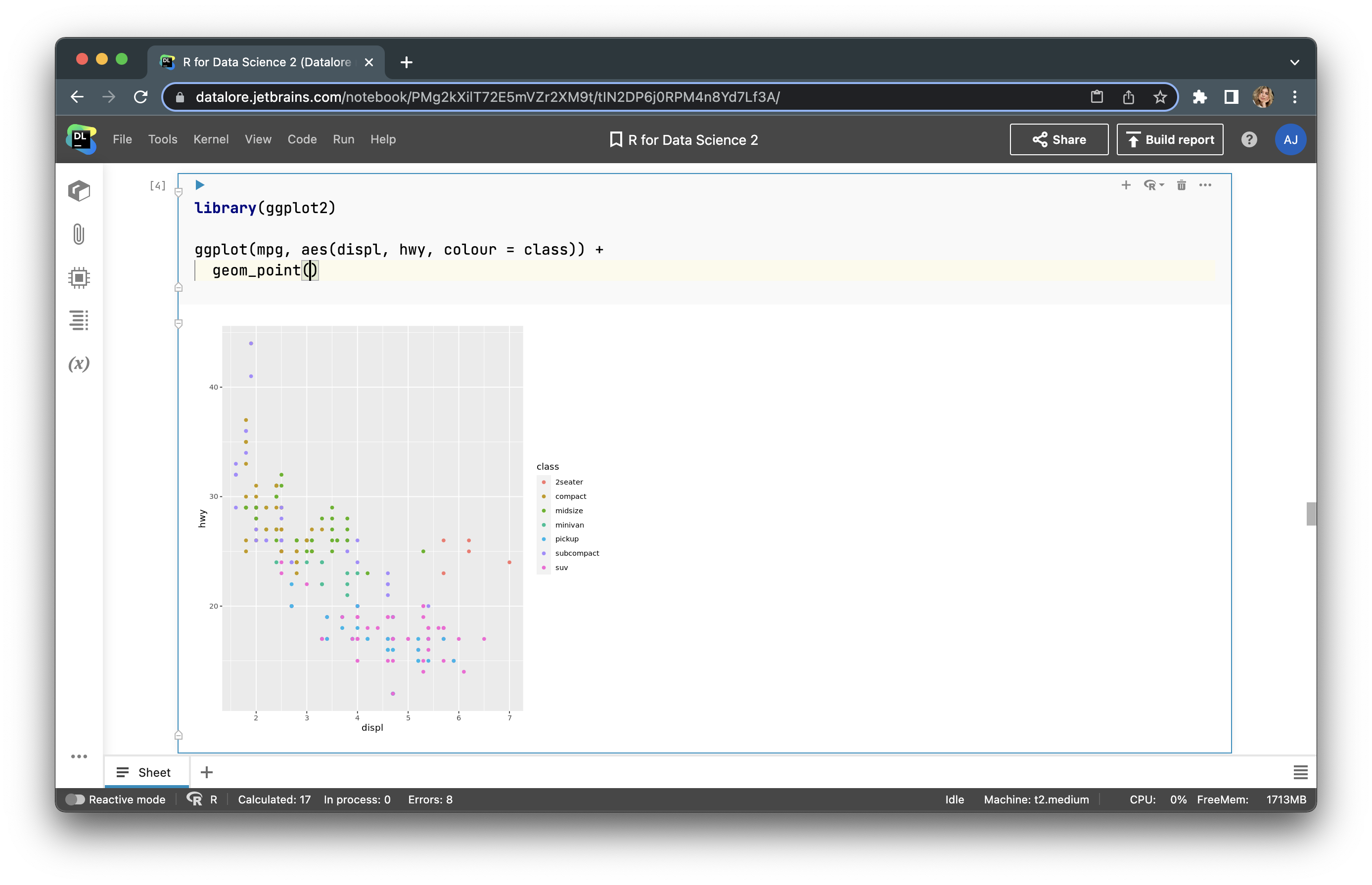
Now we have a fairly informative graph that we can customize with almost no limits!
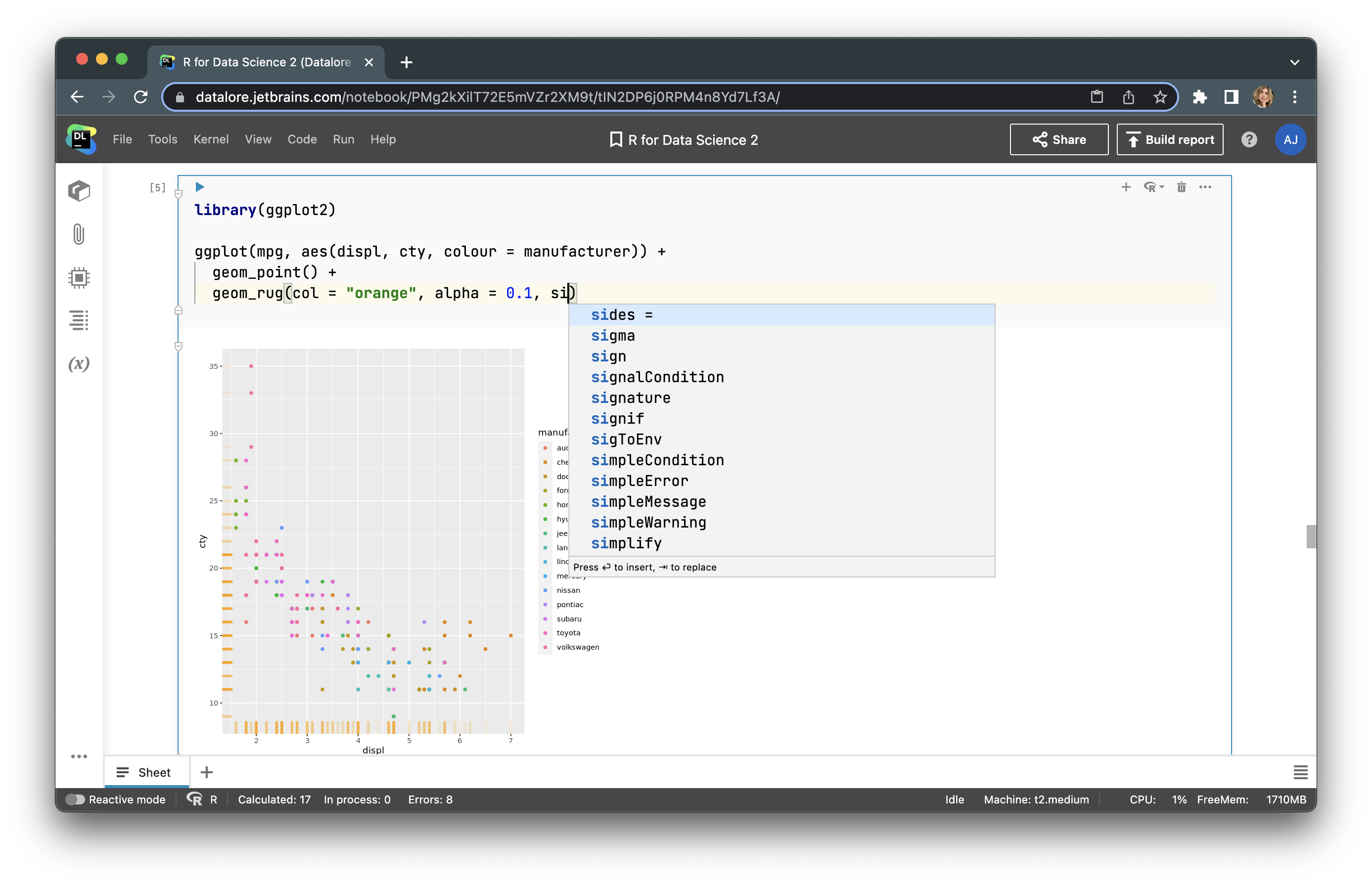
Let’s add a scatter plot to our graph with this line of code:
geom_rug(col = "orange", alpha = 0.1, size = 1.5)
Here you can see the updated graph:
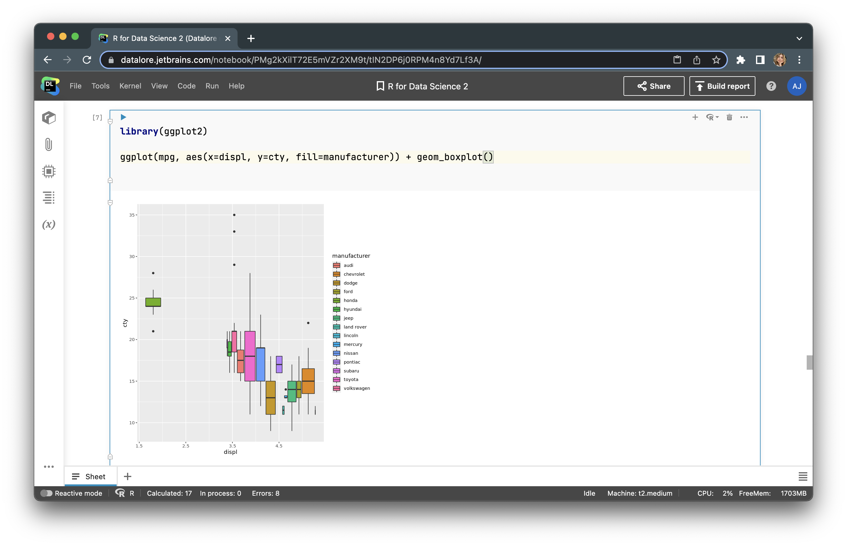
By changing the geom_point() line, we can update the type of our graph. We can make it a boxplot:
Using R, you can build any plot and adjust it to your needs. Let’s try to build a bubble plot to analyze four features (adding the number of cylinders (cyl) to the features in our previous plot). To do so, we just use the following code:
data <- mpg
data %>%
  arrange(desc(cyl)) %>%
  ggplot(aes(x=displ, y=cty, size = cyl, color=manufacturer)) +
    geom_point(alpha=0.3) +
    scale_size(range = c(.1, 15))
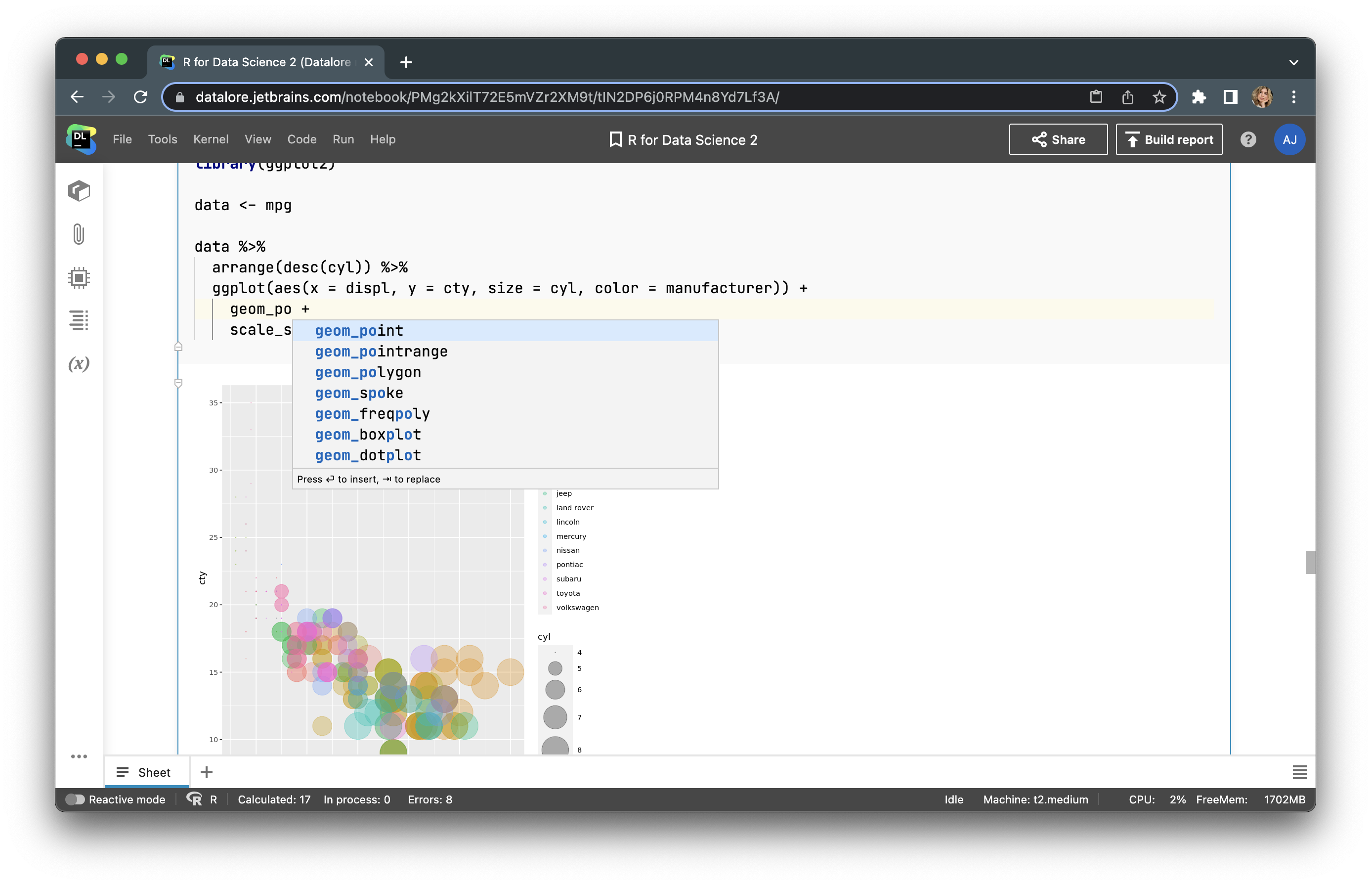
Here, you can analyze all 4 features of your dataset. The limit for graph customization in R is only your imagination. You can find more examples of how to visualize your data here and here.
How to conduct statistical modeling with R in Datalore
Now let’s conduct statistical modeling with R. We’ll use the same dataset – mpg. Our goal is to build a regression based on two features: cty and hwy, where hwy is a function of cty. First, we will calculate regression coefficients for a linear model – lm.
model <- lm(hwy ~ cty, data=mpg)
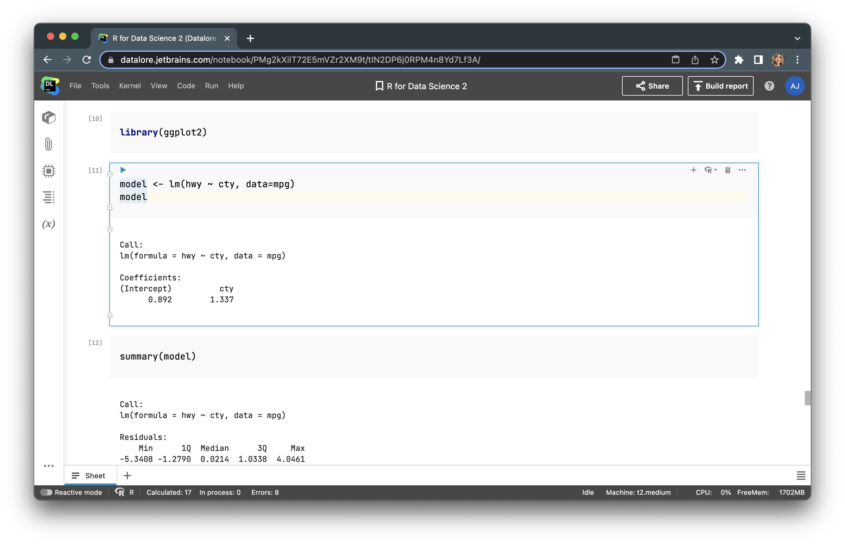
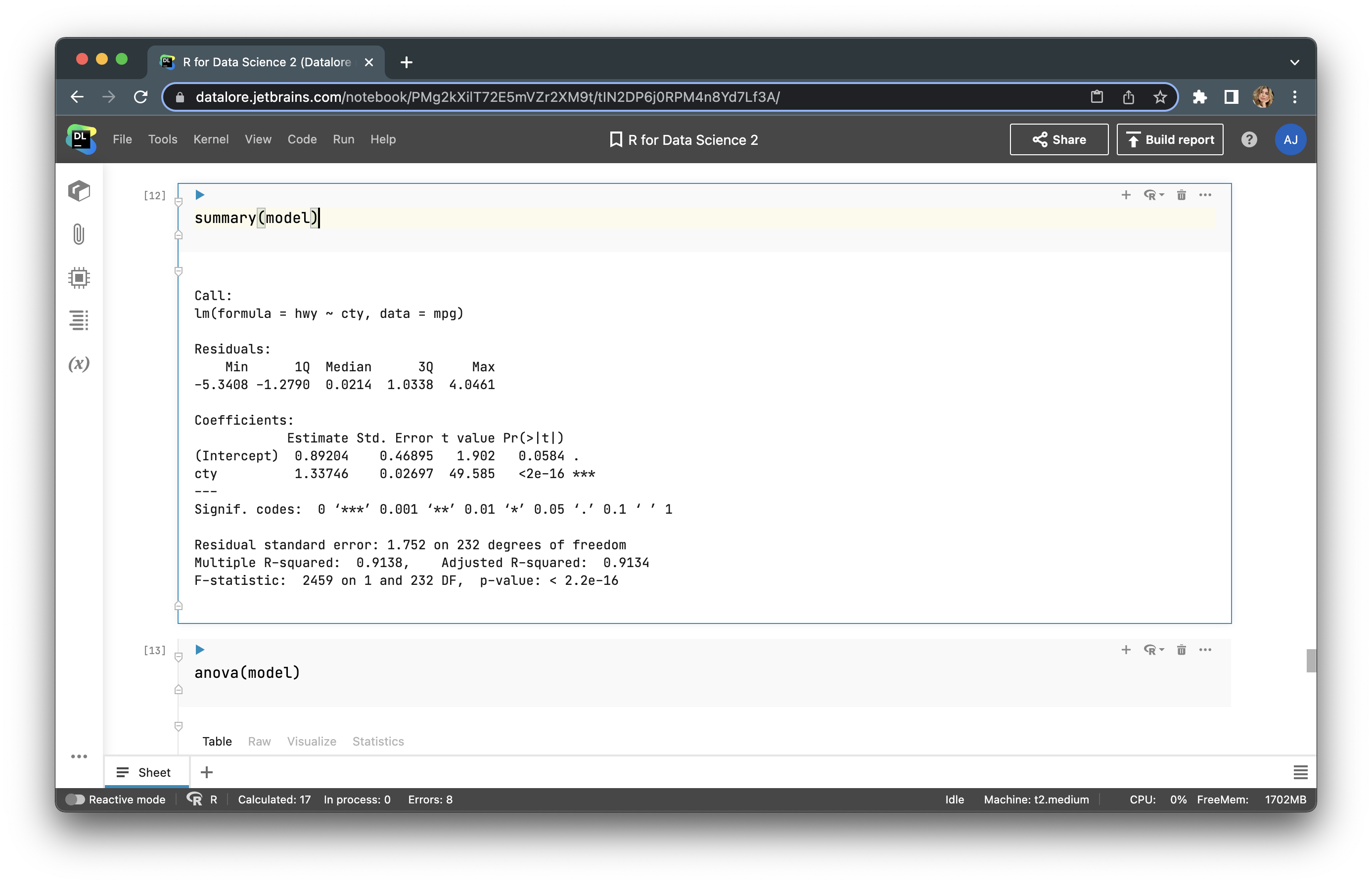
We can get more info by using summary() and anova(), as in the examples below:
We can build a simple regression line with plot() and abline() using this code:
plot(subset(mpg, select = c(cty, hwy)), col=<strong>'blue'</strong>, pch=<strong>'*'</strong>, cex=2)
abline(model, col='red', lwd=2)
Note that we are not using the whole dataset, but only a subset with the cty and hwy features.
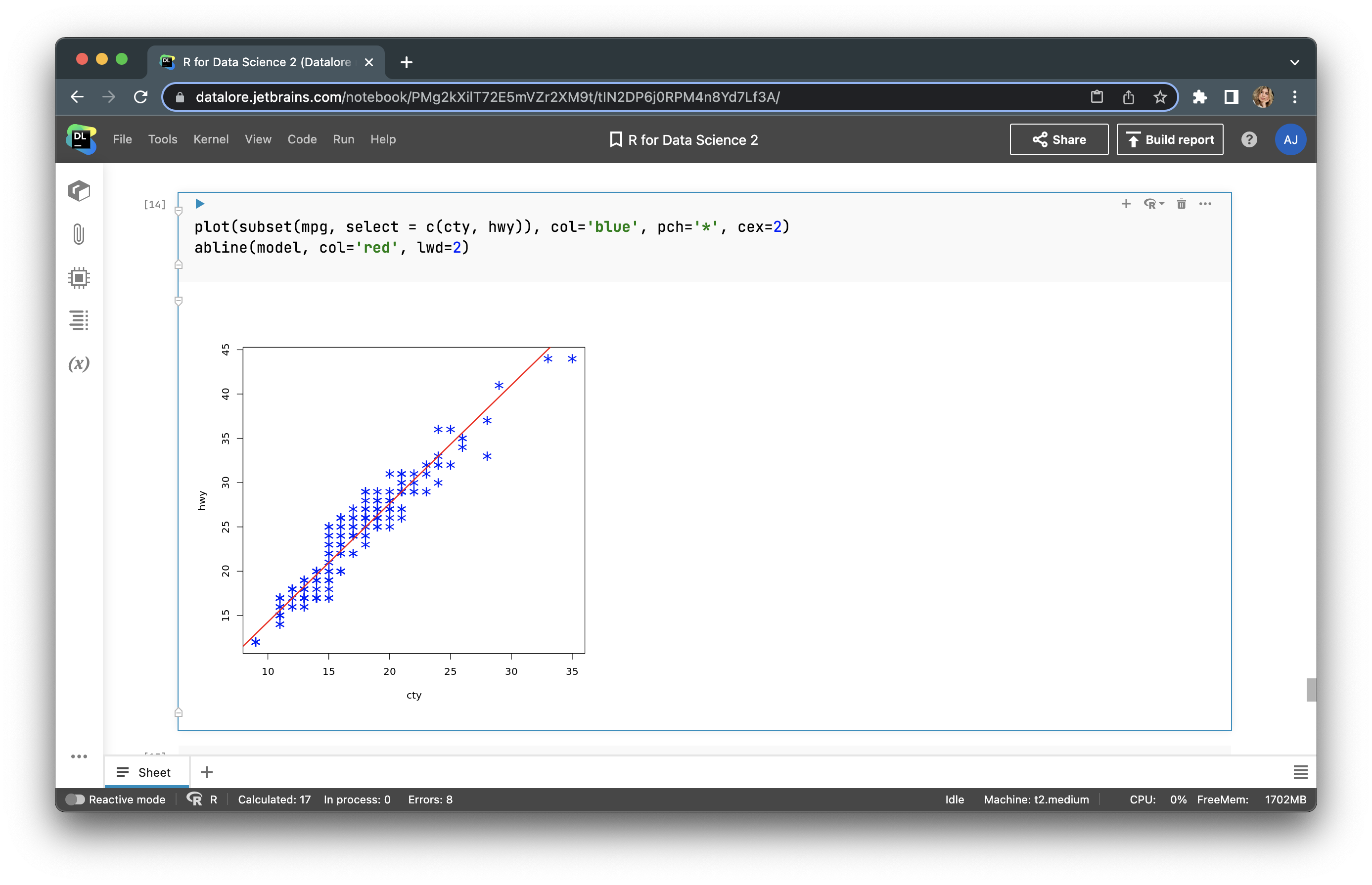
The regression looks good. Now let’s make a prediction.
predict <- predict(model, data.frame(cty=1:15))
And build a prediction line.
plot(1:15, predict, xlab='cty', ylab='hwy', type='l', lwd=2)
points(mpg)
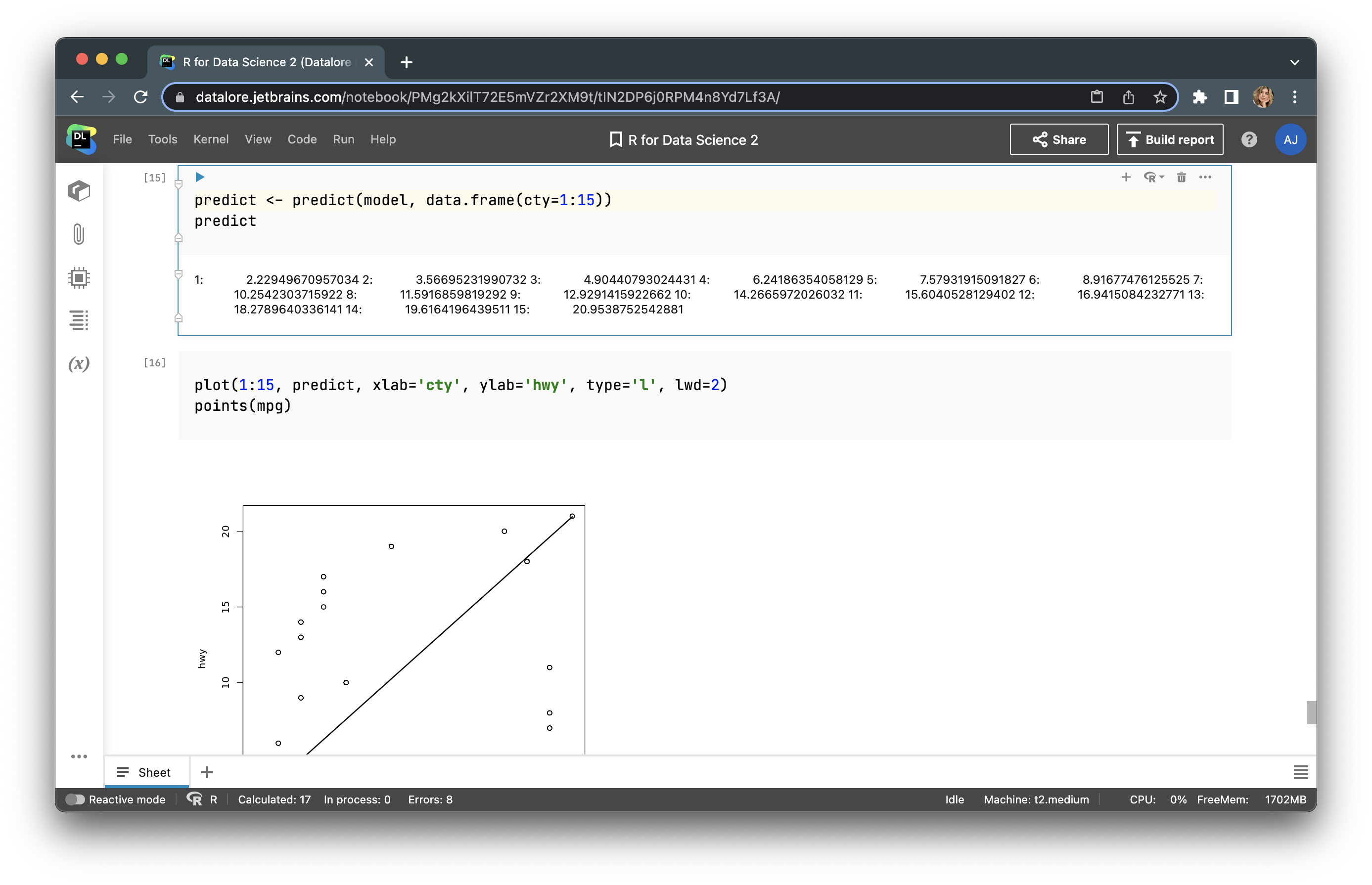
We’ve now conducted simple statistical modelling with linear regression.
How to train a machine learning model with Python in Datalore
Python only allows for about half of the options that are supported by R and its graph libraries, but Python is more suitable for machine learning tasks and applying trained models as applications.
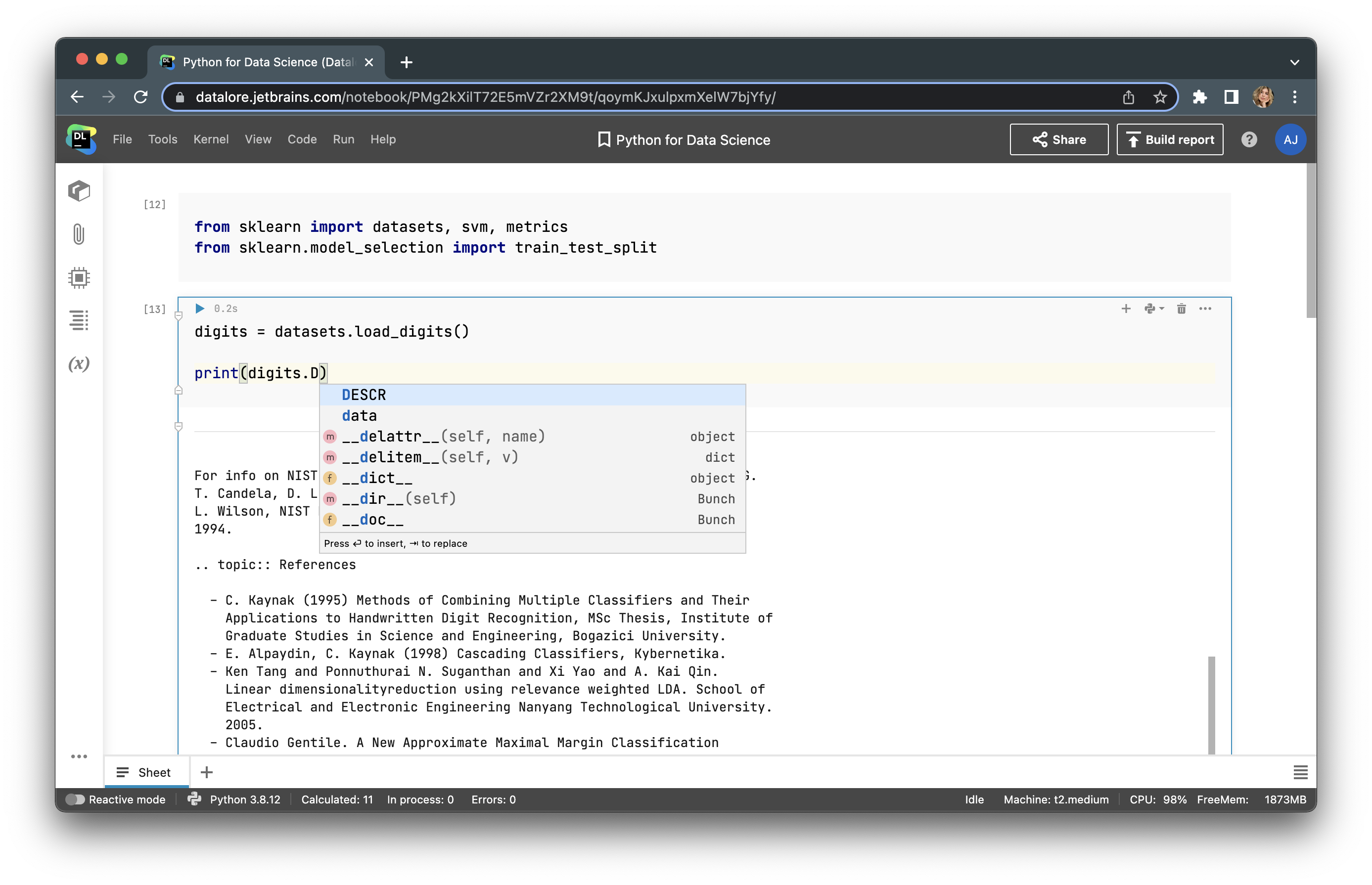
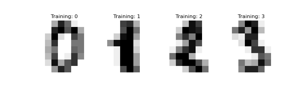
In this example, we’ll use a scikit-learn library that provides you with the tools to prepare the data and train ML algorithms to make a prediction based on data. A scikit-learn library provides users with prebuilt datasets, and we’ll be using the digits dataset in this example. This dataset consists of pixel images of digits that are 8×8 px in size. We’ll predict the attribute of the image based on what is depicted in it.
First, we need to import the library packages that are needed for scikit-learn to work.
from sklearn import datasets, svm, metrics
from sklearn.model_selection import train_test_split
Next, we will upload the dataset and print the description.
digits = datasets.load_digits()
print(digits.DESCR)
There are 1797 instances with 64 attributes. Here is an example of images presented in the dataset.
Next, we will prepare the data for training a classifier, meaning we will flatten the data.
n_samples = len(digits.images)
data = digits.images.reshape((n_samples, -1))
Now let’s create an instance of the classification model. In this example, we will use a C-Support Vector Classification. Let’s keep the default.
clf = svm.SVC()
Next, we need to split the data into training and testing sets. Let’s divide them using an 80:20 ratio.
X_train, X_test, y_train, y_test = train_test_split(data, digits.target, test_size=0.2, shuffle=False)
Now, we can train our model with the fit function.
clf.fit(X_train, y_train)
And we can make a prediction on our testing set.
predicted = clf.predict(X_test)
Let’s visualize the metrics of our model, which will help us understand how accurate it is:
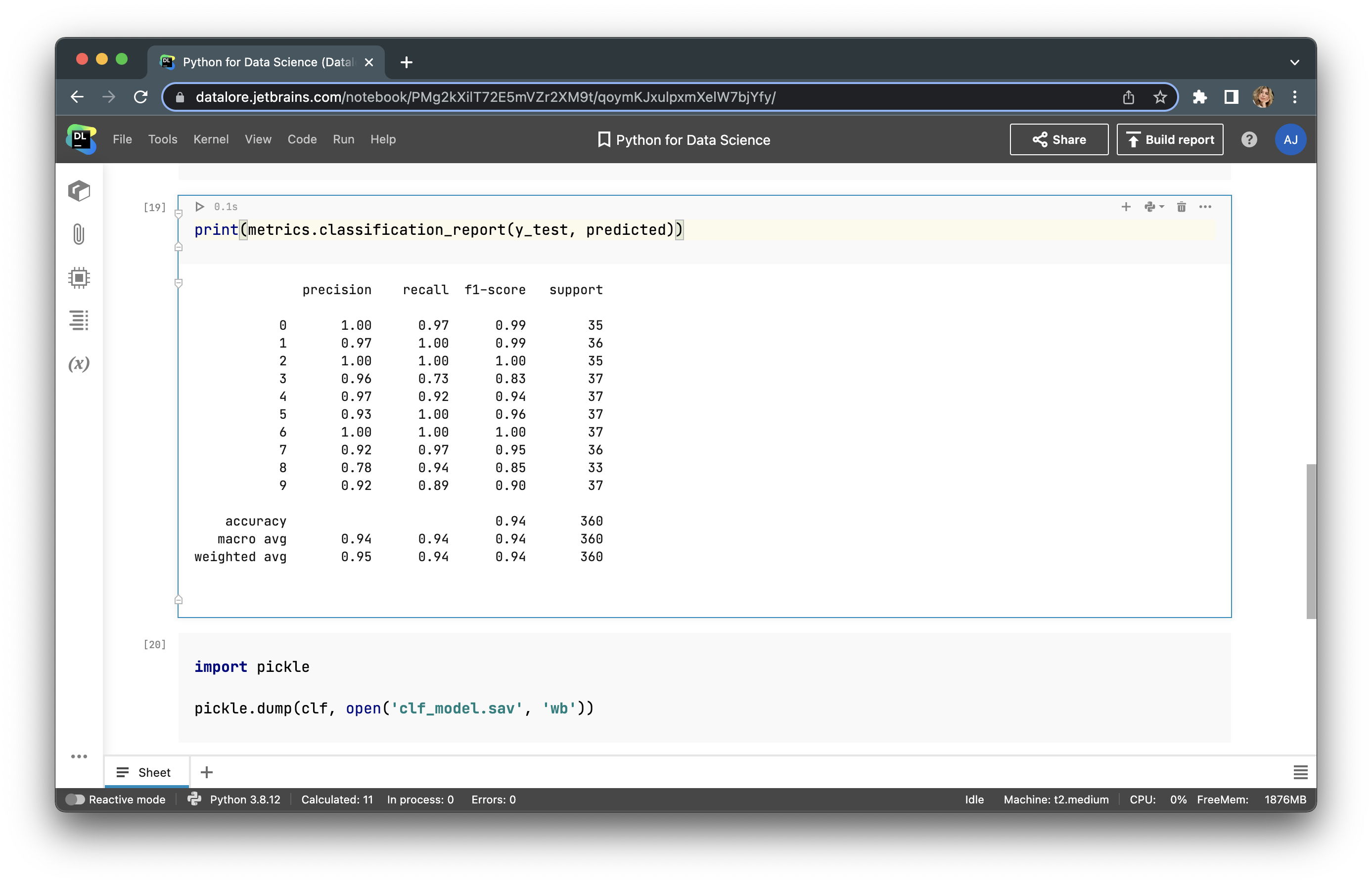
Judging by the 0.94 accuracy metric, we can say that the model is pretty accurate. Now we can save our model into a pickle file, but to do so we need to import a pickle library using the following lines of code.
import pickle
pickle.dump(clf, open(<strong>'clf_model.sav'</strong>, <strong>'wb'</strong>))
Our model can be used in any application. You can build a simple app with Flask or use more complex libraries to create ML models, such as PYTorch and TensorFlow, and create more robust apps with FastAPI, Django, etc.
Conclusion
As we discussed above, there is no straightforward answer as to which programming language to use in data science. The language you use will depend on your task and requirements. If you want to conduct statistical research or data analysis while preparing a customizable graph report, R is probably the right choice. However, if you intend to train ML models and use them in your production environment, Python is likely more suitable for your needs.


