.NET Tools
Essential productivity kit for .NET and game developers
Exploring Collections & DataTables

In Rider 2024.1, we’re shipping a highly requested feature: collection visualizers. Our very own Evgeny Terekhin has taken on the task of integrating DataGrip’s infrastructure to visualize data in the debugger. This makes it easier for .NET developers to inspect collections like List<T> and Dictionary<TKey, TValue, as well as data-oriented objects such as DataSet, DataTable, and more.
In this post, you’ll learn how to use Rider’s collection visualizer to view, query, filter, and sort collections in much the same way as you would with databases. Your debugging experience will never be the same again!
Starting the Collection View Visualizer
Every developer works with unique datasets, but what you’ll see is designed to work within any domain. That said, for the remainder of this blog post, we will take a fictional example of weather data for seven different cities over a timeframe of 14 days. Feel free to take a look at your own collection objects, or just copy/paste the following code to try it out:
var random = new Random();

var temperatures = (
    // Some cities
    from city in new[] { "Seoul", "Sofia", "Mexico City", "Cape Town", "Brisbane", "Houston", "Lima" }
    // Pick a baseline temperature, smoothing window, and temperature fluctuation
    let baselineTemperature = random.Next(5, 30)
    let smoothingWindow = 5
    let fluctuation = 7
    // Calculate smoothed temperatures for a timeframe of 14 days
    let dates = Enumerable.Range(0, 14).Select(x => DateOnly.FromDateTime(DateTime.Now).AddDays(-x)).ToList()
    from date in dates
    let startIndex = dates.IndexOf(date)
    let subset = Enumerable.Range(
            start: Math.Max(0, startIndex - smoothingWindow + 1),
            count: Math.Min(smoothingWindow, dates.Count - (startIndex - smoothingWindow + 1)))
        .Select(x => baselineTemperature + random.Next(-fluctuation, fluctuation))
    let average = subset.Average()
    select new Temperature(City: city, DegreeCelsius: (int)average, Date: date)
).ToList();

public record Temperature(string City, int DegreeCelsius, DateOnly Date)
{
    public string Feels => DegreeCelsius switch
    {
        < 10 => "cold",
        > 20 => "warm",
        _ => "normal"
    };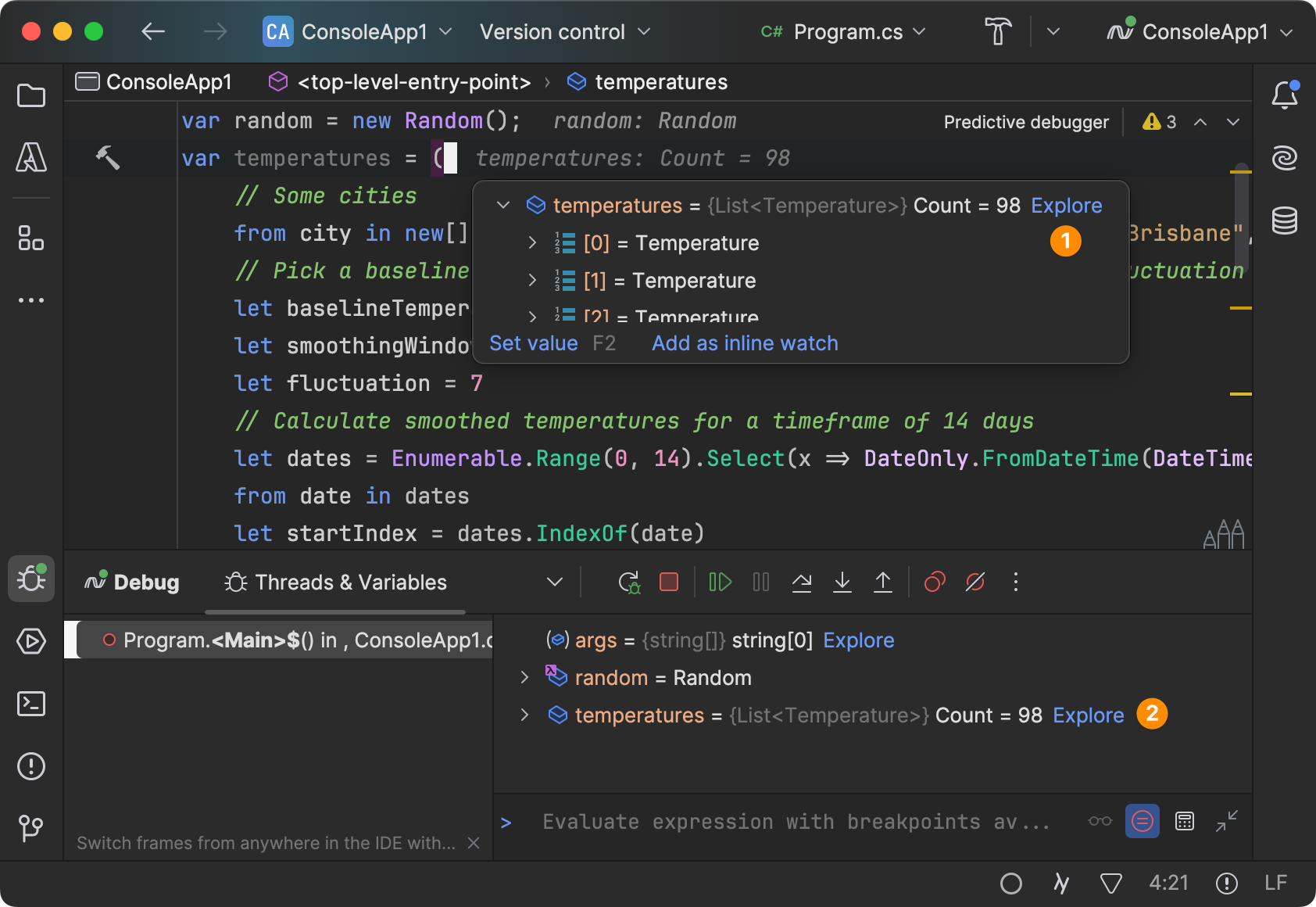
}Once you’ve started a debugging session and stopped at a breakpoint, you can inspect your collection variables (Explore hyperlink) to bring up the Collection View visualizer:
By the way, Rider comes with plenty of other powerful visualizers. In case you missed it, check out our blog post on HTML, XML, JSON, and JWT Visualizers in Rider 2023.1!
Exploring Data Collections
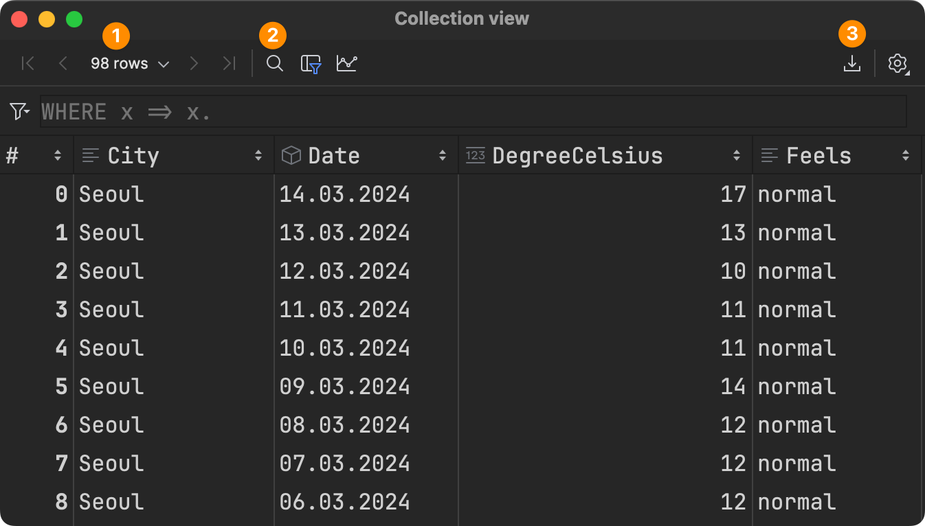
Let’s start with some basic operations you can perform in Rider’s new Collection View dialog! From the toolbar, you can (1) click through different pages of your data or change the page size, (2) use textual search on the data rows currently shown, or (3) export the data to a number of different formats:
All columns/properties are sorted alphabetically, but you can also rearrange them by dragging and dropping. We will also add sorting by definition order very soon! Clicking on an item brings up the .NET Value pane. From here, you can inspect even complex objects in the way you’re used to:
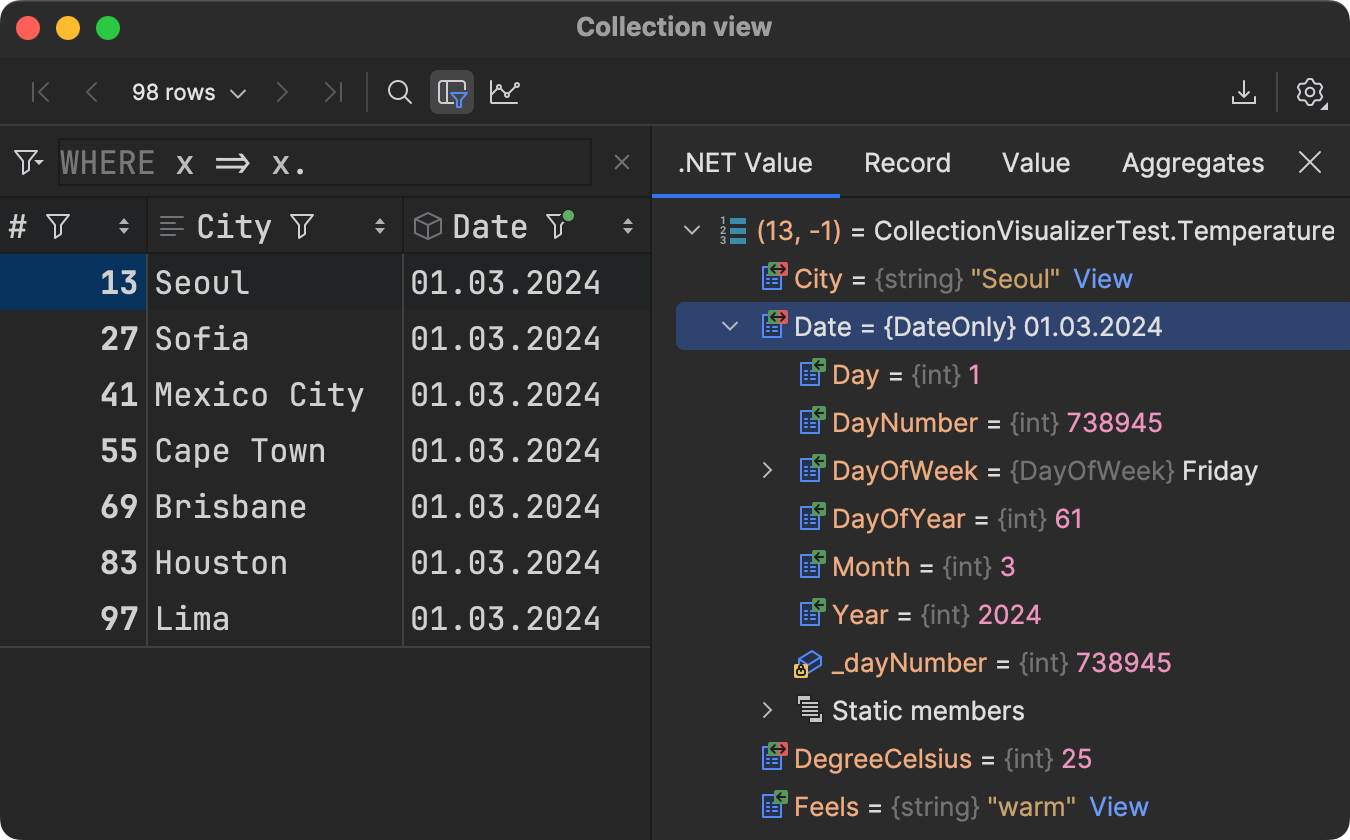
Note that, to inspect the whole item, you’ll have to click on the position (#) column. Otherwise, you’ll just see the selected property.
Just below the toolbar, you can use the filter box to write your filter conditions in LINQ style. The textbox is pre-filled with WHERE x => x. so that you can start typing immediately with code completion:
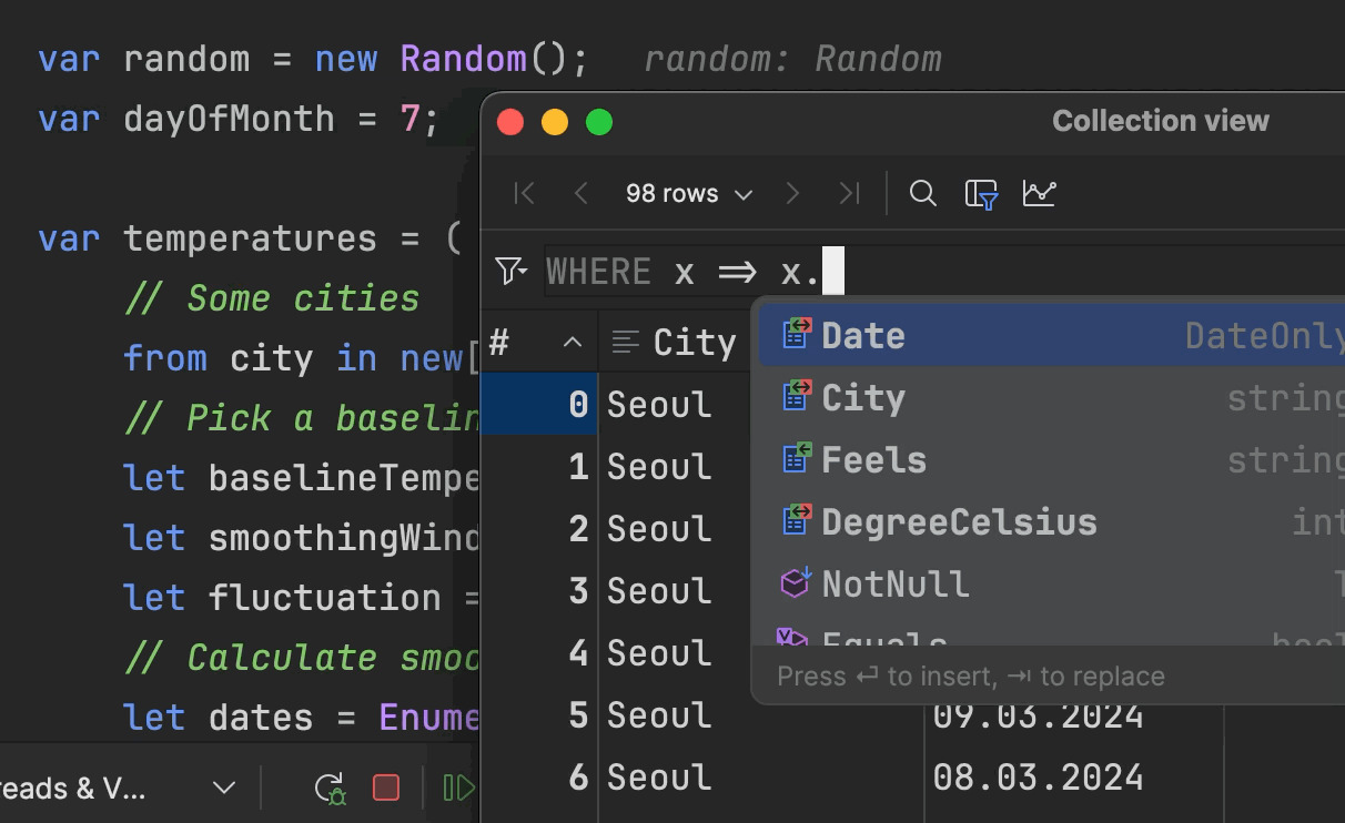
Keep in mind that you can also use locals from the context of your current statement! Like in the scenario above, we are using the dayOfMonth variable to filter down to the 7th of the month.
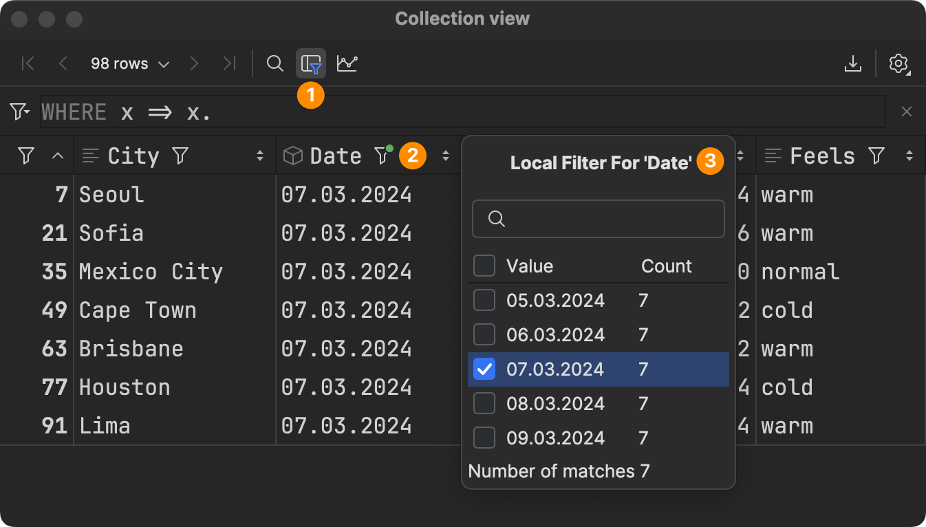
For simple textual filtering of properties/columns, there’s also a Local Filter button in the toolbar. Once local filtering has been enabled (1), you can click the filter icon on any number of properties or columns (2) to bring up the filter popup (3). You can either enter your search value manually or pick one or multiple known values from the list view:
Plotting Data Charts
Just above the data table view, you can click the Show Chart button (1) to visualize data collections in Rider. The first chart that pops up is unlikely to be exactly what you want, but you can easily fix this by clicking the Show Series Settings button (2) in the lower right-hand corner:
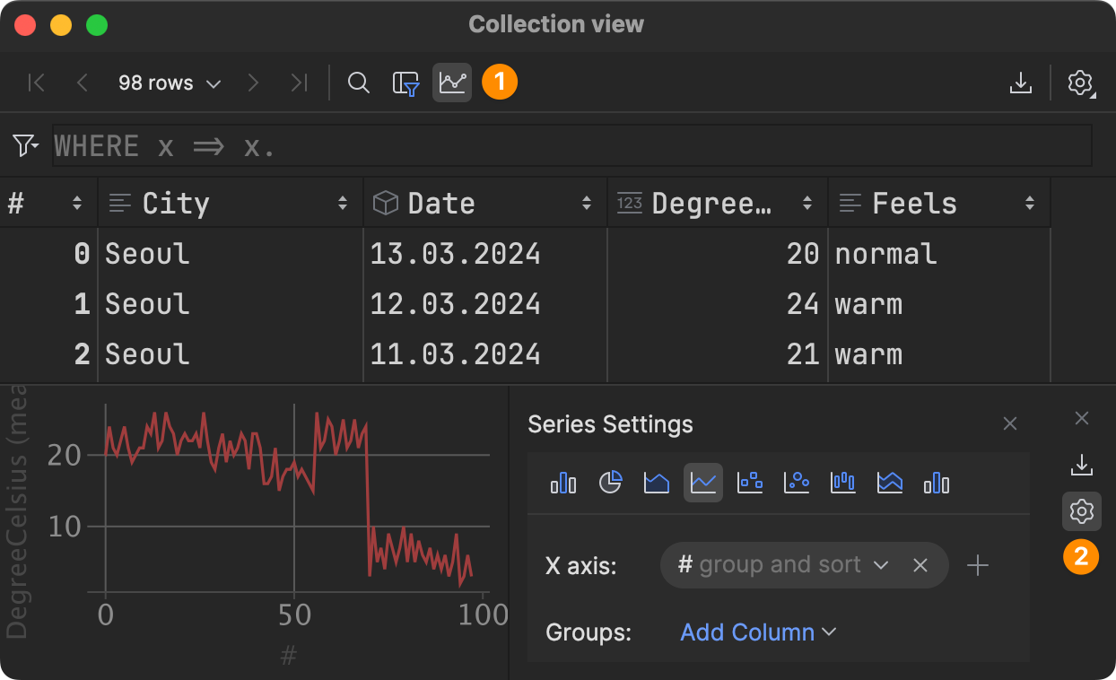
This brings up the Series Settings pane, where you can choose from 9 different chart types to illustrate your data in the best possible way, including:
- Bar Chart
- Pie Chart
- Area Chart
- Line Chart
- Scatter Chart
- Bubble Chart
- Stock Chart
- AreaRange Chart
- Histogram Chart
Each of these chart types comes with its individual series settings. For instance, to visualize our weather data for individual cities over the course of the available timeframe, we could choose a Line Chart and set the Date as X axis, DegreeCelsius as Y axis, and also City as groups along the X axis:
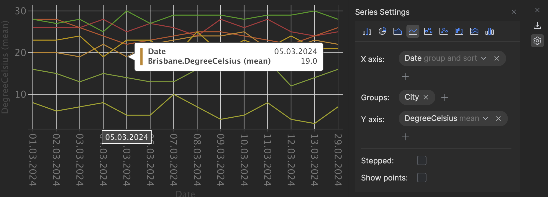
Of course, you can use your mouse to hover over the different data points and dive deeper into the details.
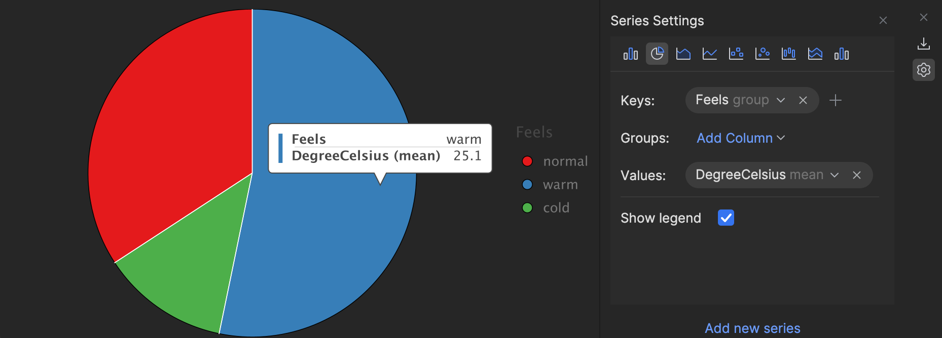
Let’s also find the distribution of warm, normal, and cold temperatures accumulated from all cities and dates. A Bar Chart should do the job! We set the calculated Feels property as a Key and DegreeCelcius as the Values. For the Values, you can also set a modifier function like mean, max, or first. These aggregated values are shown over the pie area when you hover over it:
Note that there’s also an Export to PNG button in the upper right-hand corner so that you can easily share a chart without using screenshot tools and manual cropping.
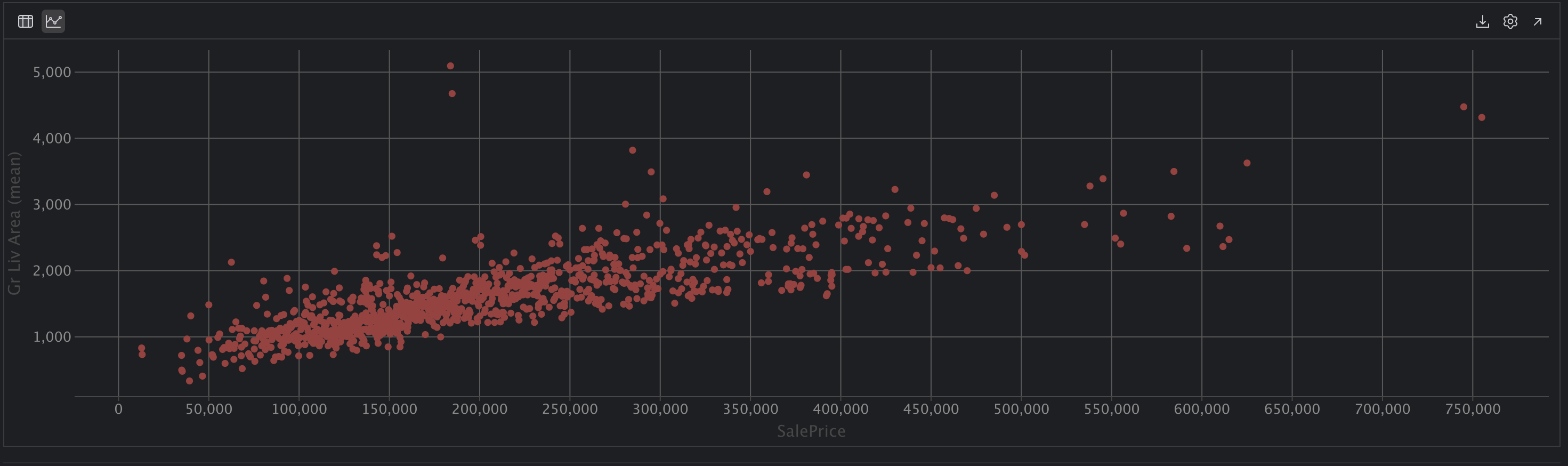
Our friends from the PyCharm team have shared another example that demonstrates the effectiveness of data visualization. By using a Scatter Chart, we can easily observe a correlation between sales prices and above-ground living areas – as the size of the living area increases, the price also tends to rise:
For more inspiration, we recommend this video about Types of Graphs and When To Use Them.
Support for ADO.NET Data Tables
For our ADO.NET framework users, we have some exciting implementation insights to share! Since the DataTable class does not provide an adequate LINQ API, we load a helper assembly into the process during your debug sessions. This helper assembly contains a generated type that enables the conversion to an IEnumerable by collecting all column names and enumerating rows using the extracted names.
Conclusion
Working with collections in .NET has never been easier. Just last November, the C# language team introduced collection expressions in C# 12 as a succinct syntax for collection construction. With Rider 2024.1, we’re adding the Collection View, which helps to explore and visualize collections more conveniently and efficiently.
Let us know in the comments if this feature is helpful to you, or if you have any ideas to make it even better!
Image credits: Martin Martz