YouTrack
Powerful project management for all your teams
Restyled UI in YouTrack 5.0: New look, same soul
We are excited to introduce absolutely new YouTrack 5.0 look & feel. We put a lot of hard work into it, to help you enjoy just the right balance between powerful functionality and a lightweight UI. Learn about the key enhancements and the main advantages of the new UI. Very soon you will start managing issues easier, faster and with more pleasure with YouTrack 5.0, where form and substance both matter.
Please welcome YouTrack 5.0 UI personalities:

Sergei Ilin, @iSerge, Lead Graphic Designer, JetBrains

Artem Tiunov, @artemtiunov, UI/UX Designer, JetBrains

Alexander Anisimov, Front-End Developer, JetBrains
General UI improvements
New menu
First of all, look at the new menu with updated components and you’ll notice that we’ve totally restyled buttons and links. For your convenience, there are no more toggle buttons. Just use the Create Issue button and follow the links to your Issue lists, Agile Board and Reports.

More visibility and unified views
There are many general design improvements for a more intuitive feel about YouTrack 5.0. The new UI makes links and icons more visible, as well as letting you hover the mouse over them with an increased mouseover area. We played with the colors and made the active elements orange (one of our primary colors at JetBrains). Check this out in the new YouTrack 5.0!
We’ve also improved visibility for all the fields on the Create/Edit Issue screens, and unified all the views. Now everything is in the same place on each screen. The issue list now features simplified checkboxes and icons, updated to help you work with issues with more fun.
Comment system
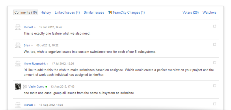
If you’ve ever submitted comments to YouTrack, you’ll see the difference now, as we’ve redesigned the comment system substantially. The new comments view is clear but still detailed, and instead of old-style links you will find new edit/delete icons.
Full Screen Issue
Layout
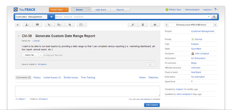
The highlights of the new look & feel in YouTrack 5.0 include the new Full Issue screen the and Create/Edit Issue screen. Take a look at the new Full Issue screen: we have redesigned the visible area and the key issue details to put them on the left side, while the secondary details are now on the right. Focus on important things first, right?
Issue change-over
There are more UI features in here. Look in the upper right-hand area above the issue details and you’ll see a new way to jump up and down to other issues within the selected YouTrack project. In the Full Issue screen, field labels are now visible permanently for your convenience.
Just look through your issues in the full screen to feel the difference.
Create Issue & Edit Issue screen
Similar issues
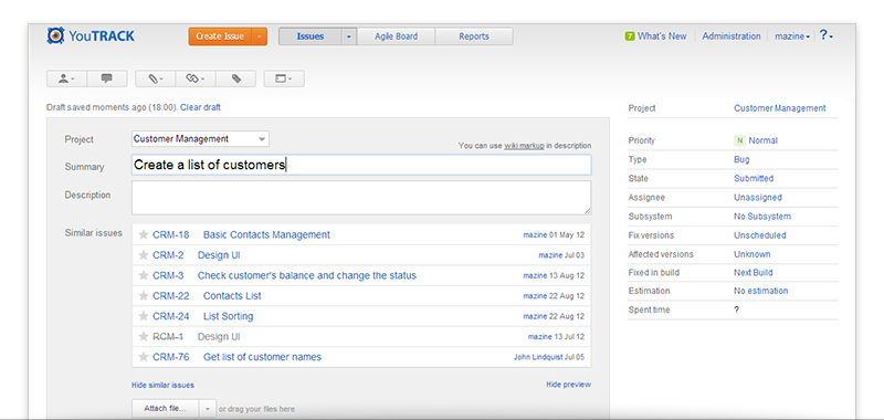
The Create Issue and Edit Issue screens have also been redefined. Next to the familiar History and Linked Issues tabs, you’ll notice a brand new tab called Similar Issues. Its purpose it to help you find issues that are similar to the selected one. How does it work? Just start editing the issue description or summary, and the list will refresh to show you the most relevant existing issues. Depending on your needs and preferences, you can always hide or show the similar issues block on the Edit Issue and Create Issue screens.
Obviously, this tab will of great benefit especially in large teams, as it helps you eliminate duplicates in your project. Users will see right away if a similar issue has already been reported. Another advantage of this new tab is that you can easily link relevant issues with one click. Stay tuned for more details on this feature in a later post.
Issue template generator
This is another new feature that allows you to generate an issue template URL to share with your customers or collaborators, available in both Create Issue & Edit Issue screens. It will help you save time on repeated actions, and instead to focus on what’s really important. Try it once and you’ll use it regularly.
File attachments
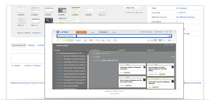
Want to attach a file or picture to your issue? Now attaching files from the system is faster and more fun: simply drag them to the Create Issue or Edit Issue screen and voila!. Check it out for yourself.
Agile Board
Your favorite Agile Board has undergone some changes as well in YouTrack 5.0. Please welcome these improvements.
New cards
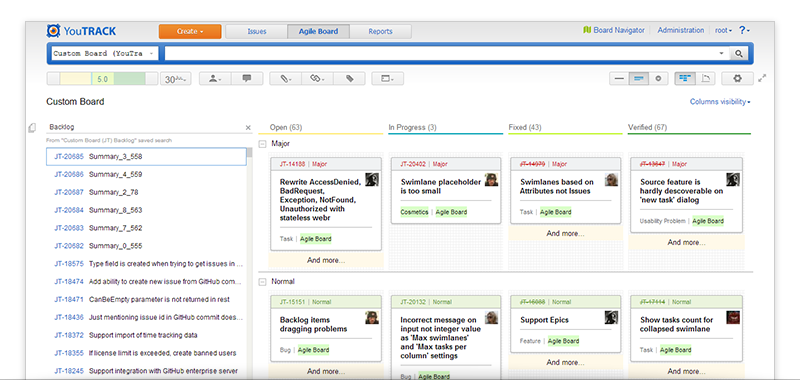
We totally redesigned the cards by putting them on white background. There are new headers on the cards which are colored in line with issue status (Normal, Major, Critical), to help you see right away what’s going on in your project or swimlane. You will also notice new edit icons in different places in the new YouTrack 5.0.
Time estimates
Time is money, so we’ve added estimates everywhere – on cards, columns, swimlanes and projects. If you value your time as much as we do at JetBrains, you’ll find this very useful.
We’ve also introduced tags for Agile Board cards, to help you work with huge volumes of issues. Tags give you more insight into what cards are about in a glance.
Columns visibility
One more new feature worth mentioning is Columns Visibility. Now you can manage your columns and their visibility with pleasure just ticking off only those columns which you really need for your current work.
Just a reminder, there are major changes in the Agile Board functionality as well. We’ll cover those in another post very soon.
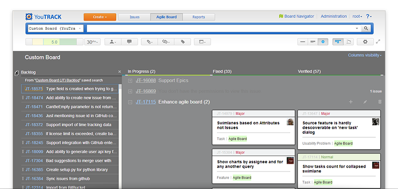
Darcula look and feel
The Darcula theme was introduced in our other products last year and its TV version has now made its way into the Agile board in YouTrack. Do give it a try! What’s the benefit? Specifically designed for TV, it is highly visible from a distance, while also being very usable on a PC screen. Come over to the darker side of Agile to help control your Agile processes.
Please tell us what you think about the new YouTrack 5.0 look & feel. You can easily do it via these channels:
- add comments here
- post on our community forum
- fill out this feedback form
- Twitter or Google+
Share your feedback with us and help us make YouTrack even better together.
Keep tracking with style with YouTrack 5,
JetBrains Team
