

Datalore
Collaborative data science platform for teams
New in Datalore: 2021 Recap, Visualization Improvements, and More
Greetings from the Datalore team!
Have you seen Datalore’s 2021 video recap on Twitter? It’s a fascinating look at the strides we made last year.
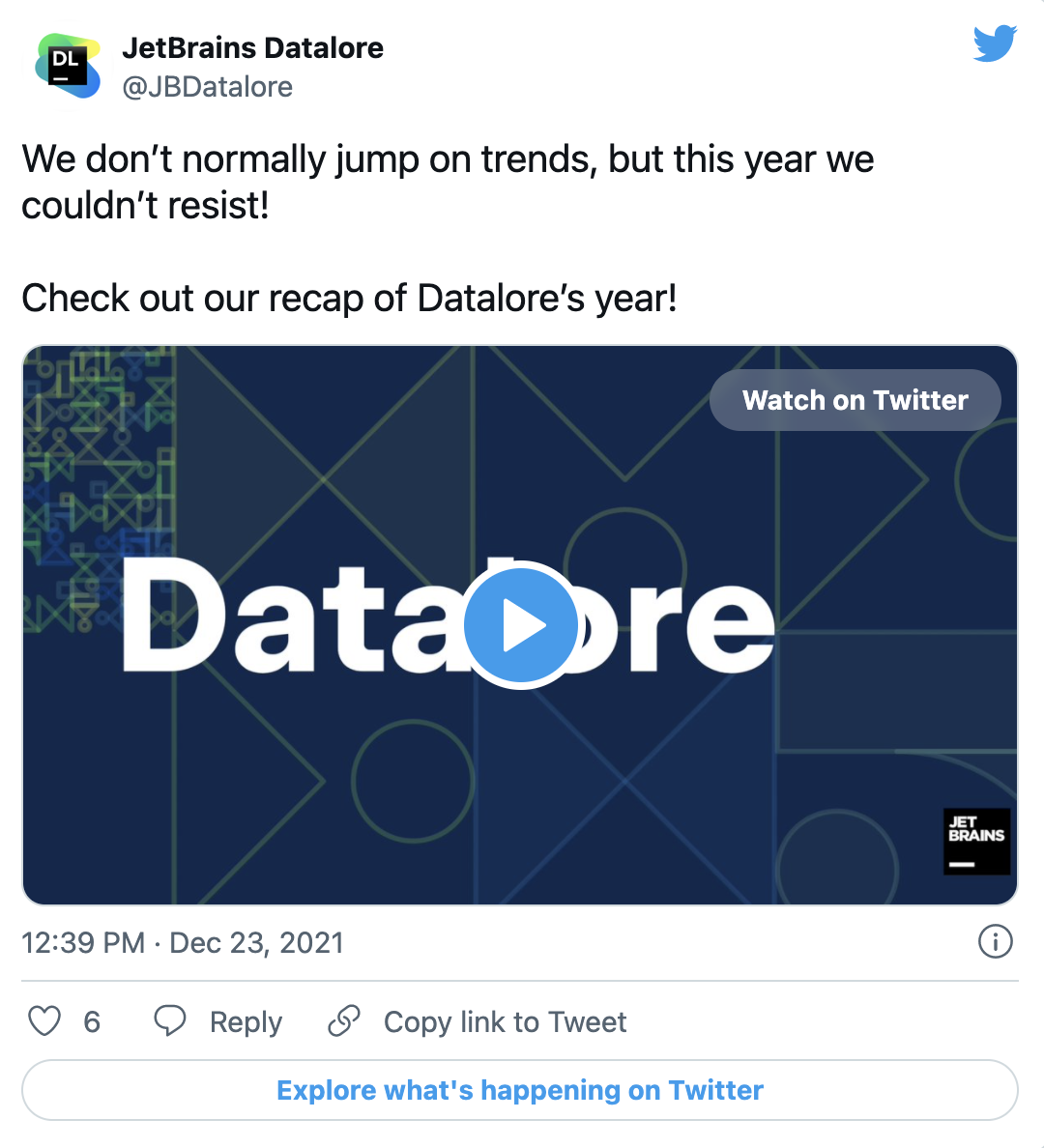
And if you don’t yet follow us on Twitter, make sure to subscribe, since it’s the first place to learn about Datalore news and updates.
It’s already 2022, and we are here with the first newsletter of the year! Read on to learn what the Datalore team has been up to recently. ?
Visualization improvements
Datalore brings automatic visualizations for every pandas dataframe right to your fingertips. Line, point, bar, area, and correlation plots are available in 2 clicks both in the Visualize tab and in Chart cells.
We’ve also updated the look and feel of the Visualize tab:
- Plots are now bigger
- The plot configuration has been moved to the left side of the tab
- Lets-plot library graphics have been updated
We’ve also added seamless transitions from the Visualize tab to Chart cells, where you can further customize plots, as well as create multi-layered visualizations and collaborate on them.
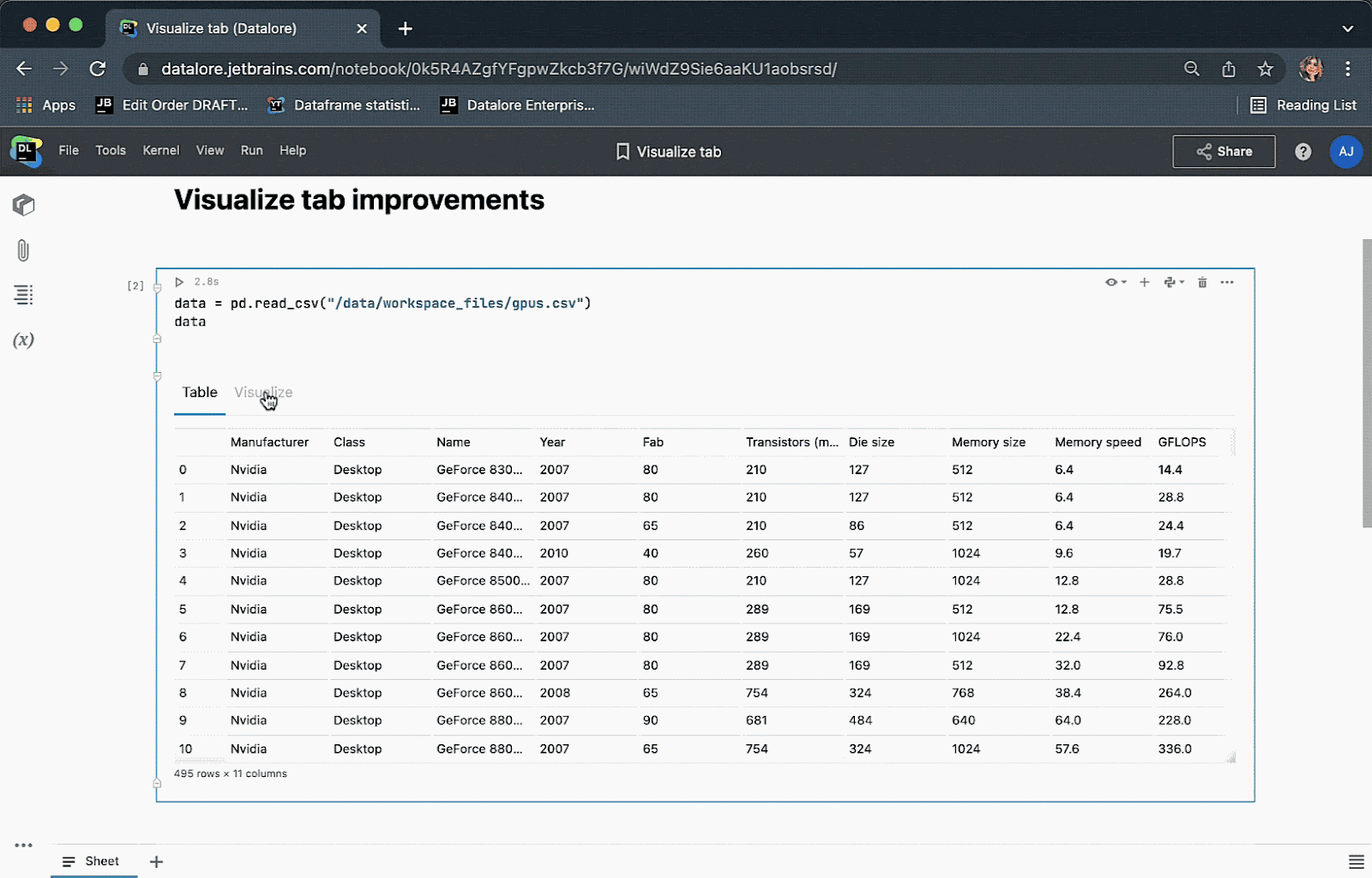
You can read more about the Visualize tab and Chart cells here.
Storage optimization for Reactive mode
A few months ago we released a new implementation of Reactive mode – thanks for all of your feedback!
An issue that many of you faced when working with heavy notebooks was that Reactive mode stored the checkpoints and consumed a lot of disk space. We’ve fixed the issue for now by not saving the state after the end of a session in Reactive mode.
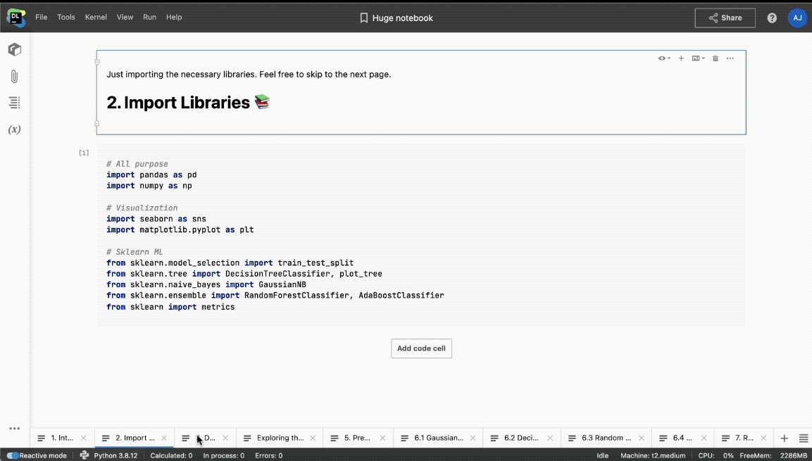
Hiding cells on a specific worksheet
Previously, it was only possible to hide cell inputs and outputs for the whole notebook or one-by-one.
This month we added the option to hide cell inputs and outputs for a single worksheet. This can be particularly useful when publishing static reports: you can now hide intermediary steps on the first N worksheets and only publish the contents from the last sheet, for example.
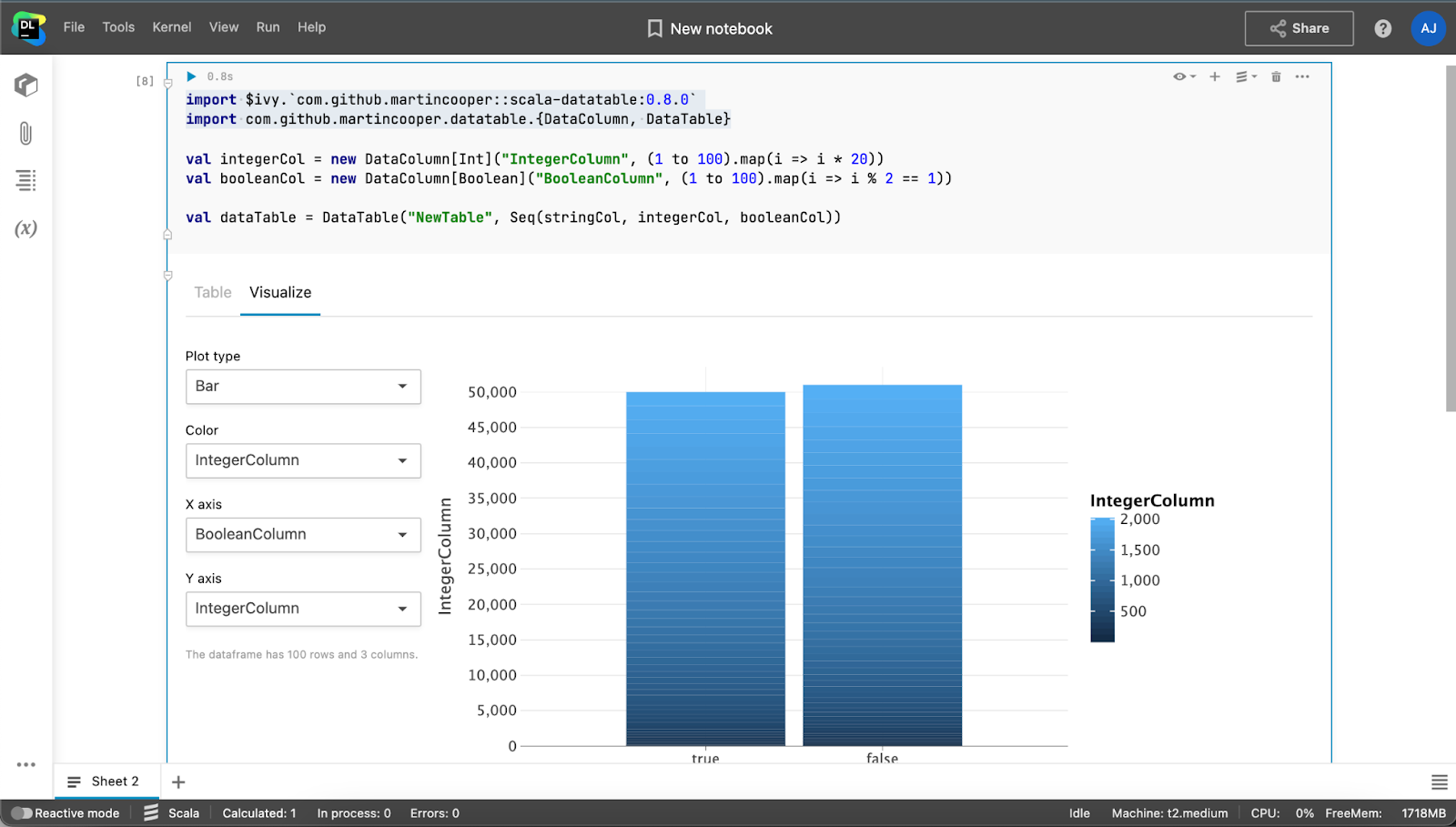
Improved rendering of scala-datatable
Have you already tried working with Scala notebooks in Datalore? If yes, let us know what you think in this thread! We’d love to learn about how you use Scala in your data science workflow.
Recently we improved the look of rendering for scala-datatable objects. This means that you will get the same table data preview and automatic visualizations as you would for a pandas dataframe in Python.
Call for research respondents!
The JetBrains Market Research & Analytics team is currently conducting analyst user research, and we would love for you to take part. The study will take no more than 60 minutes and will be conducted via Google Meet.
As a thank you for devoting your time to our research, you can choose to receive either a $100 Amazon eGift Card (or the equivalent in your local Amazon store). Please note that these rewards assume your full participation in the study.
Please fill out this short questionnaire to see whether you qualify to participate. If your profile is a good match for this study, you will automatically be redirected to the Calendly sign up page.
P.S. We’d really appreciate it if you could share this information with any friends who also work as analysts.
That’s all for now. Follow us on Twitter @JBDatalore to hear about our updates!
Happy analyzing!
The Datalore team


